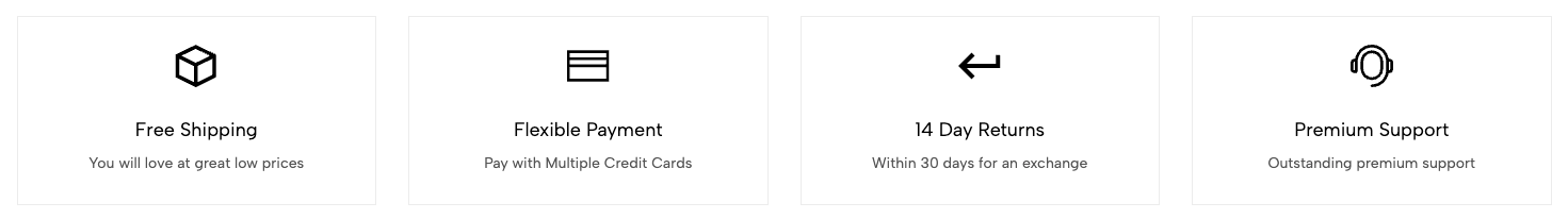
The Icon Box section is a visual component used to display icons alongside titles and short descriptions. It’s an effective way to highlight key features, services, or benefits on your website.
1. How to access the Icon box section?
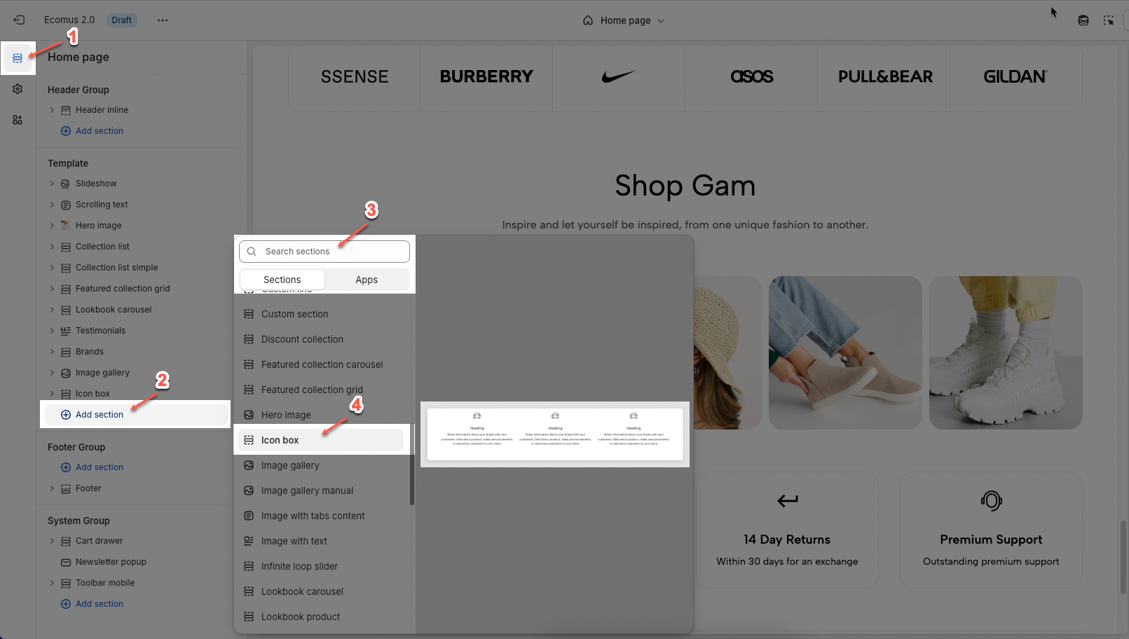
Step 01: From Shopify Admin, click on Online Store > Select Themes > In the Current theme section, click the Customize button.

Step 02: In the theme editor (Customize), click the Sections button > Click the Add section button > In the Sections tab, scroll through the list or use the search bar to find and select the Icon box.
2. How to customize the blocks?
2.1. Customize Icon column block
To add an Icon column block to the Icon box, click the Add block button (plus icon ➕) under the Icon box.
After adding the Icon column block, you can adjust its settings using the sidebar—located on the right or left side of your screen depending on your device:
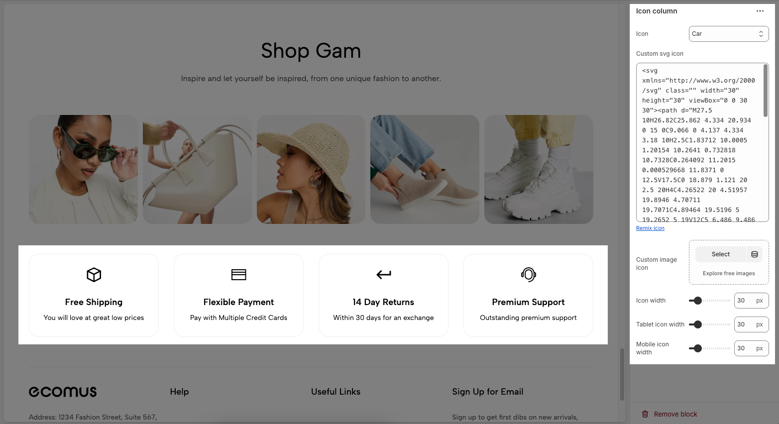
Icon: Dropdown to choose a default icon from a preset library
Custom svg Icon: A text area to paste your own SVG code if you want a fully custom icon instead of using the preset options. You can click Remix icon link to remix or customize the current SVG icon using an external editor.
Custom image Icon: Instead of using an SVG, you can upload or select a custom image to use as the icon.
Select lets you upload your own image file.
Explore free images opens a library of free stock icons/images.
Icon Width: Controls how wide the icon appears on desktop (in pixels).
Tablet Icon Width: Sets icon width specifically for tablet view.
Mobile Icon Width: Sets icon width specifically for mobile view.
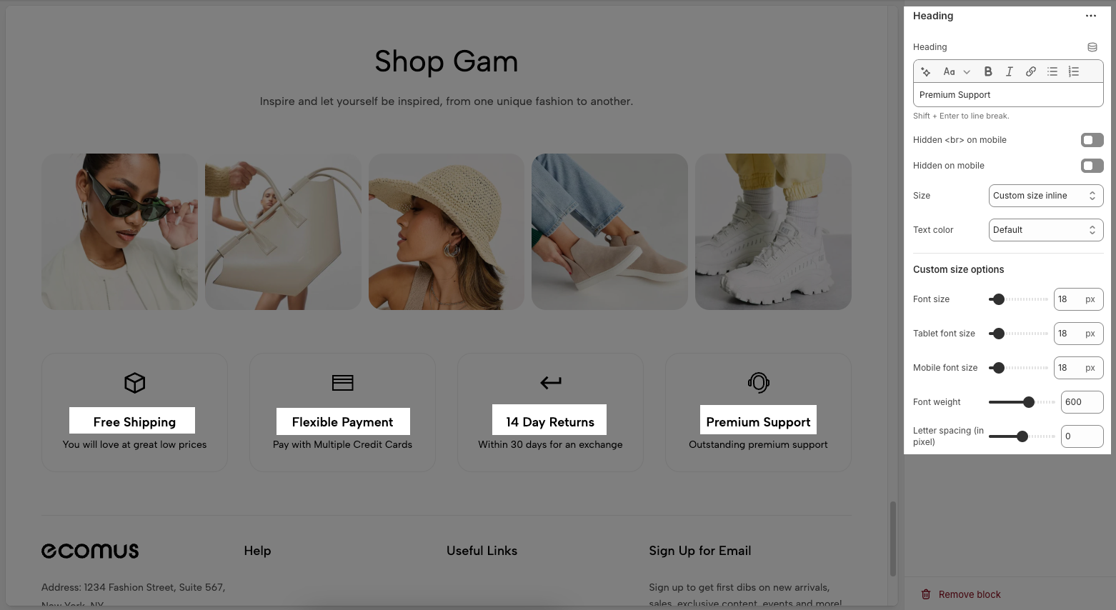
2.2. Customize the Heading/ Text block
Customizing the Heading allows you to control its appearance across different devices, ensuring consistency and responsiveness. Below are the available options to fine-tune your heading styles.
Heading: Allows you to enter and format the text (bold, italic, underline, lists, links, etc.). Shift + Enter to line break.
Hidden <br> on mobile: Disables line breaks on mobile devices.
Hidden on mobile: Hides the heading on mobile screens.
Size: Lets you select sizes for the heading.
Text color: Allows you to set the text color. Please follow this guideline to configure the Color.
Custom Size Options:
Font size: Adjusts the heading size for desktop.
Tablet font size: Adjusts the heading size for table.
Mobile font size: Adjusts the heading size for mobile.
Font weight: Controls the thickness of the text (e.g., 600 is semi-bold).
Letter spacing: Adjusts the space between characters.
2.3. Customize the Spacer block
The Spacer block is used to add empty space between blocks. It helps improve the layout, create visual separation, and ensure a balanced design. This block is particularly useful for adjusting spacing in different screen sizes (desktop, tablet, and mobile) to enhance readability and aesthetics.
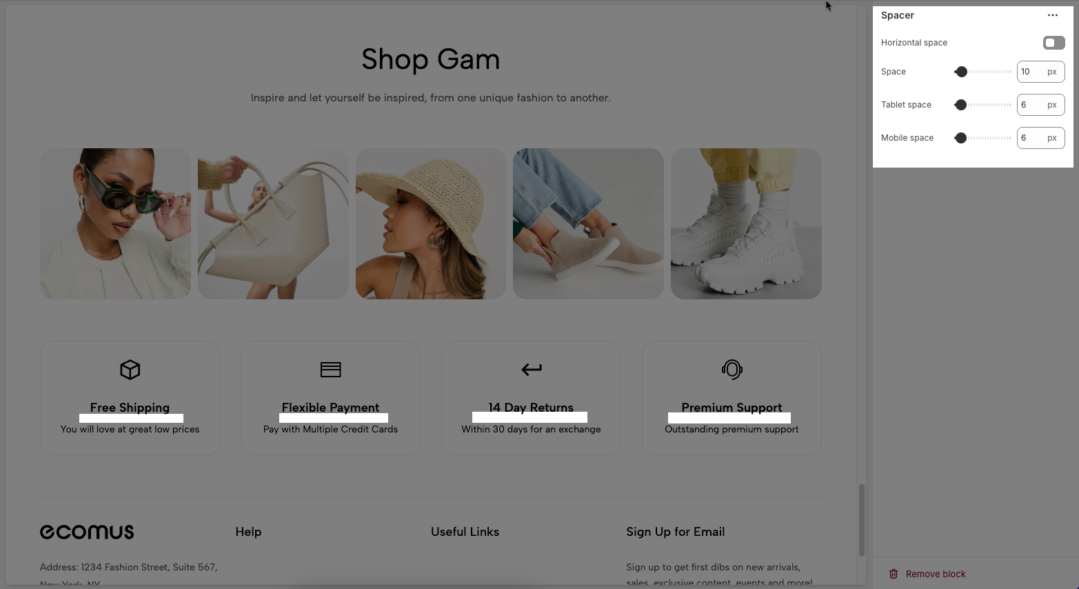
Horizontal space: If enabled, the spacer will also add horizontal spacing instead of only vertical spacing.
Space: Adjusts the amount of space (in pixels) on desktop screens.
Tablet space: Defines the amount of space for tablet devices, ensuring responsive spacing.
Mobile space: Sets the spacing specifically for mobile screens.
3. How to customize the Icon box section?
Here’s how you can customize the Icon box section to best fit your content and layout. Below are the available options for customization:
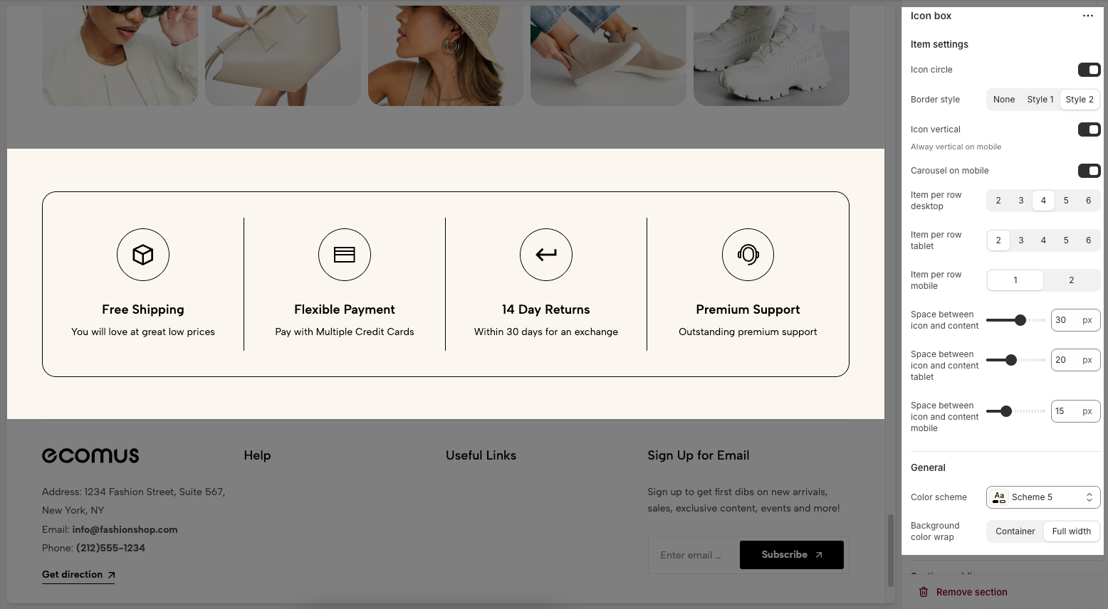
3.1. Item Settings
Icon Circle: Toggle to display icons inside a circle.
Border Style: Choose between None, Style 1, or Style 2 for box borders.
Icon Vertical: Stack the icon above the text (always vertical on mobile).
Carousel on Mobile: Enable horizontal scroll (carousel) layout on mobile.
Item per row desktop: Options to select the number of items displayed per row on desktop devices (2, 3, 4, 5, or 6).
Item per row tablet: Options to select the number of items displayed per row on tablet devices (2, 3, 4, 5, or 6).
Item per row mobile: Options to select the number of items displayed per row on mobile devices (1 or 2).
Space between icon and content: A slider and input field to adjust the spacing between the icon and its accompanying content (currently set to 30 px).
Space between icon and content tablet: A slider and input field to adjust the spacing between the icon and its accompanying content on tablet devices (currently set to 20 px).
Space between icon and content mobile: A slider and input field to adjust the spacing between the icon and its accompanying content on mobile devices (currently set to 15 px).
3.2. General
Color Scheme: A dropdown menu to select the color scheme.
Background Color Wrap: Choose Container for standard width or Full width to stretch background across the screen.
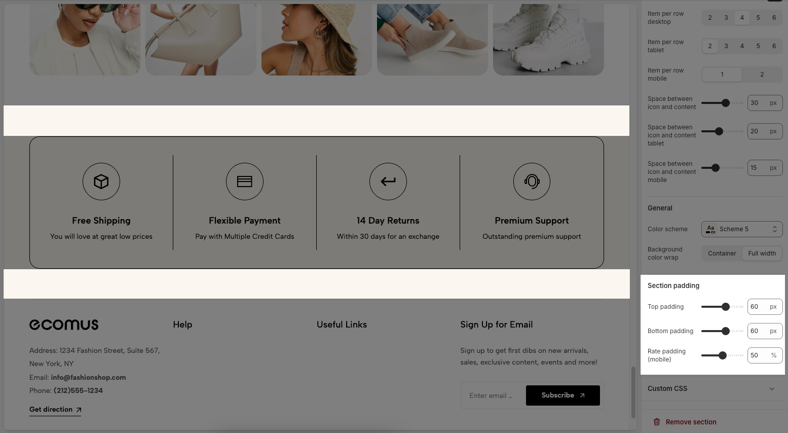
3.3. Section padding
Top padding: Creates space above the content within an element, separating it from elements above and improving visual layout.
Bottom padding: Creates space below the content within an element, separating it from elements below and improving visual layout.
Rate padding (mobile): Adjust spacing around mobile top elements, optimizing user experience and ensuring easy interaction on smaller screens.
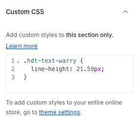
3.4. Custom CSS
Allows users to customize by adding CSS rules, beyond the limitations of default settings. This allows for fine-tuning the design to every detail, to suit specific needs.
Add custom styles to this section only.
To add custom styles to your entire online store, go to theme settings for detailed instructions.