


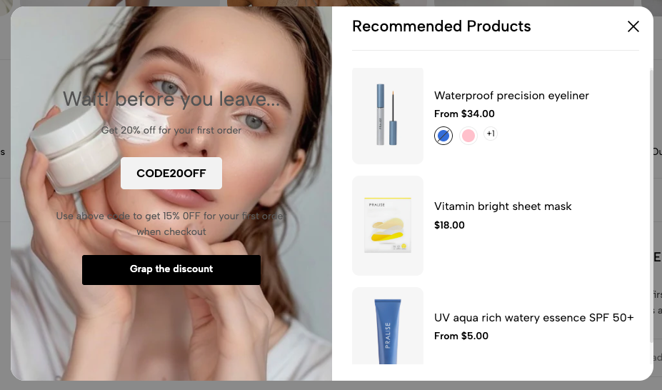
Exit Popup is a powerful tool designed to retain users and convert them before they leave your website.
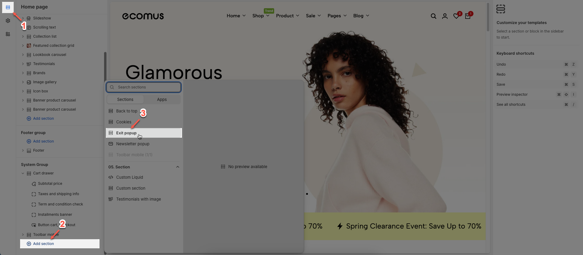
1. How to access the Exit pop-up?
Step 01: From Shopify Admin, click on Online Store > Select Themes > In the Current theme section, click the Customize button.

Step 02: In the theme editor (Customize) > Click the Section button > In the Sections tab, scroll through the list or use the search bar to find and select the System Group > click Add section button > add Exit pop-up
2. How to customize the Exit pop-up?
2.1. Exit pop-up blocks content
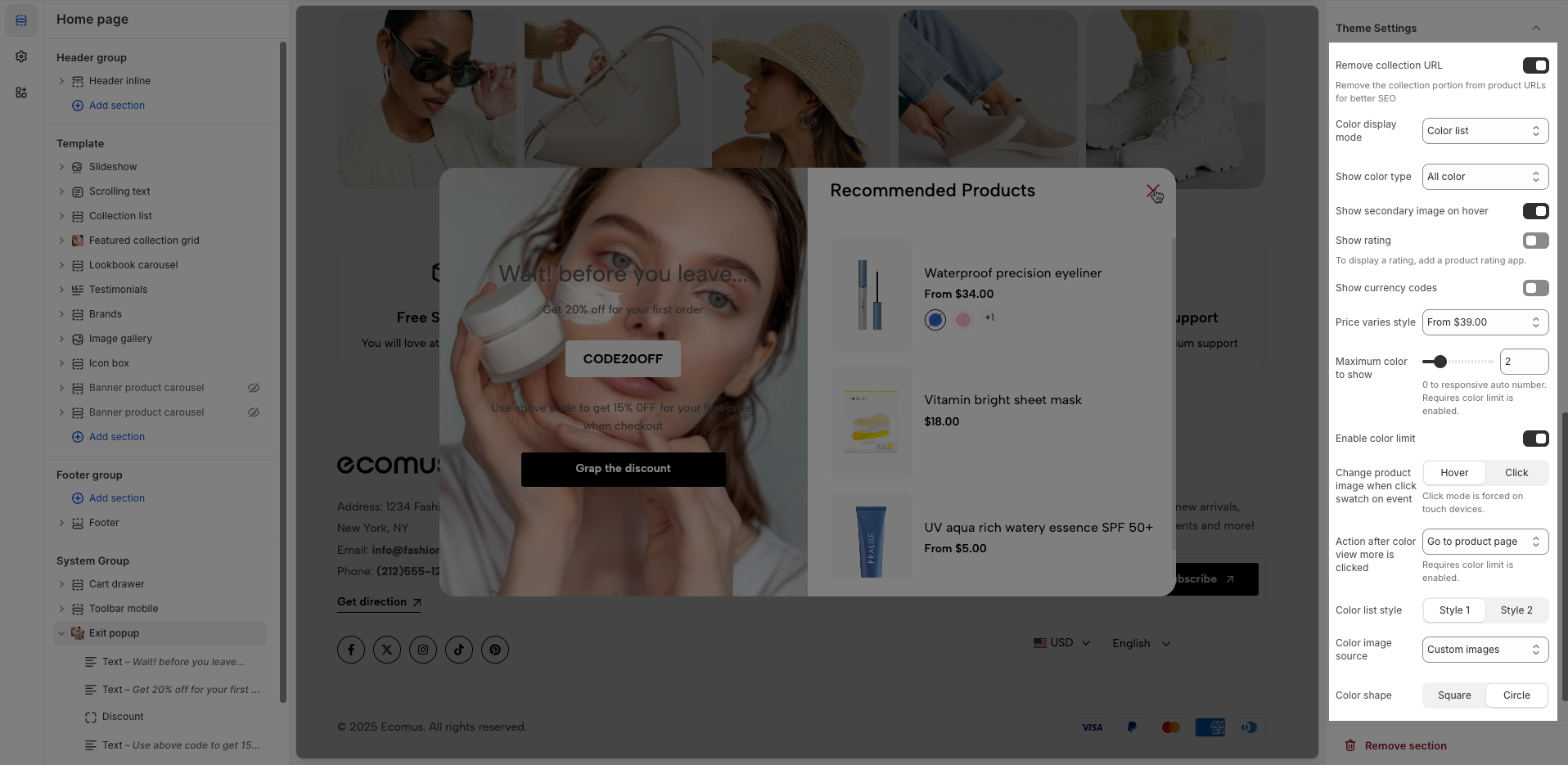
There are 3 blocks: Text, Discount, and Button.
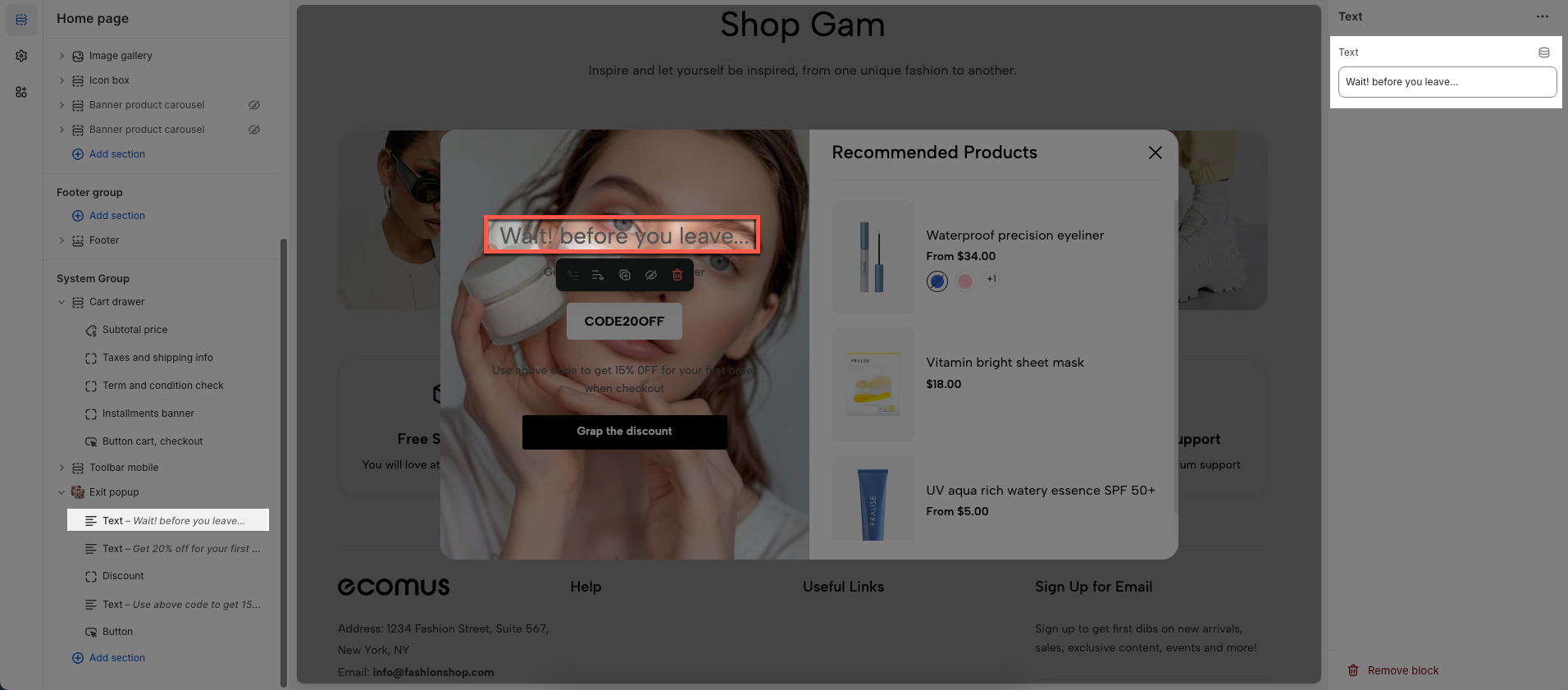
2.1.1. Text block
To add a Text block to the Exit pop-up, click the Add block button (plus icon ➕) under the Exit pop-up.
After adding the Text block, you can adjust its settings using the sidebar—located on the right or left side of your screen, depending on your device
Text: Enter text you want to display
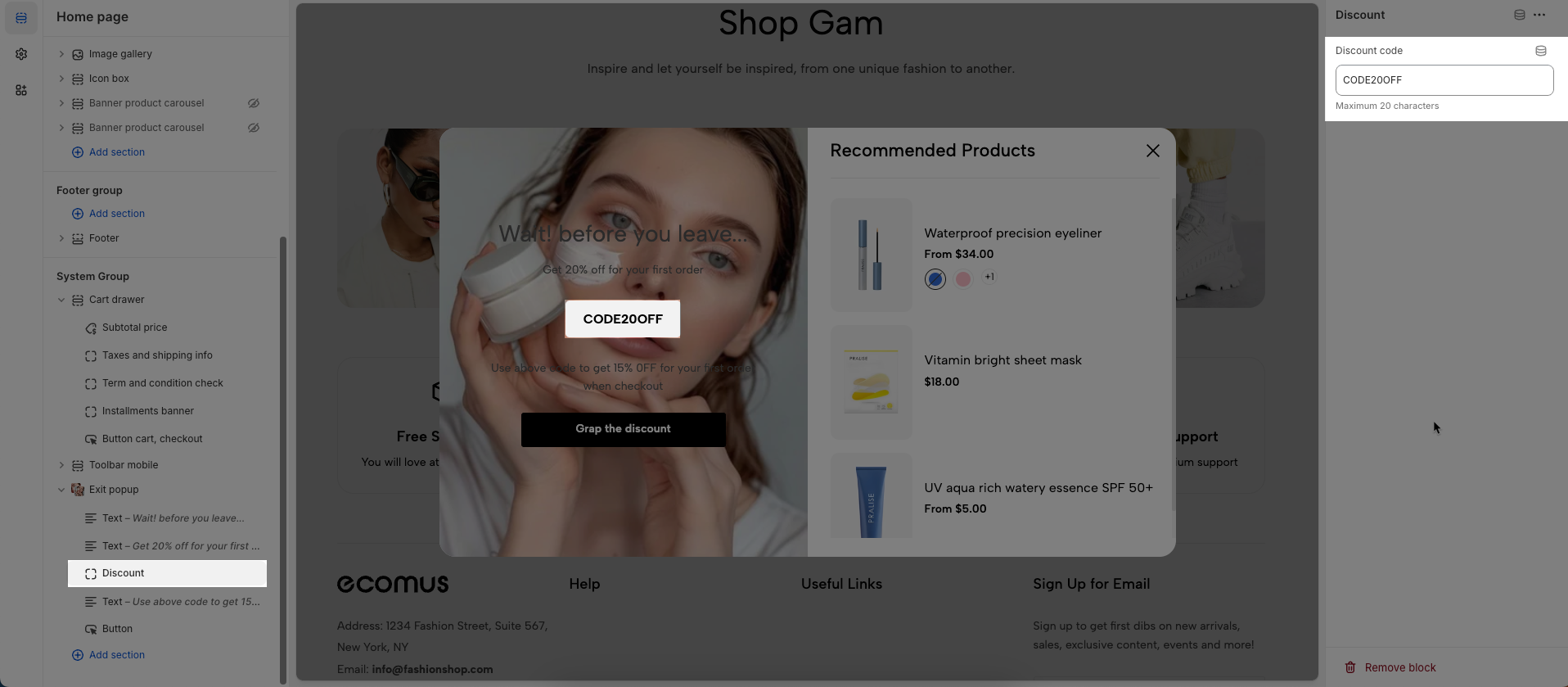
2.1.2. Discount block
To add a Discount block to the Exit pop-up, click the Add block button (plus icon ➕) under the Exit pop-up.
After adding the Discount block, you can adjust its settings using the sidebar—located on the right or left side of your screen, depending on your device
Discount code: Enter the discount code to be applied or displayed.
Maximum 20 characters
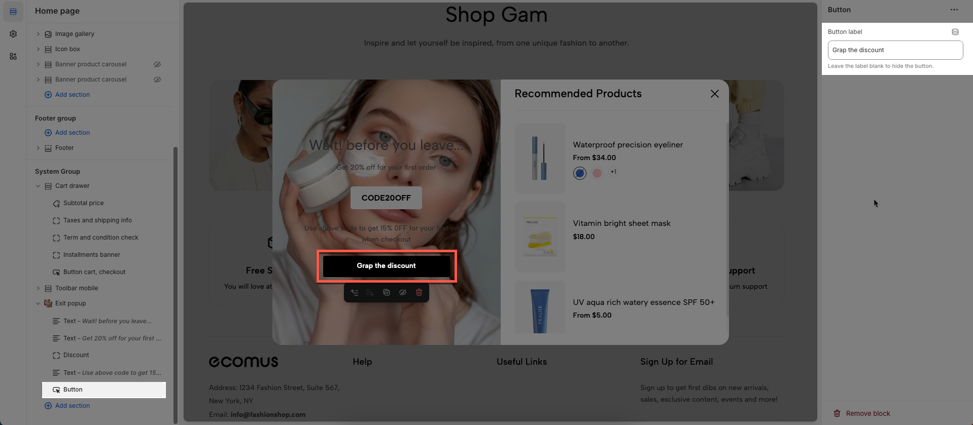
2.1.3. Button block
To add a Button block to the Exit pop-up, click the Add block button (plus icon ➕) under the Exit pop-up.
After adding the Button block, you can adjust its settings using the sidebar—located on the right or left side of your screen, depending on your device
Button label: Leave the label blank to hide the button.
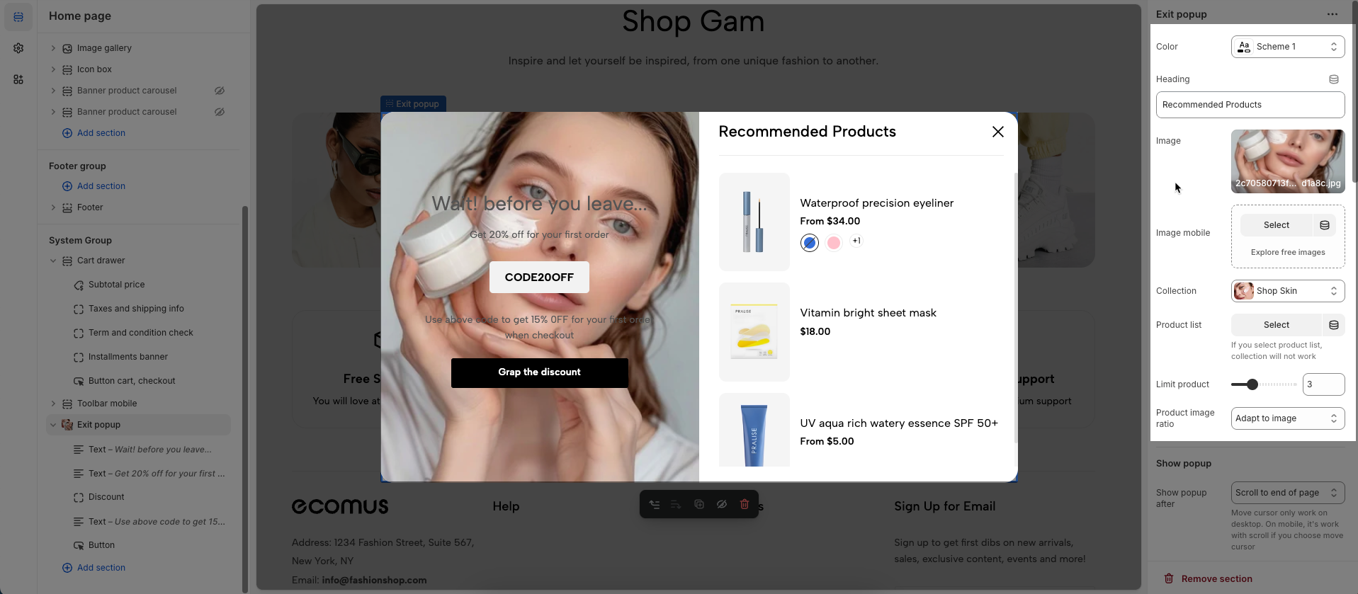
2.2. Exit pop-up options
Color: Select the color to apply to this element.
Heading: Enter the main heading for this section
Image: Upload or select the image to display.
Image mobile: Upload or select a different image to display specifically on mobile devices.
Collection: Select a specific product collection from your store.
Product list: Select an individual list of products to display. If you choose this, the "Collection" setting will not be used.
Limit product: Set the maximum number of products to display.
Product image ratio: Set the aspect ratio (width to height proportion) for product images.
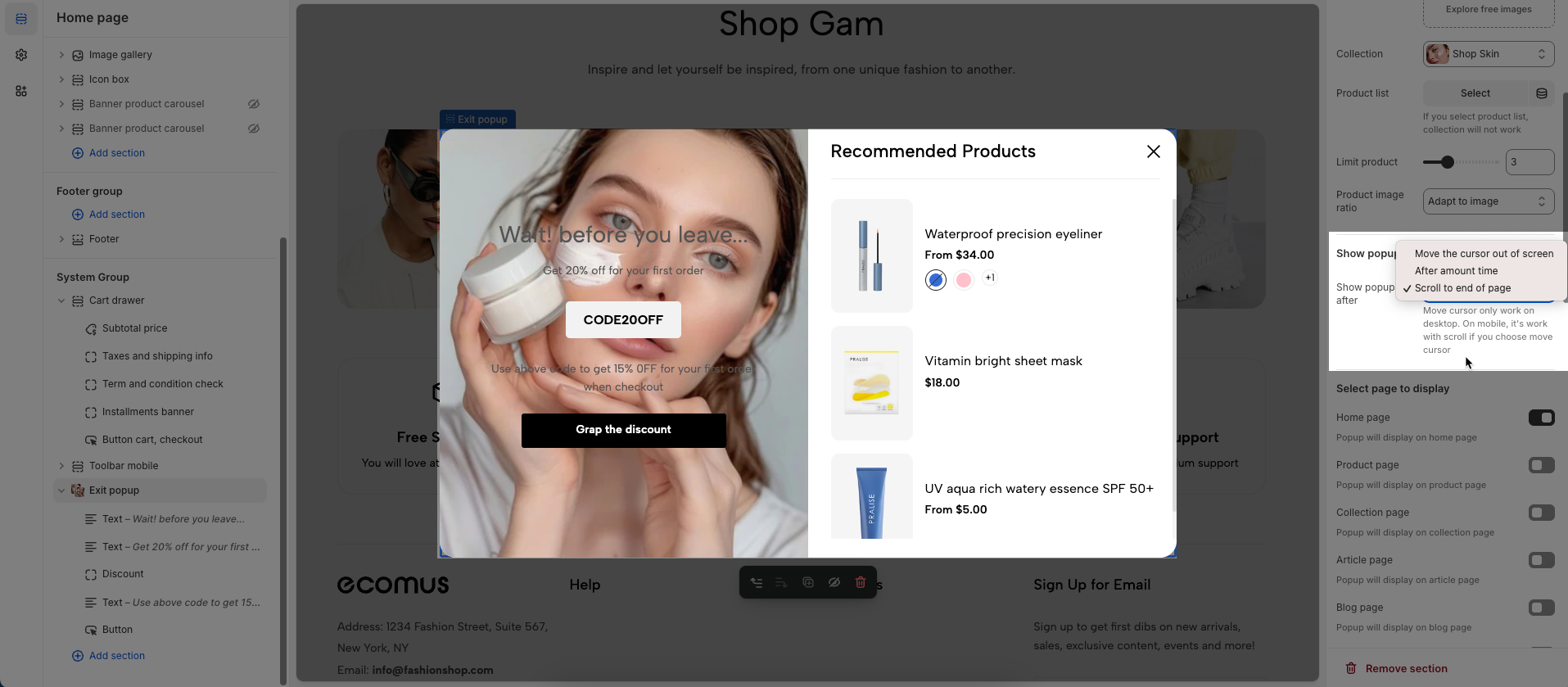
Show popup
Show popup after Show popup after: Display the popup after one of the following conditions is met:
Move the cursor out of screen: The popup will appear when the user moves their mouse cursor outside the browser's viewport (often indicating an intent to exit the page).
After amount time: The popup will show after the user has spent a specified duration (in seconds) on the page.
Scroll to end of page: The popup will appear when the user scrolls near the bottom of the page content.
Move cursor only work on desktop. On mobile, it's work with scroll if you choose move cursor
Select page to display
Home page: Popup will display on home page
Product page: Popup will display on product page
Collection page: Popup will display on collection page
Article page: Popup will display on article page
Blog page: Popup will display on blog page
Cart page: Popup will display on cart page
Other pages: Popup will display on other page
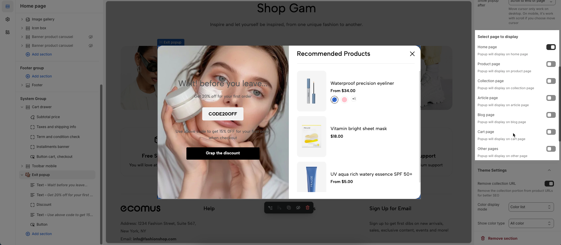
Theme Settings
Remove collection URL: Eliminates the collection URL from the product page path, optimizing SEO and creating shorter URLs.
Remove the collection portion from product URLs for better SEO
Color display mode: Selects the product color display method, such as color list or count
Show color type: Displays All colors or Only color available. This option allows customers to see the complete color range of a product or focus solely on colors currently in stock.
Show secondary image on hover: Displays a secondary product image when hovering over it, giving customers a multi-dimensional view of the product.
Show rating: Enables or disables the display of product ratings, providing customer feedback information.
To display a rating, add a product rating app.
Use collection link on vendor: Replace vendor link to collection link. Requires exist a collection has the name same as the vendor of the product. Learn more
Show currency codes: Enables or disables the display of currency codes next to product prices, providing clear currency information.
Price varies style: Choose a display style for variable product prices (e.g. "From [price]"), which helps customers understand the price range.
Maximum color to show: Limits the number of product colors displayed
0 to responsive auto number. Requires color limit is enabled.
Enable color limit: Enables or disables the limit on the number of product colors displayed, allowing control over the color count shown on the product page.
Change product image when click swatch on event: Allows the product image to change when a user clicks on a color swatch, creating a more interactive and visual experience.
Click mode is forced on touch devices.
Action after color view more is clicked: Defines the action that occurs when a user clicks the "view more colors" button, such as showing all colors or redirecting to a more detailed page (Expand all colors, Go to product page)
Requires color limit is enabled.
Color list style: Selects the display style for the product color list
Color image source: Selects the image source for product colors, allowing the use of actual product images or standard color images for display (Custom images or variant images)
Color shape: Selects the display shape for product colors (e.g., square, circle), customizing the color display interface.
Custom CSS
Allows users to customize by adding CSS rules, beyond the limitations of default settings. This allows for fine-tuning the design to every detail, to suit specific needs.
Add custom styles to this section only.
To add custom styles to your entire online store, go to theme settings.


