


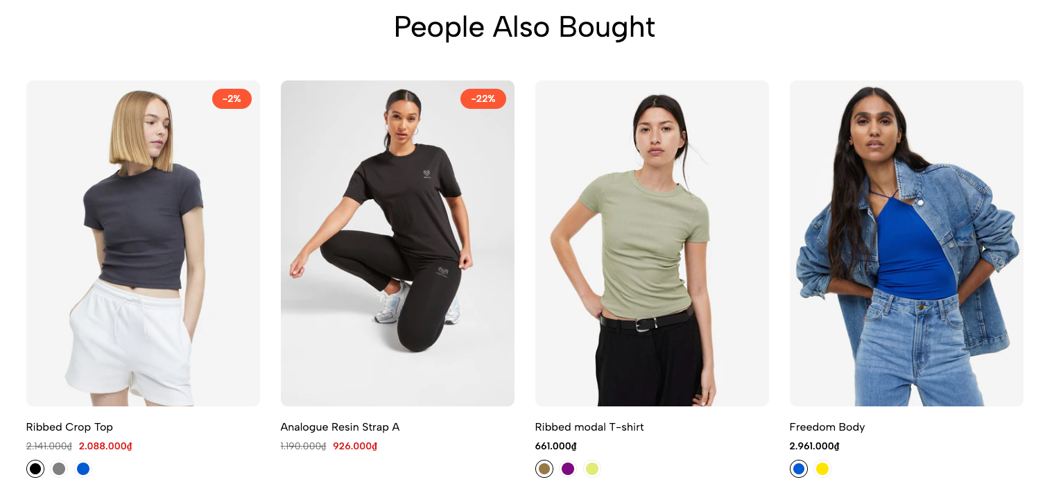
The Related Products section helps you recommend similar or complementary items on the product page. This encourages customers to explore more products and increases the chance of additional purchases.
You can easily customize the heading, layout, product display style, and number of items shown to match your store's design.
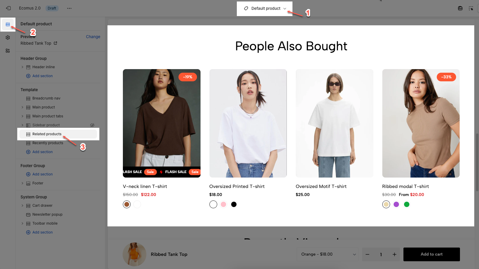
1. How to access the Related product section?
Step 01: From Shopify Admin, click on Online Store > Select Themes > In the Current theme section, click the Customize button.

Step 02: In the theme editor (Customize), click to open dropdown pages in the topbar > select Products > select Default product > click the Sections button, then scroll and find Recently products in Template.
2. How to customize the Related product section?
Here’s how you can customize the Related product section to best fit your content and layout. Below are the available options for customization:
2.1. Heading options
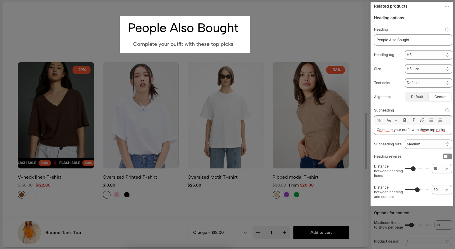
Heading: Set the main title for the section (e.g. People Also Bought).
Heading tag: Choose the HTML heading level (H2, H3, etc.) for SEO and styling purposes.
Size: Control the visual size of the heading text.
Text color: Pick a color for the heading text.
Alignment: Align the heading text (Default or Center).
Subheading: Add an optional subheading below the main title using rich text (bold, italic, links, etc.).
Subheading size: Select the size of the subheading text.
Heading reverse: Toggle to flip the order of heading and subheading.
Distance between heading items: Adjust the space between the heading and subheading.
Distance between heading and content: Adjust the space between the heading area and the product list.
2.2. Options for content
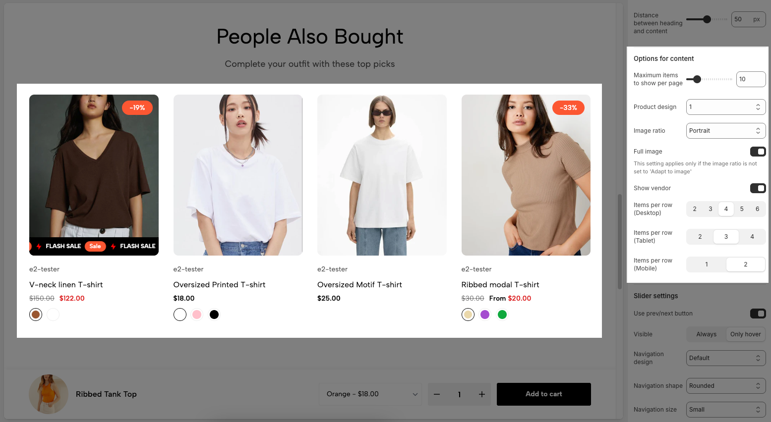
Maximum items to show per page: Sets the maximum number of products displayed at once.
Product design: Selects the layout/style of product cards (Include 1 to 12 design, each number represents a different design).
Image ratio: Sets the shape of product images (Include: Adapt to image, Square, Portrait, Lanscape, ASOS, Custom )
Full image: Toggles whether to show the full image.
This setting applies only if the image ratio is not set to 'Adapt to image'
Show vendor: Toggles display of the product vendor/brand name under the product title.
Items per row (Desktop): Sets how many products appear in one row on desktop screens.
Items per row (Tablet): Sets how many products appear in one row on tablet screens.
Items per row (Mobile): Sets how many products appear in one row on mobile screens.
2.3. Slider setting
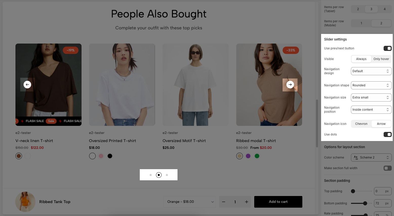
Use prev/next button: Toggle to show or hide the previous/next navigation buttons.
Visible (Always / Only hover): Choose when the navigation buttons appear:
Always: Always visible.
Only hover: Visible only when the user hovers over the section.
Navigation design: Selects the design style of the navigation buttons (Include: Default, Outline, Simple.).
Navigation shape: Sets the shape of the buttons:
Rounded: Circular edges.
Square: Sharp edges.
Navigation size: Controls the size of the navigation buttons (e.g., Extra small, Small, Medium, Large.).
Navigation position: Determines the placement of the buttons:
Inside content: Buttons appear within the product area.
Outside content: Buttons may appear outside the product slider.
Navigation icon: Choose the icon style used on the navigation buttons:
Chevron: Pointed arrows.
Arrow: Basic arrows.
Use dots: Toggle to show or hide dot indicators below the section
2.4. Options for layout section
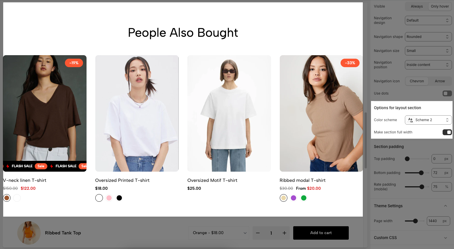
Color scheme: Allows you to choose a predefined color theme for the section background, text, and other elements.
Make section full width: Toggle this option on to expand the section to the full width of the screen. When off, the content remains within a fixed-width container.
2.5. Section padding
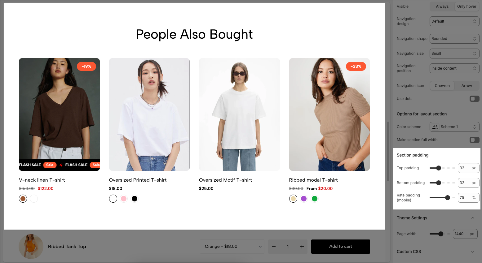
Top padding: Sets the vertical spacing (in pixels) above the section.
Bottom padding: Sets the vertical spacing (in pixels) below the section.
Rate padding (mobile): Defines the vertical padding as a percentage for mobile devices, allowing responsive spacing.
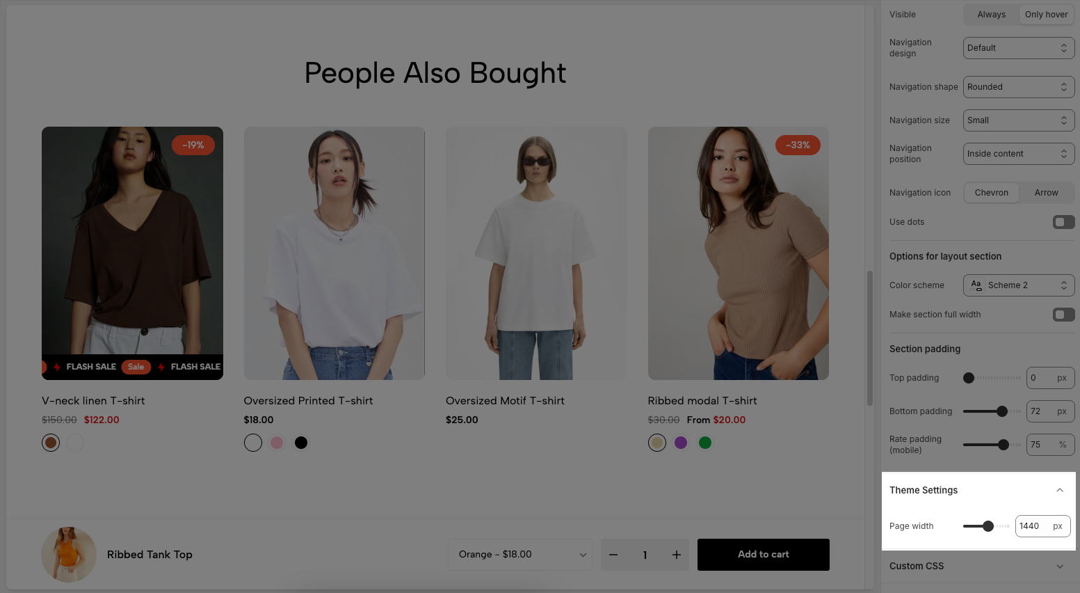
2.6. Theme Settings
Page width: Defines the maximum width of the page content, influencing layout and display on various devices.
2.7. Custom CSS
Allows users to customize by adding CSS rules, beyond the limitations of default settings. This allows for fine-tuning the design to every detail, to suit specific needs.
Add custom styles to this section only.
To add custom styles to your entire online store, go to theme settings for detailed instructions.


