A banner is a prominent element on a page, typically used to grab users' attention with important messages, promotions, or special announcements. In this guide, you will learn how to use the Banner Section to create visually appealing, customizable banners that suit your website's content.
From Theme section sidebar -> Add section -> Banner Section
1. Banner content
1.1. Section heading
The Section Heading block allows you to add a title and description to different sections of your page, you can customize this block with options below:
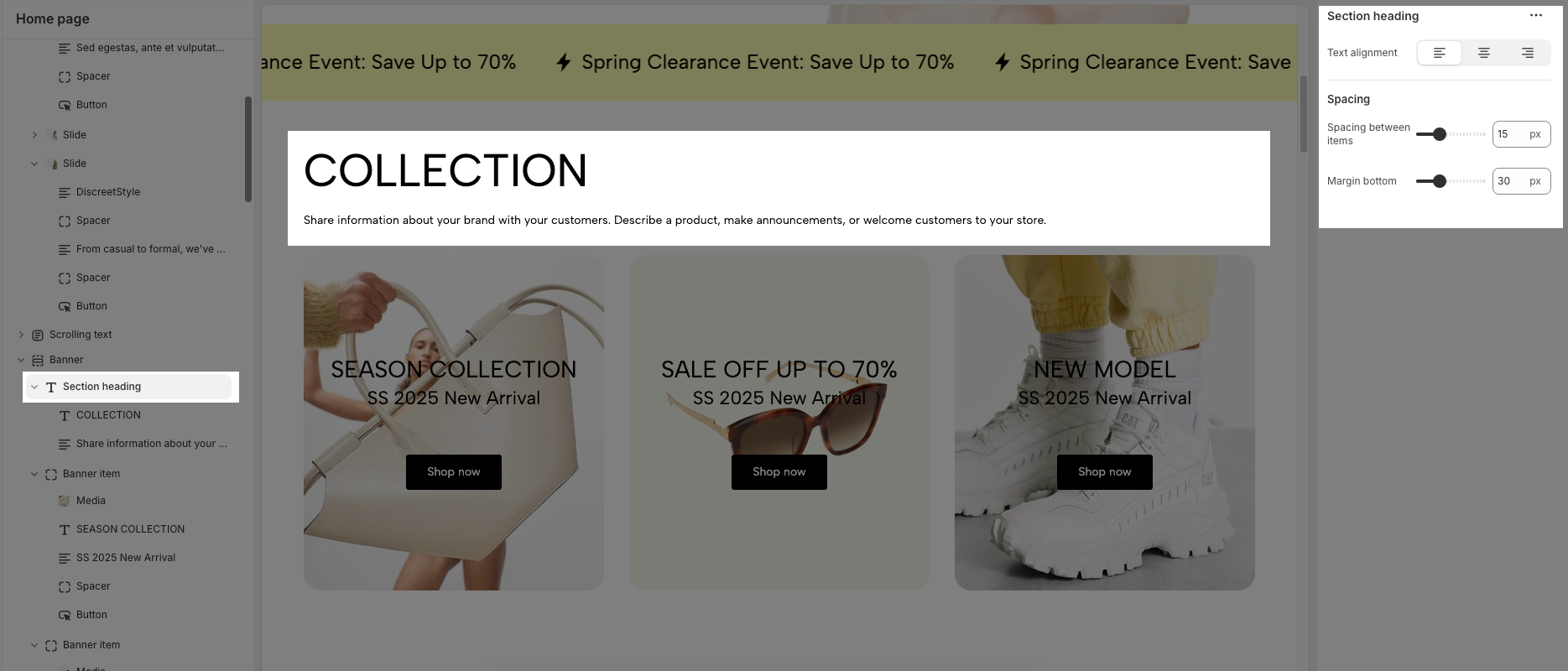
Text Alignment: Align the Section heading block to the left, center, or right
Spacing between items: Adjust the space between the heading and the text (measured in pixels).
Margin bottom: Define the space between the Section Heading and the next section to maintain a balanced layout.
1.2. Banner item block
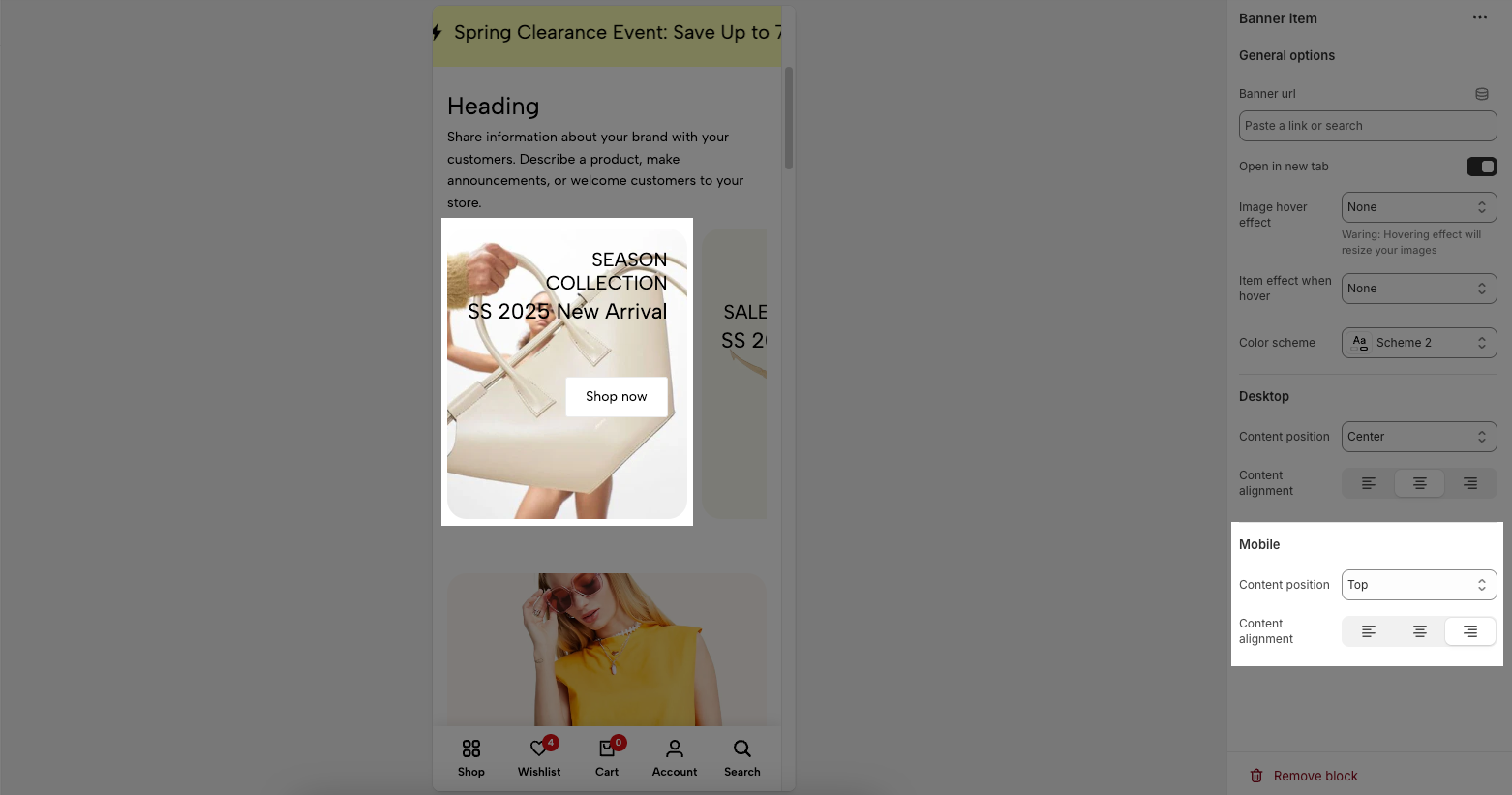
This is a single banner that displays content (image, title, description, button) in a regular layout. The content and image are usually arranged in a single block.
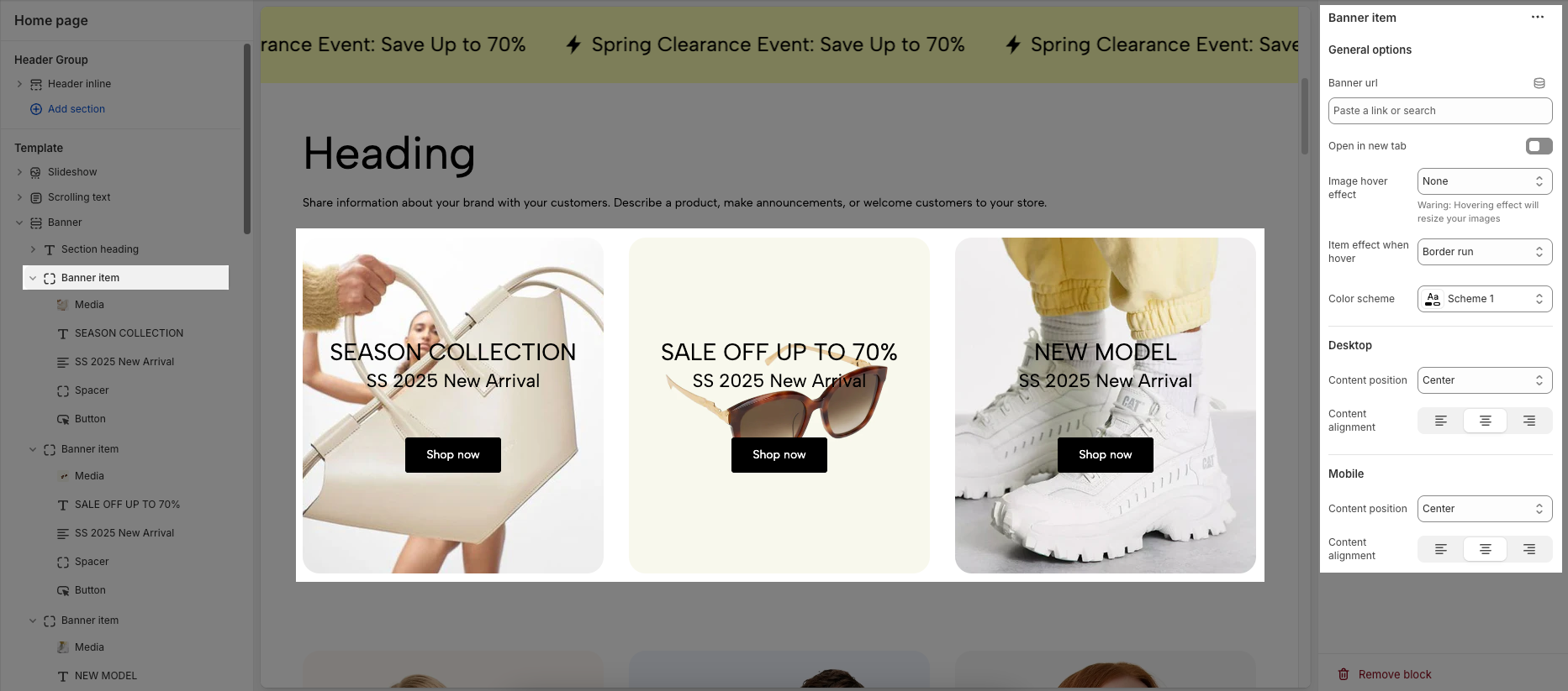
Each image represents one banner. In this block, you can adjust your Banner with many options below:
General options
Banner url: Set the destination link for the banner.
Open in new tab: Enable this option to open the banner link in a new browser tab.
Image hover effect: Choose an animation effect when the user hovers over the banner image.
Item effect when hover: Select an effect applied to the entire banner when hovered.
Color scheme: Customize the banner's color theme to match your website’s design.
Option for Desktop
Content position: Choose where the content appears within the banner (e.g., top, center, bottom,...).
Content alignment: Adjust the text and elements alignment within the content area (e.g., left, center, right)
Option for Mobile
Content position: Choose where the content appears within the banner (e.g., top, center, bottom,...).
Content alignment: Adjust the text and elements alignment within the content area (e.g., left, center, right)
1.3. Banner item spit block
This is a banner format that is divided into separate sections using Column block, which helps highlight both the image and the message by arranging them parallel, giving a more professional and easy-to-see interface
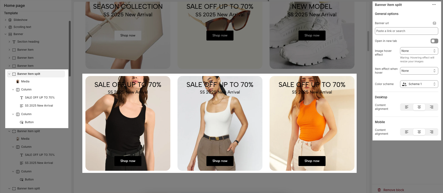
Each image represents a split banner. In this block, you can customize your Banner with many of the same options as with a single banner.
1.4. Other block
In the Banner Item, you can add various blocks such as Heading, Text, Button, Paragraph, and Spacer to enhance the layout and design.
To customize these blocks, follow the detailed guide here.
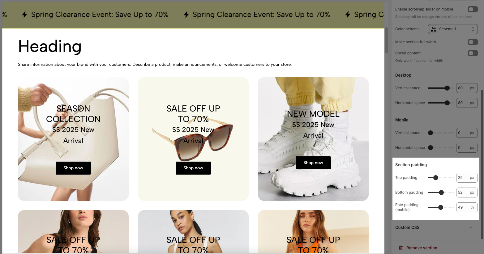
2. How to configure the Banner Section?
2.1. General options
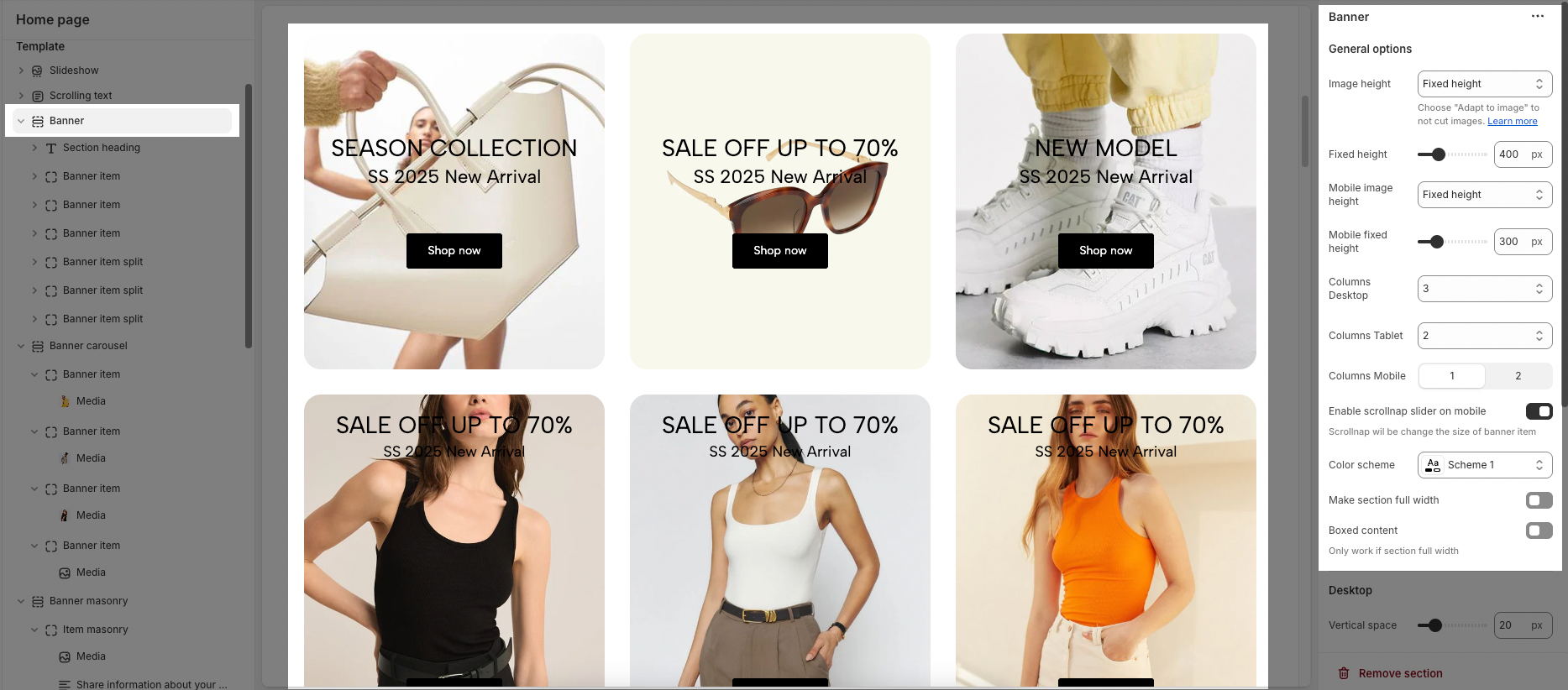
For each banner section, you can customize general options your banner with a variety of flexible options below:
Image height: Select the image height type (Fixed or Adapt to image).
Fixed height: Set a fixed height for the banner on desktop (e.g., 400px).
Mobile image height: Choose the image height type for mobile devices.
Mobile fixed height: Set a fixed height for the banner on mobile (e.g., 300px).
Columns Desktop/Tablet/Mobile: Define the number of columns displayed on each device type.
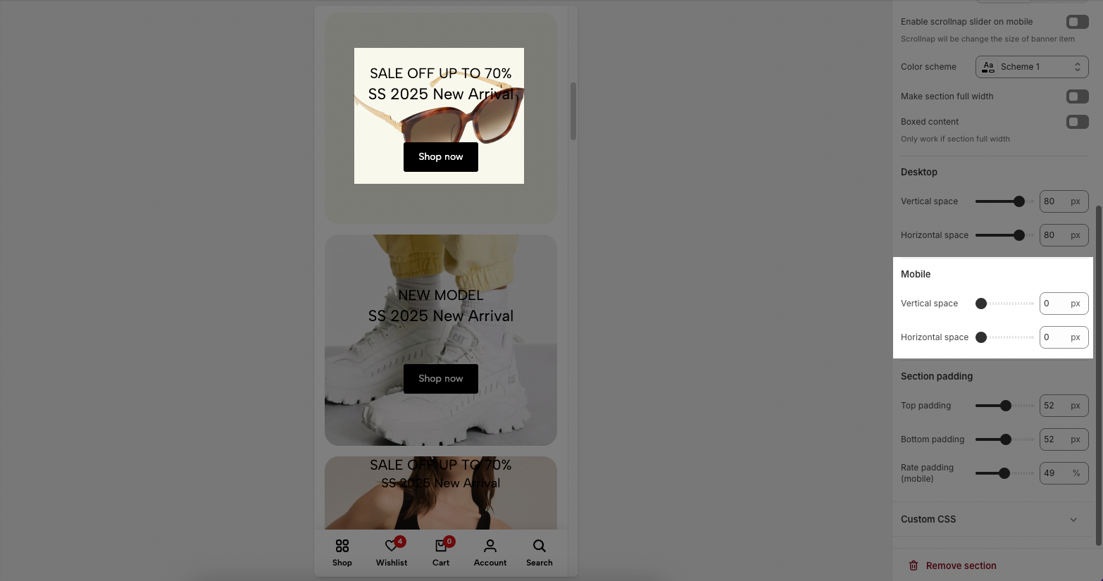
Enable scrollsnap slider on mobile: Enable/disable automatic scrolling for the banner on mobile.
Color scheme: Select a color scheme to match the website’s design.
Make section full width: Enable/disable full-width display for the banner.
Boxed content: When enabled, the content is constrained within a specific area (only works if full width is enabled).
2.2. Options for Desktop
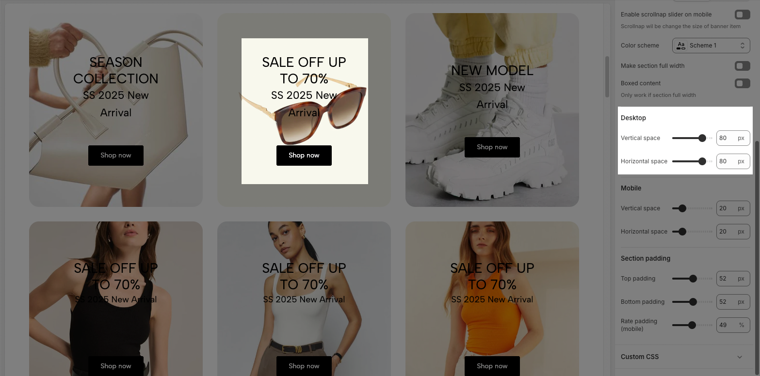
Vertical space: Adjust the vertical spacing between banner item contents on desktop.
Horizontal space: Adjust the horizontal spacing between banner item contents on desktop.
2.3. Options for Mobile
Vertical space: Adjust the vertical spacing between banner item contents on mobile devices.
Horizontal space: Adjust the horizontal spacing between banner item contents on mobile devices.
2.4. Section padding
Top padding: Adjust the space above the banner relative to other content.
Bottom padding: Adjust the space below the banner relative to other content.
Rate padding (mobile): Adjust the top and bottom padding ratio for the banner on mobile display.