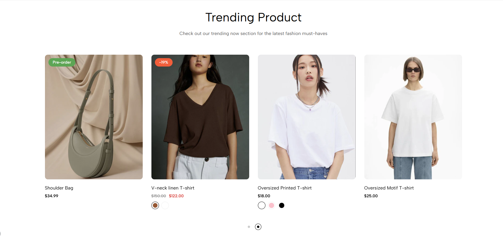
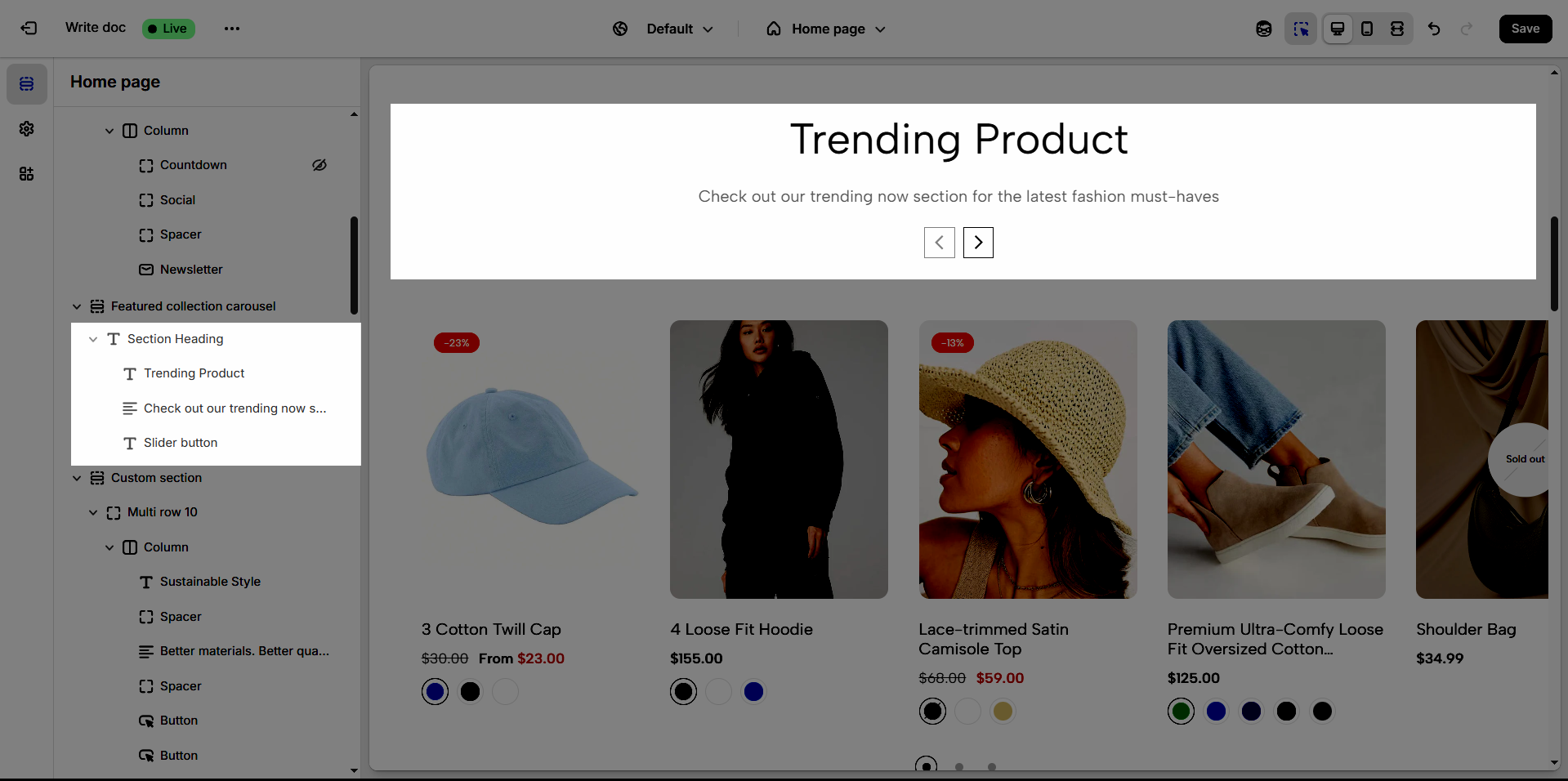
The 'Featured collection carousel' section is a powerful tool to visually and attractively showcase your highlighted products or collections. With its carousel format, viewers can easily browse through multiple products without leaving the page, creating a seamless shopping experience and encouraging customers to explore more of your offerings.
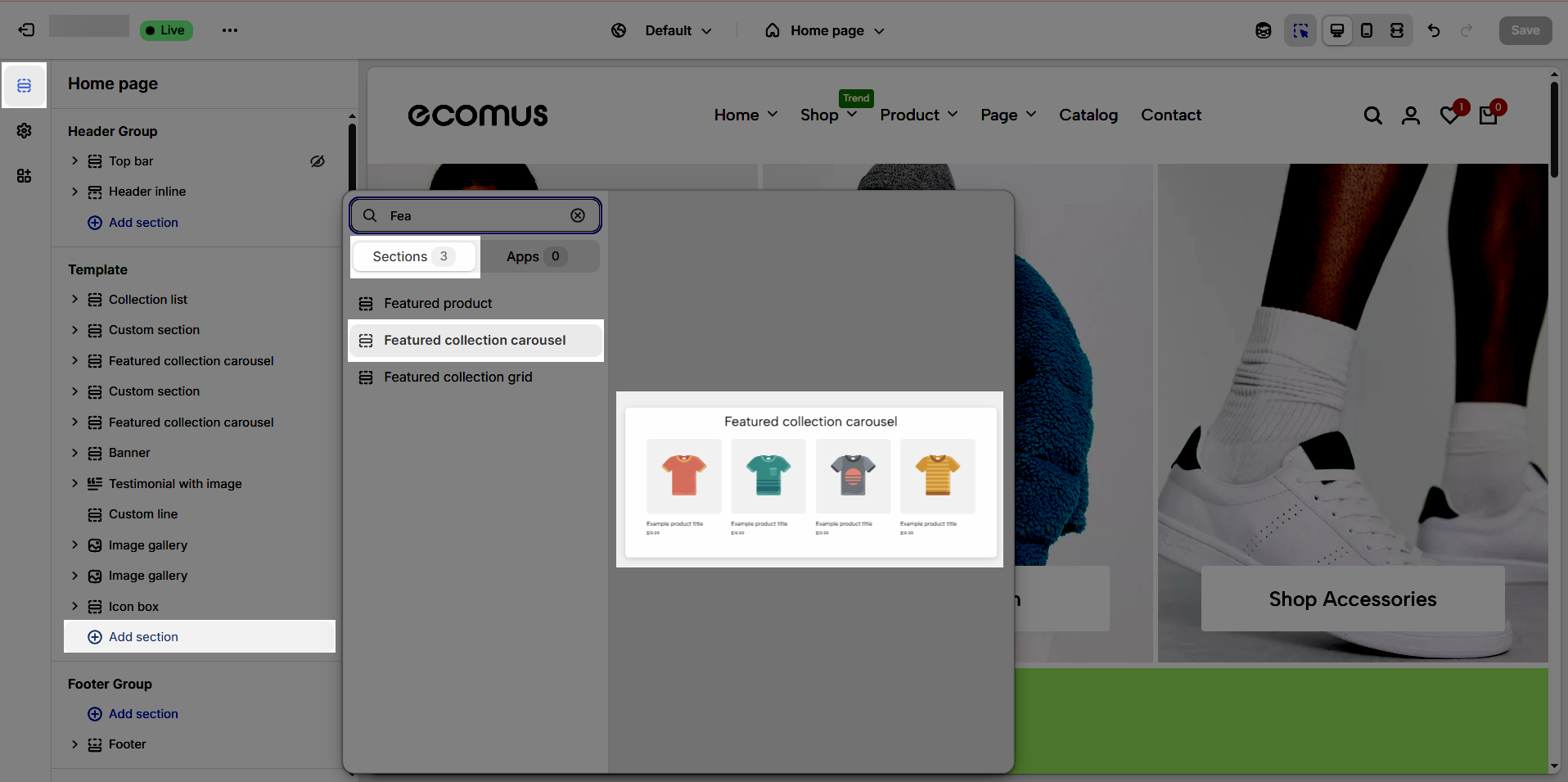
1. How to access the Featured collection carousel section?
Step 01: From Shopify Admin, click on Online Store > Select Themes > In the Current theme section, click the Customize button.

Step 02: In the theme editor (Customize), click the Sections button > Click the Add section button > In the Sections tab, scroll through the list or use the search bar to find and select the Featured collection carousel.
2. How to customize the Featured collection carousel section?
2.1. Featured collection carousel
After adding the Featured collection carousel section, you can customize its settings in the right sidebar.
2.1.1 General options
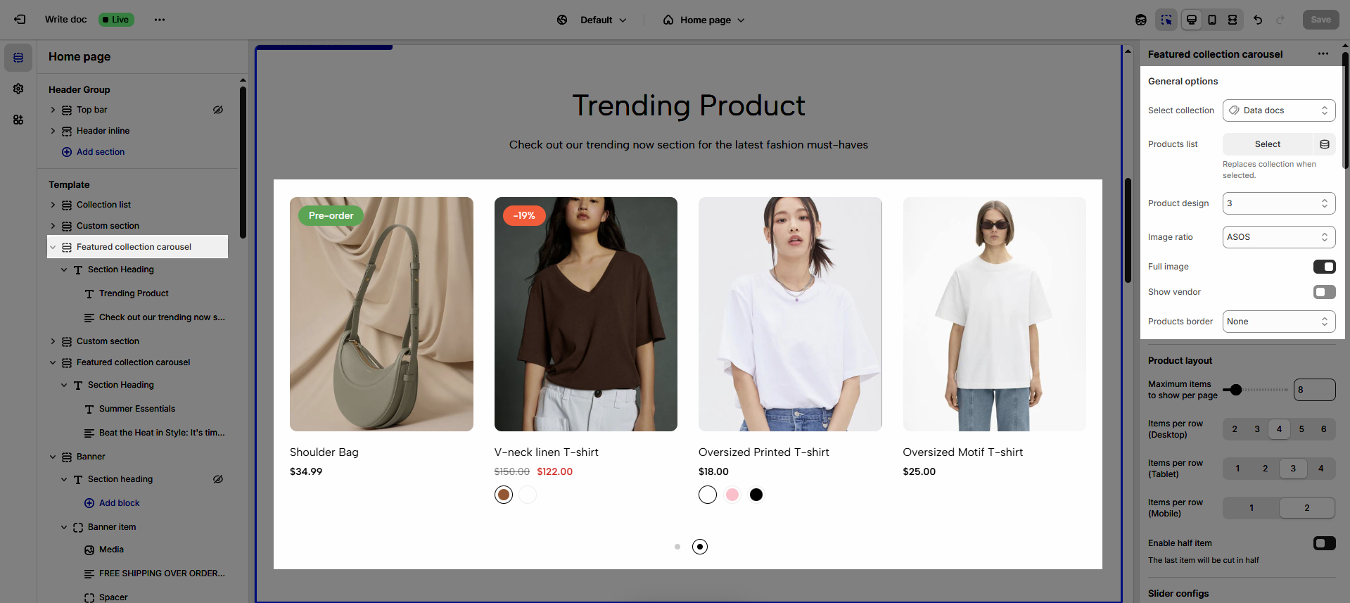
Select collection: Allows users to choose a product collection to display in the carousel, customizing the displayed content.
Products list: Displays a list of products from the selected category, allowing users to view the products.
Product design: Customize the product display style (we have 12 designs available)
Image ratio: Adjusts the aspect ratio of product images, ensuring images display beautifully and proportionally (Adapt to image, Square, ASOS, Portrait, Lanscape, Custom)
Full image: Allows the full product image to be displayed, avoiding cropping and preserving product details
Show vendor: Displays the product vendor's name, providing additional information to customers.
Products border: Adds a border around the products, creating distinction and highlighting the products (None, In image, On items)
2.1.2. Product layout
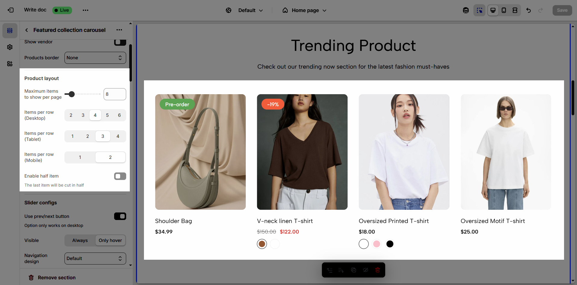
Maximum items to show per page: Limits the number of products or items displayed on each page, optimizing loading speed and user experience.
Items per row (Desktop): Defines the number of products or items displayed in each row on desktop screens, optimizing the layout for large screens.
Items per row (Tablet): Adjusts the number of products or items displayed in each row on tablet screens, ensuring balanced and easy viewing.
Items per row (Mobile): Optimizes the number of products or items displayed in each row on mobile phone screens, ensuring neat and interactive display.
Enable half item: Allows displaying a half product or item at the end of a row, creating a unique visual effect and encouraging users to scroll.
The last item will be cut in half
2.1.3. Slider settings
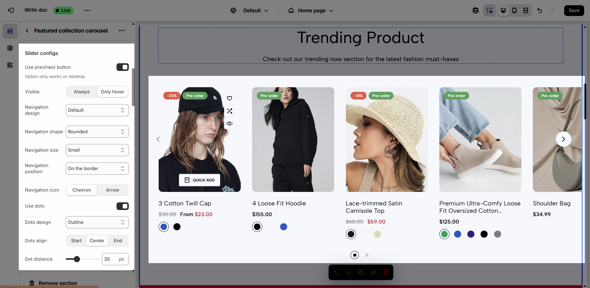
Use prev/next button: Enables or disables "previous/next" buttons for content navigation, giving users greater control.
Option only works on desktop
Visible: Determines the visibility state of navigation buttons (Always or Only hover)
Navigation design: Selects the design style for navigation buttons, matching the website's overall aesthetic (Default, Outline, Simple)
Navigation shape: Chooses the shape of the navigation buttons (e.g., rounded, square, rotate), customizing the interface.
Navigation size: Adjusts the size of the navigation buttons
Navigation position: Determines the position of the navigation buttons within the element
Navigation icon: Chooses the icon for the navigation buttons, enhancing visual clarity and ease of understanding.
Use dots: Enables or disables the use of dots for navigation, providing an alternative navigation method.
Dots design: Selects the design style for navigation dots, matching the overall design.
Dots align: Adjusts the alignment of the navigation dots, optimizing the layout.
Dot distance: Adjusts the spacing between the navigation dots, ensuring they are easily visible and interactive.
2.1.4. Section padding
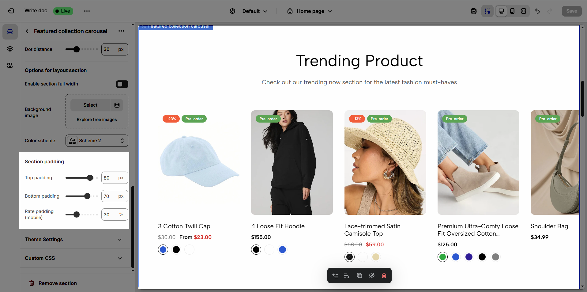
Top padding: Creates space above the content within an element, separating it from elements above and improving visual layout.
Bottom padding: Creates space below the content within an element, separating it from elements below and improving visual layout.
Rate padding (mobile): Adjust spacing around mobile top elements, optimizing user experience and ensuring easy interaction on smaller screens.
2.1.5. Theme Settings
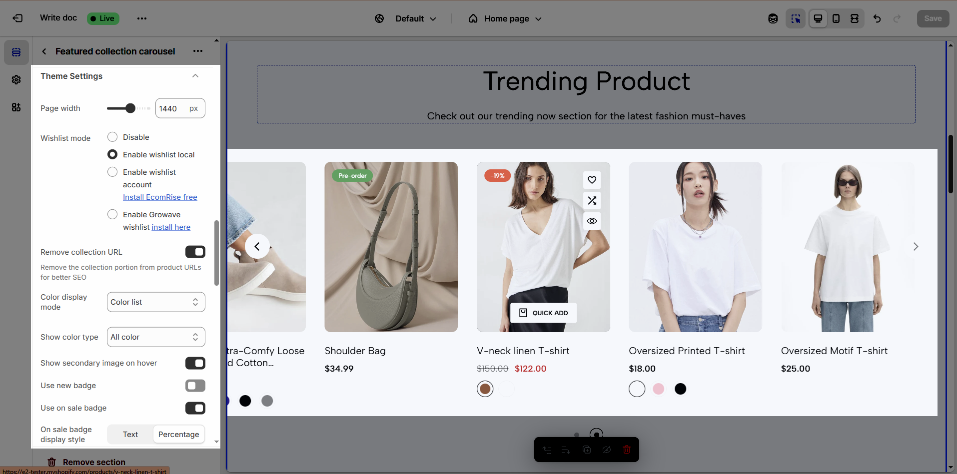
Page width: Defines the maximum width of the page content, influencing layout and display on various devices.
Wishlist mode: Enables or disables the wishlist feature, providing users with a function to save favorite products.
You can Disable, Enable wishlist local, Enable wishlist account Install EcomRise free, Enable Growave wishlist
Remove collection URL: Eliminates the collection URL from the product page path, optimizing SEO and creating shorter URLs.
Remove the collection portion from product URLs for better SEO
Color display mode: Selects the product color display method, such as color list or count
Show color type: Displays All colors or Only color available. This option allows customers to see the complete color range of a product or focus solely on colors currently in stock.
Show secondary image on hover: Displays a secondary product image when hovering over it, giving customers a multi-dimensional view of the product.
Use new badge: Enables or disables the display of a "new" badge on new products, attracting customer attention.
Use on sale badge: Enables or disables the display of an "on sale" badge on discounted products, stimulating purchases.
On sale badge display style: Selects the display style "Text" or "Percentage" for the "on sale" badge
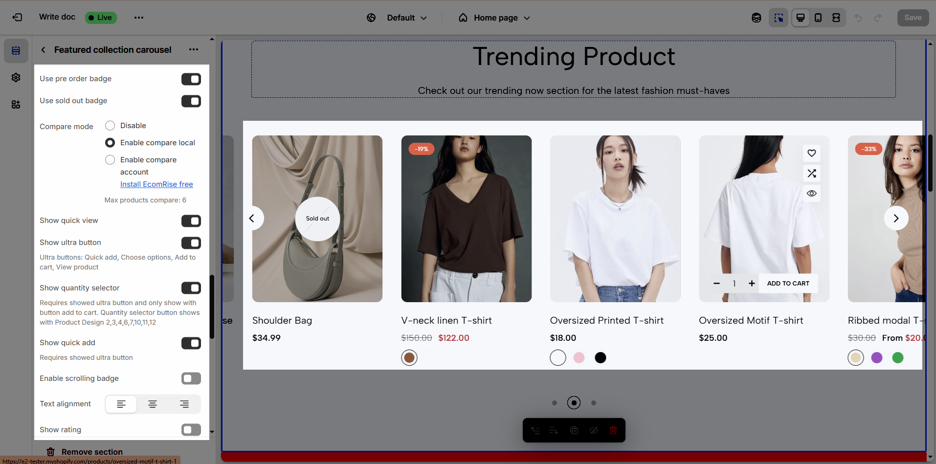
Use pre-order badge: Enables or disables the display of a "pre-order" badge on upcoming products, informing customers of pre-order availability.
Use sold out badge: Enables or disables the display of a "sold out" badge on out-of-stock products, notifying customers of product availability.
Compare mode: Enables or disables the product comparison mode, allowing customers to compare products side-by-side for informed purchasing decisions.
You can Disable, Enable compare local, Enable compare account
Max products compare: 6
Show quick view: Enables or disables the "quick view" button, allowing customers to view product details without leaving the current page.
Show ultra button: Enables or disables the "ultra" button (custom button), allowing the addition of special action buttons to products.
Ultra buttons: Quick add, Choose options, Add to cart, View product
Enable scrolling badge: Enables or disables scrolling badges, allowing badges to move with the page
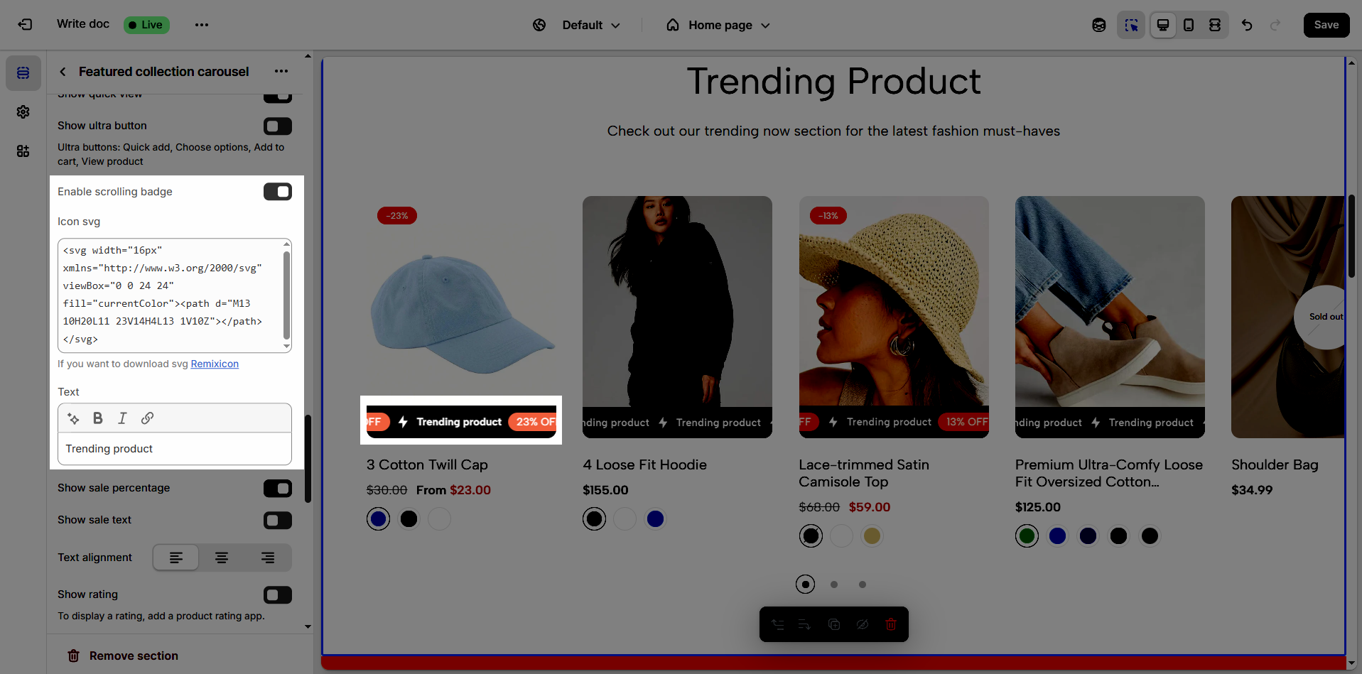
Icon SVG (If you want to download svg Remixicon): Use icon from Remixicon to enhance visual appeal and personalize the interface.
Text: Enter custom text to display alongside icons or other information, creating clear and engaging messages.
Show sale percentage: Enables or disables the display of the sale percentage on products, helping customers easily identify discounts.
Show sale text: Enables or disables the display of sale text (e.g., "Sale"), providing clear information about promotional offers.
Follow this document to know more about the Srcolling badge
Text alignment: Adjusts the text alignment of products (left, right, center), customizing the display layout.
Show rating: Enables or disables the display of product ratings, providing customer feedback information.
To display a rating, add a product rating app.
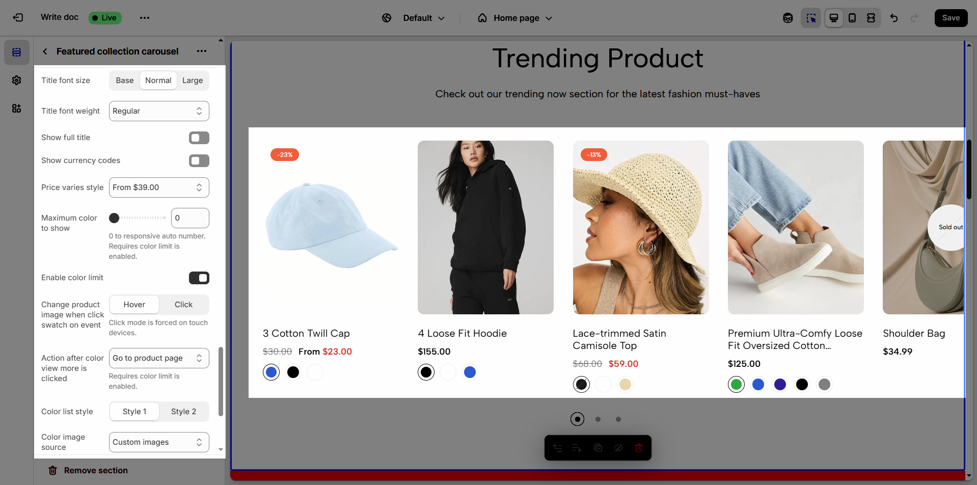
Title font size: Adjusts the font size of the product title, ensuring readability and compatibility with the website design
Title font weight: Selects the font weight of the product title, creating emphasis and attracting attention.
Show full title: Enables or disables the display of the full product title, preventing title truncation and ensuring complete information.
Show currency codes: Enables or disables the display of currency codes next to product prices, providing clear currency information.
Price varies style: Choose a display style for variable product prices (e.g. "From [price]"), which helps customers understand the price range.
Maximum color to show: Limits the number of product colors displayed
0 to responsive auto number. Requires color limit is enabled.
Enable color limit: Enables or disables the limit on the number of product colors displayed, allowing control over the color count shown on the product page.
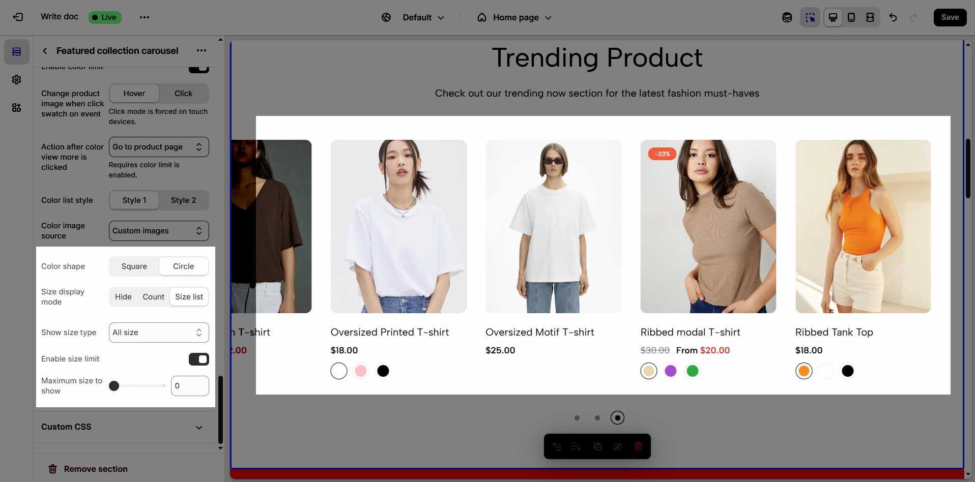
Change product image when click swatch on event: Allows the product image to change when a user clicks on a color swatch, creating a more interactive and visual experience.
Click mode is forced on touch devices.
Action after color view more is clicked: Defines the action that occurs when a user clicks the "view more colors" button, such as showing all colors or redirecting to a more detailed page (Expand all colors, Go to product page)
Requires color limit is enabled.
Color list style: Selects the display style for the product color list
Color image source: Selects the image source for product colors, allowing the use of actual product images or standard color images for display (Custom images or variant images)
Color shape: Selects the display shape for product colors (e.g., square, circle), customizing the color display interface.
Size display mode: Selects the display method for product sizes (e.g., list, count), suitable for the website layout and user experience.
Show size type: Displays All sizes or Only size available. This option allows customers to see the complete size range of a product or focus solely on sizes currently in stock.
Enable size limit: Enables or disables the limit on the number of product sizes displayed
Maximum size to show: Limits the number of product sizes displayed, with "0" for responsive auto-adjustment based on screen resolution. (Requires size limit to be enabled.)
2.1.6. Custom CSS
Allows users to customize by adding CSS rules, beyond the limitations of default settings. This allows for fine-tuning the design to every detail, to suit specific needs.
Add custom styles to this section only.
To add custom styles to your entire online store, go to theme settings.
2.2. Section heading
Choose a heading that aligns with your brand’s tone and message to build trust and engagement.
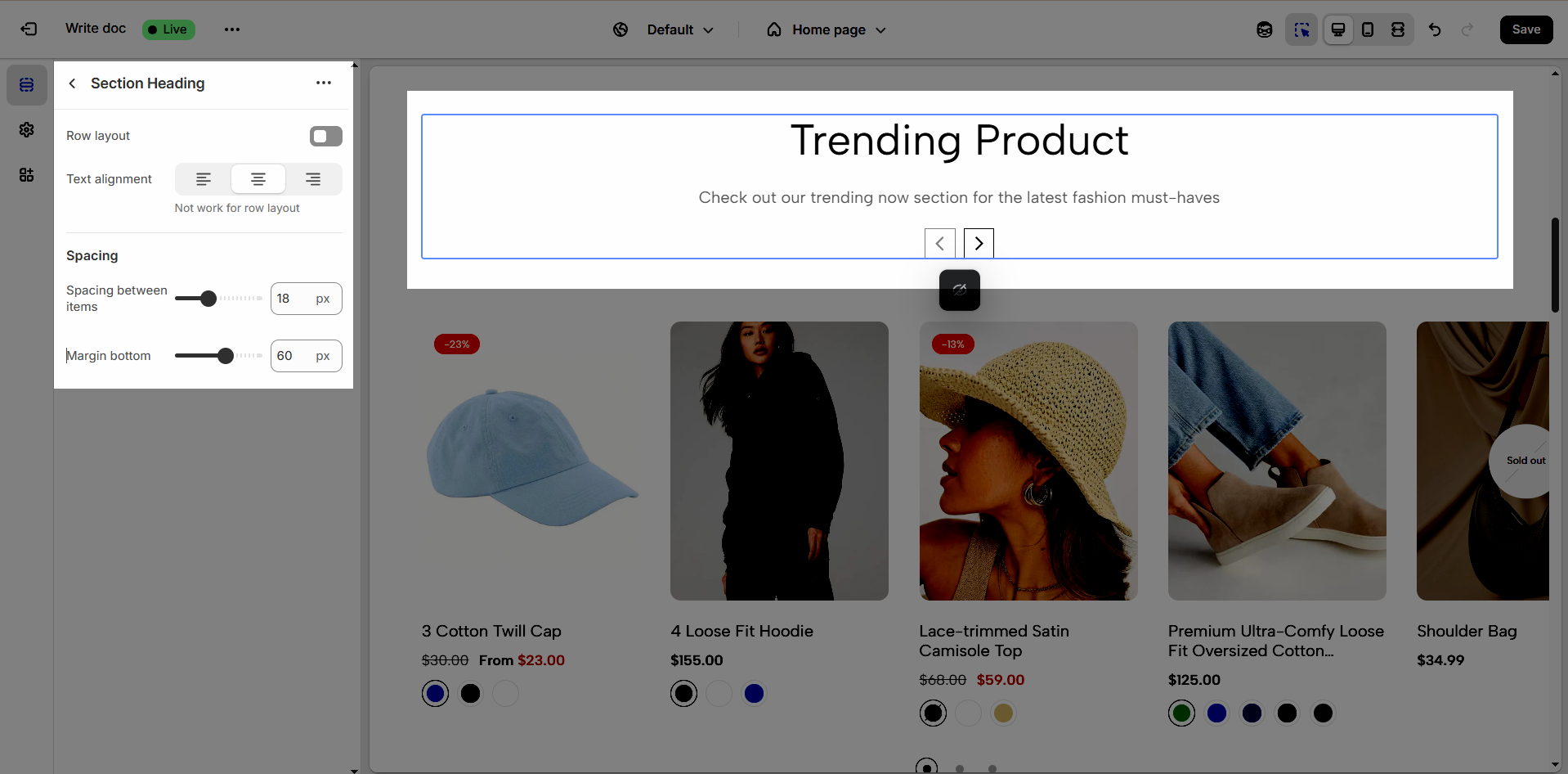
2.2.1. Section heading
Clicking on the Section heading title under Featured collection carousel section, you can customize that section's settings in the right sidebar
Enable Row Layout to align your content horizontally for a clean and structured design.
Text alignment: Choose how your testimonials are aligned for the best visual impact. Center alignment creates a balanced look, while left or right alignment can match your overall design style.
Not work for row layout
Spacing between items: Adjust the spacing between items to create the perfect flow
Margin bottom: Set the bottom margin to control the spacing between the heading and the section
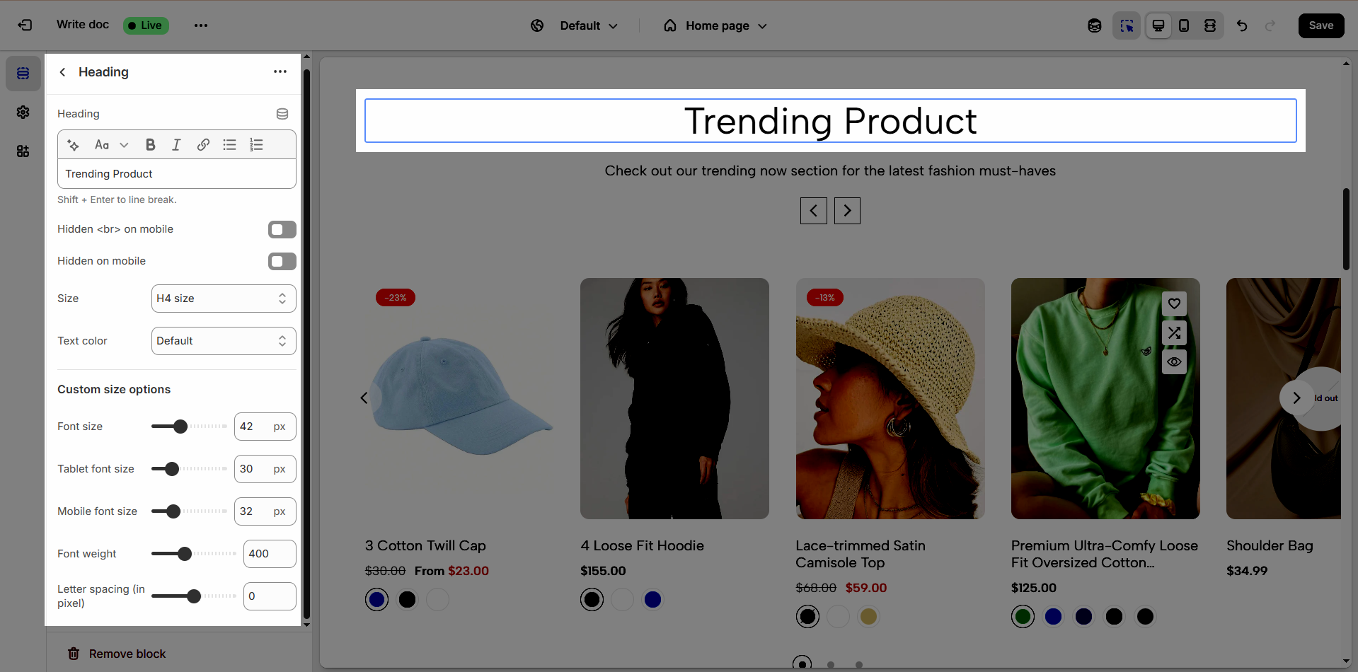
2.2.2. Heading block
To add Heading block to the Section heading, click the Add item button (plus icon ➕) under the Section heading.
Once the Heading block is added, you can customize its settings in the right-hand sidebar:
Heading: Define the main title that represents your content or section. Make it engaging and relevant.
Hidden <br> on mobile: Remove unnecessary line breaks on mobile devices
Hidden on mobile: Choose whether to hide the heading completely on mobile devices for a streamlined display.
Choose "Custom size inline" to freely adjust the size in the Custom Size Options section.
Size: Adjust the overall heading size to fit the design aesthetics of your store.
Text Color: Customize the heading color to align with your brand identity and improve readability.
Font size (Desktop/Tablet/Mobile): Set different font sizes for each device type to ensure a responsive and visually appealing layout.
Font weight: Control the thickness of the heading text
Letter spacing (in pixel): Adjust the space between letters to enhance readability and design precision.
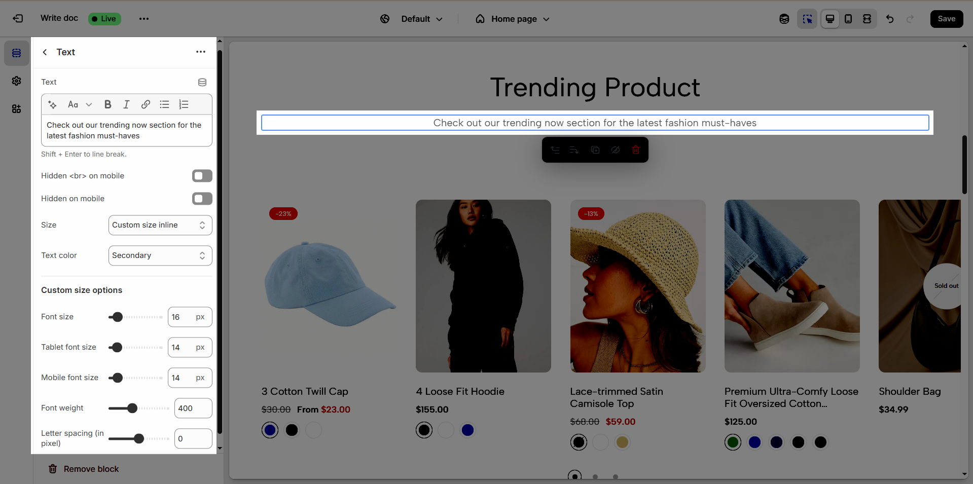
2.2.3. Text block
To add Text block to the Section heading, click the Add item button (plus icon ➕) under the Section heading.
Once the Text block is added, you can customize its settings in the right-hand sidebar:
Text (Shift + Enter to line break): Allows users to add textual content, providing information, descriptions, or explanations.
Hidden <br> on mobile: Remove unnecessary line breaks on mobile devices
Hidden on mobile: Choose whether to hide the heading completely on mobile devices for a streamlined display.
Choose "Custom size inline" to freely adjust the size in the Custom Size Options section.
Size: Adjust the overall heading size to fit the design aesthetics of your store.
Text Color: Customize the heading color to align with your brand identity and improve readability.
Font size (Desktop/Tablet/Mobile): Set different font sizes for each device type to ensure a responsive and visually appealing layout.
Font weight: Controls the thickness of the heading text
Letter spacing (in pixel): Adjust the space between letters to enhance readability and design precision.
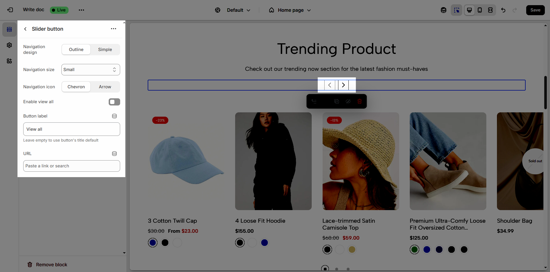
2.2.4. Slider button
To add Slider button block to the Section heading, click the Add item button (plus icon ➕) under the Section heading.
Once the Slider button block is added, you can customize its settings in the right-hand sidebar:
Navigation design: Choose the style of navigation (Outline or Simple) that best suits your store’s aesthetic and enhances user experience.
Navigation size: Adjust the size of the navigation elements (Extra small, Small, Medium, Large) to ensure optimal visibility and usability.
Navigation icon: Select an icon (Chevron or Arrow) that complements the navigation style and makes it more intuitive for users.
Enable view all: Turn on this option to allow customers to see the full collection or category at once.
Button label: Enter a clear and engaging call-to-action text for the navigation button.
Leave empty to use button's title default
URL: Provide the destination link for the navigation button to direct customers to the relevant page.