This guide will help you customize shared blocks across different sections, such as HTML, Text, Space HTML, Button, Image (child),... By following this tutorial, you'll learn how to adjust these blocks to fit your design needs, ensuring consistency and flexibility throughout your layout.
1. Text block
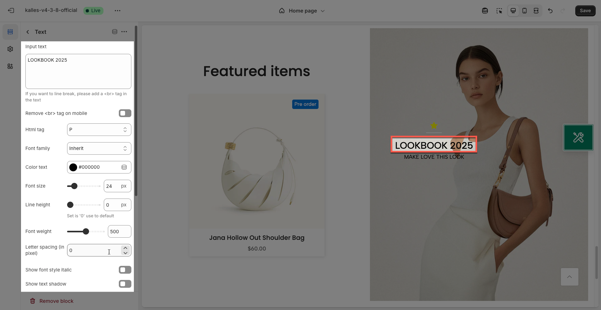
The "Text Block" section offers a simple yet powerful way to add and format textual content on your store.
Input text: Enter the text content you want to display.
If you want to line break, please add a <br> tag in the text
Remove <br> tag on mobile: Enable this option to automatically remove
<br>tags (manual line breaks) when displaying the text on mobile devices. This helps the text wrap naturally on smaller screens, avoiding unwanted gaps.HTML tag: Select the appropriate HTML tag to wrap this text (e.g.,
<h1>,<h2>,<p>,<span>). Choosing the correct tag improves semantic meaning, page structure, and SEO.Font family: Select the font family for the text. Available fonts will be provided from the theme's font library or external font services
Color text: Choose the color for the text. Ensure this color provides sufficient contrast with the background color for readability.
Font size: Enter the font size for the text (in pixels).
Line height: Enter the line height for the text. This is the vertical spacing between lines of text.
Set is '0' use to default
Font weight: Select the weight or boldness of the font (e.g., normal, bold, light). Set '0' to use the default font weight.
Letter spacing (in pixels): Adjust the spacing between characters in the text (in pixels). Positive values will increase spacing, negative values will decrease it.
Show font style italic: Enable this option to display the text with an italic font style.
Show text shadow: Enable this option to add a text shadow effect, creating a sense of prominence and depth.
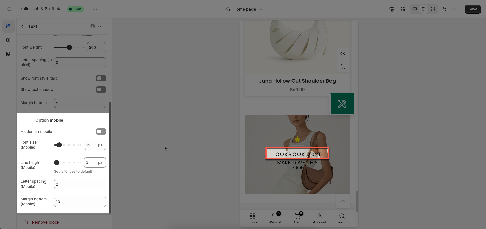
Margin bottom: Set the bottom margin of this text element (in pixels).
Option mobile
Hidden on mobile: Enable this option to completely hide this text element on mobile devices
Font size (Mobile): Enter the desired font size for the text on mobile devices
Line height (Mobile): Enter the line height for the text on mobile devices. This is the vertical spacing between lines of text
Set is '0' use to default
Letter spacing (Mobile): Adjust the spacing between characters in the text on mobile devices (usually in pixels). Customizing letter spacing can improve readability or create a specific aesthetic on smaller screens.
Margin bottom (Mobile): Set the whitespace (margin) on the bottom of this text element on mobile devices (in pixels)
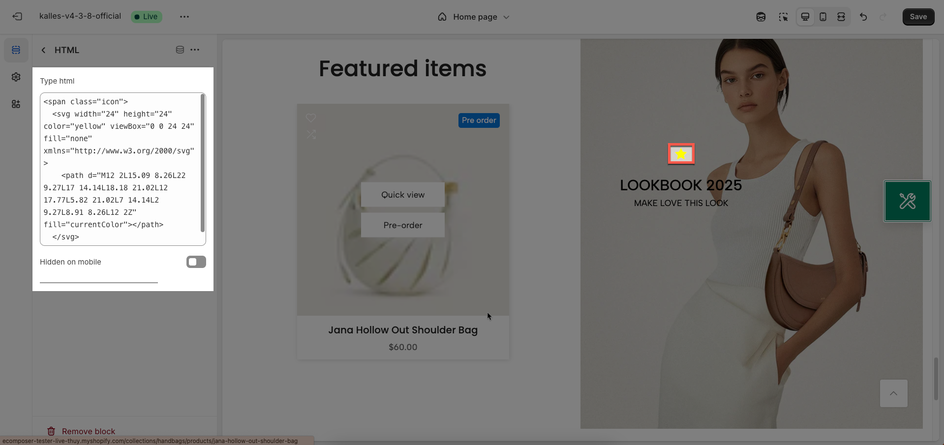
2. HTML block
The "HTML Block" section empowers you to freely embed any custom HTML, CSS, or JavaScript code directly into your store. It's the ideal tool for adding elements not covered by built-in section options, integrating third-party widgets, or crafting unique layouts.\
Type HTML: Select the type of HTML content you will be adding. This helps the system process and render your code most appropriately.
Hidden on mobile: Enable this option to completely hide this HTML block on mobile devices (screens smaller than a specified breakpoint).
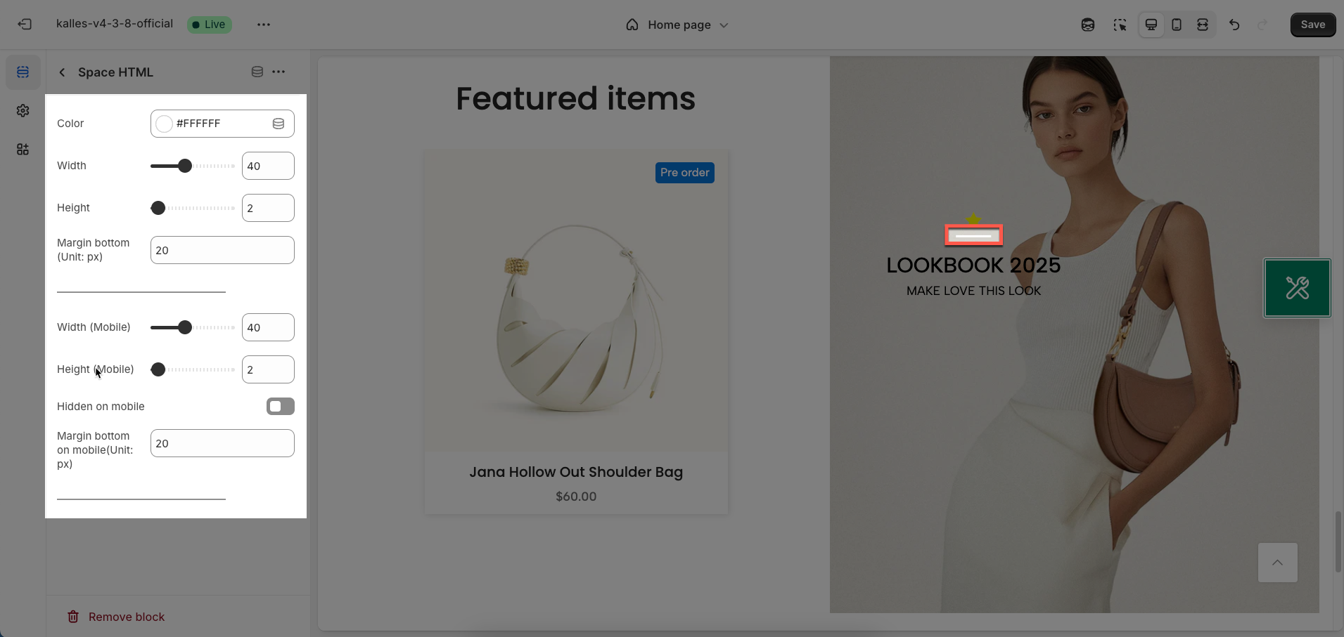
3. Space HTML block
Enter the spacing value for your custom HTML block. This value is typically applied as margin or padding and will define the space between the HTML block and its surrounding elements.
Color: Choose the color for the element. This will be the background or primary color of the object.
Width: Enter the width of the element (in pixels). This value will determine the object's width on desktop screens.
Height: Enter the height of the element (in pixels). This value will determine the object's height on desktop screens.
Margin bottom (Unit: px): Set the bottom margin of the element (in pixels). This spacing creates space between this element and the next one below it on desktop.
Width (Mobile): Enter the width of the element on mobile devices (in pixels). If left blank, the default desktop width will be used.
Height (Mobile): Enter the height of the element on mobile devices (in pixels). If left blank, the default desktop height will be used.
Hidden on mobile: Enable this option to completely hide the element on mobile devices. This is useful when the element is unnecessary or negatively impacts the layout on smaller screens.
Margin bottom on mobile(Unit: px): Set the bottom margin of the element on mobile devices (in pixels). Adjust this spacing to optimize the vertical layout on smaller screens.
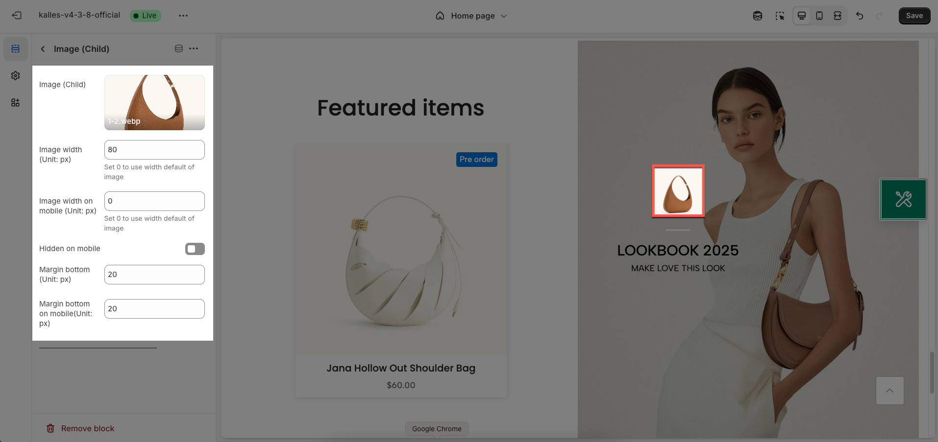
4. Image (child) block
The "Image" block provides the ability to add and customize individual images within a section, providing great flexibility in layout and presentation of visual content.
Image (Child): Upload the main image for this block. Choose a high-resolution image with an aspect ratio suitable for your design.
Image width (Unit: px): Enter the desired width for the image (in pixels). This value will determine the rendered width of the image on desktop screens.
Set 0 to use width default of image
Image width on mobile (Unit: px): Enter the desired width for the image when displayed on mobile devices (in pixels)
Hidden on mobile: Enable this option to completely hide the image on mobile devices. Use when the image is unsuitable or clutters the layout on smaller screens.
Margin bottom (Unit: px): Set the bottom margin of the image (in pixels). This spacing creates space between this image and the next element below it on desktop.
Margin bottom on mobile(Unit: px): Set the bottom margin of the image on mobile devices (in pixels). Adjust this spacing to optimize the vertical layout on smaller screens, ensuring elements aren't too cramped.
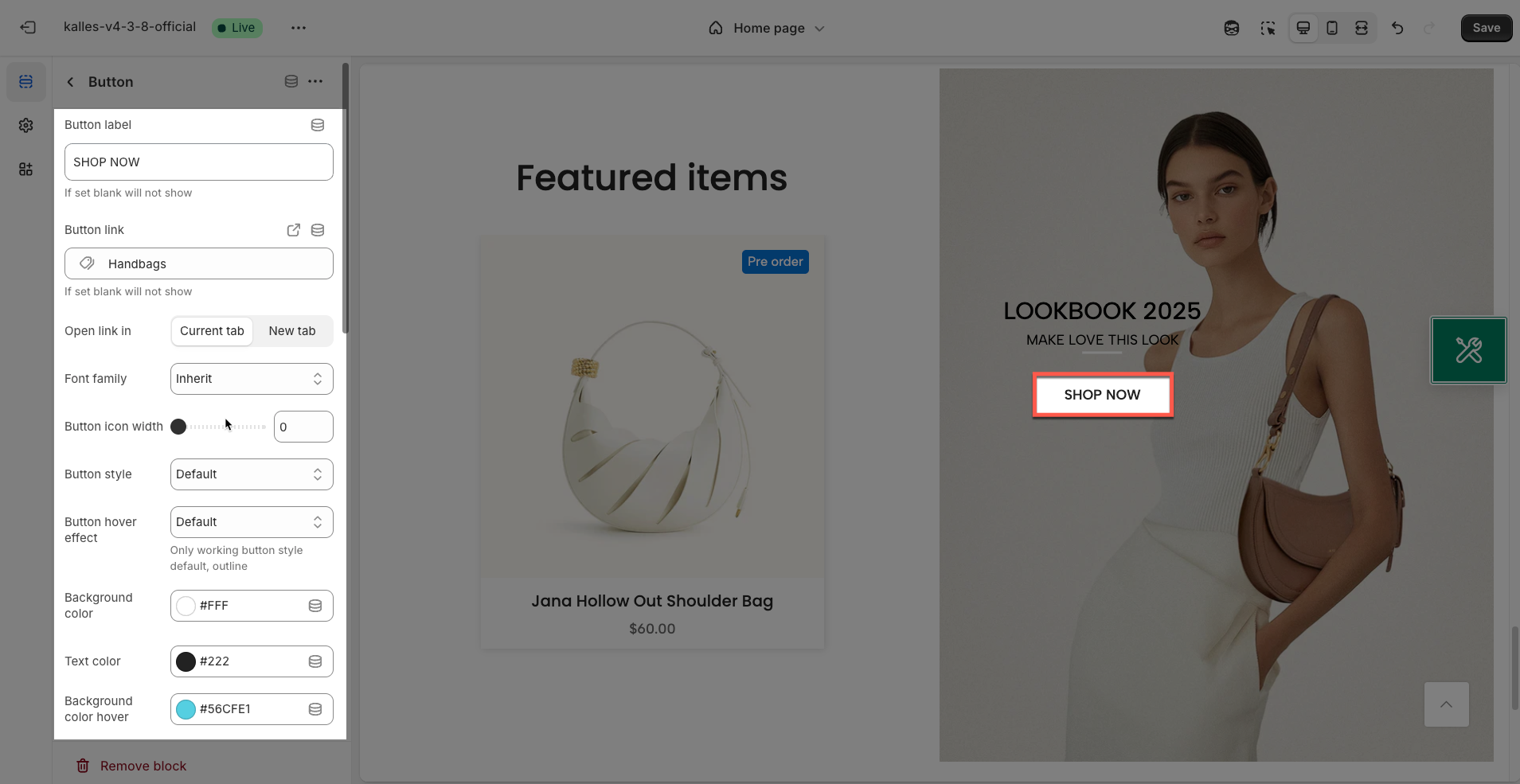
5. Button block
The Button block allows you to create interactive call-to-action elements that guide users to specific links. Customizing the button ensures it matches your design and provides a seamless user experience. Below are the available options for customization:
Button label: Enter the text that will be displayed on the button. This is the call-to-action content you want users to see.
If set blank will not show
Button link: Enter the destination URL that the button will link to when clicked. Ensure this link is valid and relevant to the button label.
If set blank will not show
Open link in: Choose how the link will open.
Current tab: The link will open in the current browser tab, replacing the page you're viewing.
New tab: The link will open in a new browser tab or window.
Font family: Select the font family for the text on the button.
Button icon width: Enter the desired width for the icon (in pixels).
Button style: Select the visual style for the button:
Default: The theme's standard button style (typically with a solid background and border).
Outline: A button with only a border and a transparent background.
Bordered bottom: A button with a border only along its bottom edge.
Link: A button styled to appear like a text link, usually without a distinct background or border.
Button hover effect: Select the visual effect that appears when a user hovers over the button (e.g., Fade, Rectangle out, Sweep to right, Shutter out horizontal). These effects make the button feel more interactive. Only working button style default, outline
Background color: Choose the background color for the button. Select a color that stands out and complements your website's overall color scheme.
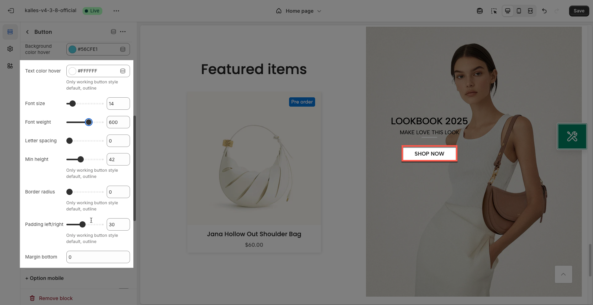
Text color: Choose the color for the text on the button. Ensure this color has good contrast with the background color for readability.
Background color hover: Choose the background color for the button when a user hovers their mouse over it. This effect provides visual feedback, indicating the button is clickable.
Text color hover: Choose the color for the text on the button when a user hovers over it. Make sure this color has good contrast with the hover background color for readability.
Only working button style default, outline
Font size: Enter the font size for the text on the button (in pixels). Font size impacts the prominence and readability of the button label.
Font weight: Select the weight or boldness of the font for the text on the button (e.g., normal, bold, semibold, thin). Font weight can be used to emphasize the button label.
Letter spacing: Adjust the spacing between characters in the button label (in pixels). Increasing or decreasing letter spacing can affect the readability and aesthetics of the text.
Min height: Set the minimum height for the button (in pixels). This helps ensure the button has enough space for the text and icon
Only working button style default, outline
Border radius: Define the roundness of the button's corners (in pixels). The higher the value, the more rounded the corners. A value of 0 will create square corners.
Only working button style default, outline
Padding left/right: Set the internal whitespace within the button on the left and right sides of the text (in pixels). Horizontal padding affects the button's width and the spacing between the text and the button's borders.
Only working button style default, outline
Margin bottom: Set the bottom margin of the button (in pixels). This spacing creates space between this button and the next element below it.
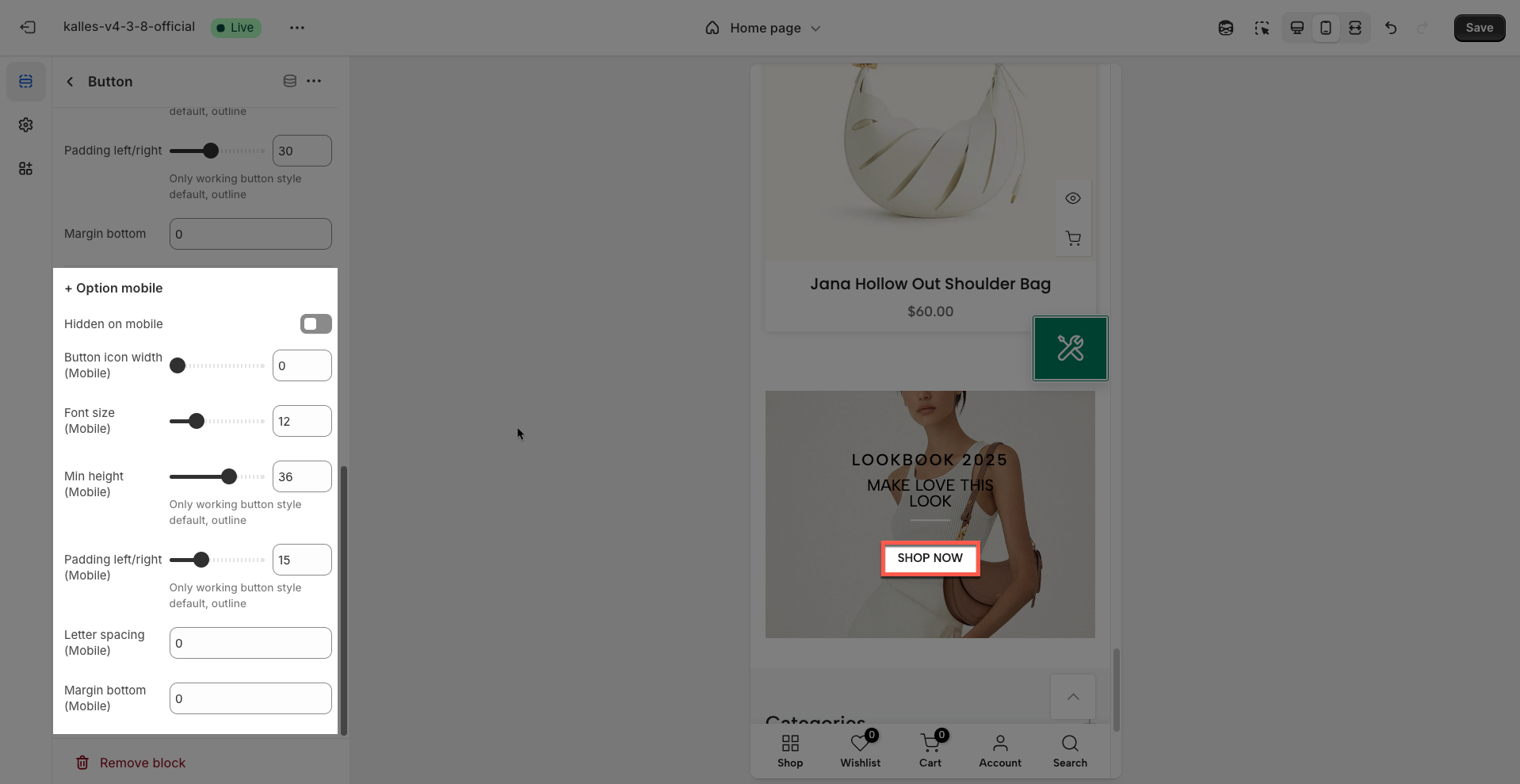
Option mobile
Hidden on mobile: Enable this option to completely hide this button on mobile devices (screens smaller than a specified breakpoint)
Button icon width (Mobile): Enter the desired width for the icon inside the button on mobile devices (in pixels)
Font size (Mobile): Enter the desired font size for the button text on mobile devices (in pixels). Adjusting the font size helps ensure good readability on smaller screens.
Min height (Mobile): Set the minimum height for the button on mobile devices (in pixels). This helps ensure the button remains large enough for easy interaction and to fully display text/icons without taking up too much screen space.
Only working button style default, outline
Padding left/right (Mobile): Set the internal whitespace within the button on the left and right sides on mobile devices (in pixels)
Only working button style default, outline
Letter spacing (Mobile): Adjust the spacing between characters in the button text on mobile devices (in pixels). Customizing letter spacing can improve the readability of text on smaller screens.
Margin bottom (Mobile): Set the whitespace (margin) on the bottom of the button on mobile devices (in pixels)
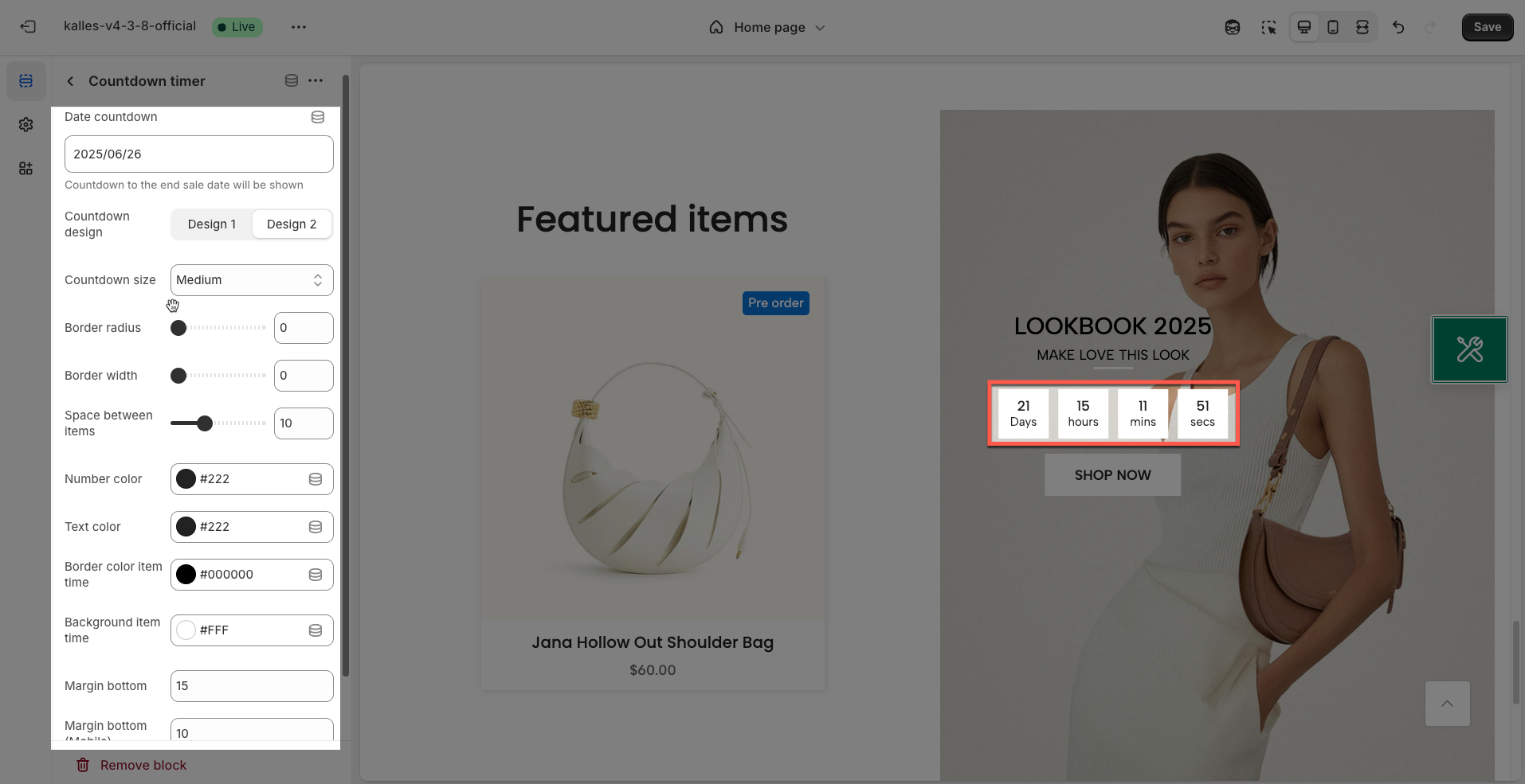
6. Countdown timer block
The "Countdown Timer" block allows you to easily add a countdown clock to your store, ideal for driving quick action from customers. Use it to highlight expiring sales, upcoming events, or new product launches.
Date countdown: Select the end date and time for the countdown.
Countdown to the end sale date will be shown
Countdown design: Select the display style of the countdown timer.
Countdown size: Select the size of the countdown timer.
Border radius: Select the border radius of the countdown timer.
Border width: Select the border width of the countdown timer.
Space between items: Select the space between the elements of the countdown timer.
Number color: Select the color of the countdown timer numbers.
Text color: Select the color of the text for the countdown timer.
Border color item time: Select the color of the border for the time elements of the countdown timer.
Background item time: Select the background color for the time elements of the countdown timer.
Margin bottom: Select the bottom margin of the countdown timer.
Margin bottom (Mobile): Select the bottom margin of the countdown timer on mobile devices.
Hidden on mobile: Hide the countdown timer on mobile devices.
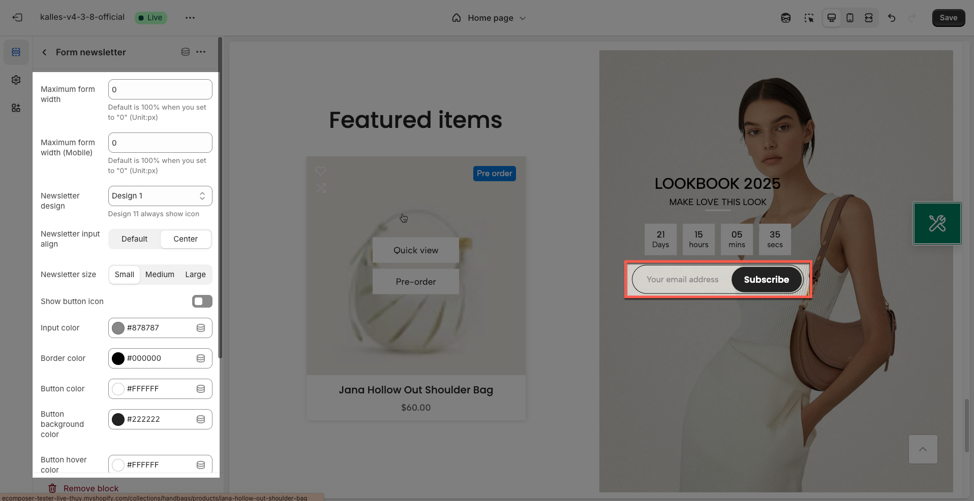
7. Form Newsletter block
The "Form Newsletter" block offers an effective way to collect customer emails and build your marketing list. Customize the messaging, input fields, and display settings to optimize conversion rates.
Maximum form width: Enter the maximum width for the entire newsletter form (in pixels or percentage). This helps control the form's size, especially on large desktop screens
Default is 100% when you set to "0" (Unit:px)
Maximum form width (Mobile): Enter the maximum width for the newsletter form on mobile devices (in pixels or percentage). This customization is crucial to ensure the form displays well on smaller screens.
Default is 100% when you set to "0" (Unit:px)
Newsletter design: Select the overall design style for the newsletter form. Options might include:
Design 11 always show icon
Newsletter input align: Choose how the email input field and submit button are aligned within the form.
Newsletter size: Select the overall size of the input field and button (e.g., small, medium, large). This affects the height and padding of these elements.
Show button icon: Enable this option to display an icon on the submit button (if supported by the button design).
Input color: Choose the text color inside the email input field.
Border color: Choose the border color for the email input field.
Button color: Choose the text color on the submit button.
Button background color: Choose the background color for the submit button.
Button hover color: Choose the text color of the button when a user hovers over it.
Button hover background color: Choose the background color of the button when a user hovers over it.
Hidden on mobile: Enable this option to completely hide the newsletter form on mobile devices. Useful if you have a different email capture strategy for mobile.
Margin bottom: Set the bottom margin of the entire newsletter form block (in pixels). This spacing creates space between the form and the next element below it on desktop.
Margin bottom (Mobile): Set the bottom margin of the entire newsletter form block (in pixels). This spacing creates space between the form and the next element below it on desktop.