


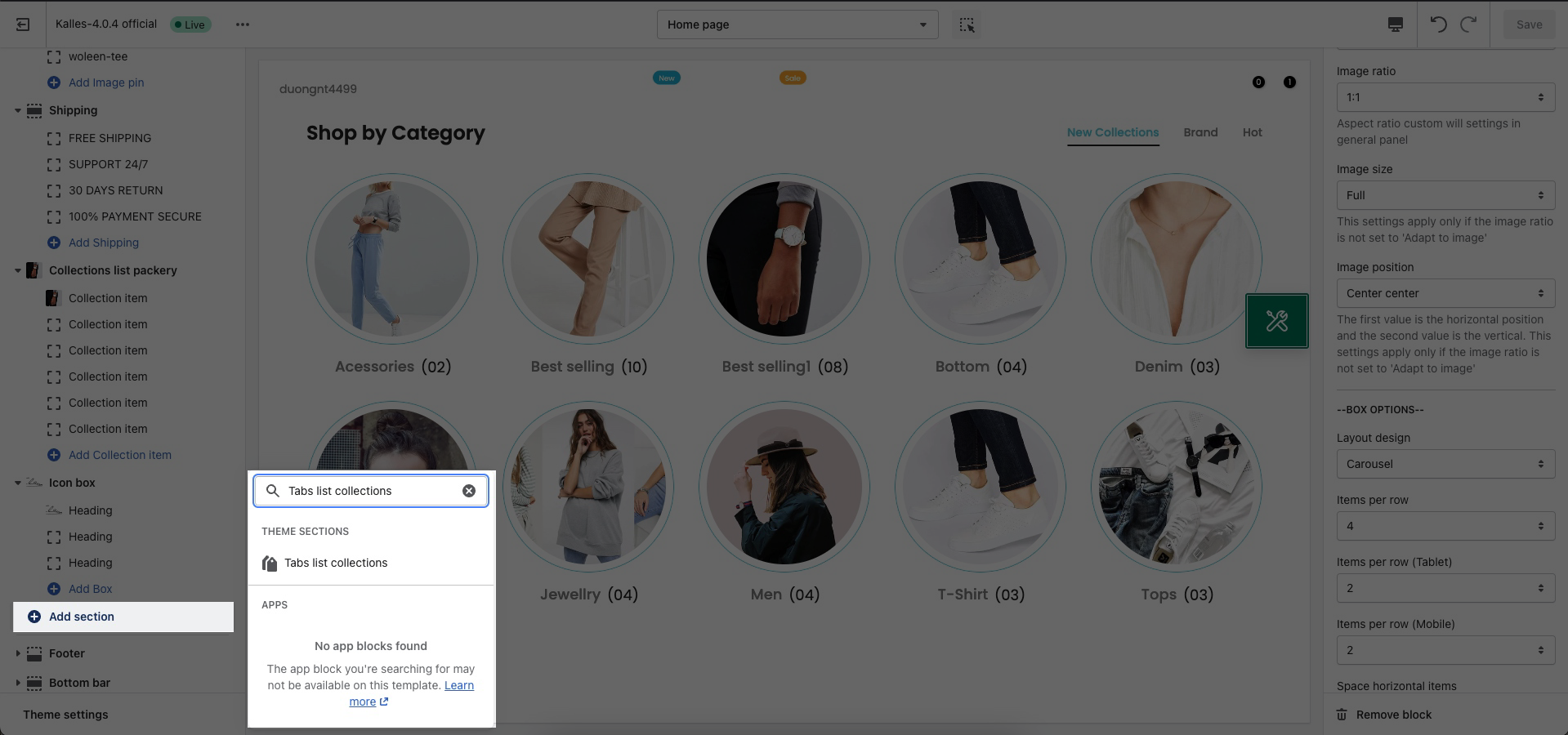
This section is very useful and flexible, you can create many tabs with collections list.
From Theme Section Sidebar > Add section > Tabs list collections
1. Tab item settings
1.1. Title settings
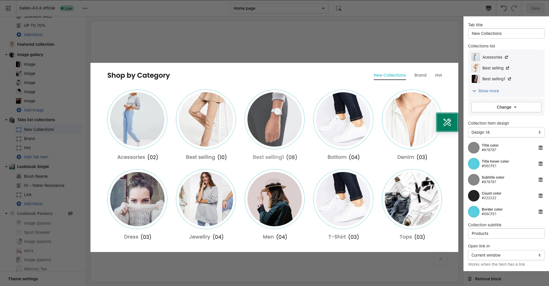
Tab Title: You can add title for Tab collections.
Collections list: You can add multiple Collections in this option.
Collection item design: You can change the design for items.
Colors: You can set color for Title, Title hover, Subtitle, Count, Border.
Collection subtitle: You can change the subtitle of collections.
Open link in: Works when the item has a link.
1.2. OPTIONS IMAGE COLLECTION
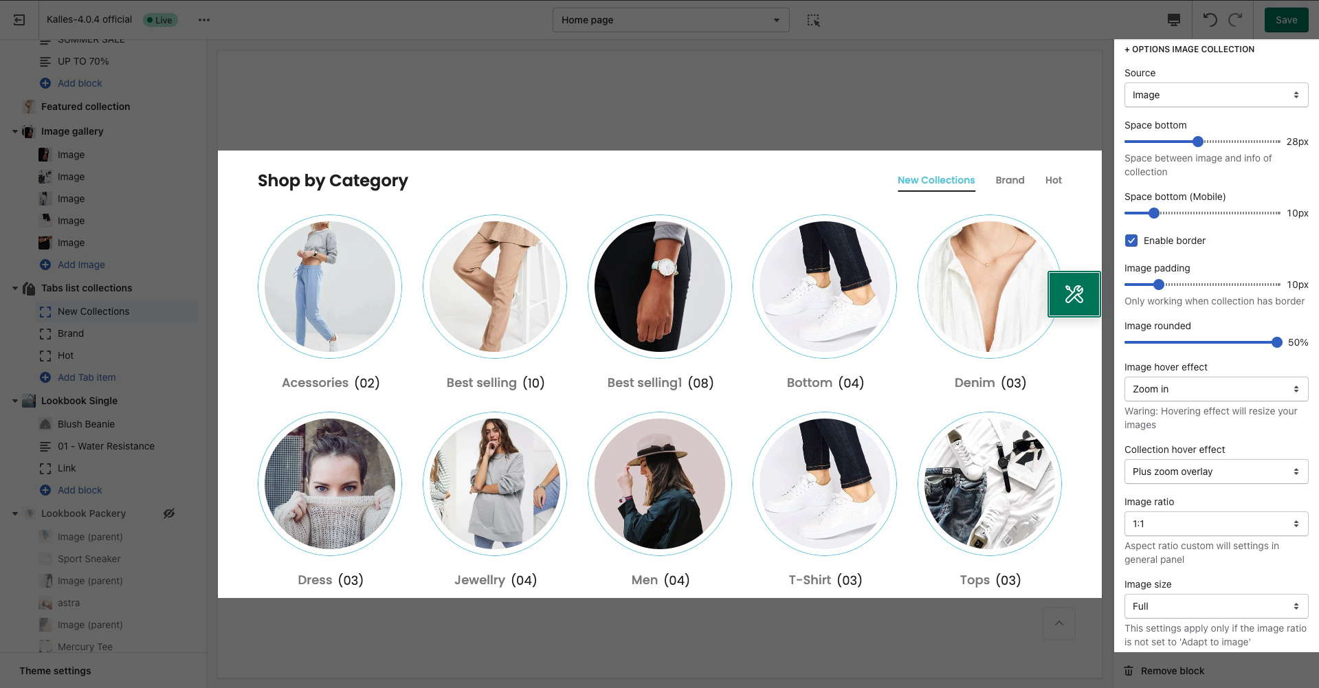
Source: You can choose between Image or Icon source to display on collections.
Space bottom: Space between image and info of collection.
Enable border: Border for collections.
Image padding, Image rounded, Image hover effect
Collection hover effect: Effect for Collections when hovering.
You can change Image ratio, Image size, Image position.
1.3. BOX OPTIONS
Layout design: You can set the layout design as Grid or Carousel.
Items per row: You can set item per row for many devices.
Space horizontal items: You can set space between items by horizontal.
Space vertical items: You can set space between items by vertical.
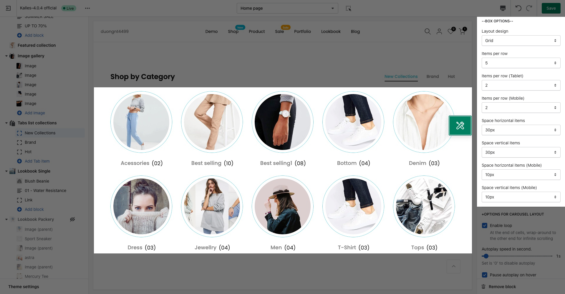
1.4. OPTIONS FOR CAROUSEL LAYOUT
Enable loop: At the end of cells, wrap-around to the other end for infinite scrolling.
Autoplay speed in second: Set is ‘0’ to disable autoplay.
Pause autoplay on hover: Auto-playing will pause when the user hovers over the carousel.
Change style for Prev next button and Page dots

2. Tabs list collections settings
HEADING OPTIONS
Heading: You can add title for this section.
Space bottom (px): The vertical spacing between heading and content.

GENERAL OPTIONS
Color item: You can set color for Tabs collections.
Color item active: You can set color when hover to Tabs collection or active it.
Background/border item active: You can set color for border Tabs when active.
Space between items: You can set space between Tabs.
DESIGN OPTIONS
Please follow this guideline to config Layout, Background, Margin/Padding for the section.


