


This section lets you create tabs to switch between different collections. It makes your store professional and flexible.
From Theme Section Sidebar > Add section > Tabs collection
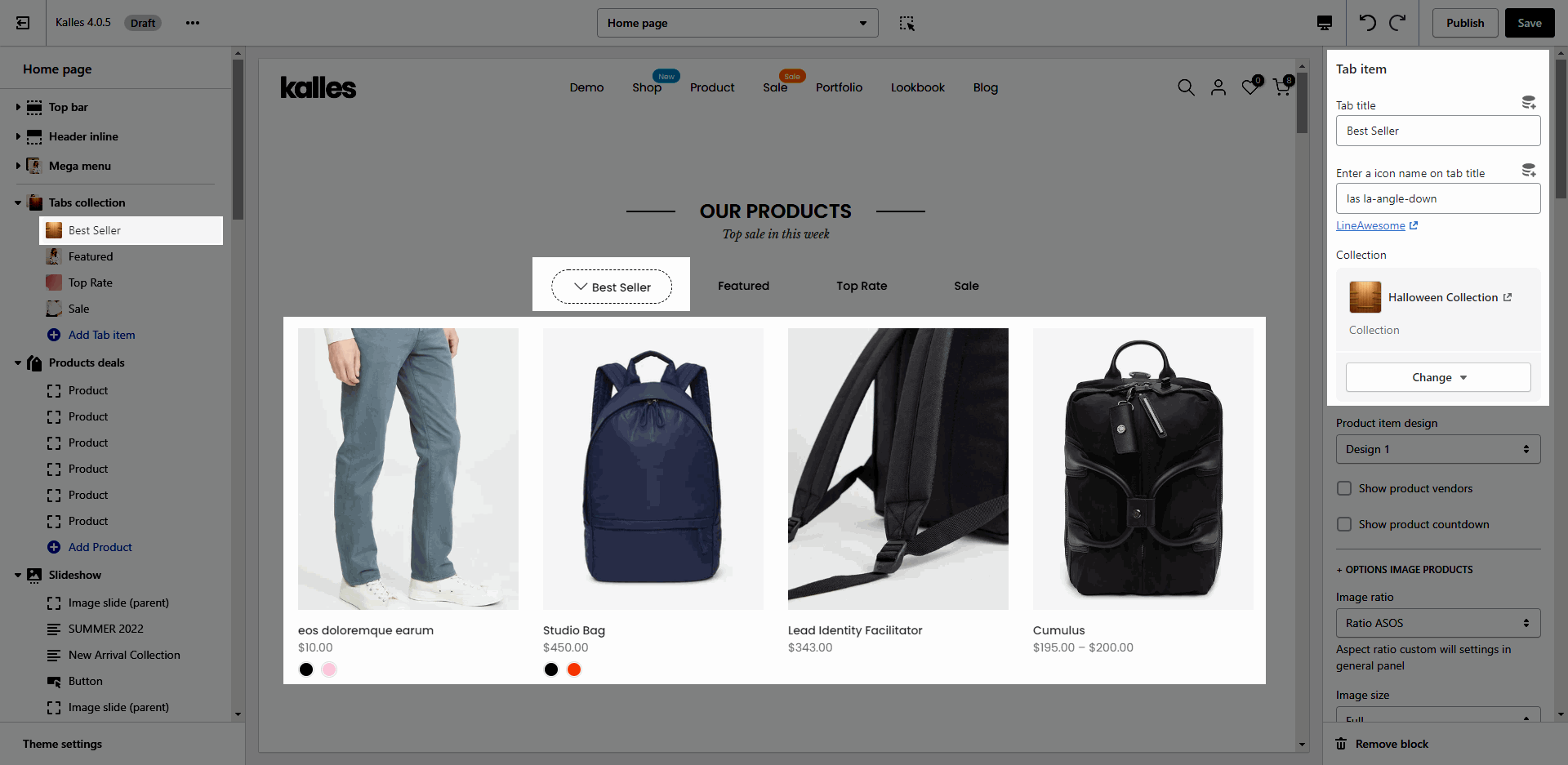
1. Tab item
Click on Tabs collection > Add tab item. Each tab item is present for a tab. You are able to config many options for each tab.
Tab title: Show the title of tab item
Enter a icon name on tab title: Show icon in front of tab title.
Collection: You can choose the collection to show product.
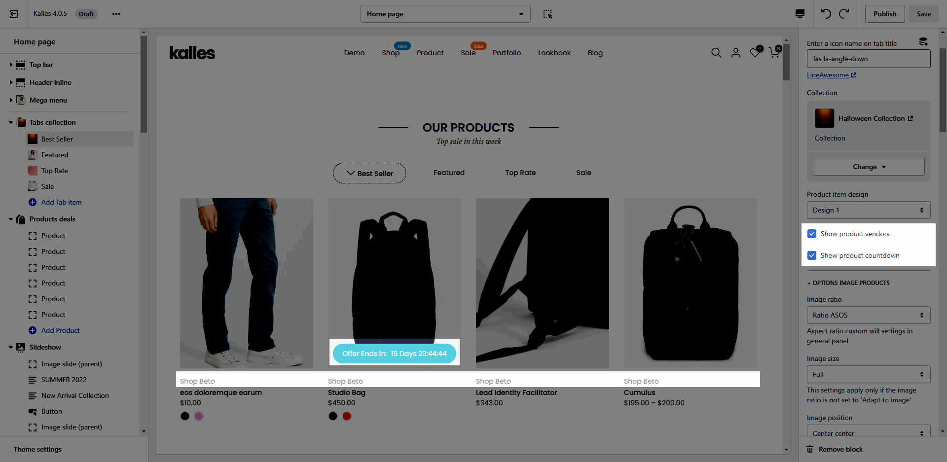
1.1. Product item design
Design: you can choose the design for product items. You can check this video:
Show product vendors, Show product countdown
OPTIONS IMAGE PRODUCTS: you can change Image ratio, Image size, Image position.
Product content align: set text align for text content of product.
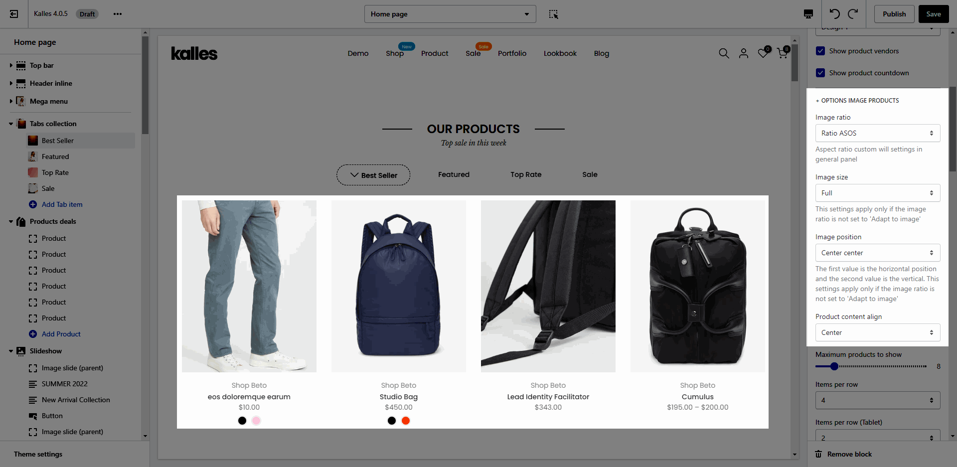
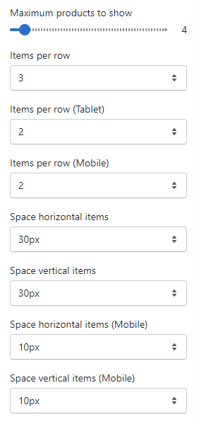
Quantity of product to show and Space between items:
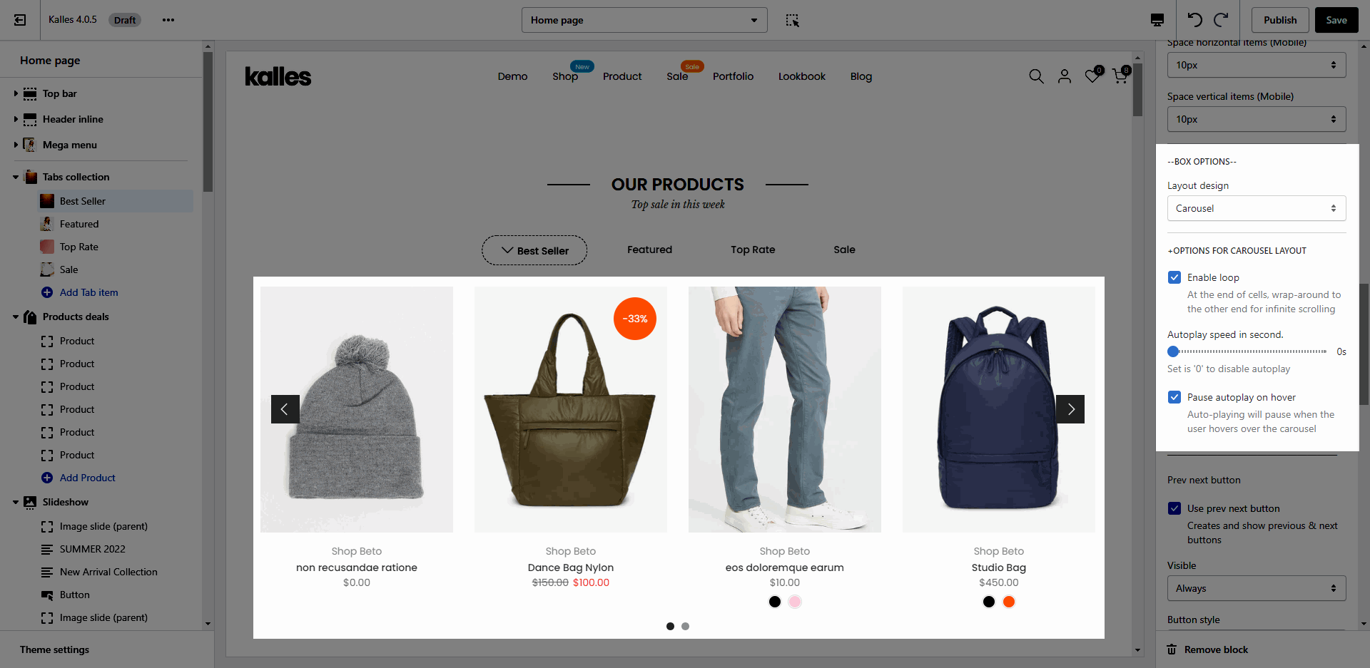
1.2. BOX OPTIONS
CAROUSEL LAYOUT: You can choose layout Carousel, customize for prev next button, page dots.
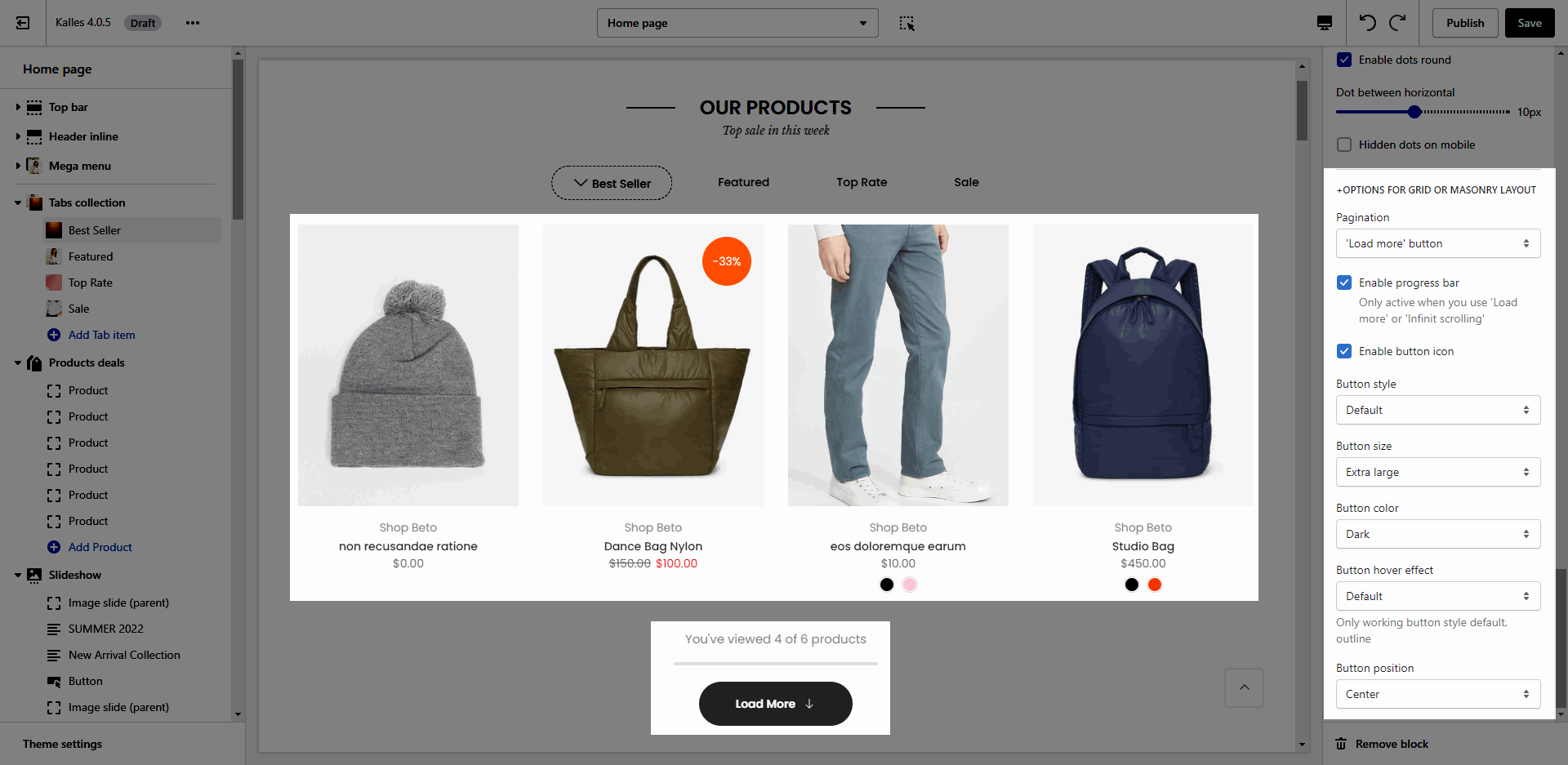
GRID OR MASONRY LAYOUT: You can choose Pagination style, progress bar, icon and button design.
2. Tabs collection setting
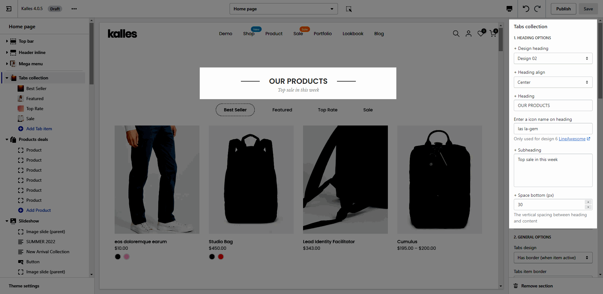
2.1. HEADING OPTIONS
You can change: design, align, content, icon, subheading and space bottom in this setting for heading.
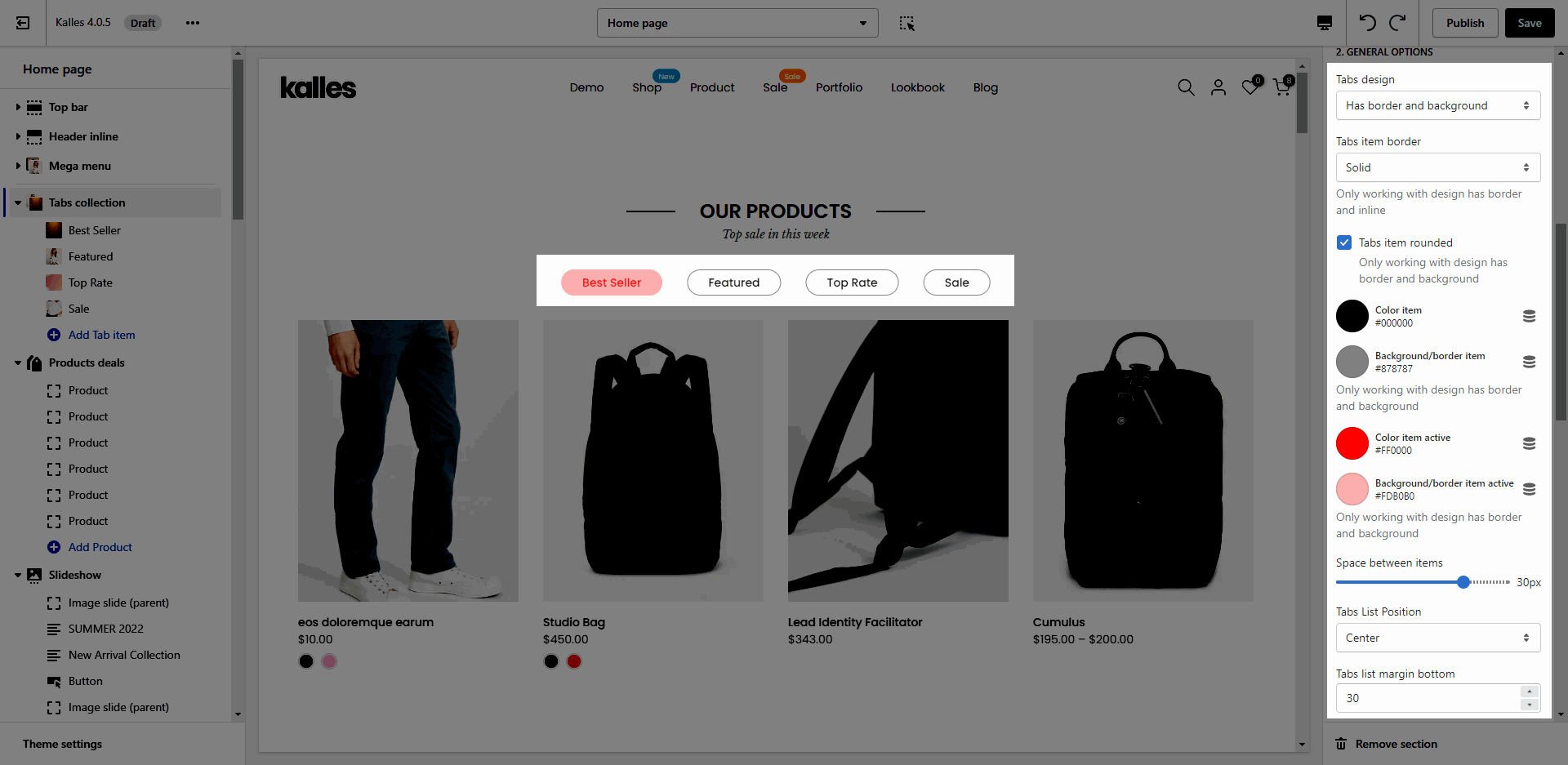
2.2. GENERAL OPTIONS
Tab design: we have 7 design for tab as the video below.
Tabs item border: choose border for tab items. There are 4 options: none, solid, dashes, dotted.
Customize color for item, background, border. Only working with design has border and background.
Space between items, Tabs List Position, Tabs list margin bottom:
Here is an example for customizing tab items:
2.3. DESIGN OPTIONS
Please follow this guideline to config Layout, Background, Margin/Padding for the section.


