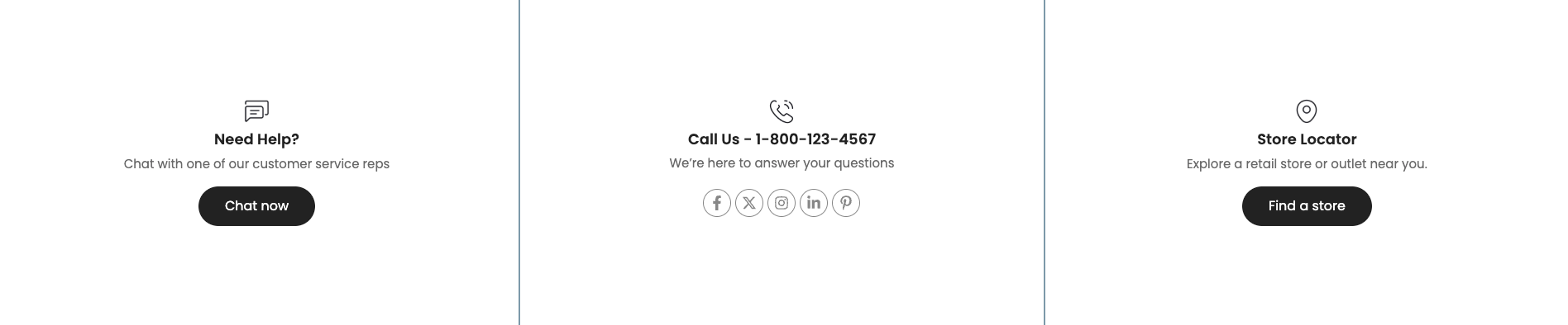
Versatile "Icon Box 2" Section: Provides an intuitive and engaging way to present key information by combining icons, titles, and content. Supports various layout options (e.g., icon above/left/right of the title), icon styles (e.g., with background, with border), and the ability to customize colors and sizes for both icons and text.
1. How to access Icon box 2 section?
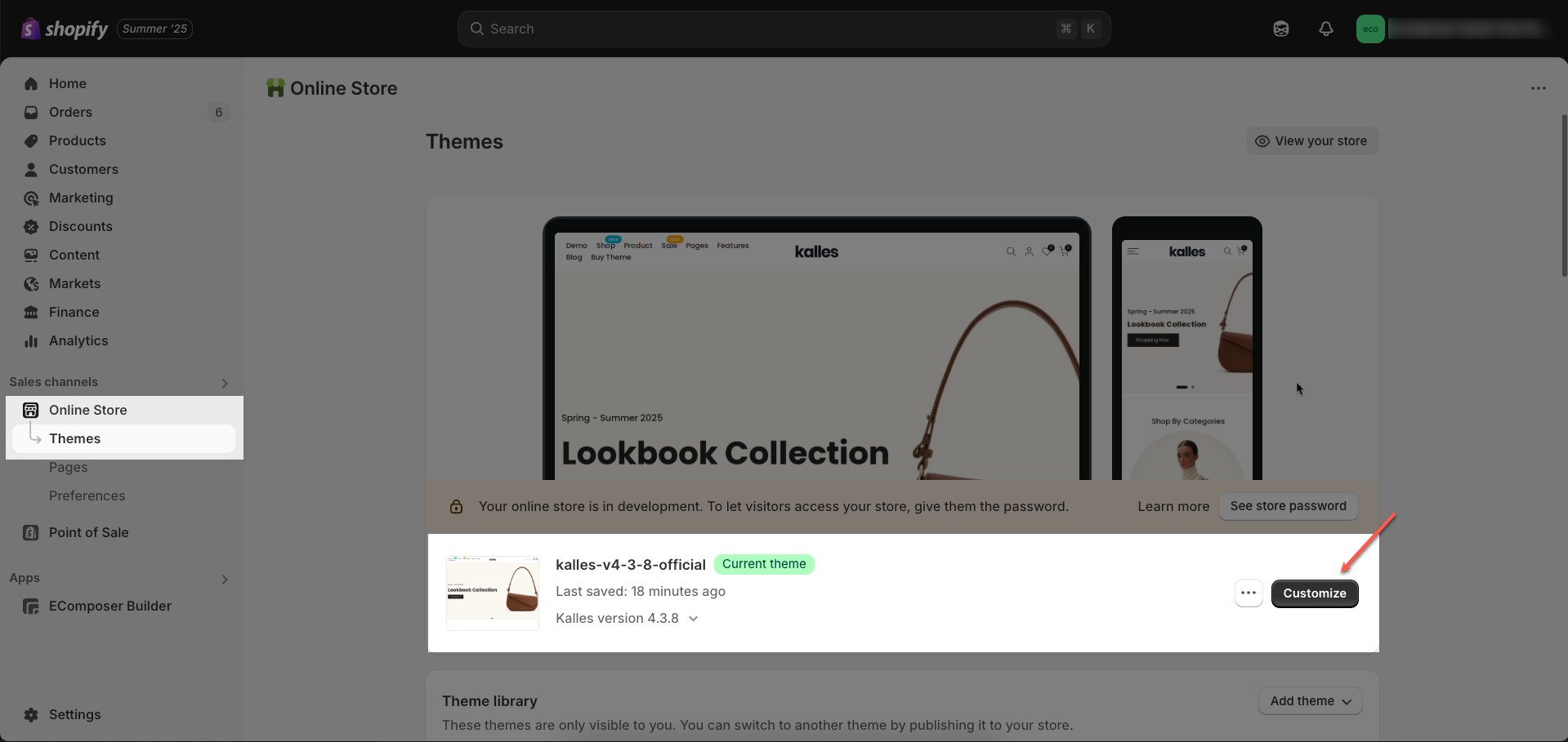
Step 01: From Shopify Admin, click on Online Store > Select Themes > In the Current theme section, click the Customize button.
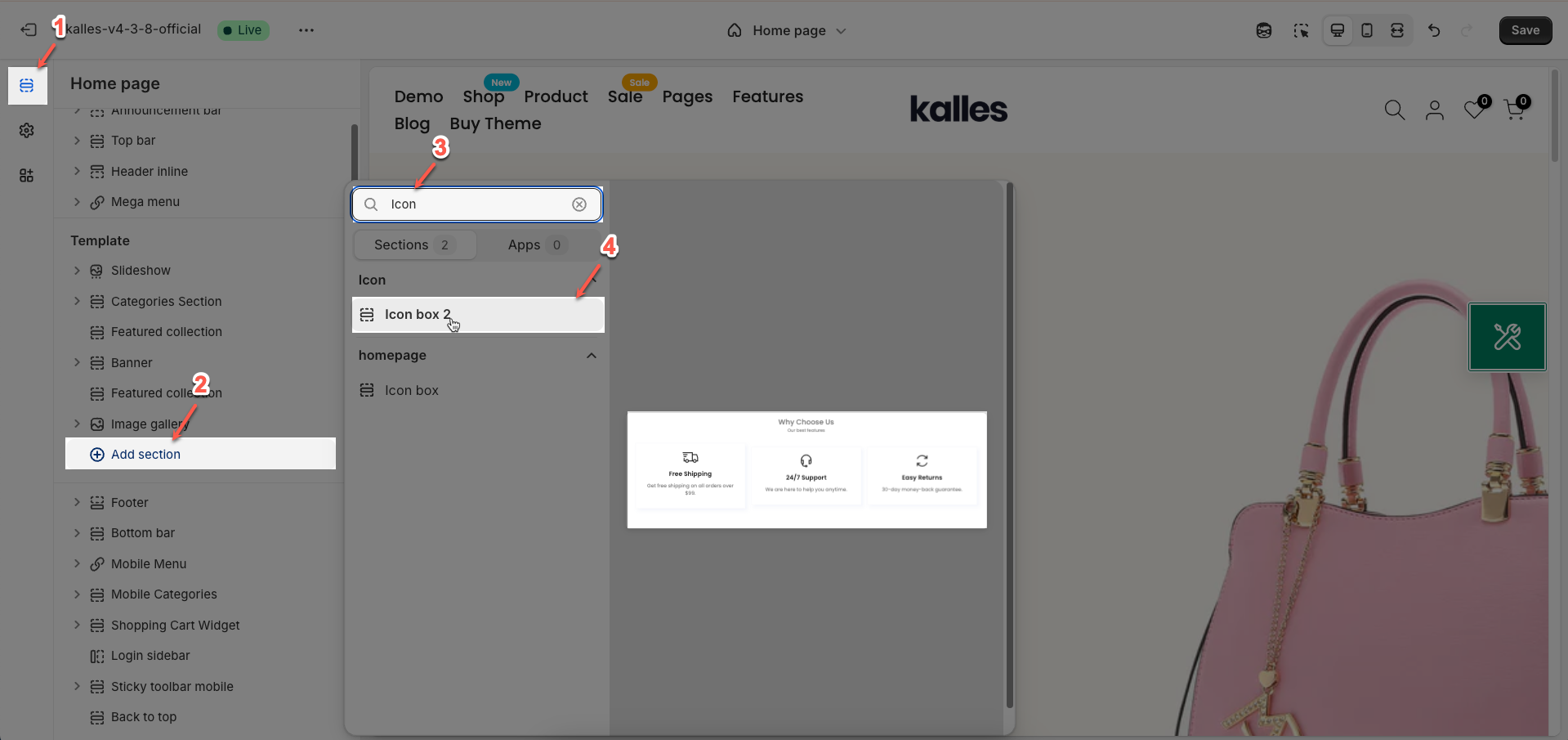
Step 02: In the theme editor (Customize), click the Sections button > Click the Add Section button or hover below another section until the (➕) icon appears > In the Sections tab, scroll through the list or use the search bar to find and select Icon box 2.
2. How to customize the Icon box 2 section?
2.1. Box block
To add a Box block to the Icon box 2, click the Add Box button (plus icon ➕) under the Icon box 2.
Once the Box block is added, you can customize its settings in the left or right-hand sidebar (depending on your screen size).
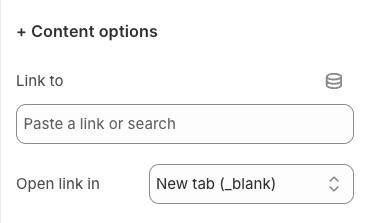
Content options
Link to: Enter the destination URL that users will be redirected to when clicking on this element. Ensure the URL is valid and relevant to the element's context for a positive user experience.
Open link in: Choose how the link will be opened when a user clicks on the element.
Current tab (_self): The link will open in the current browser tab, replacing the current page's content. This is the default option.
New tab (_blank): The link will open in a new browser tab or a new window (depending on the browser's settings).
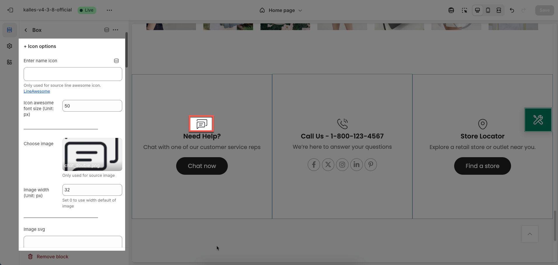
Icon options
Enter name icon: Enter the class name of the icon you want to use from the Font Awesome library (e.g.,
fa fa-check,fa fa-star).Only used for source line awesome icon. LineAwesome
Icon awesome font size (Unit: px): Enter the desired size for the Font Awesome icon in pixels. This value will determine the rendered size of the icon.
Choose image: Upload the image you want to use. This option will be used if you do not enter a Font Awesome icon name.
Only used for source image
Image width (Unit: px): Enter the desired width for the image in pixels. This value will limit the displayed width of the image.
Set 0 to use width default of image
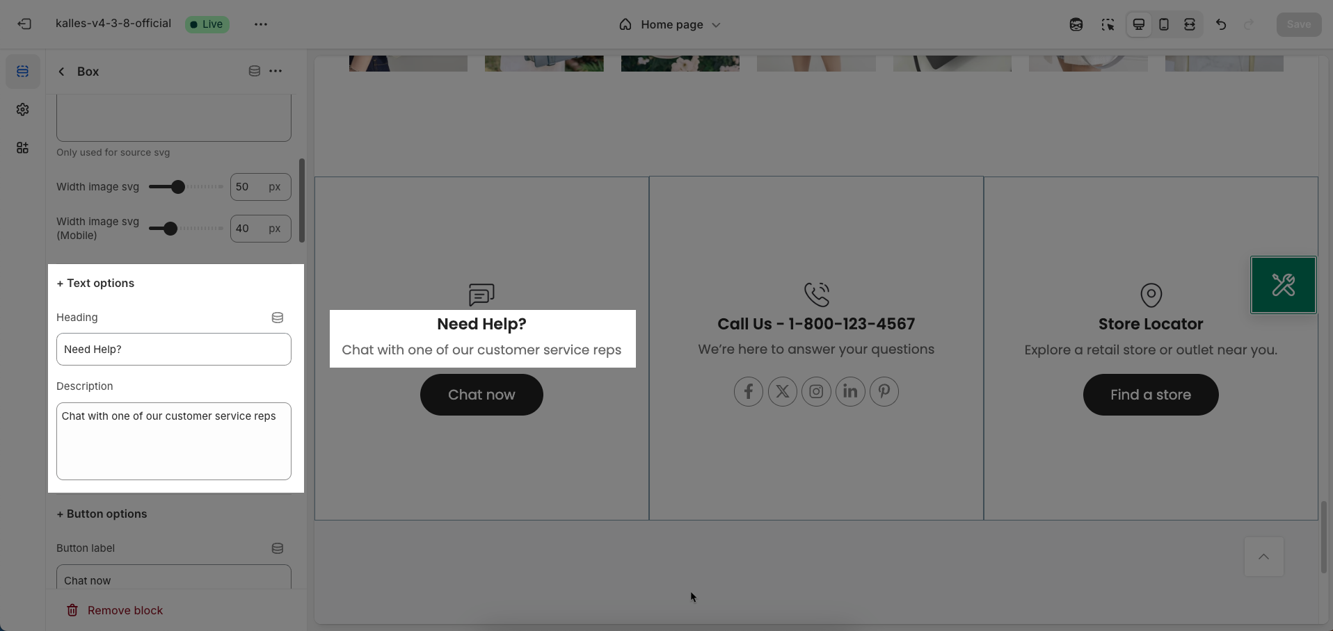
Image SVG: Upload an SVG (Scalable Vector Graphics) file if you want to use a vector image. SVGs have the advantage of being scalable without loss of quality and often have smaller file sizes.
Only used for source svg
Width image SVG: Enter the desired width for the SVG image in pixels. Similar to "Image width", this value will limit the displayed width of the SVG.
Width image svg (Mobile): Enter the desired width for the SVG image on mobile devices in pixels. This option allows you to display a different SVG size on smaller screens
Text options
Heading: Enter the main heading text you want to display for this box.
Description: Enter more detailed description text to provide additional information, context, or clarify the meaning of the heading
Button options
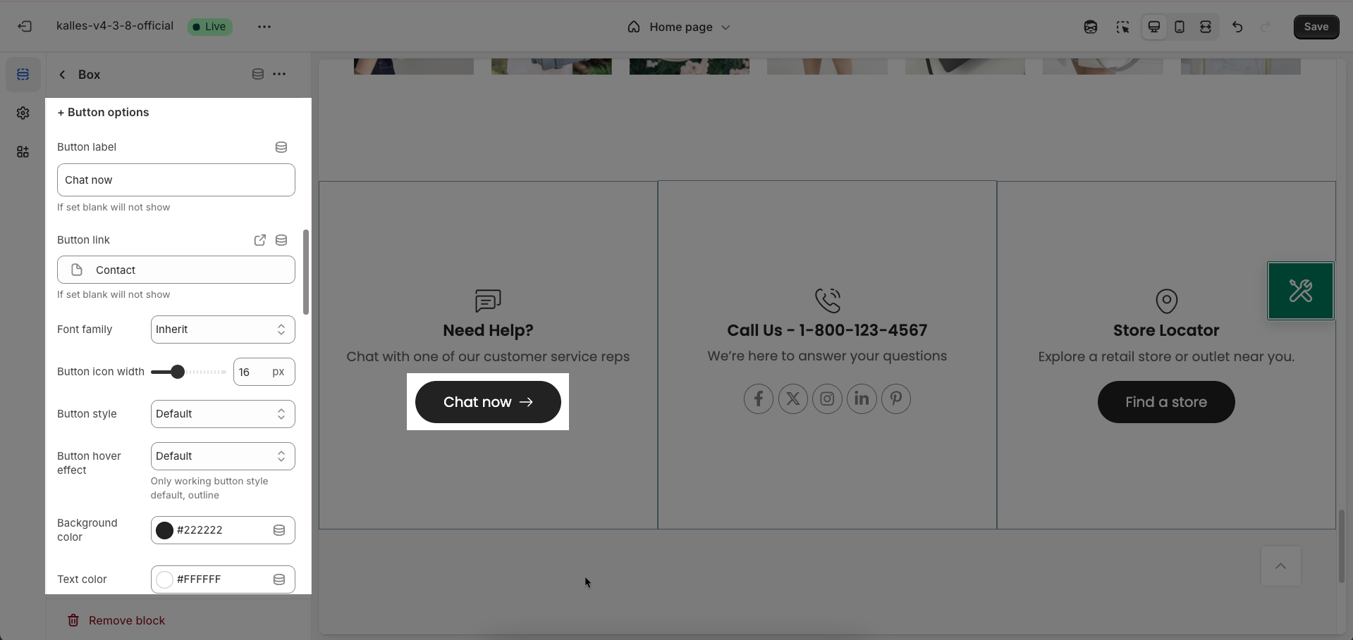
Button label: Enter the text displayed on the button. This is the main call-to-action content that you want users to click.
If set blank will not show
Button link: Enter the destination URL that the button will link to when clicked. Ensure the URL is valid and relevant to the button label.
If set blank will not show
Font family: Select the typeface (font) for the text on the button from the list of fonts available in the theme
Button icon width: Enter the desired width for the icon displayed inside the button (in pixels).
Button style: Select the visual style for the button.
Default: The theme's standard button style (usually with a background and border).
Outline: A button style with only a border and no background color (transparent background).
Bordered bottom: A button style with a border only at the bottom.
Link: A button style that looks like a text link, usually without a clear background or border.
Button hover effect: Select the visual effect to display when users hover their mouse over the button (Default, Fade, Rectangle out, Sweep to right, Sweep to left, Sweep to bottom, Sweep to top, Shutter out horizontal, OutlineShadow). These effects provide visual feedback and encourage interaction.
Only working button style default, outline
Background color: Choose the background color for the button. Select a color that stands out and complements the website's color scheme.
Text color: Choose the color for the text on the button. Ensure good contrast with the background color for readability.
Only working button style default
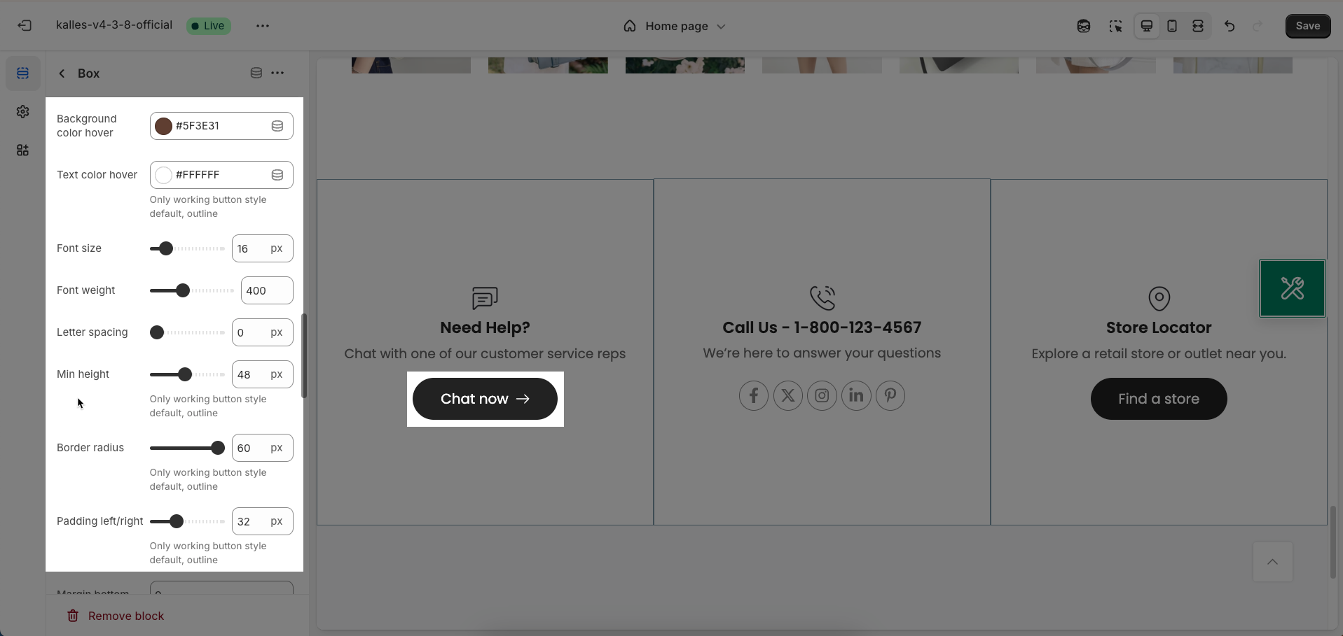
Background color hover: Choose the background color for the button when a user hovers their mouse over it. This effect provides visual feedback and indicates that the button is interactive.
Text color hover: Choose the color for the text on the button when a user hovers their mouse over it. Ensure this color has good contrast with the hover background color to maintain readability.
Only working button style default, outline
Font size: Enter the font size for the text on the button (usually in pixels or relative units like
emorrem).Font weight: Select the weight or boldness of the font for the text on the button
Letter spacing: Adjust the spacing between characters in the button label (usually in pixels or relative units like
em)Min height: Set the minimum height for the button (usually in pixels). This helps ensure that the button has enough space for the text and icon (if any)
Only working button style default, outline
Border radius: Define the roundness of the button's corners (usually in pixels). The higher the value, the more rounded the corners. A value of 0 will create square corners.
Only working button style default, outline
Padding left/right: Set the internal whitespace within the button on the left and right sides of the text (usually in pixels).
Only working button style default, outline
Margin bottom: Set the whitespace (margin) on the bottom of this element, creating space between this element and the element that follows it below.
Option Mobile
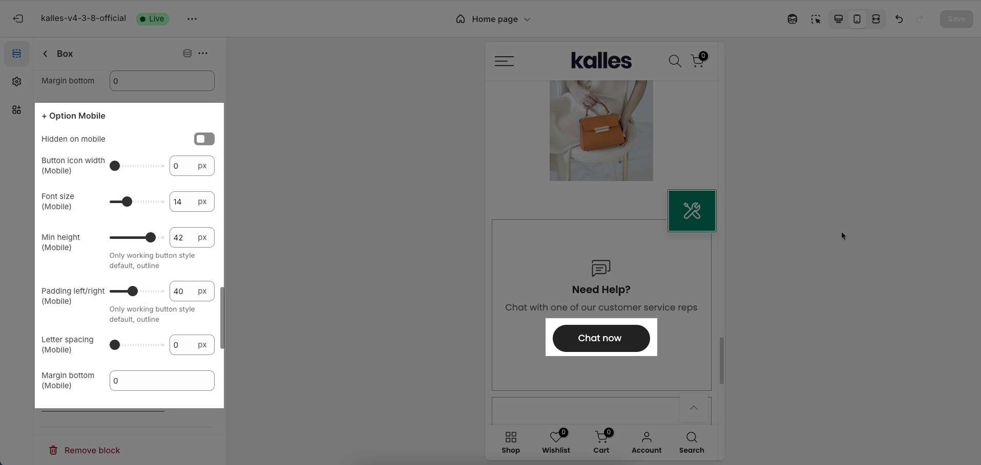
Hidden on mobile: Enable this option to completely hide this element on mobile devices
Button icon width (Mobile): Enter the desired width for the icon inside the button on mobile devices
Font size (Mobile): Enter the desired font size for the text within this element on mobile devices
Min height (Mobile): Set the minimum height for this element on mobile devices
Only working button style default, outline
Padding left/right (Mobile): Set the internal whitespace within the element on the left and right sides on mobile devices
Only working button style default, outline
Letter spacing (Mobile): Adjust the spacing between characters in the text of this element on mobile devices
Margin bottom (Mobile): Set the whitespace (margin) on the bottom of this element on mobile devices
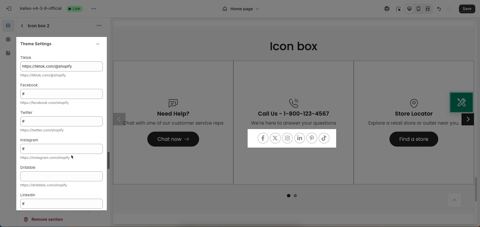
Socials options
Enable socials: Enable this option to display social media icons that link to your social media pages.
Socials mode: Choose the display mode for the social media icons
Follow: Displays icons that encourage users to follow your social media pages.
Share: Displays icons that allow users to share the current page on social media platforms.
Socials style (Style 1, Style 2 (Has background), Style 3 (Has border), Style 4 (Has border & background): Select the visual style for the social media icons. Each style will have a different presentation regarding colors, background, and borders.
Socials size: Select the display size of the social media icons (small, medium, large) to fit the layout and space of the section.
Border radius: Define the roundness of the corners of the social media icons (if the style has a background or border). The higher the value, the more rounded the corners. A value of 0 will create square corners.
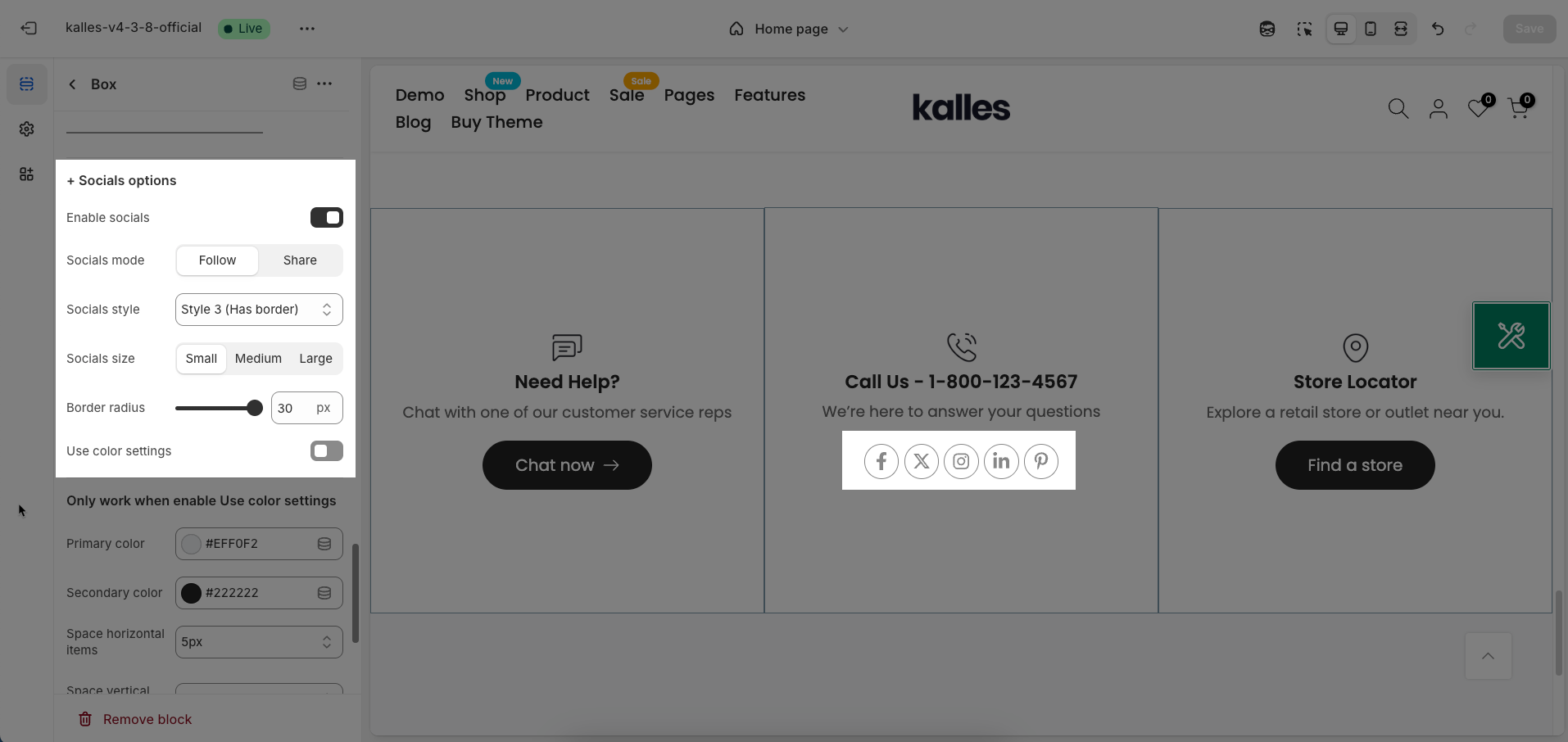
Use color settings: Enable this option to use custom color settings for the social media icons
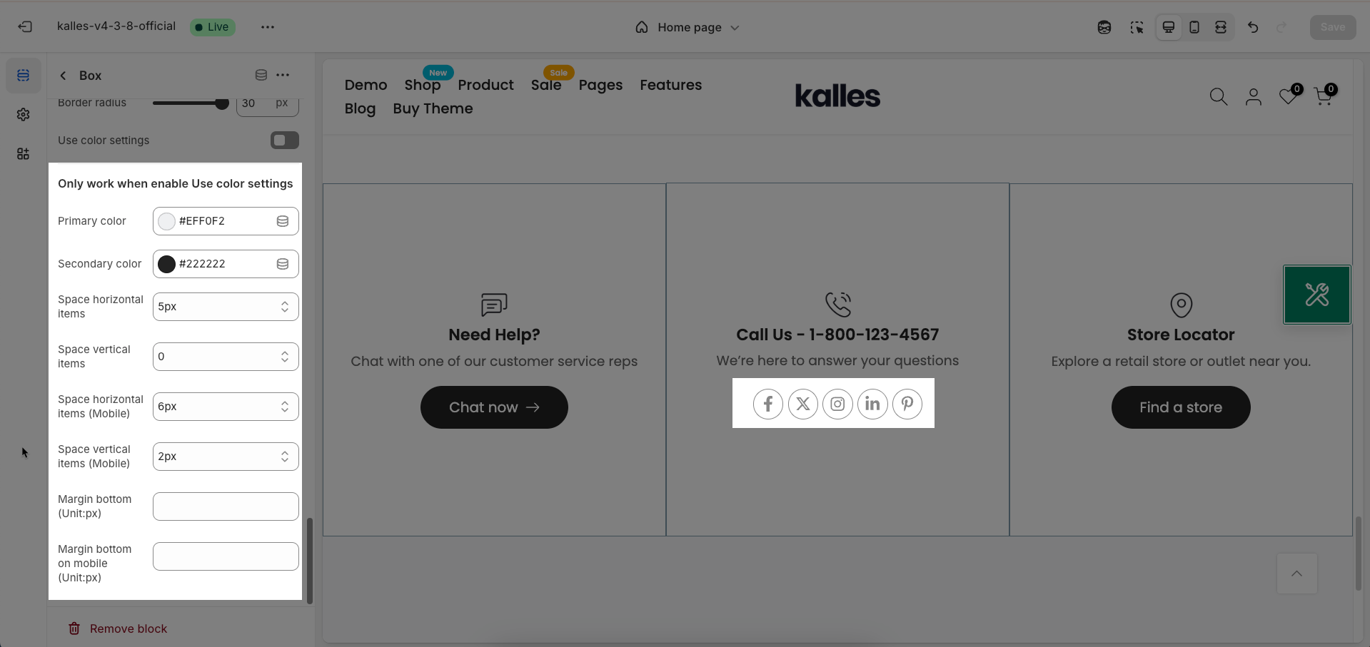
Primary color: Choose the primary color for this socials.
Secondary color: Choose the secondary color to complement the primary color. This color is often used for less prominent elements or as
Space horizontal items: Set the horizontal spacing between socials within the box (usually in pixels). Adjusting this value helps control the layout and creates visual breathing room between socials.
Space vertical items: Set the vertical spacing between rows of socials within the box (usually in pixels). Similar to horizontal spacing, adjusting this value helps control the vertical layout and creates clarity between socials.
Space horizontal items (Mobile): Set the horizontal spacing between items on mobile devices
Space vertical items (Mobile): Set the vertical spacing between items on mobile devices
Margin bottom (Unit:px): Set the whitespace (margin) on the bottom of this socials
Margin bottom on mobile (Unit:px): Set the whitespace (margin) on the bottom of this socials on mobile devices
2.2. Icon box 2 section
After adding the Icon box 2 section, you can customize its settings in the left or right sidebar (depending on your screen size)
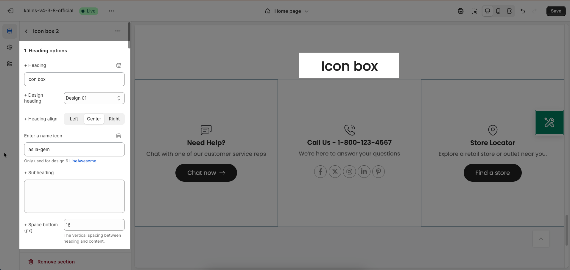
2.2.1. Heading options
Heading: Enter the main heading text you want to display for this section. This heading is typically used to introduce the content or purpose of the section.
Design heading: Select a pre-designed style for the heading. This option allows for quick application of common heading decorations without complex CSS customization.
Heading alignment: Choose the alignment for the heading (and subheading if present) within its container. Common options include left, center, and right alignment, helping to create a balanced layout that fits the section's overall design.
Enter a name icon: Enter the icon class name from the integrated icon library (e.g., Font Awesome, Shopify Icons). The icon will be displayed next to the heading, enhancing visual appeal and recognition
Only used for design 6 LineAwesome
Subheading: Enter the subheading text to provide additional details or context for the main heading. The subheading is typically smaller in size and less prominent than the main heading.
Space bottom (px): Enter the spacing value (padding or margin bottom) in pixels between the heading (and subheading if present) and the content below it
The vertical spacing between heading and content.
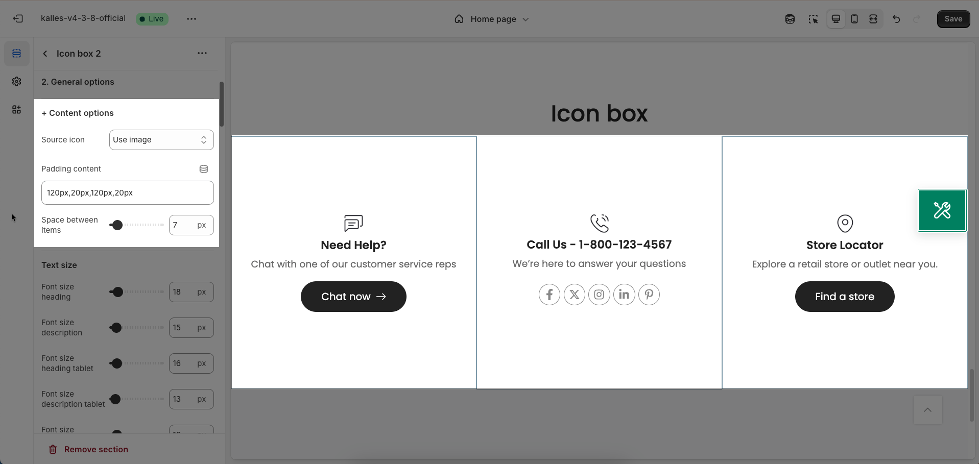
2.2.2. General options
Content options
Source icon: Choose the source for the icon of this element.
Line Awesome: Use the Line Awesome icon library (requires this library to be integrated into the theme). You will need to enter the icon's class name.
Use image: Allows you to upload an image file (PNG, JPG, GIF) to use as the icon.
SVG: Allows you to upload an SVG (Scalable Vector Graphics) file to use as the icon. SVGs have the advantage of scaling without loss of quality.
Padding content: Set the internal whitespace (padding) around the content (e.g., text, icon) of the element. Values are typically entered in pixels (px) or relative units
Space between items: Set the spacing between items within a container holding multiple items.
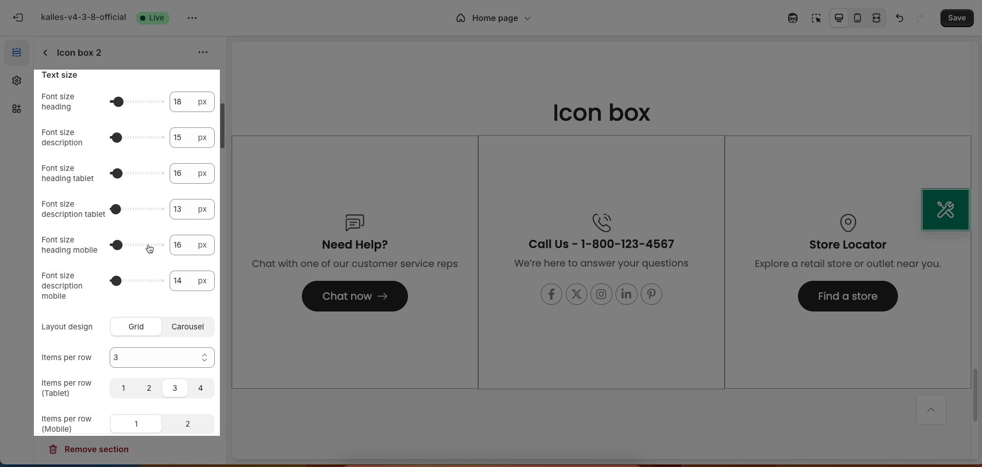
Text size
Font size heading: Enter the desired font size for the heading of this element on desktop screens (usually in pixels or relative units like
emorrem).Font size description: Enter the desired font size for the description of this element on desktop screens (usually in pixels or relative units).
Font size heading tablet: Enter the desired font size for the heading on tablet screens (usually in pixels or relative units). If you want to use the same size as desktop, leave this field blank.
Font size description tablet: Enter the desired font size for the description on tablet screens. If you want to use the same size as desktop, leave this field blank.
Font size heading mobile: Enter the desired font size for the heading on mobile screens
Font size description mobile: Enter the desired font size for the description on mobile screens
Layout design: Select the display layout style for the items in this section (Grid, Carousel)
Items per row: Define the number of items displayed in a single row in the grid layout on desktop screens.
Items per row (Tablet): Define the number of items displayed in a single row in the grid layout on tablet screens.
Items per row (Mobile): Define the number of items displayed in a single row in the grid layout on mobile screens. This value is often 1 or 2 to ensure items display fully on smaller screens.
Space horizontal between items: Set the horizontal spacing between items (in both grid and carousel layouts) on desktop screens (usually in pixels).
Space vertical beetween items: Set the vertical spacing between rows of items in the grid layout on desktop screens (usually in pixels). This option does not apply to the carousel layout.
Space horizontal between items (Mobile): Set the horizontal spacing between items on mobile screens
Space vertical beetween items (Mobile): Set the vertical spacing between rows of items in the grid layout on mobile screens
Options for carousel layout
Enable loop: Enable this option to make the carousel automatically loop, meaning that when it reaches the last item, it will automatically return to the first item.
At the end of cells, wrap-around to the other end for infinite scrolling
Autoplay speed in seconds: Enter the number of seconds that each item (slide) will be displayed before the carousel automatically transitions to the next item.
Set is '0' to disable autoplay
Pause autoplay on hover: Enable this option to pause autoplay when the user hovers their mouse over the carousel
Auto-playing will pause when the user hovers over the carousel
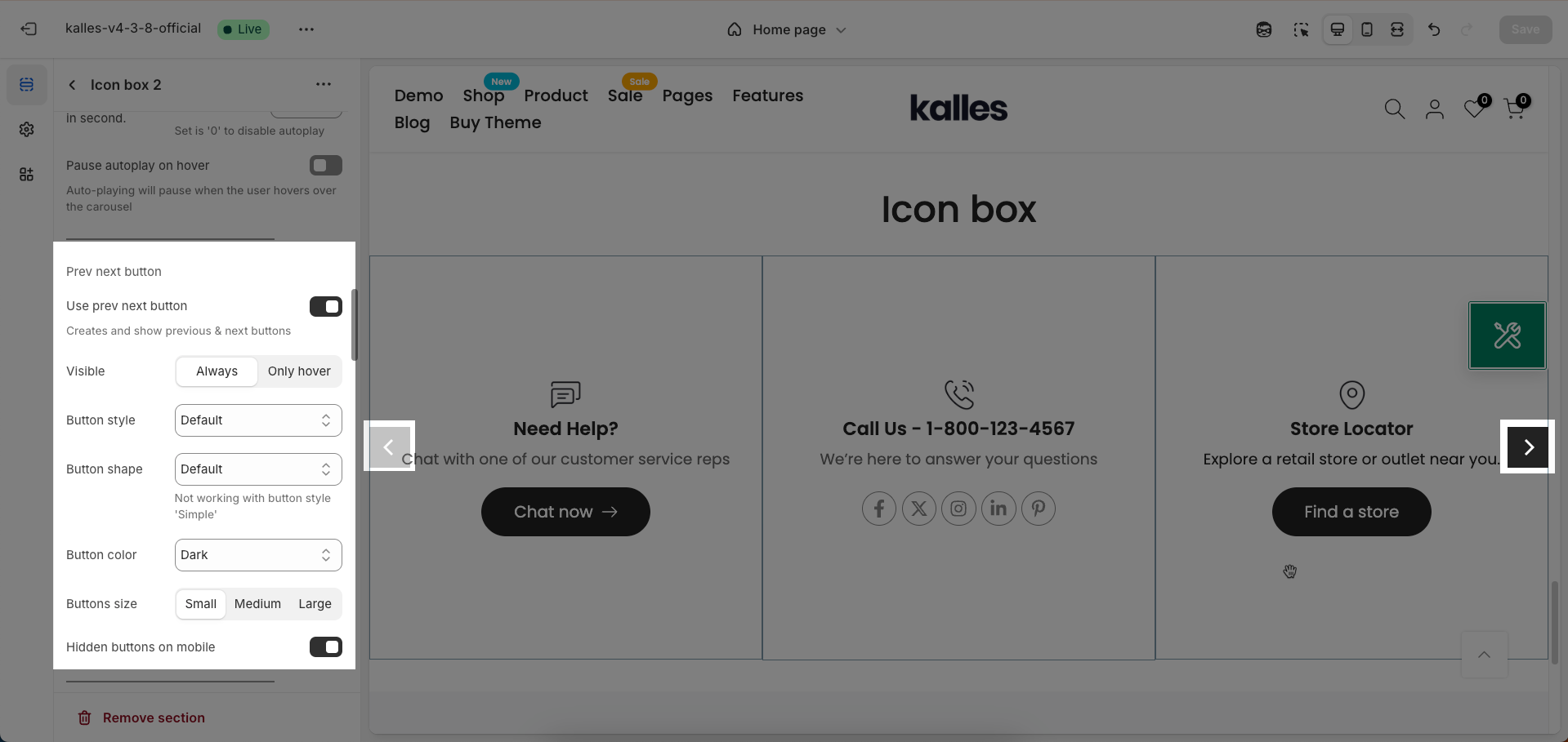
Use prev/next buttons: Enable this option to display "Previous" and "Next" navigation buttons on the carousel, allowing users to manually control the transition between items (slides).
Creates and show previous & next buttons
Visible: Determine when the "Previous/Next" buttons are visible
Always: The buttons will always be displayed on the carousel.
Only hover: The buttons will only appear when the user hovers their mouse over the carousel.
Button style: Select the visual style for the "Previous/Next" buttons
Default: The theme's standard button style.
Outline: A button style with only a border and no background color.
Simple: A minimalist button style, possibly just an icon or text.
Button shape: Select the shape of the "Previous/Next" buttons.
Default: The theme's default button shape (usually rectangular).
Round: A circular or rounded button shape.
Rotate: (Describe the rotation effect if applicable, e.g., the arrow icon may rotate on hover). If there's no specific rotation effect, you can describe it as "Default button shape with a potentially rotating arrow icon."
Not working with button style 'Simple'
Button color: Choose the color for the "Previous/Next" buttons. Select a color that is easily visible and complements the overall color scheme of the website.
Button size: Select the size of the "Previous/Next" buttons (small, medium, large) to match the carousel size and ensure easy interaction.
Hidden buttons on mobile: Enable this option to hide the "Previous/Next" buttons on mobile device screens. This can be useful for optimizing display space on smaller screens
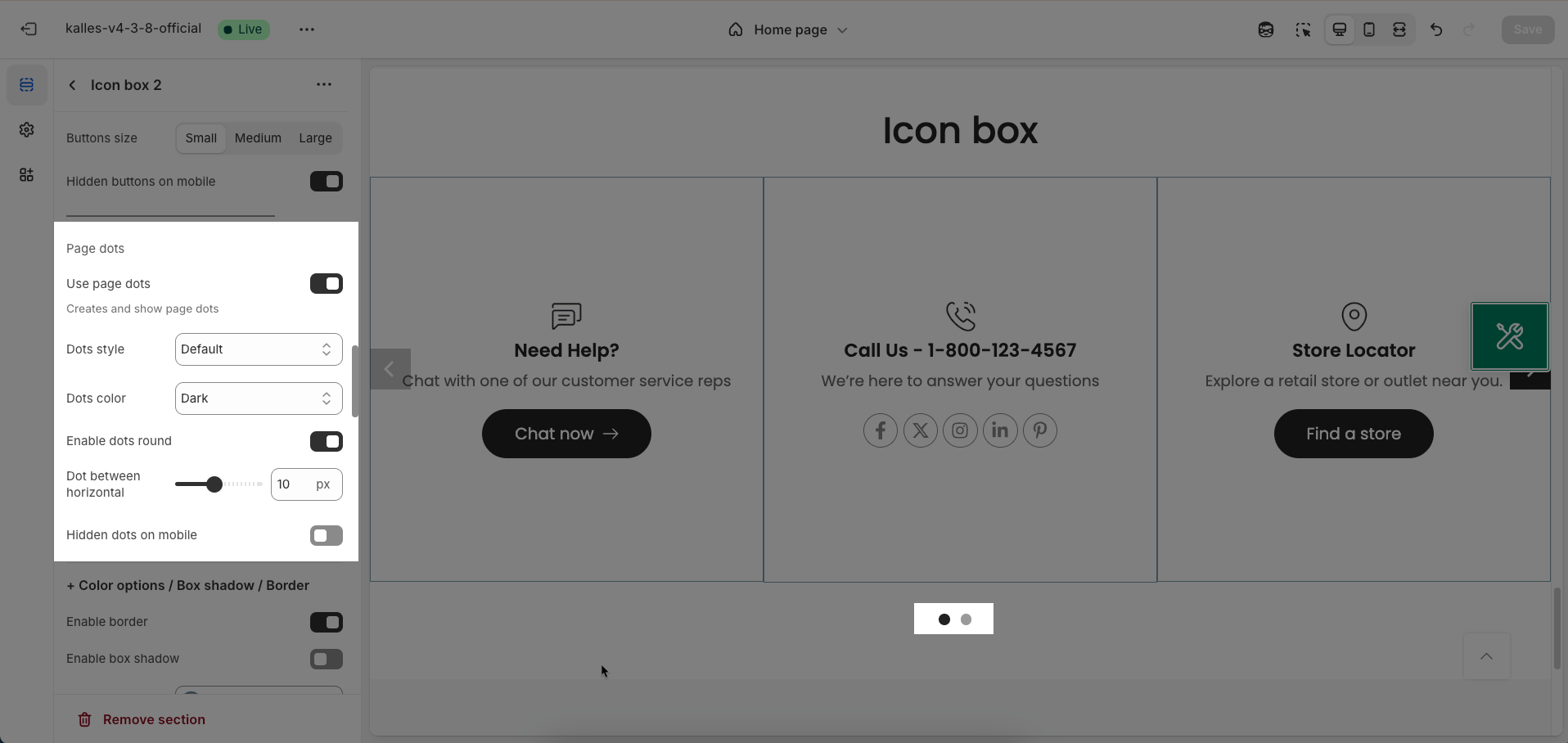
Use page dots: Enable this option to display dots below the carousel, indicating the number of slides and the user's current position.
Dots style: Select the visual style for the navigation dots.
Default: The theme's standard dot style (usually small colored circles).
Outline: A dot style with only a border and no background color.
Elessi: (If there's a specific style named Elessi, briefly describe its characteristics, e.g., "Small, elegant dot style with a unique transition effect"). If no specific information, you can describe it as "A distinctive dot style from the Elessi theme."
Dot color: Select the color for the dots. Options include:
Light (Best on dark background): A light color, suitable for dark backgrounds.
Dark: A dark color, suitable for light backgrounds.
Primary: The theme's primary color.
Custom color 1: The first custom color defined by the user.
Custom color 2: The second custom color defined by the user.
Enable dots round: Enable this option to make the dots have a circular shape. Disable this option if you want to use the theme's default shape (which might be small squares or rectangles).
Dot between horizontal: Adjust the horizontal spacing between the dots (usually in pixels or a relative unit). Increasing this value will create more space between the dots.
Hidden dots on mobile: Enable this option to hide the navigation dots on mobile device screens.
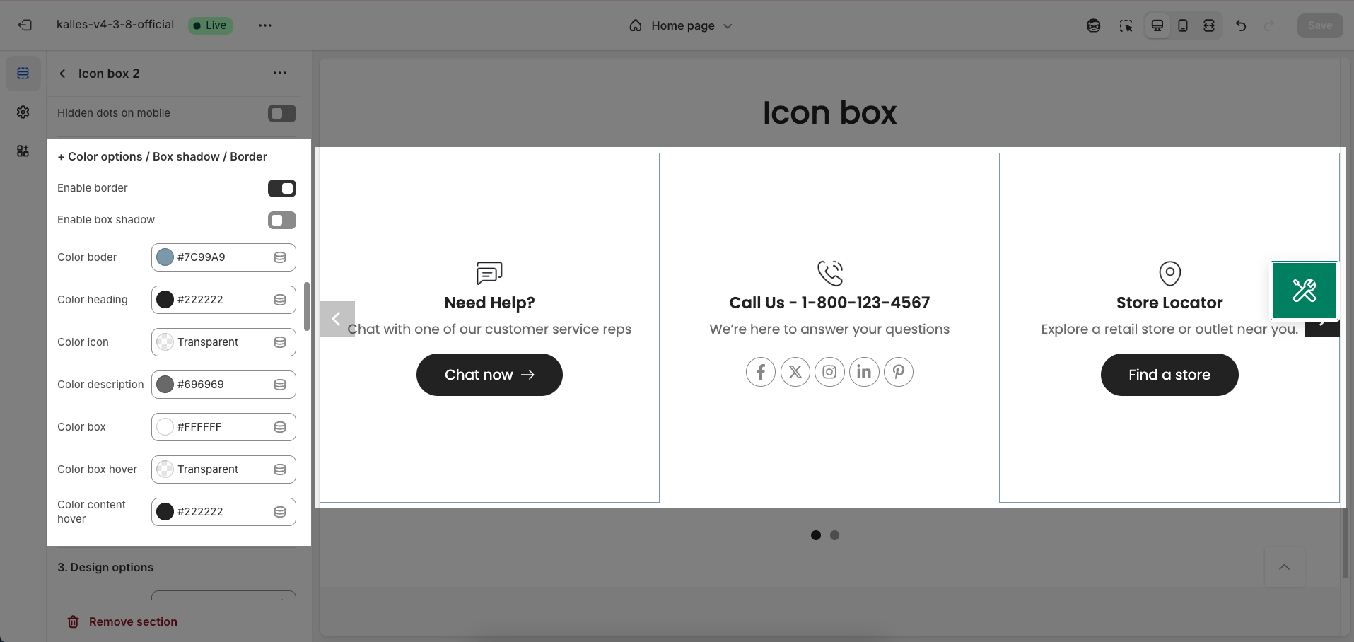
Color options / Box shadow / Border
Enable border: Enable this option to display a border around the element. You can customize the color, thickness, and style of the border using other options.
Enable box shadow: Enable this option to add a box shadow effect around the element, creating a sense of prominence and adding depth to the interface.
Color border: Choose the color for the border of the element. Select a color that complements the overall color scheme and provides clear separation from the background.
Color heading: Choose the color for the heading text within the element.
Color icon: Choose the color for the icon within the element.
Color description: Choose the color for the description text within the element.
Color box: Choose the background color for the entire container (box) of the element.
Color box hover: Choose the background color for the element's container when a user hovers their mouse over it. This effect provides visual feedback on interaction.
Color content hover: Choose the color for the content (e.g., heading, icon, description) within the element when a user hovers their mouse over it.
2.2.3. Design options
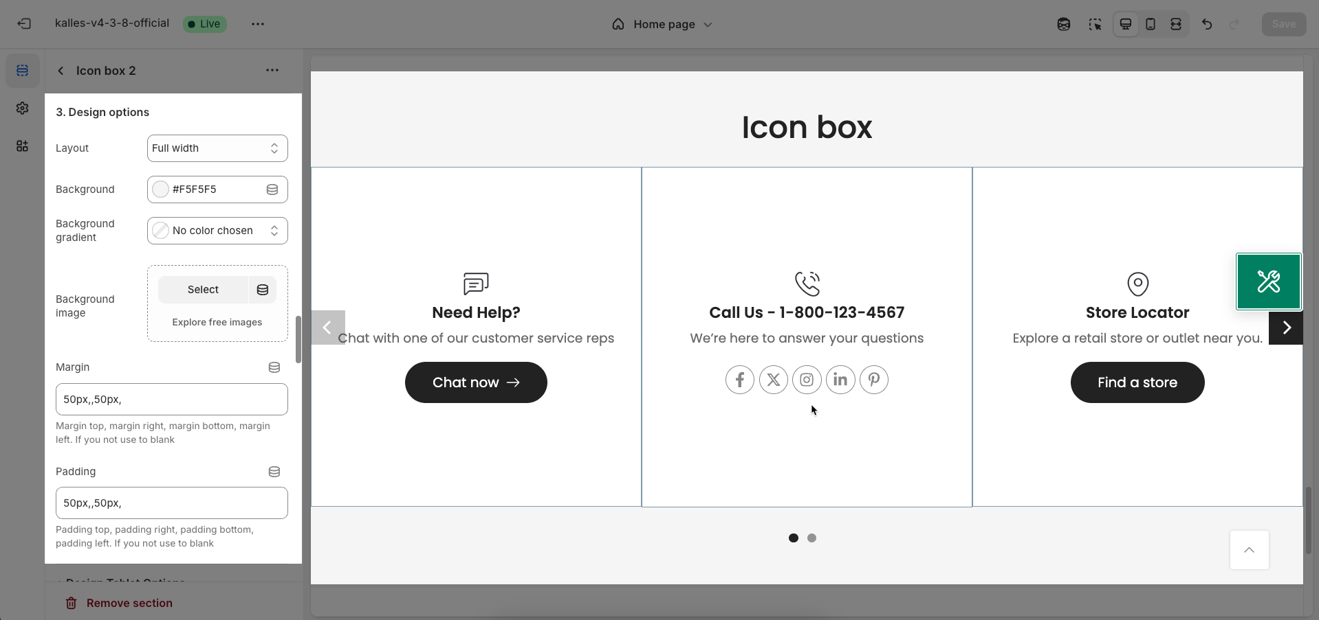
Layout: Select the width layout style for the section.
Container: The section will have a fixed maximum width, typically matching the website's main content width, and will be centered on the screen.
Wrapped container: Similar to "Container" but may include default padding or margin on both sides, creating whitespace around the content.
Full width: The section will span the entire horizontal width of the browser viewport.
Background: Select the background style for the section.
Background gradient: Allows you to set up a smooth color transition effect for the section's background.
Background image: Allows you to upload an image to use as the section's background.
Margin: Set the whitespace (margin) around the section. You can customize the margin for the top, bottom, left, and right edges separately
Margin top, margin right, margin bottom, margin left. If you not use to blank
Padding: Set the internal whitespace (padding) within the section, between the section's border and its inner content.
Padding top, padding right, padding bottom, padding left. If you not use to blank
Design Tablet/Mobile Options
Margin: Set the whitespace (margin) around the section for Tablet/Mobile screens. You can customize the margin for the top, bottom, left, and right edges separately
Padding: Set the internal whitespace (padding) within the section for Tablet/Mobile screens, between the section's border and its inner content.
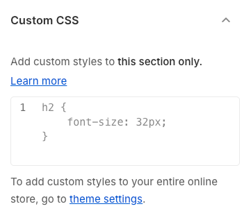
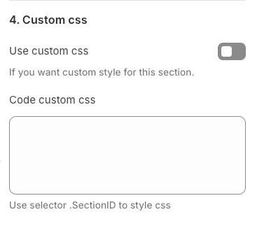
2.2.4. Custom CSS for this section
Use custom CSS: Enable this option if you want to apply unique CSS styles to this section, beyond the available configuration options. This allows for advanced interface customization.
Code custom CSS: Enter your custom CSS code here. To ensure these styles only apply to the current section, use the
.SectionIDclass selector
2.2.5. Theme Settings
Enter link socials here!
2.2.6. Custom CSS
Add custom styles to this section only.
To add custom styles to your entire online store.