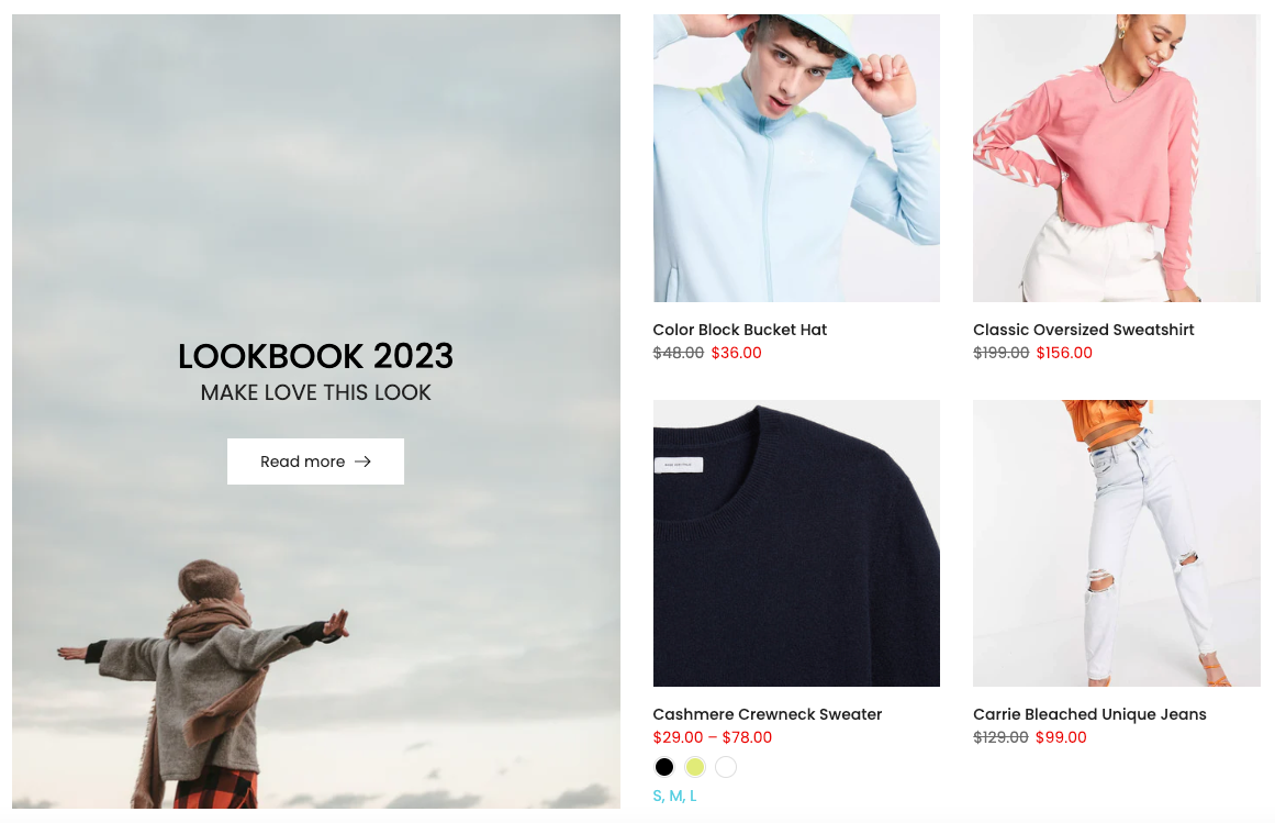
These sections allow you to show the products with banner and you can choose a grid, carousel layout for the products.
1. Products with banner
You can go to Theme sections > Add section > add Products With Banner to configure it.
1.1. Products with banner content
Banner Item (parent)
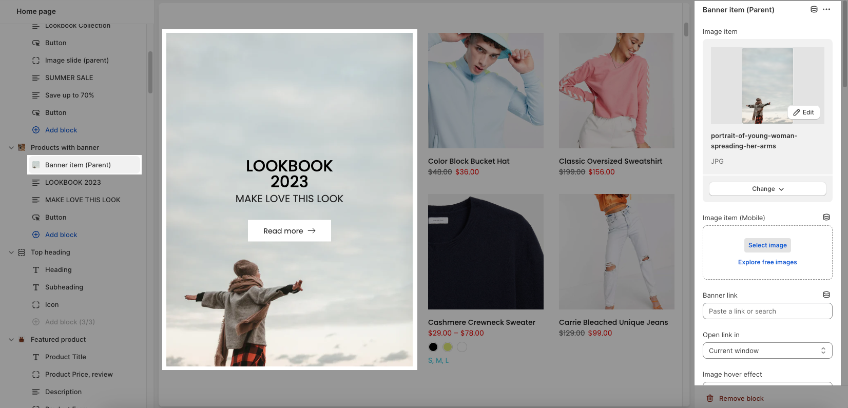
You can freely add the banner for the section and customize it with many design options.
Upload different images for desktop and mobile versions
Banner link and Open link in
Choose an effect when hover image and banner
Content align, Content vertical/horizontal position, Content padding
Background content, Border content
You can check this video:
Other blocks (Child)
This section provides you with many blocks such as: Text, HTML, Image (Child), Button, Countdown timer, Form Newsletter, Space HTML.
You can check this video to know more:
1.2. Product With Banner 2 settings
GENERAL OPTIONS
Collection position: choose position left or right for the product items
You can select a collection, product item design and decide to show product vendors, product countdown for the product item in the section or not.
OPTIONS IMAGE PRODUCTS
It helps you configure the image collections with options for Image ratio, Image size and Image position, Product content align, Maximum products to show, Items per row (both on Desktop, Tablet and Mobile devices), Space horizontal items, Space vertical items
Please check this video to know more:
BOX OPTIONS and OPTIONS FOR CAROUSEL LAYOUT
You can select Layout design for the section.
Turn on the Enable loop when using a carousel layout and then you can also set the Autoplay speed in second and Pause autoplay on hover
Turn on the Use prev next button option and you can configure the prev/next button
Turn on the Use page dots option and you can configure the section for the dots
Please check video below to know more:
DESIGN OPTIONS
Please follow this guideline to config Layout, Background, Margin/Padding for the section.
2. Products with banner 2
This section allows you to show the products with banner and you can choose a grid, carousel layout for the products.
You can go to Theme sections > Add section > add Products With Banner 2 to configure it.
2.1. Banner Item (parent)
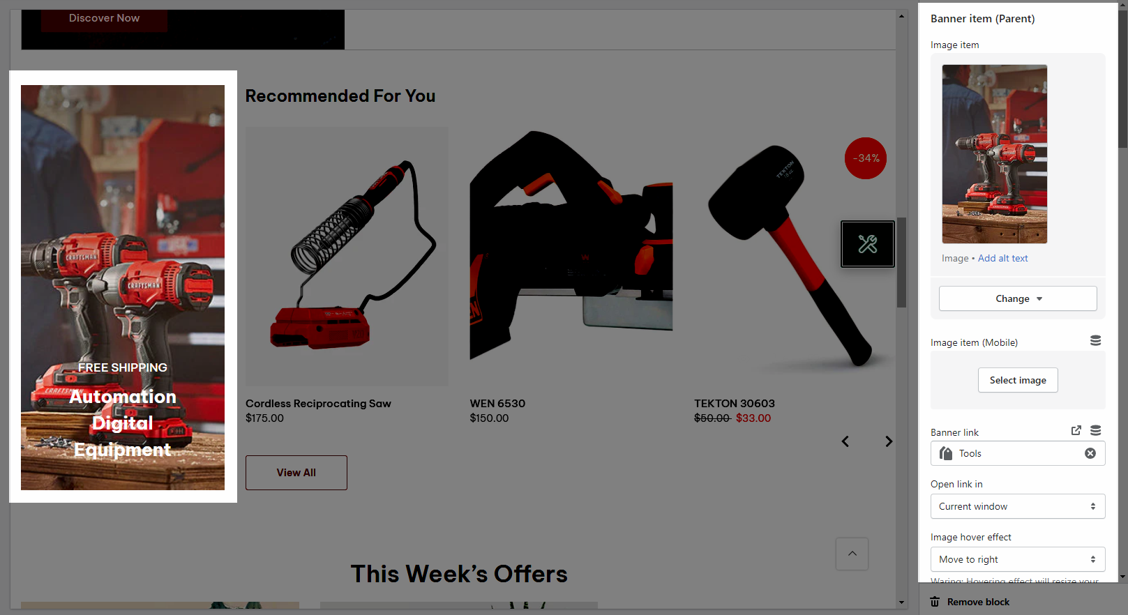
You can freely add the banner for the section and customize it with many design options.
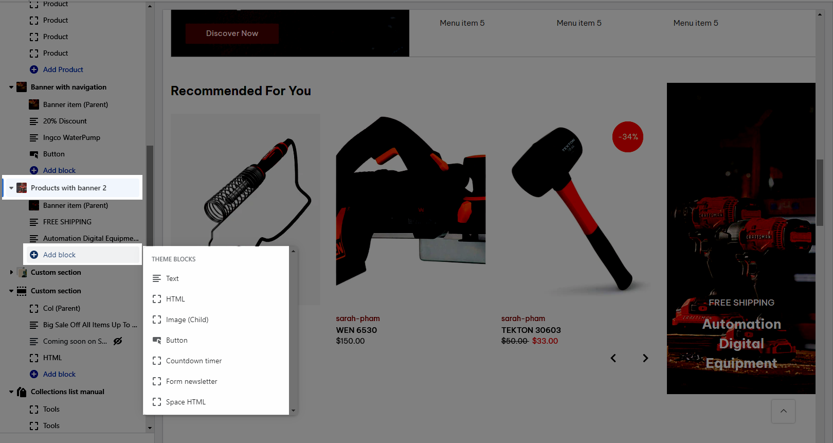
This section provides you with many blocks such as:
Text
HTML
Image (Child)
Button
Countdown timer
Form Newsletter
Space HTML
2.2. Product With Banner 2 settings
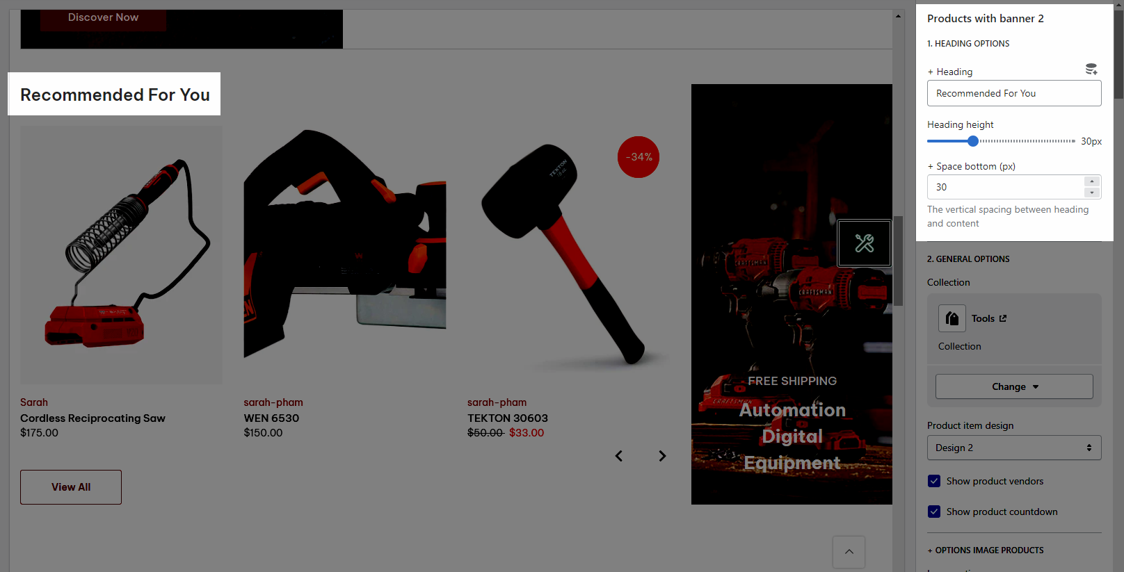
HEADING OPTIONS
You can freely add the section heading and customize the Space bottom (px) for it.
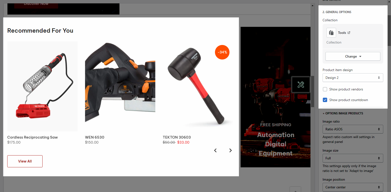
GENERAL OPTIONS
You can select a collection, product item design and decide to show product vendors, product countdown for the product item in the section or not.
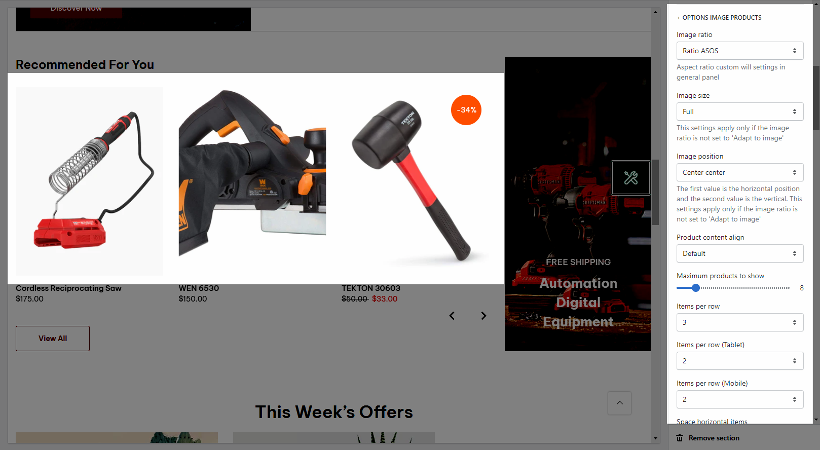
OPTIONS IMAGE PRODUCTS
It helps you configure the image collections with options for Image ratio, Image size and Image position, Product content align, Maximum products to show, Items per row (both on Desktop, Tablet and Mobile devices), Space horizontal items, Space vertical items
BOX OPTIONS and OPTIONS FOR CAROUSEL LAYOUT
You can select Layout design and Banner position for the section.
Turn on the Enable loop when using a carousel layout and then you can also set the Autoplay speed in second and Pause autoplay on hover
Turn on the Use prev next button option and you can configure the prev/next button
Turn on the Use page dots option and you can configure the section for the dots
Please check video below to know more:
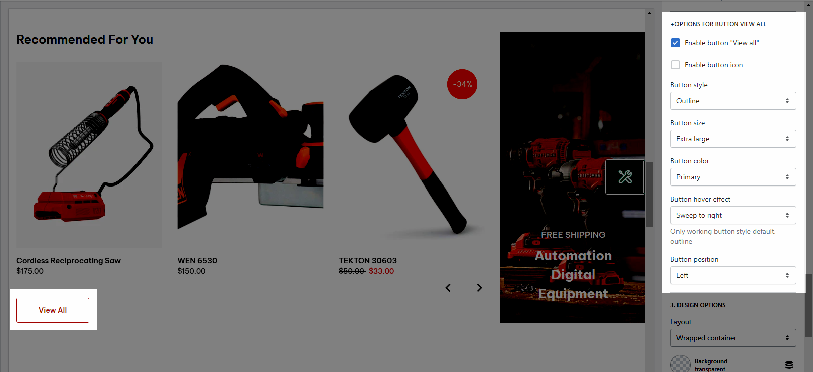
OPTIONS FOR BUTTON VIEW ALL
It helps you configure the "view all" button and customize it with many design options.
DESIGN OPTIONS
Please follow this guideline to config Layout, Background, Margin/Padding for the section.
3. Products with banner 3
You can go to Theme sections > Add section > Search and add Products With Banner 3 to configure it.
3.1. Products With Banner 3 content
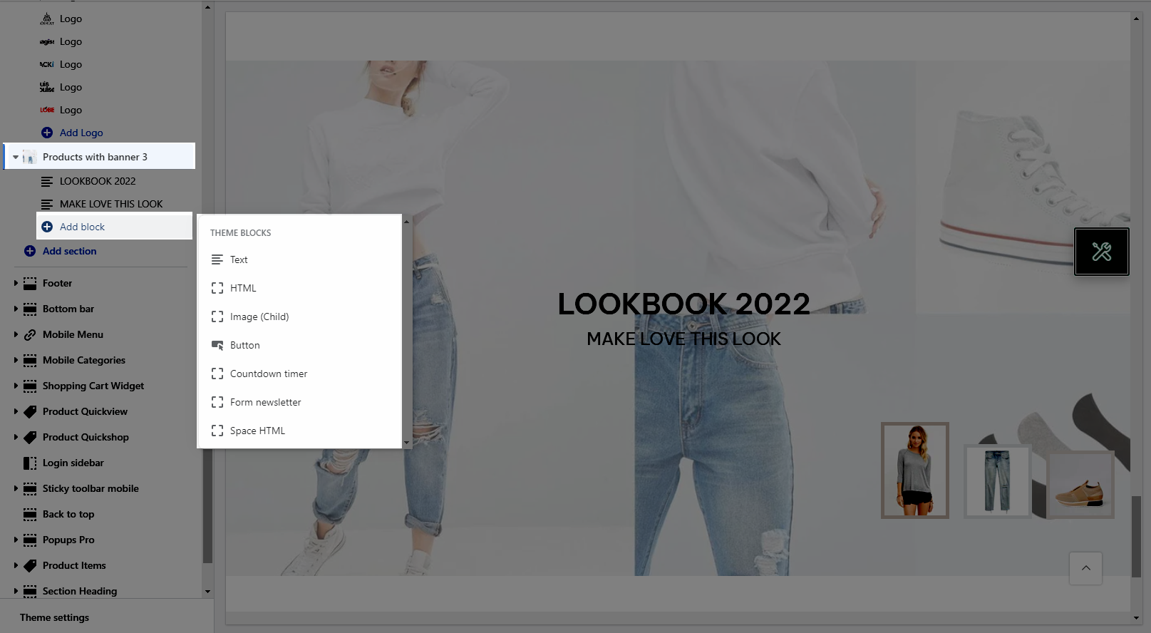
This section provides you with many blocks such as:
Text
HTML
Image (Child)
Button
Countdown timer
Form Newsletter
Space HTML
3.2. Products With Banner 3 settings
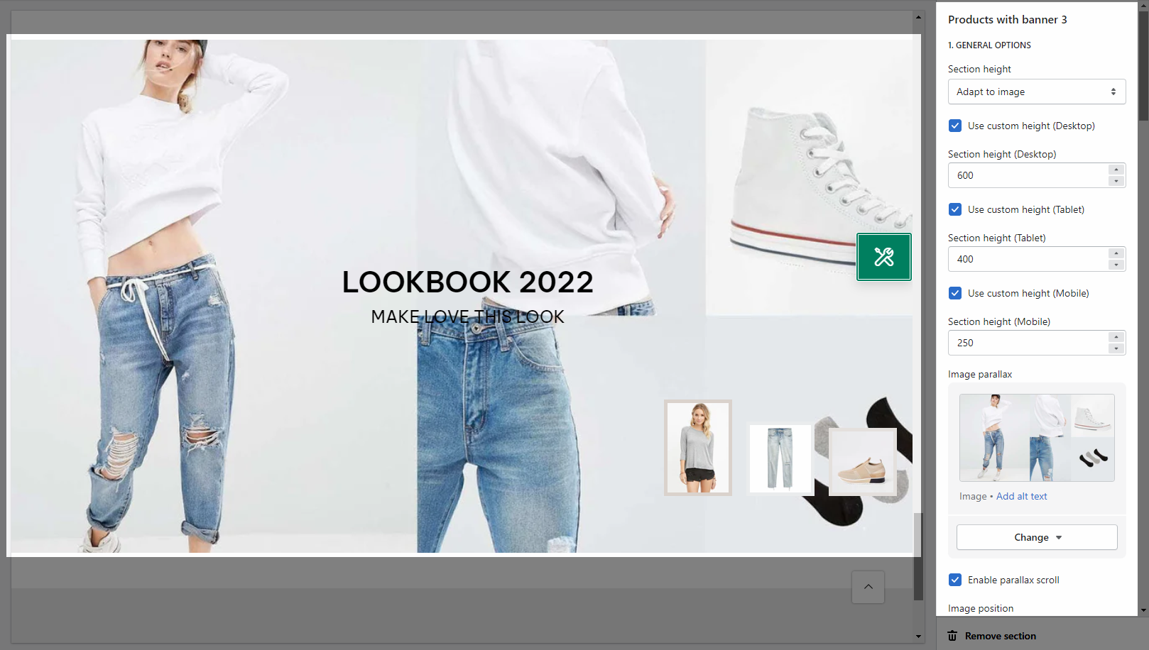
GENERAL OPTIONS
You can freely add the image and customize it with many design options.
CONTENT BACKGROUND, COLOR OPTIONS
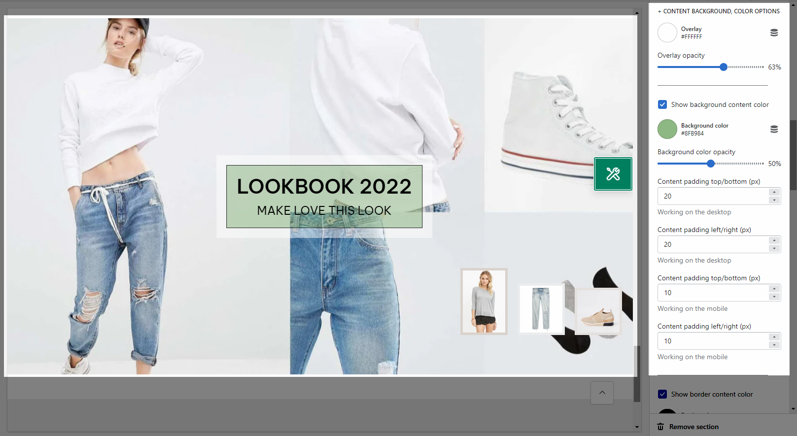
Helps you configure the style of the content color & content background color with options for Overlay color, Overlay opacity, Background color, Background color opacity.
You can also change the Content padding top/bottom (px), Content padding left/right (px) for both on Moblile & Desktop
Use border content: Turn on this option to use the border content. And you can change the Border color, Background border, Border opacity, Border style and Borderr Padding.
GENERAL SETTINGS
You can add the products that you want it to show on the section
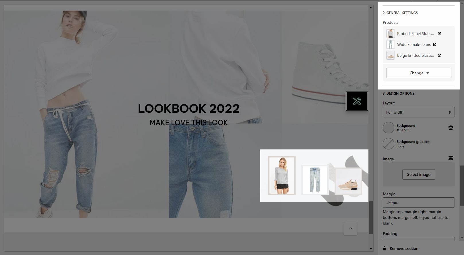
DESIGN OPTIONS
Please follow this guideline to config Layout, Background, Margin/Padding for the section.


