


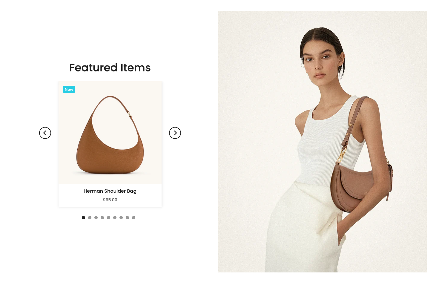
Versatile "Products with Banner" Section: Enables the display of a prominent promotional banner alongside a curated list of products. Ideal for showcasing promotions, new collections, or products related to the banner's message. Easily customize the banner's position (above, below, left, right) relative to the product list.
1. How to access Products with banner 4 section?
Step 01: From Shopify Admin, click on Online Store > Select Themes > In the Current theme section, click the Customize button.
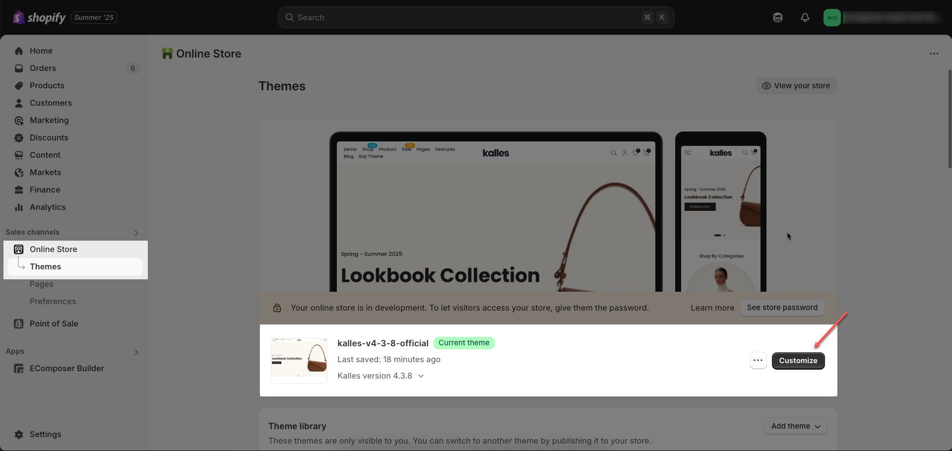
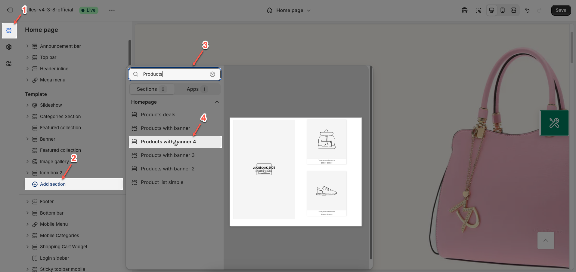
Step 02: In the theme editor (Customize), click the Sections button > Click the Add Section button or hover below another section until the (➕) icon appears > In the Sections tab, scroll through the list or use the search bar to find and select Products with banner 4.
2. How to customize Products with banner 4 section?
2.1. Products with banner 4 section
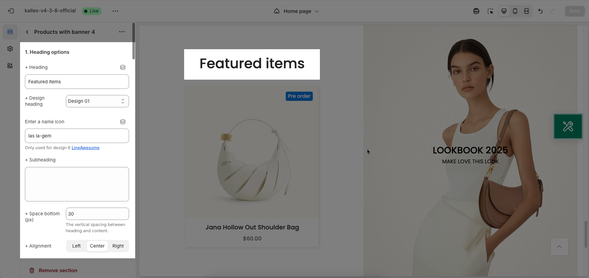
After adding the Products with banner 4 section, you can customize its settings in the left or right sidebar (depending on your screen size)
2.1.1. Heading options
Heading: Enter the main heading text you want to display for this section. This heading is typically used to introduce the content or purpose of the section.
Design heading: Select a pre-designed style for the heading. This option allows for quick application of common heading decorations without complex CSS customization.
Enter a name icon: Enter the icon class name from the integrated icon library (e.g., Font Awesome, Shopify Icons). The icon will be displayed next to the heading, enhancing visual appeal and recognition
Only used for design 6 LineAwesome
Subheading: Enter the subheading text to provide additional details or context for the main heading. The subheading is typically smaller in size and less prominent than the main heading.
Space bottom (px): Enter the spacing value (padding or margin bottom) in pixels between the heading (and subheading if present) and the content below it
The vertical spacing between heading and content.
Alignment: Choose the alignment for the heading (and subheading if present) within its container. Common options include left, center, and right alignment, helping to create a balanced layout that fits the section's overall design.
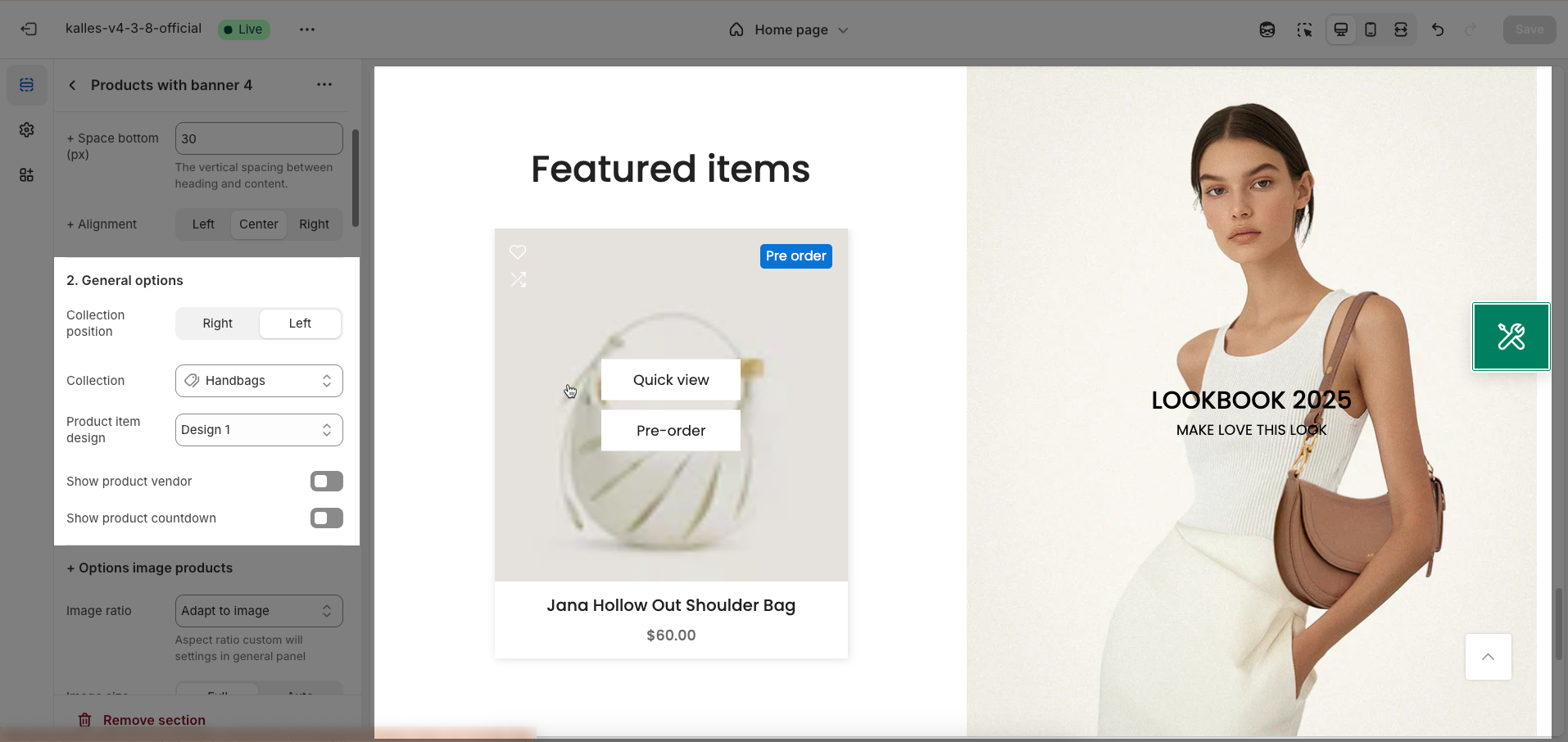
2.1.2. General options
Collection position (right, left): Determines the display position of the collection information relative to the product list within the section.
Collection: Select the specific collection whose products you want to display in this section.
Product item design: Choose the display style for each product item in the list. Options may include the arrangement of the image, title, price, buy button, and other elements.
Show product vendor: Toggle the option to display the product's vendor name above or next to the product title.
Show product countdown: Enable the option to display a countdown timer for products that are on sale with an end date.
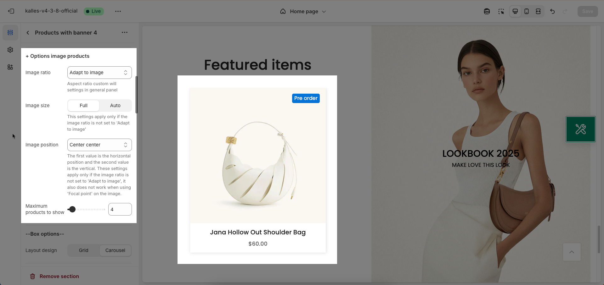
Options image products
Image ratio: Set the aspect ratio (Adapt to image, Square, Landscape,...) for product images displayed in the section
Aspect ratio custom will settings in general panel
Image size: Determine how the product image size is displayed within its container.
Full: The image will attempt to fill the entire container, potentially leading to cropping to fit the selected aspect ratio.
Auto: The image size will automatically adjust to display its entire content without cropping, potentially resulting in containers with varying dimensions depending on the image's original aspect ratio.
This settings apply only if the image ratio is not set to 'Adapt to image'
Image position: Choose the display position of the product image relative to other information within each product item.
The first value is the horizontal position and the second value is the vertical. These settings apply only if the image ratio is not set to 'Adapt to image', it also does not work when using 'Focal point' on the image.
Maximum products to show: Define the maximum number of products to display in this section. This option is useful for controlling the length of the section and ensuring page load performance
Box options
Layout design: Select the display layout style for this section. You can choose between a grid to display items in a row-and-column structure, or a carousel to display items horizontally, allowing for scrolling or sliding.
Options for carousel layout
Enable loop: Enable this option to make the carousel automatically loop, meaning that when it reaches the last item, it will automatically return to the first item.
At the end of cells, wrap-around to the other end for infinite scrolling
Autoplay speed in seconds: Enter the number of seconds that each item (slide) will be displayed before the carousel automatically transitions to the next item.
Set is '0' to disable autoplay
Pause autoplay on hover: Enable this option to pause autoplay when the user hovers their mouse over the carousel
Auto-playing will pause when the user hovers over the carousel
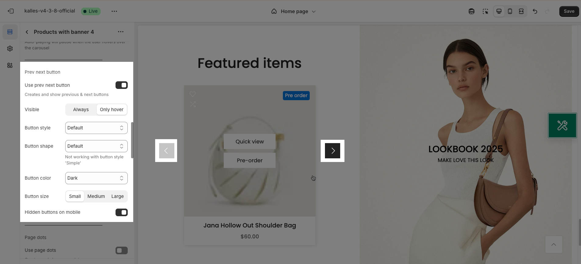
Use prev/next buttons: Enable this option to display "Previous" and "Next" navigation buttons on the carousel, allowing users to manually control the transition between items (slides).
Creates and show previous & next buttons
Visible: Determine when the "Previous/Next" buttons are visible
Always: The buttons will always be displayed on the carousel.
Only hover: The buttons will only appear when the user hovers their mouse over the carousel.
Button style: Select the visual style for the "Previous/Next" buttons
Default: The theme's standard button style.
Outline: A button style with only a border and no background color.
Simple: A minimalist button style, possibly just an icon or text.
Button shape: Select the shape of the "Previous/Next" buttons.
Default: The theme's default button shape (usually rectangular).
Round: A circular or rounded button shape.
Rotate: (Describe the rotation effect if applicable, e.g., the arrow icon may rotate on hover). If there's no specific rotation effect, you can describe it as "Default button shape with a potentially rotating arrow icon."
Not working with button style 'Simple'
Button color: Choose the color for the "Previous/Next" buttons. Select a color that is easily visible and complements the overall color scheme of the website.
Button size: Select the size of the "Previous/Next" buttons (small, medium, large) to match the carousel size and ensure easy interaction.
Hidden buttons on mobile: Enable this option to hide the "Previous/Next" buttons on mobile device screens. This can be useful for optimizing display space on smaller screens
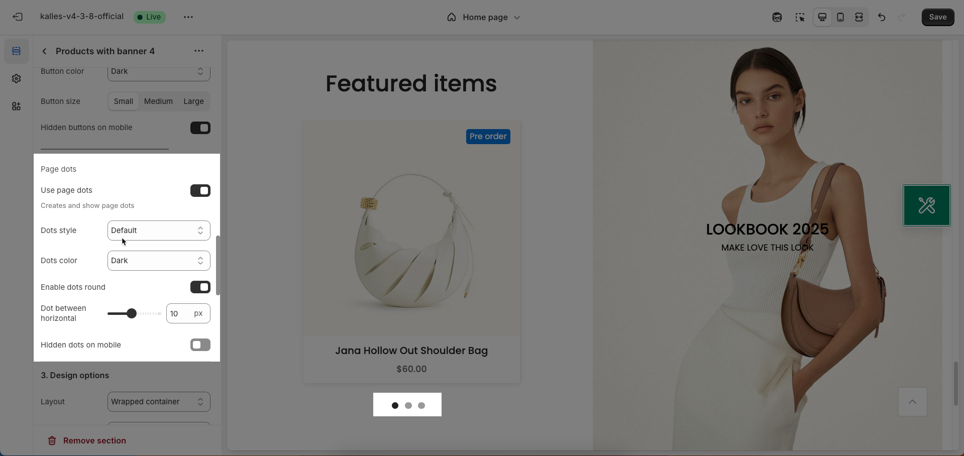
Use page dots: Enable this option to display dots below the carousel, indicating the number of slides and the user's current position.
Dots style: Select the visual style for the navigation dots.
Default: The theme's standard dot style (usually small colored circles).
Outline: A dot style with only a border and no background color.
Elessi: (If there's a specific style named Elessi, briefly describe its characteristics, e.g., "Small, elegant dot style with a unique transition effect"). If no specific information, you can describe it as "A distinctive dot style from the Elessi theme."
Dot color: Select the color for the dots. Options include:
Light (Best on dark background): A light color, suitable for dark backgrounds.
Dark: A dark color, suitable for light backgrounds.
Primary: The theme's primary color.
Custom color 1: The first custom color defined by the user.
Custom color 2: The second custom color defined by the user.
Enable dots round: Enable this option to make the dots have a circular shape. Disable this option if you want to use the theme's default shape (which might be small squares or rectangles).
Dot between horizontal: Adjust the horizontal spacing between the dots (usually in pixels or a relative unit). Increasing this value will create more space between the dots.
Hidden dots on mobile: Enable this option to hide the navigation dots on mobile device screens.
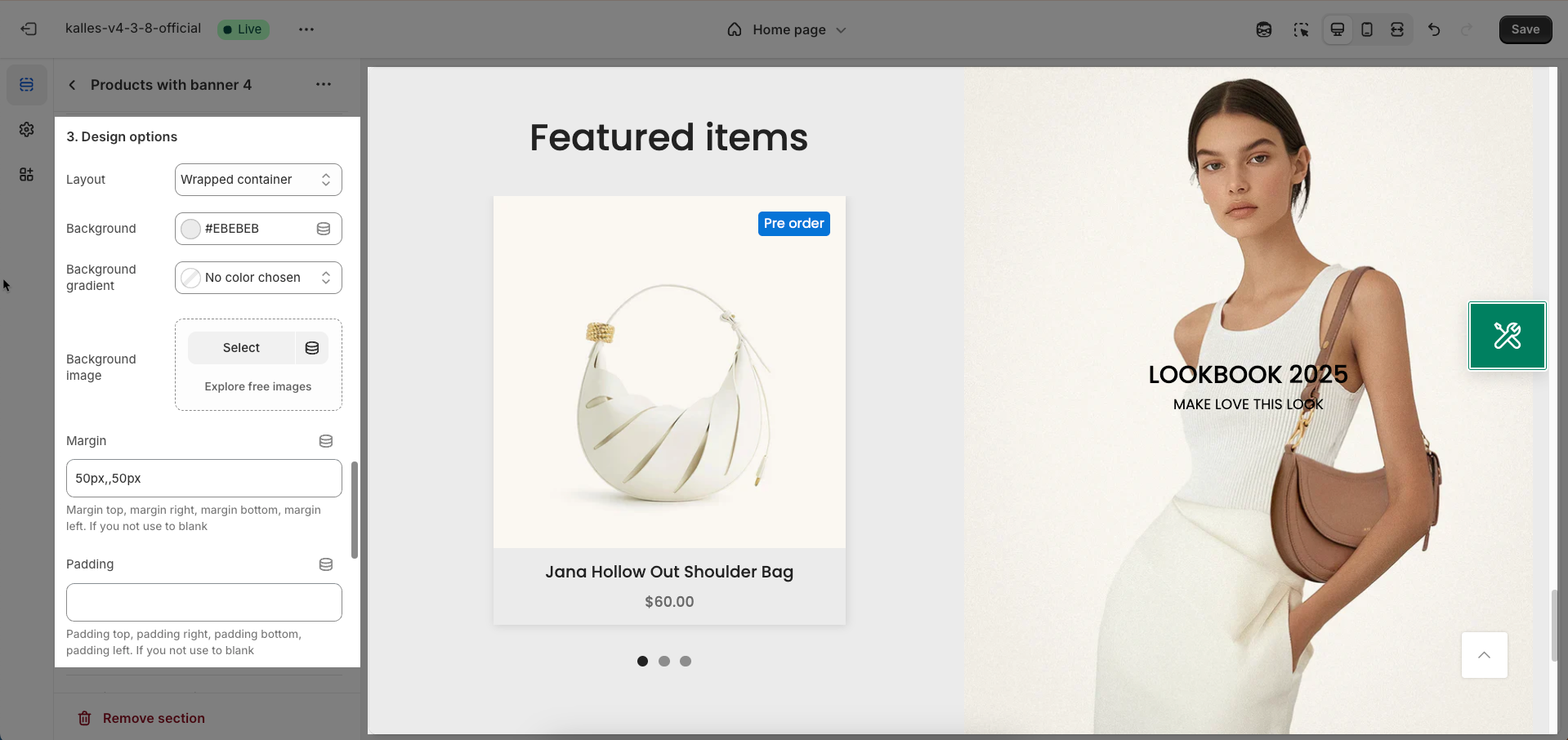
2.1.3. Design options
Layout: Select the width layout style for the section.
Container: The section will have a fixed maximum width, typically matching the website's main content width, and will be centered on the screen.
Wrapped container: Similar to "Container" but may include default padding or margin on both sides, creating whitespace around the content.
Full width: The section will span the entire horizontal width of the browser viewport.
Background: Select the background style for the section.
Background gradient: Allows you to set up a smooth color transition effect for the section's background.
Background image: Allows you to upload an image to use as the section's background.
Margin: Set the whitespace (margin) around the section. You can customize the margin for the top, bottom, left, and right edges separately
Margin top, margin right, margin bottom, margin left. If you not use to blank
Padding: Set the internal whitespace (padding) within the section, between the section's border and its inner content.
Padding top, padding right, padding bottom, padding left. If you not use to blank
Design Tablet/Mobile Options
Margin: Set the whitespace (margin) around the section for Tablet/Mobile screens. You can customize the margin for the top, bottom, left, and right edges separately
Padding: Set the internal whitespace (padding) within the section for Tablet/Mobile screens, between the section's border and its inner content.
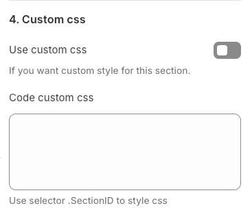
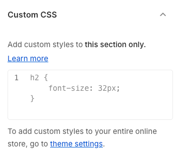
2.1.4. Custom CSS for this section
Use custom CSS: Enable this option if you want to apply unique CSS styles to this section, beyond the available configuration options. This allows for advanced interface customization.
Code custom CSS: Enter your custom CSS code here. To ensure these styles only apply to the current section, use the
.SectionIDclass selector
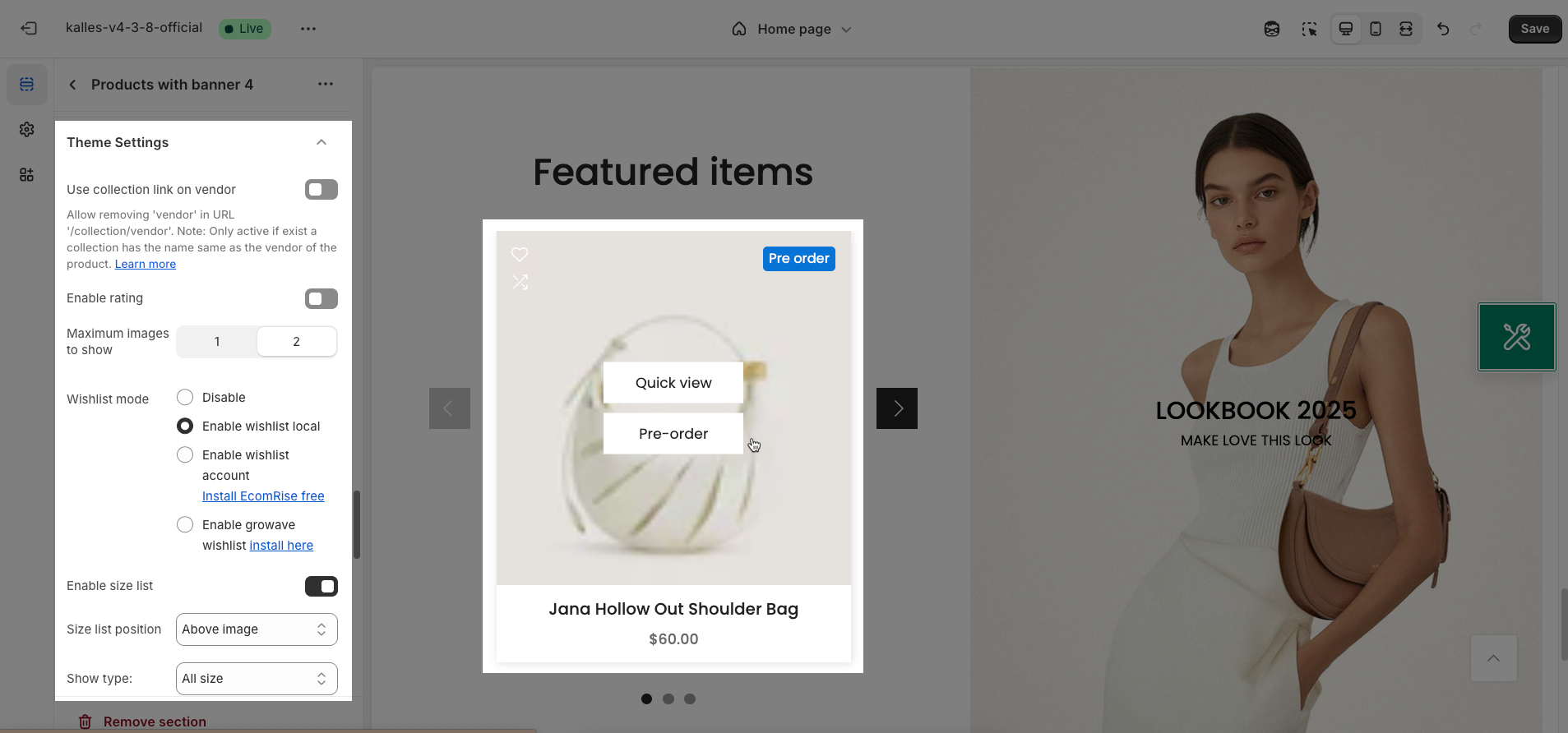
2.1.5. Theme Settings
Use collection link on vendor: Enable this option to link the vendor name on the product page to a collection page that has the same name as the vendor (if such a collection exists).
Allow removing 'vendor' in URL '/collection/vendor'. Note: Only active if exist a collection has the name same as the vendor of the product. Learn more
Enable rating: Enable this option to display the average product rating (e.g., star rating) on the product page and in product listings.
Maximum images to show: Define the maximum number of product images to display on the product page
Wishlist mode: Choose how the wishlist feature operates
Disable: Completely disable the wishlist feature.
Enable wishlist local: Allows customers to add products to a wishlist stored locally in their browser (usually using local storage)
Enable wishlist account: Enables the wishlist feature requiring an account and suggests installing the free EcomRise Wishlist app to manage logged-in customers' wishlists.
Enable Growave wishlist: Enables the wishlist feature and provides instructions to install the Growave Wishlist app
Enable size list: Enable this option to display a list of available sizes for the product (if the product has size variants).
Size list position: Determine the display position of the size list on the product page. You can choose to show it above the product image or below the product information
Show type: Choose the type of sizes to display in the size list.
All size: Display all configured sizes for the product, including those currently out of stock.
Only size available: Display only the sizes that are currently in stock.
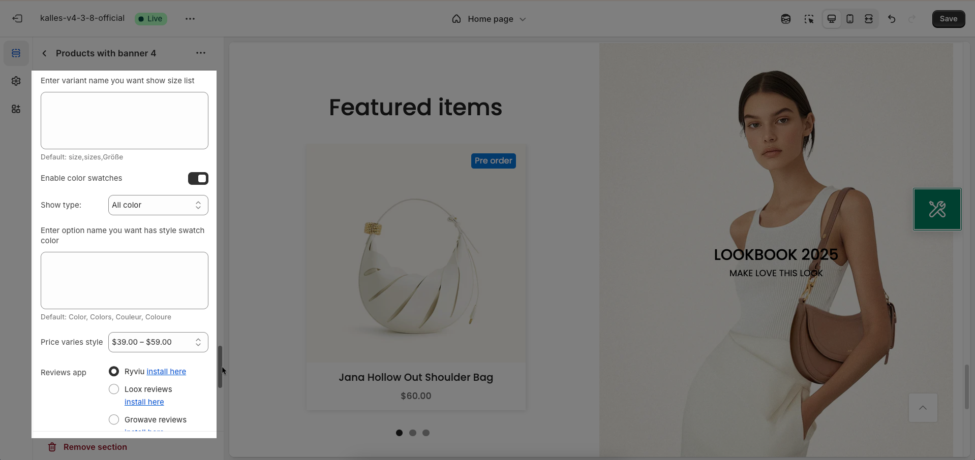
Enter variant name you want show size list: Enter the name of the variant option that you want to display as a size list
Default: size,sizes,Größe
Enable color swatches: Enable this option to display color swatches instead of a dropdown list for the product's color variants.
Price varies style: Choose the display style when the product price varies depending on the variant
Reviews app: Select the product review app you are using to integrate review display on the product page
Ryviu install here
Loox reviews install here
Growave reviews install here
LAI reviews install here
Other app Instructions here
Only show price varies of variants available: Enable this option to only display the "Price varies" message when at least one variant of the product is in stock
Placeholder for product no image: Upload a placeholder image that will be displayed when a product does not have any images set up.
Show currency codes: Enable this option to display currency codes (e.g., USD, VND, EUR) next to product prices. This option is useful for stores selling in multiple currencies.
2.1.6. Custom CSS
Add custom styles to this section only.
To add custom styles to your entire online store.
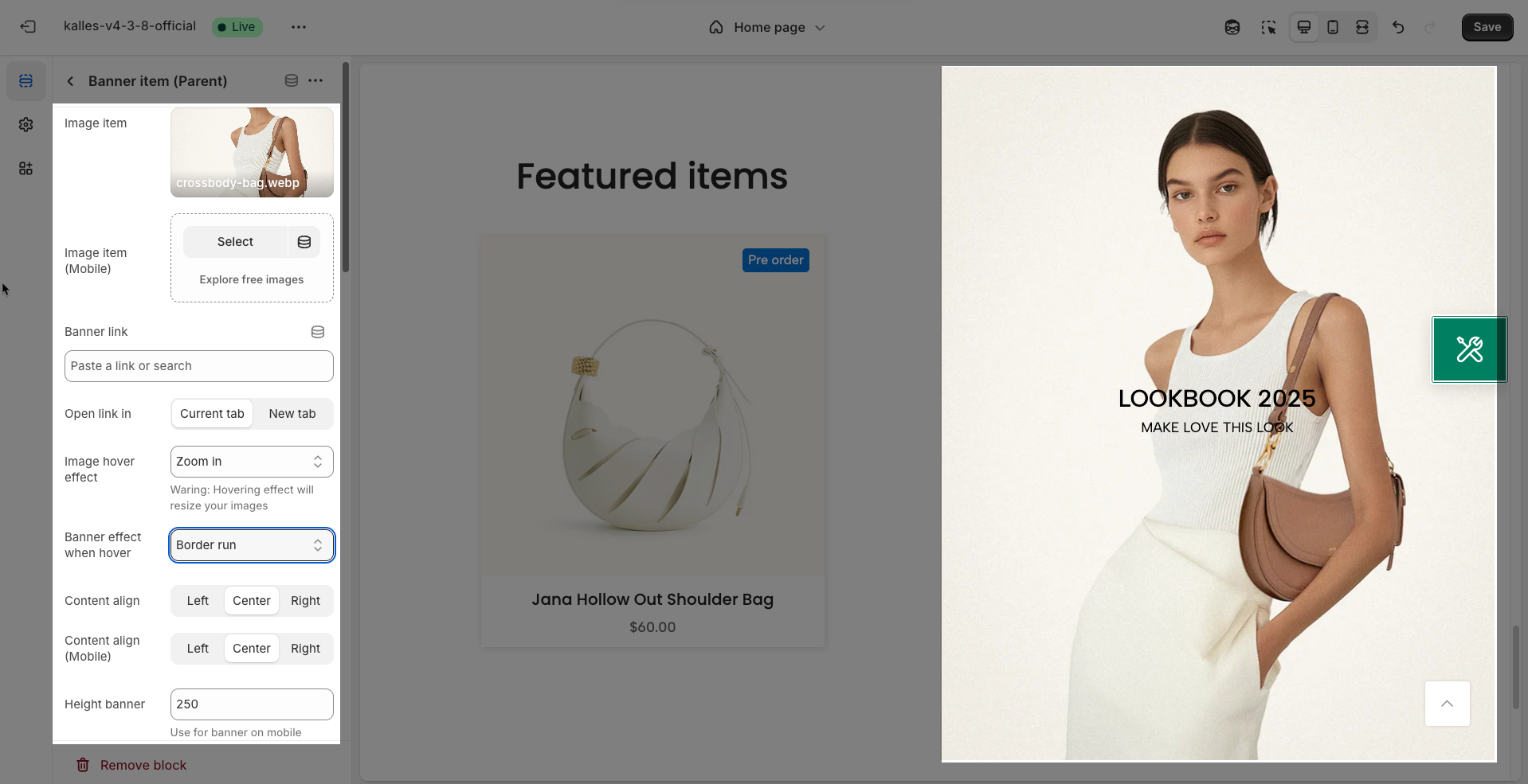
2.2. Banner item block
To add a Banner item block to the Products with banner 4, click the Add Banner item button (plus icon ➕) under the Products with banner 4.
Once the Banner item block is added, you can customize its settings in the left or right-hand sidebar (depending on your screen size).
Image item: Upload the banner image for desktop screens. Choose a high-resolution image with dimensions suitable for the section's layout.
Image item (Mobile): Upload a separate banner image for mobile device screens. This option allows you to provide an optimized image version for smaller screens
Banner link: Enter the destination URL that users will be redirected to when they click on the banner.
Open link in (Current tab, New tab): Choose how the link will open. "Current tab" will load the new page in the current tab, replacing the current page. "New tab" will open the new page in a new tab or window.
Image hover effect: Select the effect displayed when users hover their mouse over the banner image. These effects can include Zoom in, Rotate, Move to top, Move to right,...
Waring: Hovering effect will resize your images
Banner effect when hover: Select the effect displayed for the entire banner area on hover. This option allows you to create more engaging interactions
Content align (Left, Center, Right): Select the horizontal alignment of the content within the banner.
Content align (Mobile): Select the horizontal alignment of the content within the banner on mobile devices
Height banner: Enter the desired height for the banner (usually in pixels). This helps control the banner's size and ensures it fits within the page's layout.
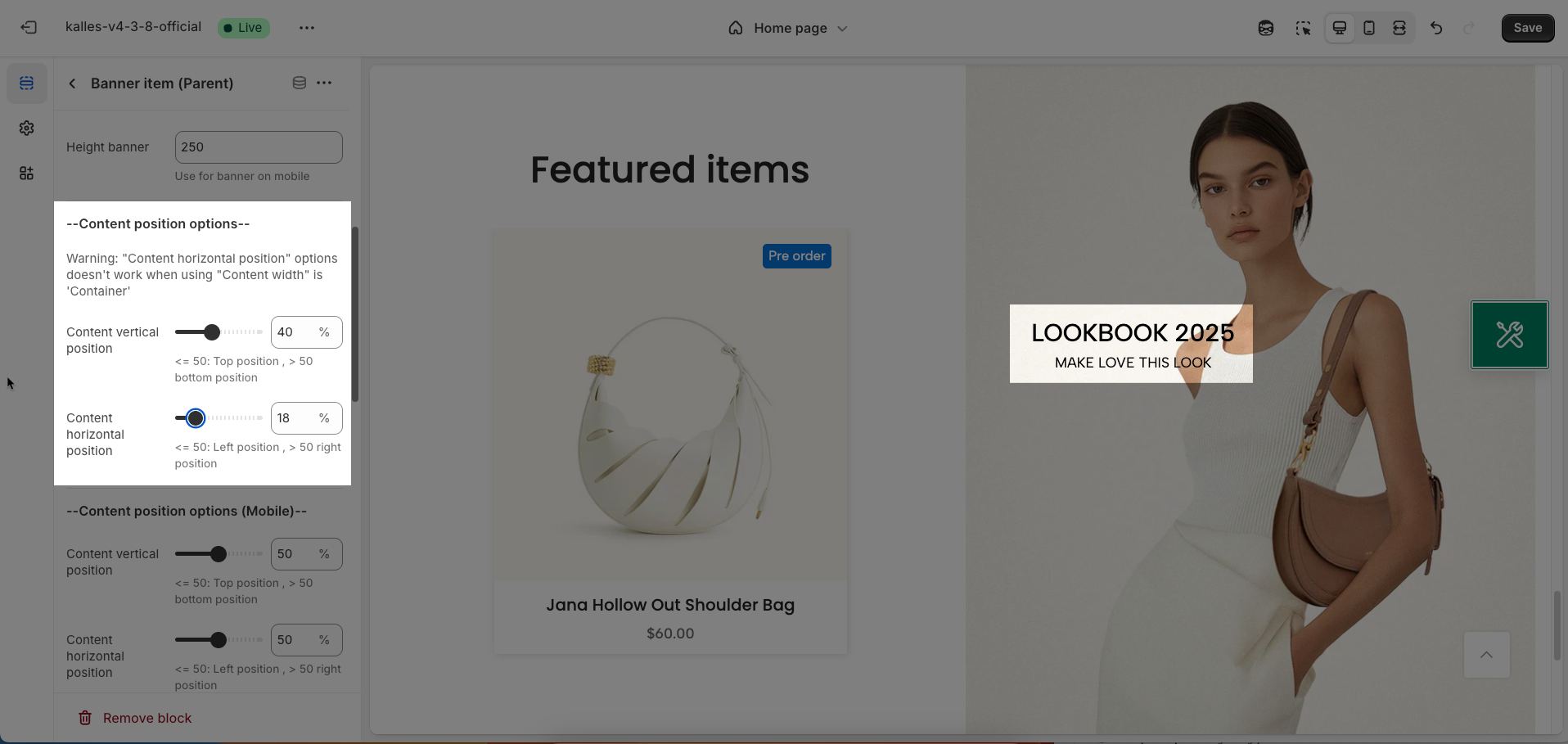
Content position options (Desktop/Mobile)
Warning: "Content horizontal position" options doesn't work when using "Content width" is 'Container'
Content vertical position: Determine the vertical alignment of the content within the container
<= 50: Top position , > 50 bottom position
Content horizontal position: Determine the horizontal alignment of the content within the container
<= 50: Left position , > 50 right position
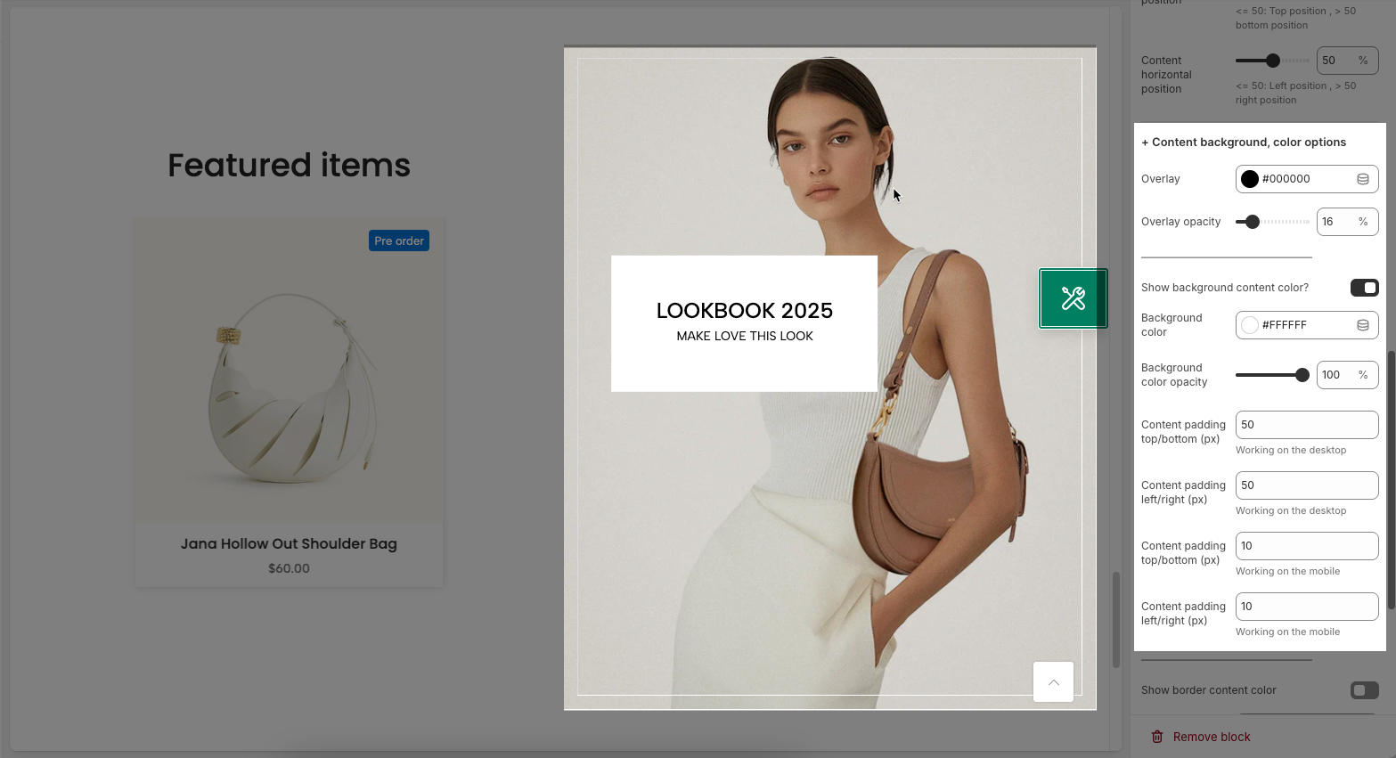
Content background, color options
Overlay: Enable this option to display a color overlay on the image or background of the container. This overlay can be used to darken the image, increase text contrast, or create a specific aesthetic effect.
Overlay opacity: Enter the opacity value for the overlay, ranging from 0 (fully transparent) to 1 (fully opaque)
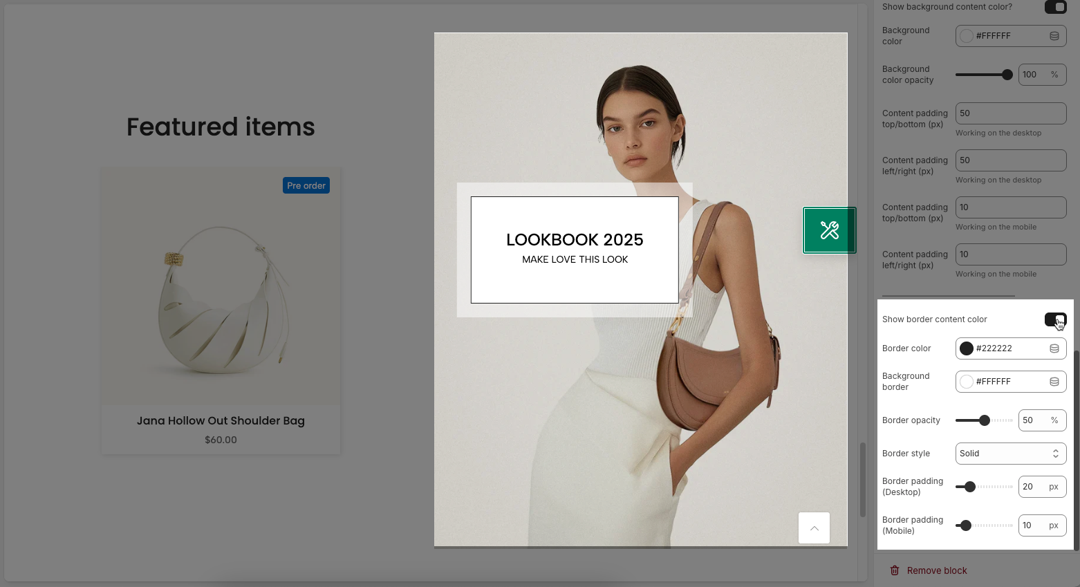
Show background content color?: Enable this option to display a background color for the content area (e.g., text container) within the main container.
Background color: Choose the background color for the content area. Select a color that provides good contrast with the text color to ensure readability.
Background color opacity: Enter the opacity value for the background color of the content area, ranging from 0 to 1.
Content padding top/bottom (px): Set the internal whitespace within the content area on the top and bottom (in pixels)
Content padding left/right (px): Set the internal whitespace within the content area on the left and right sides (in pixels)
Show border content color: Enable this option to display a border around the content area within the element. This helps to clearly separate the content area from the background or other elements.
Border color: Choose the color for the border of the content area
Background border: Choose the background color for the border itself.
Border opacity: nter the opacity value for the border, ranging from 0 (fully transparent) to 1 (fully opaque).
Border style: Choose the style for the border (e.g., solid, dashed, dotted, double).
Border padding (Desktop): Set the internal whitespace (padding) within the border of the content area on desktop screens (in pixels).
Border padding (Mobile): Set the internal whitespace (padding) within the border of the content area on mobile devices (in pixels).
2.3. Other block
Follow this Guide


