This section allows you to show a list of collections with many designs. Shopify 2.0 allows you to add this section to any pages that you wanna use.
1. Collections list
Steps: In the theme editor (Customize) > Add section > Collection list simple > Save.
1.1. Collection item
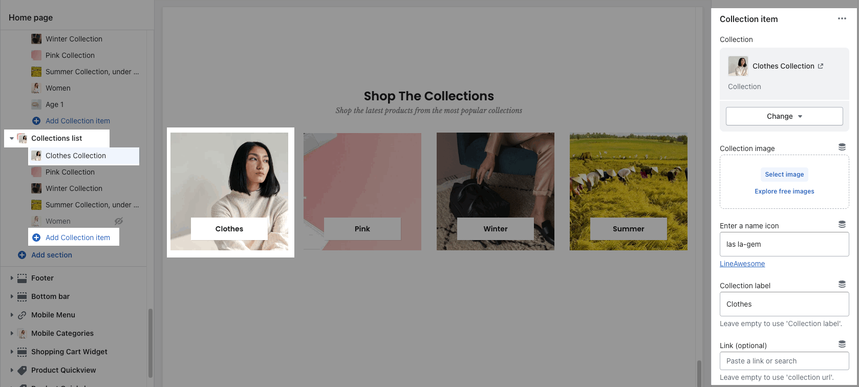
Go to Collection list > Add collection item. You can choose a Collection and adjust an image, an icon, a title, a link for each item.
1.2. Collections list settings
HEADING OPTIONS
You can enter the Heading and Subheading, choose the design for the heading, also can choose text align: center.

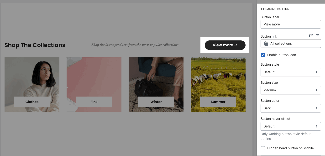
Enable Button heading and config style for it.
GENERAL OPTIONS
Collection item design: there are many designs for collection item. You can adjust collection item with some color options. Each color option will depend on the collection item design.
Please check this video to know more about collection designs:
Open link in current window or new tab
OPTIONS IMAGE COLLECTION
You can config Source, Space bottom, Image padding, Image rounded, hover effect, Image ratio, size, position. Please check this video:
BOX OPTIONS
Layout design: Grid or Carousel.
For Carousel layout, you can Enable loop, auto playing, scroll bar. Config position, visible, style, color for Prev, next button and Page dot.
You can choose Items per row and Space horizontal items
Please check this video to config in detail:
DESIGN OPTIONS
Please follow this guideline to config Layout, Background, Margin/Padding for the section.
2. Collections list manual
Steps: In the theme editor (Customize) > Add section > Collections list manual > Save.
2.1. Collection item
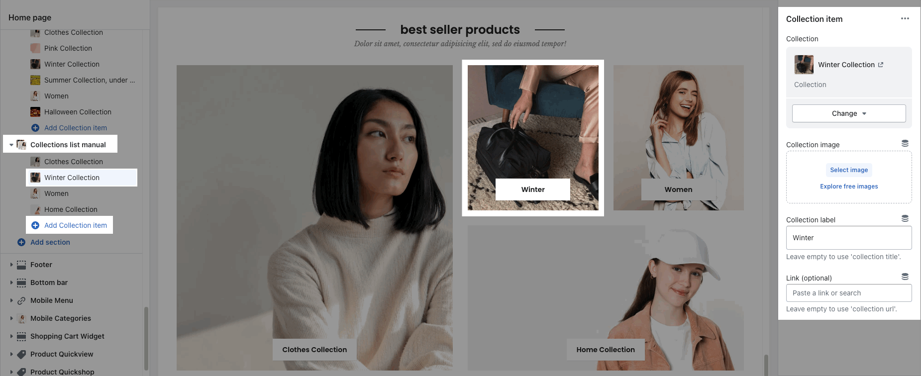
Go to Collection list > Add collection item. You can choose a Collection and adjust an image, a title, a link for each item.
2.2. Collections list manual settings
HEADING OPTIONS
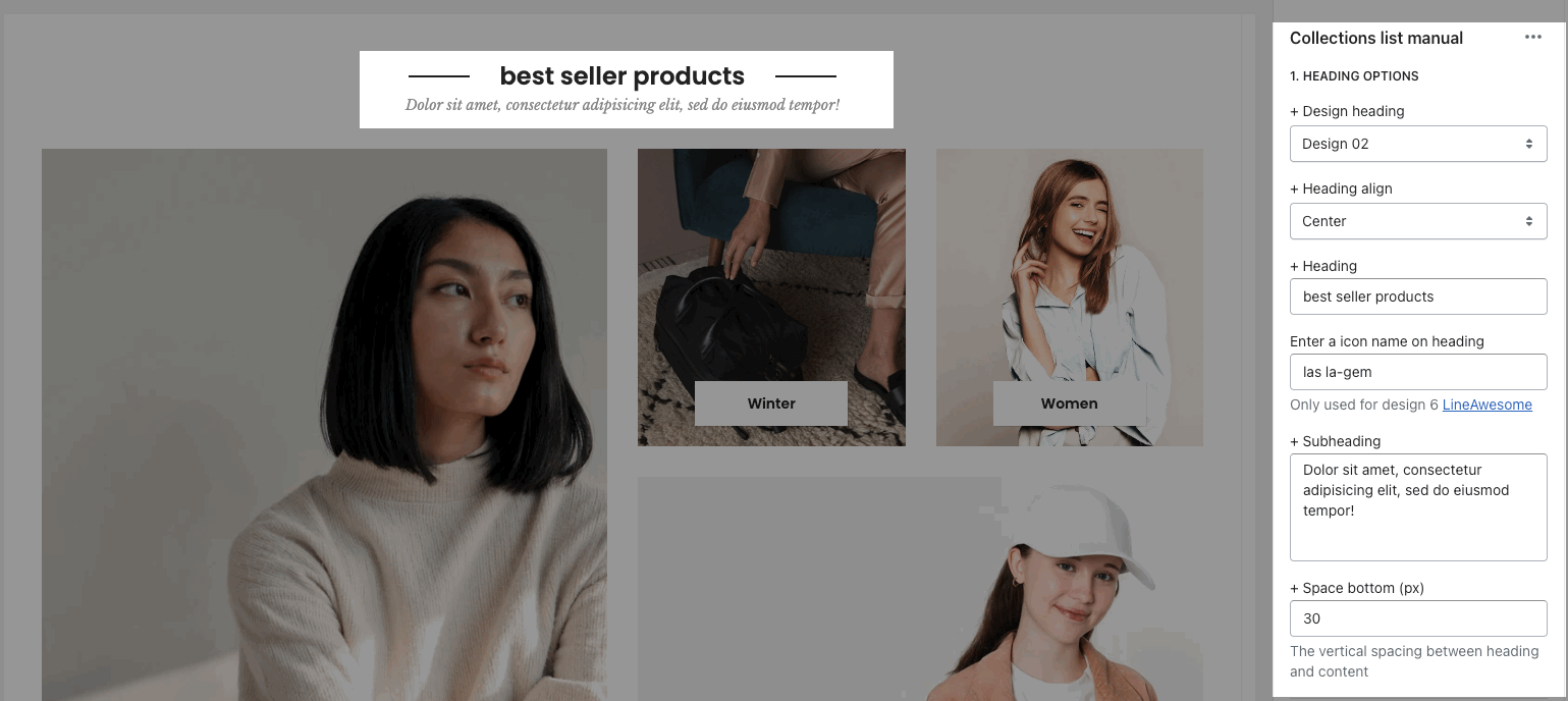
You can enter the Heading and Subheading, choose the design for the heading, also can choose text align: center.
GENERAL OPTIONS
Collection item design: there are many designs for collection item. You can adjust collection item with some color options. Each color option will depend on the collection item design.
Please check this video to know more about collection designs:
Open link in current window or new tab
OPTIONS IMAGE COLLECTION
You can config Space bottom, Image padding, Image rounded, hover effect, Image position. Please check this video:
COLLECTION BOX LAYOUT
Select layout for group collection: there are many designs of box layouts for you to choose. You can see them in this video:
DESIGN OPTIONS
Please follow this guideline to config Layout, Background, Margin/Padding for the section.
3. Collections list packery
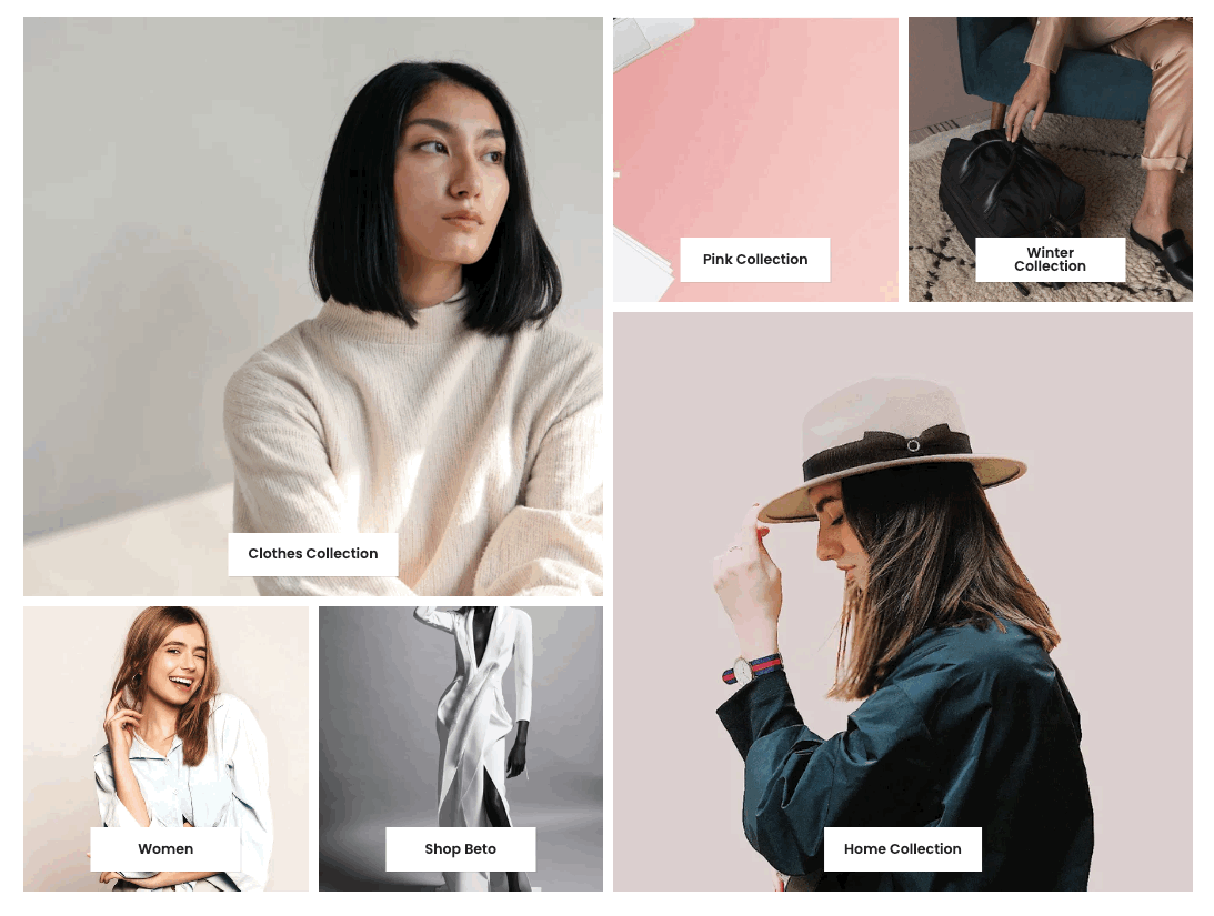
Steps: In the theme editor (Customize) > Add section > Collections list packery > Save.
3.1. Collection item
Go to Collections list packery > Add collection item. You can choose a Collection and adjust an image, a title, a link for each item.
Moreover, you can choose Item width for desktop, tablet and mobile. With each item width, you will have a different layout:
3.2. Collections list packery settings
HEADING OPTIONS
You can enter the Heading and Subheading, choose the design for the heading, also can choose text align: center.
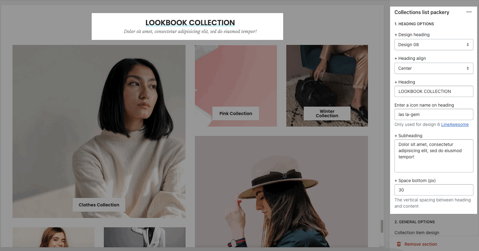
GENERAL OPTIONS
Collection item design: there are many designs for collection item. You can adjust collection item with some color options. Each color option will depend on the collection item design.
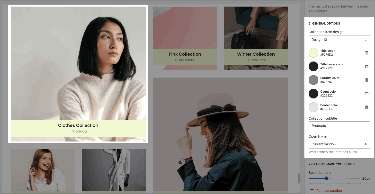
Open link in current window or new tab
OPTIONS IMAGE COLLECTION
You can config Space bottom, Image padding, Image rounded, hover effect, Image ratio, size, position. Please check this video:
Space horizontal/vertical items:
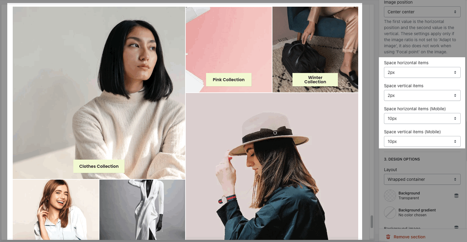
DESIGN OPTIONS
Please follow this guideline to config Layout, Background, Margin/Padding for the section.
4. Collection list simple
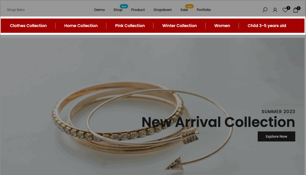
Steps: In the theme editor (Customize) > Add section > Collection list simple > Save.
4.1. Collection list simple blocks
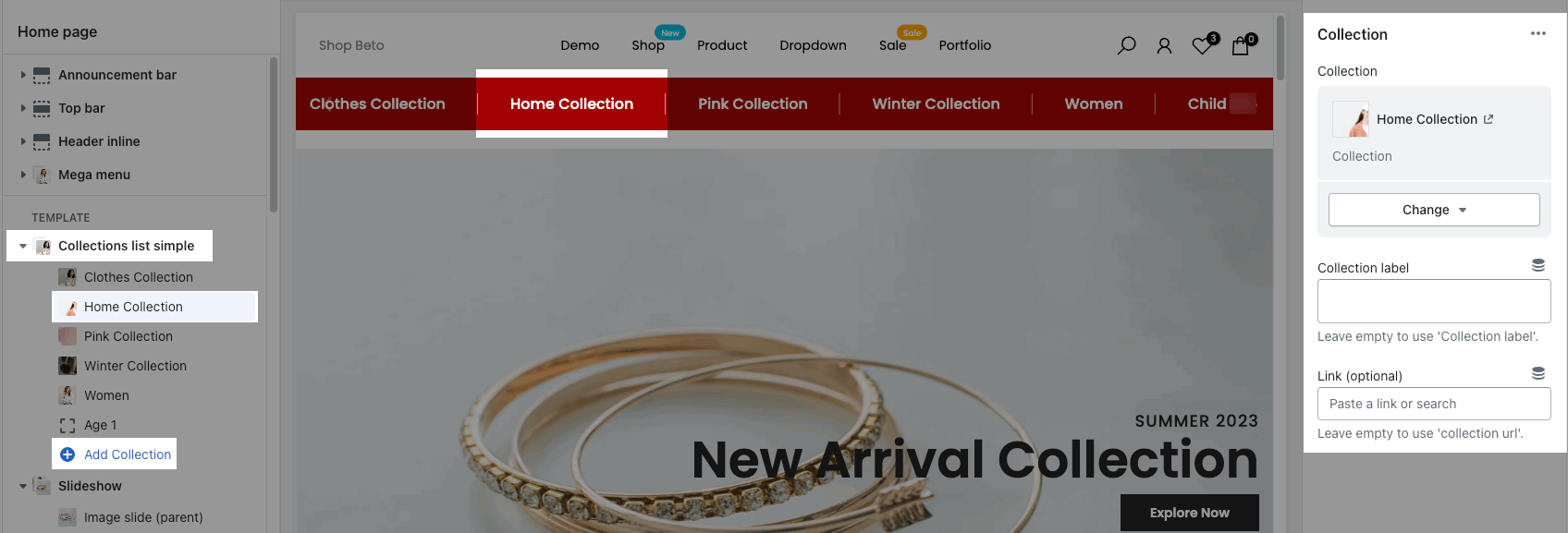
Go to Collection list simple > Add collection > you can add many collection items to show in this section.
You are allowed to choose a collection, enter a label, add a link for each collection item.
4.2. Collection list simple settings
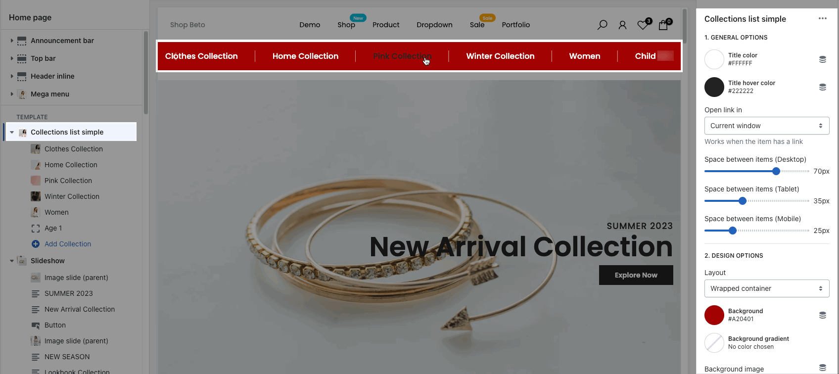
GENERAL OPTIONS
you can choose Title color, title hover color, config Space between items on desktop, tablet and mobile.
DESIGN OPTIONS
Please follow this guideline to config Layout, Background, Margin/Padding for the section.


