


The section Blog Post allows you to automatically add those articles that have the same blog group without manually adding them one by one. It's never been easier to create a blog post.
First, you need to create some blog posts from Shopify Admin > Online store > Blog post. You can follow this article.
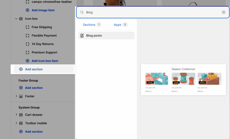
Then you can add a section to your theme. Steps: In the theme editor (Customize) > Add section > Blog post > Save.
1. How to configure the Blog post section?
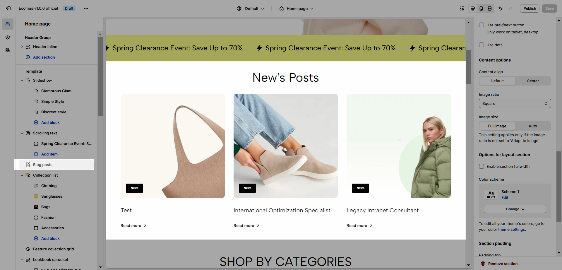
1.1. Heading options:
You can fill in Heading, Heading tag, Margin heading, these are basic options for heading.
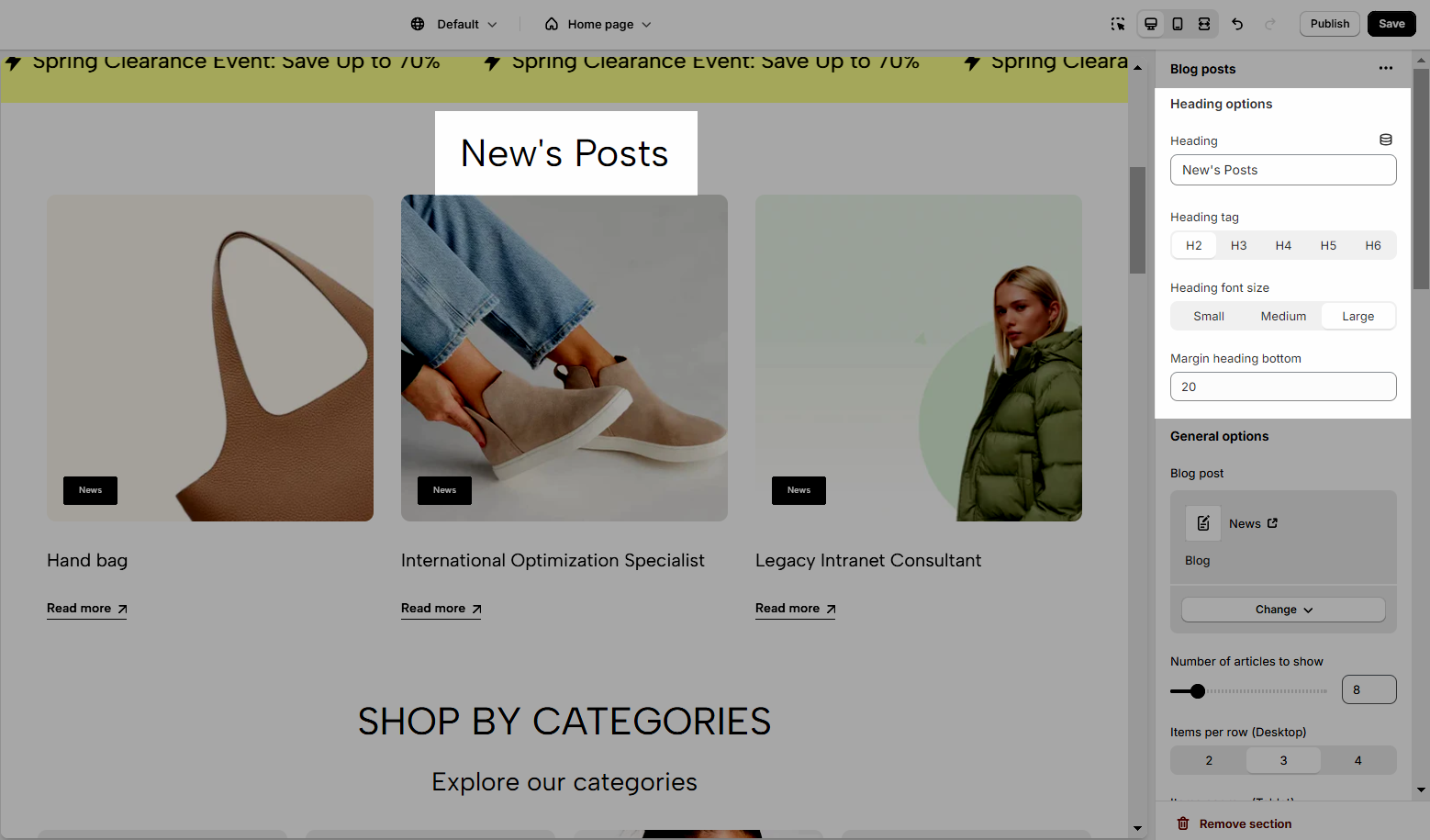
1.2. General Options
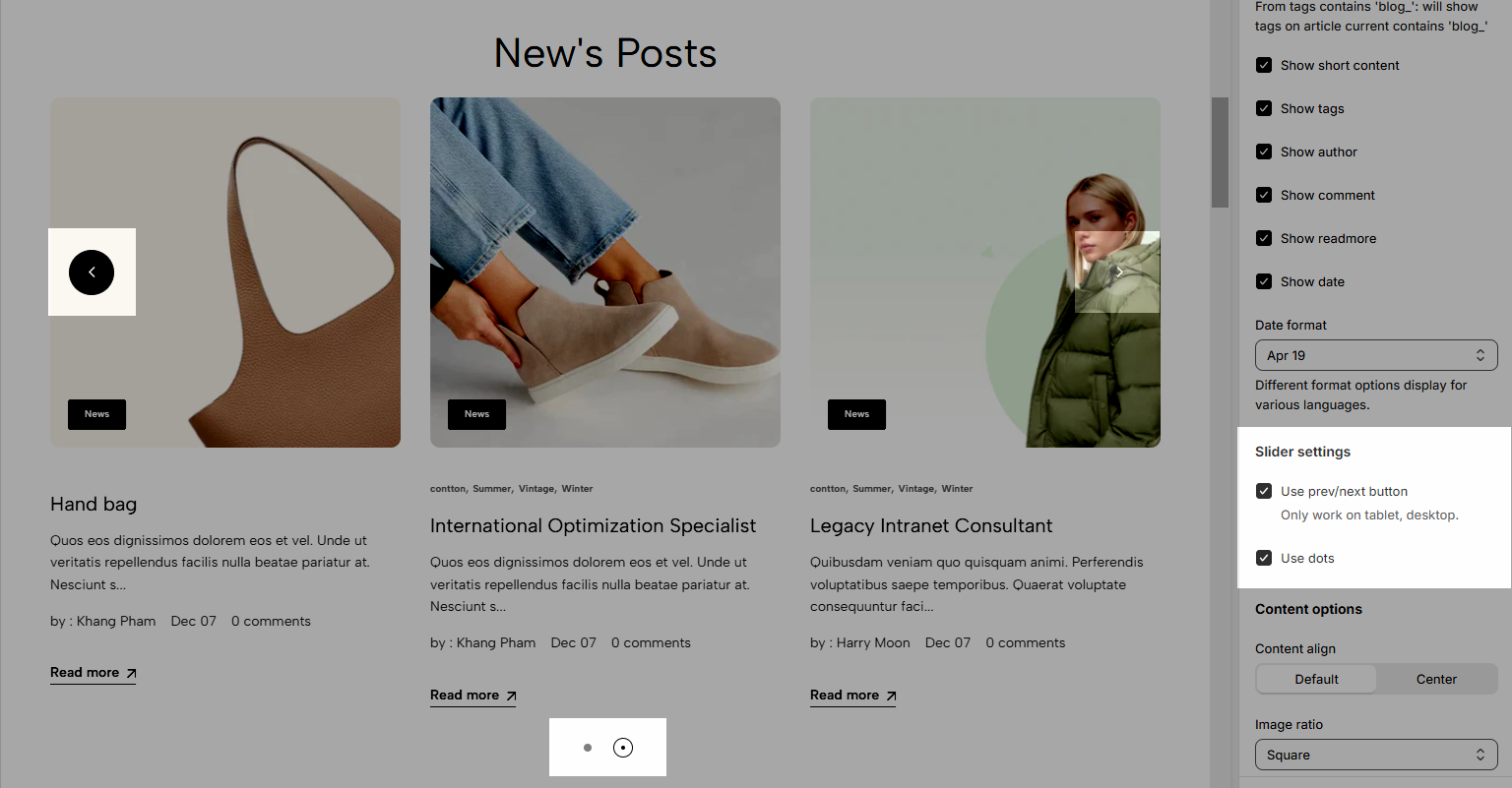
Blog post: Select a blog to show.
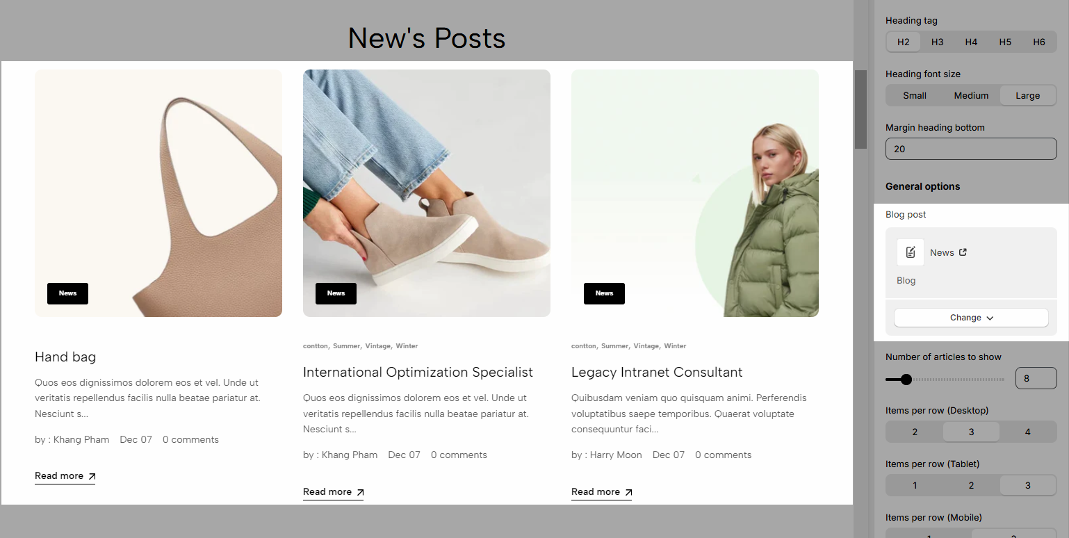
Number of articles to show: You can set a number of articles per page to show and items per row on different devices.
Show blog information: you can choose show/hide blog title, short content, tags, author, comment, readmore, date.
Date format: You can set the date format to display (different format options display for various languages).
Slider settings:
Use the prev/next button and dots.
1.3. Content options
Content align: choose to align Default or Center.
Image ratio: Change the ratio of the image.
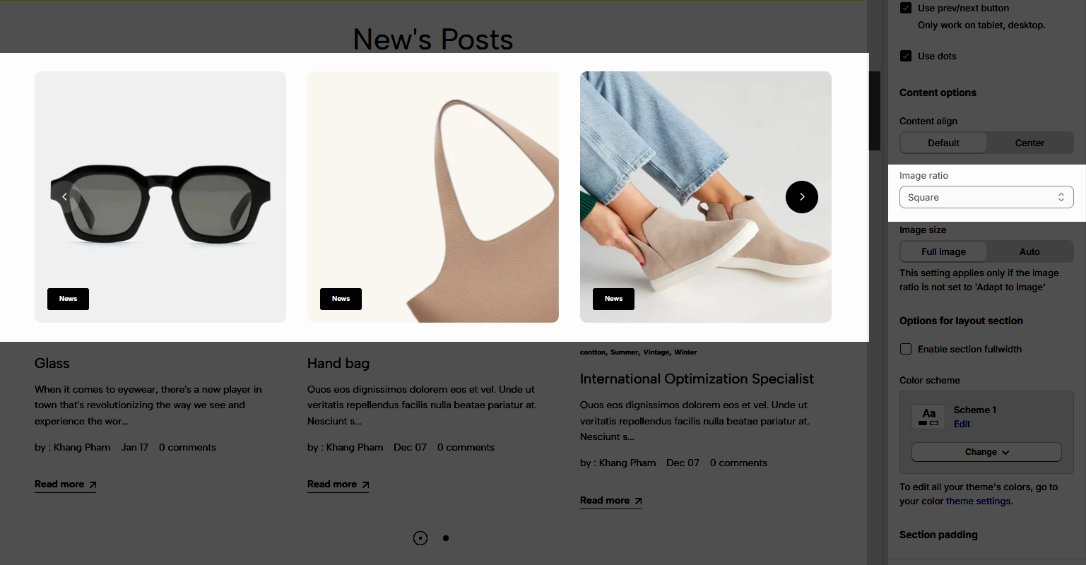
Image size: There are 2 options to select Full Image and Auto.
1.4. Design options & Section padding
Enable section full-width: Make the Top heading 100% of the screen width.
Color scheme: Change the colors of the section by the configured scheme color, learn more here.
Section padding: Determine the top, bottom padding on both desktop and mobile.


