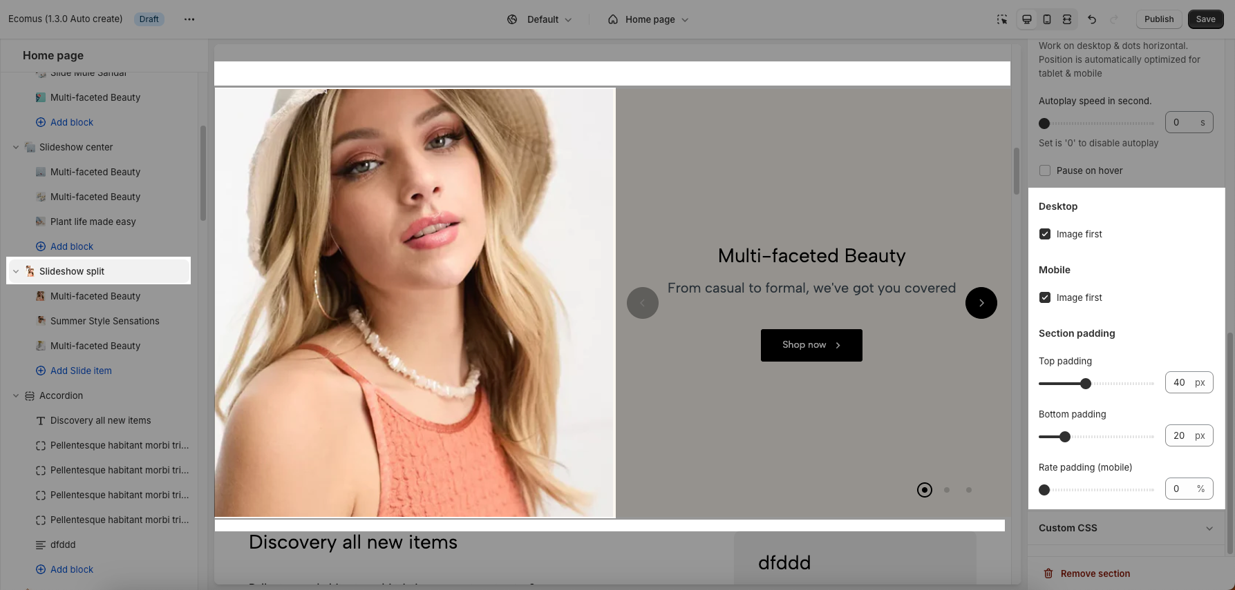
There are 3 Slideshow sections: Slideshow, Slideshow Center, and Slideshow Split.
These sections allow you to create the Slider with images, customers can swipe to see the next images or they watch it autoplay. You also can add texts, call-out buttons for them.
You can look over this video about 3 slideshow sections:
Steps: In the Theme editor (Customize) > Add section > Slideshow > Save.
1. Slideshow & Slideshow center
1.1. Slideshow & Slideshow center blocks
There are 4 blocks inside each section: Slide base, Slide with product, Slide with icon, and Slide custom label.
Click on Slideshow > ADD BLOCK > choose the block you want to add.
You can check this video about the blocks:
On each block, you can configure:
Images for desktop and mobile. Link URL for image
Color scheme for that block
Customize Heading, Subheading and Button
Desktop & Mobile options: Content position and Text alignment on each device.
1.2. Slideshow & Slideshow center settings
You can configure some general options for the section below:
Image settings: Image height for desktop and mobile.
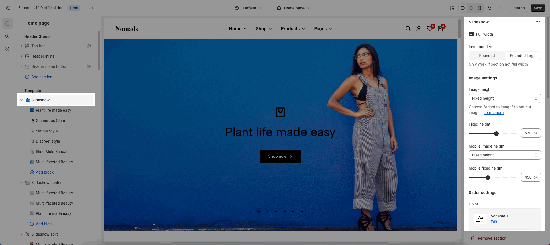
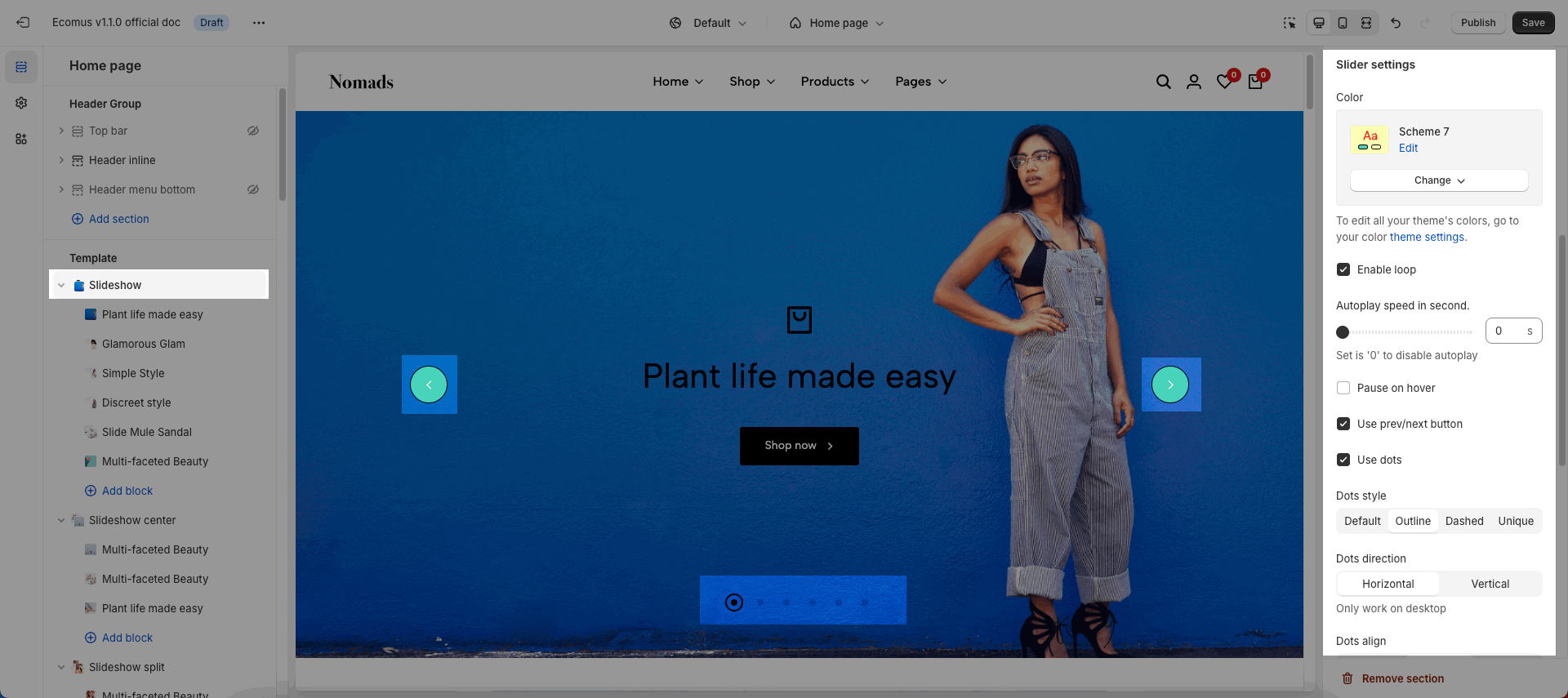
Slider settings: Color scheme, Enable loop, Autoplay, Use prev/next button and dots
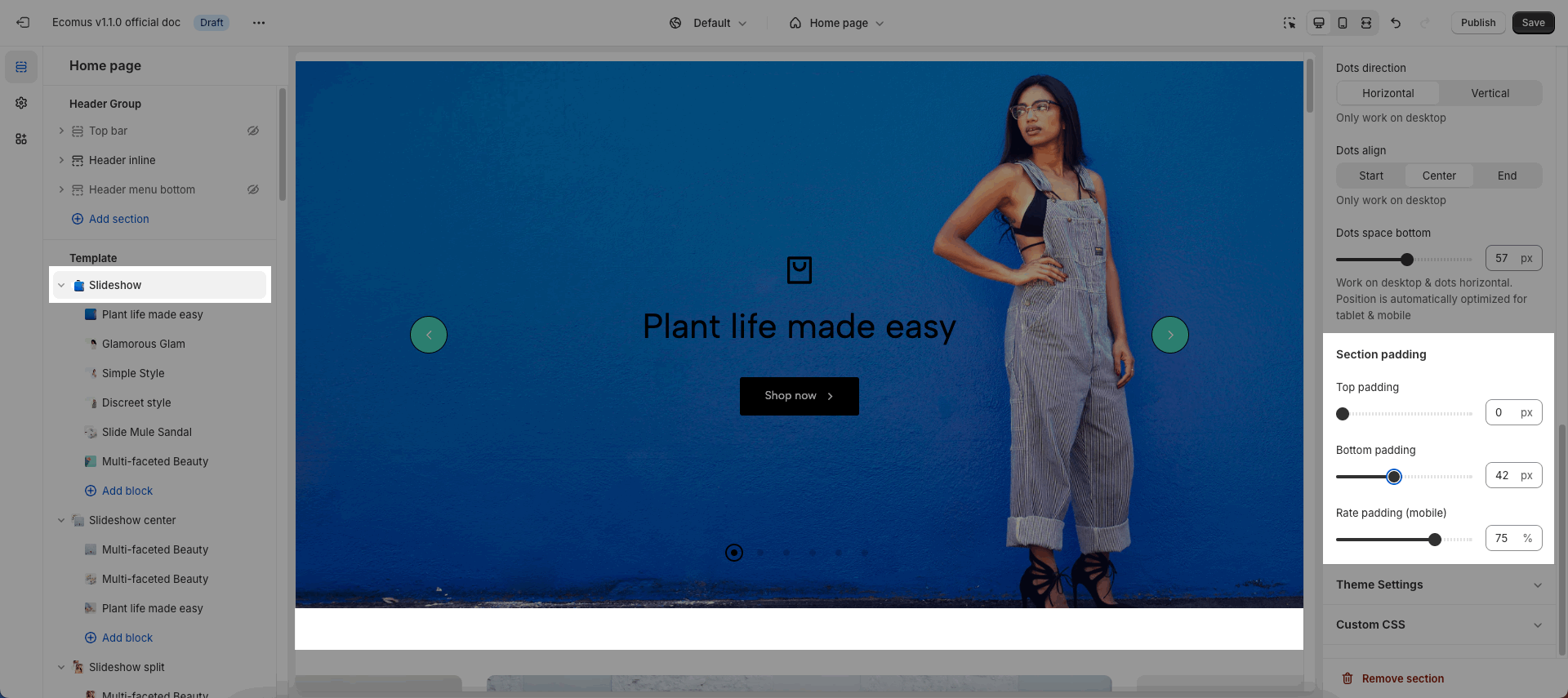
Section padding:
2. Slideshow split
2.1. Slide item
Click on Slideshow split > Add Slide item
On this block, you can configure:
Images for desktop and mobile. Link URL for image
Color scheme for that block
Customize Heading, Subheading and Button
Desktop & Mobile options: Content position and Text alignment on each device.
Please check this video:
2.2. Slideshow split settings
You can configure some general options for the section below:
Image settings: Image height for desktop and mobile.
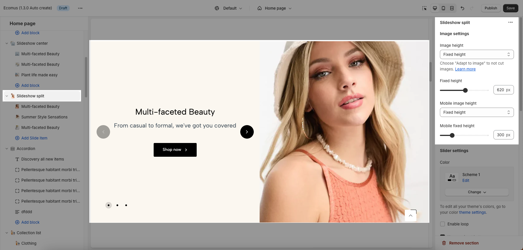
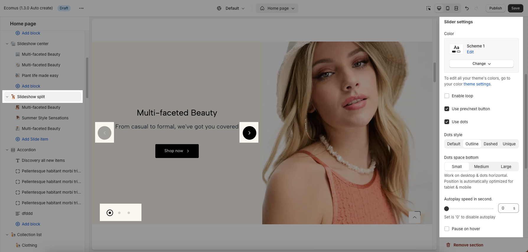
Slider settings: Use prev/next button and dots, autoplay, pause on hover.
Choose Image first on desktop and mobile.
Section padding
