In this article, we will explore the steps involved in configuring the Tab Collections Carousel.
1. Configuration
1.1. Heading options
There are some options you can adjust with the heading: Title heading, Enable tabs heading inline, Distance between heading items.
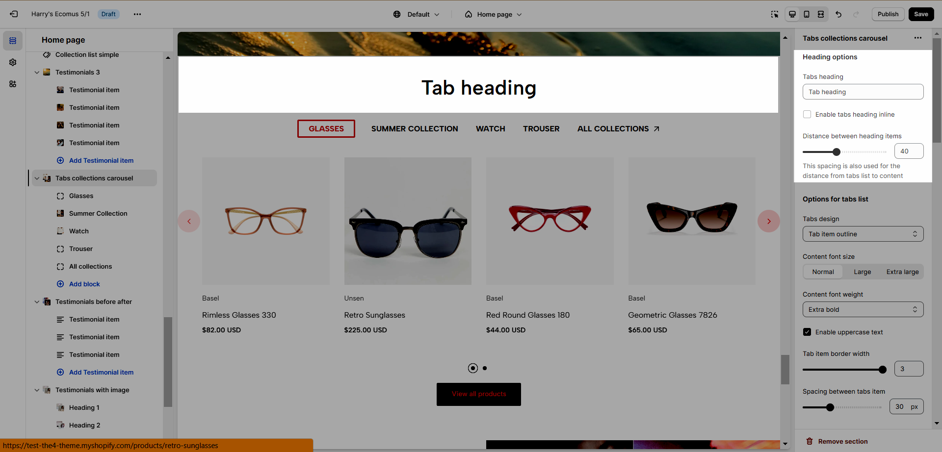
Two heading design options are available, and you can switch between them by activating the "Enable tabs heading inline" feature.
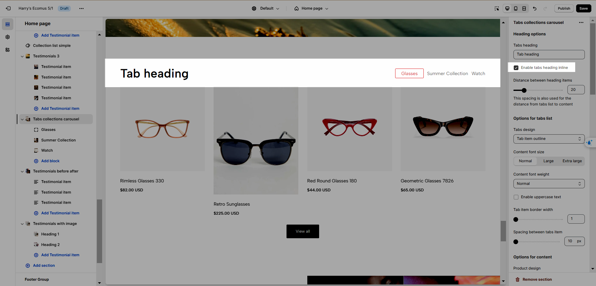
1.2. Options for tabs list
You can adjust Tab design, Content font size, Content font weight, Enable uppercase text, Tab item border width, and Spacing between tabs item. See the video below to learn how to configure it.
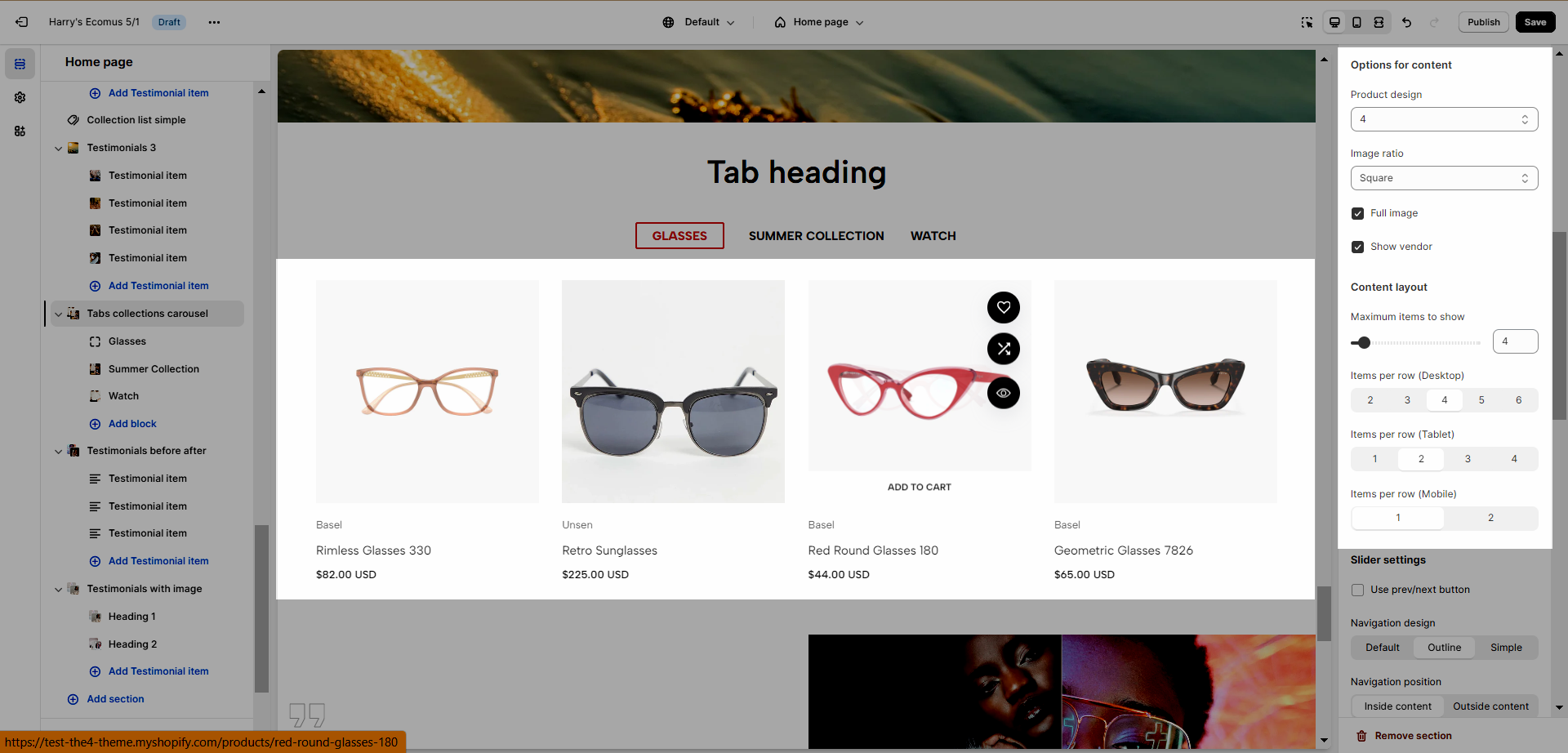
1.3. Options for content and content layout
You have the ability to change:
Product design: determine how the product looks.
Image ratio: Change the width and height of the product image.
Full width: make the image (which is smaller than the container full width).
Show vendor: Show the product vendor.
Maximum products to show: The limited number of products that are showing.
Items per row: You can change this option on 3 devices: Desktop, Tablet and Mobile.
1.4. Slider option
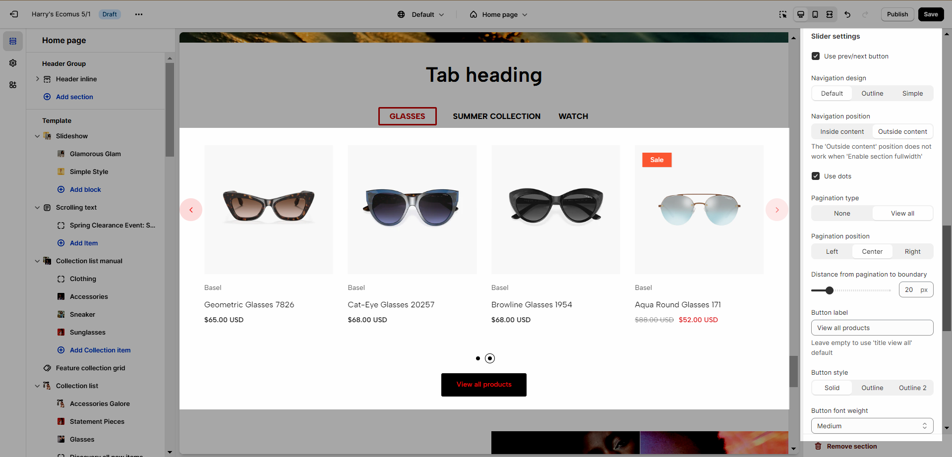
You can use the slider options as explained below:
Use the prev/next button: You can choose a design (default, outline, or simple) and position (Inside content, or outside content).
Use dots: Show dots.
Navigation: This allows you to adjust the position (left, center, or right), the space between products, and the style of buttons, you can also change the text and text style of the button.
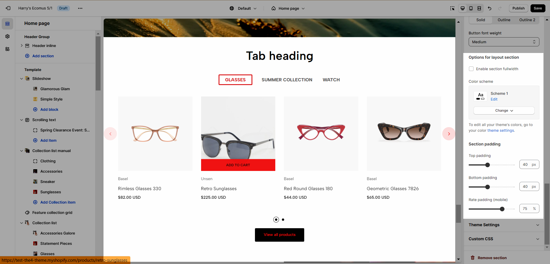
1.5. Options for layout section
Enable section full width: make your testimonial section 100% of the screen width.
Color Scheme: This option is used in all testimonials, to learn more about this, refer to this document.
Section padding: This option is in all testimonials sections, and allows you to adjust top and bottom padding both on desktop and mobile.
2. Item
To learn about the tab collection carousel, refer to the video below


