What are color schemes?
Color schemes allow you to create a preset choice of colors that you can apply throughout your site. This is convenient because you define them in one location and then if you ever want to change a color, you can change it in that one place and it will update across every section and element you've applied it to.
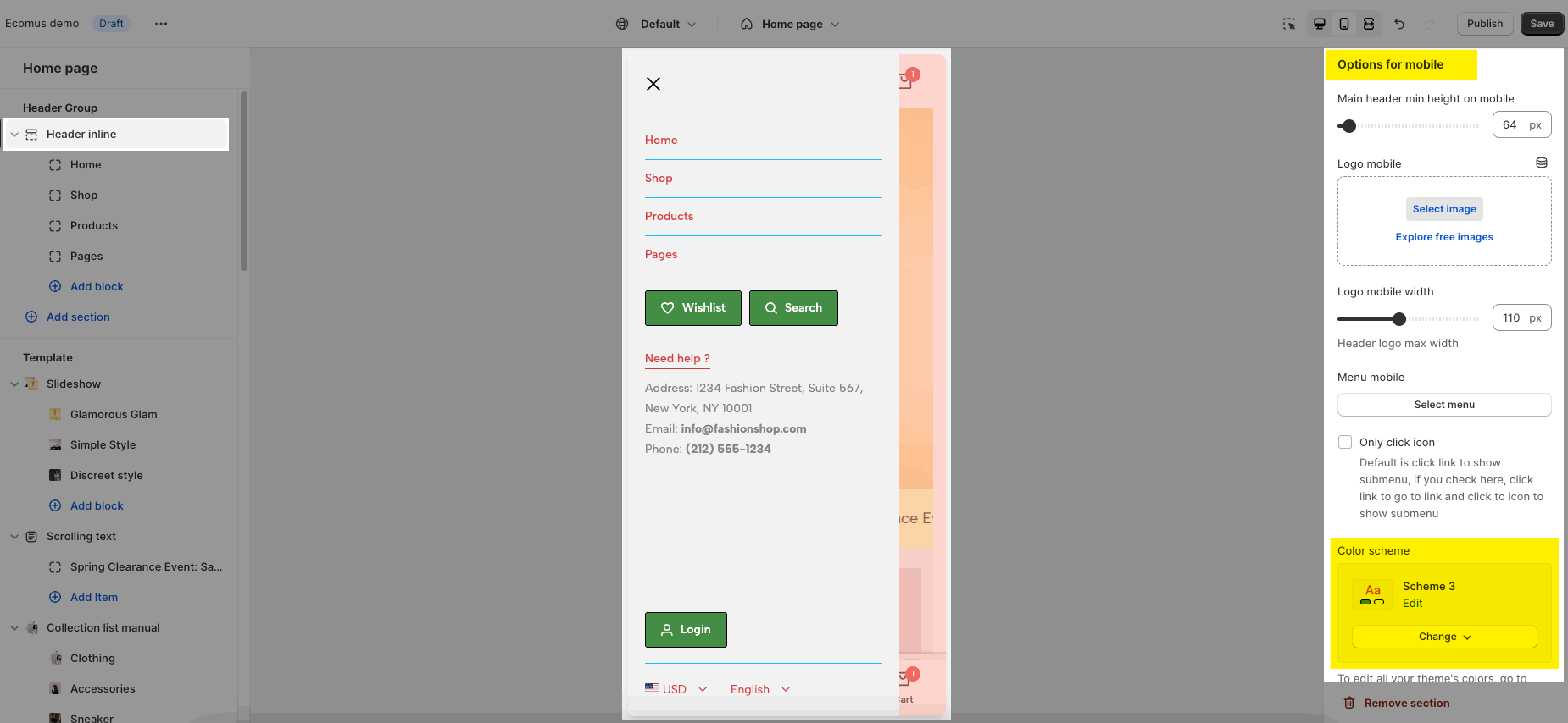
Go to Theme settings > Colors to config it
In each section/block setting, you have the option to choose 'color scheme'. For example in 'Slideshow' section below:
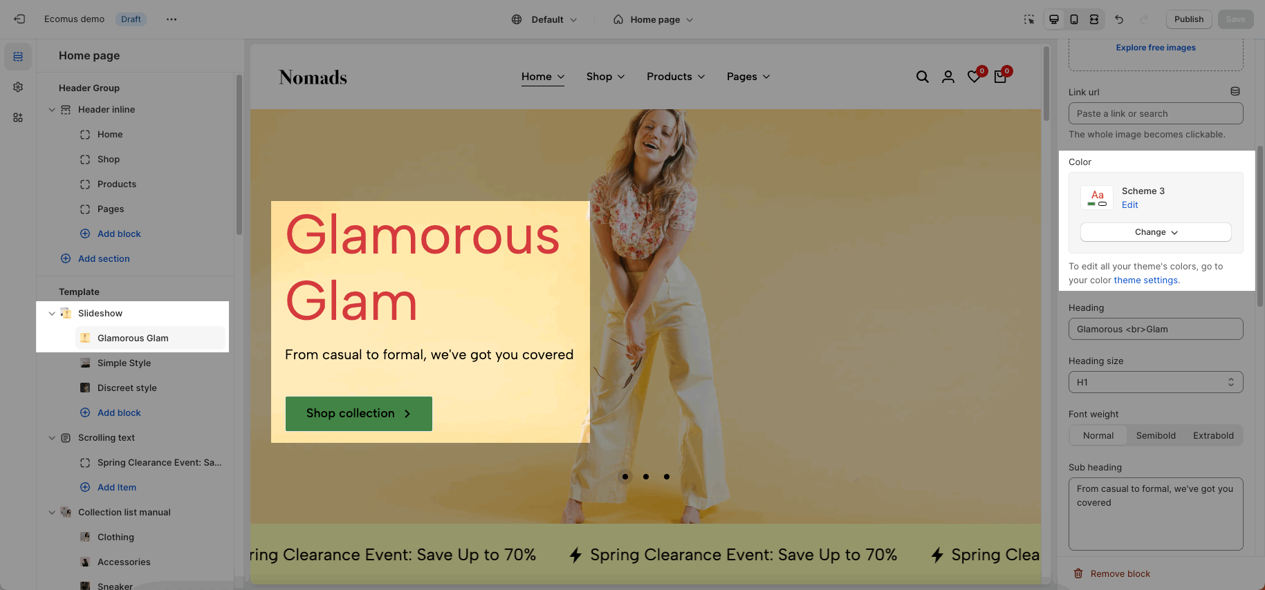
You can choose a different color scheme for each section, please refer to this video:
1. How to edit a Color scheme?
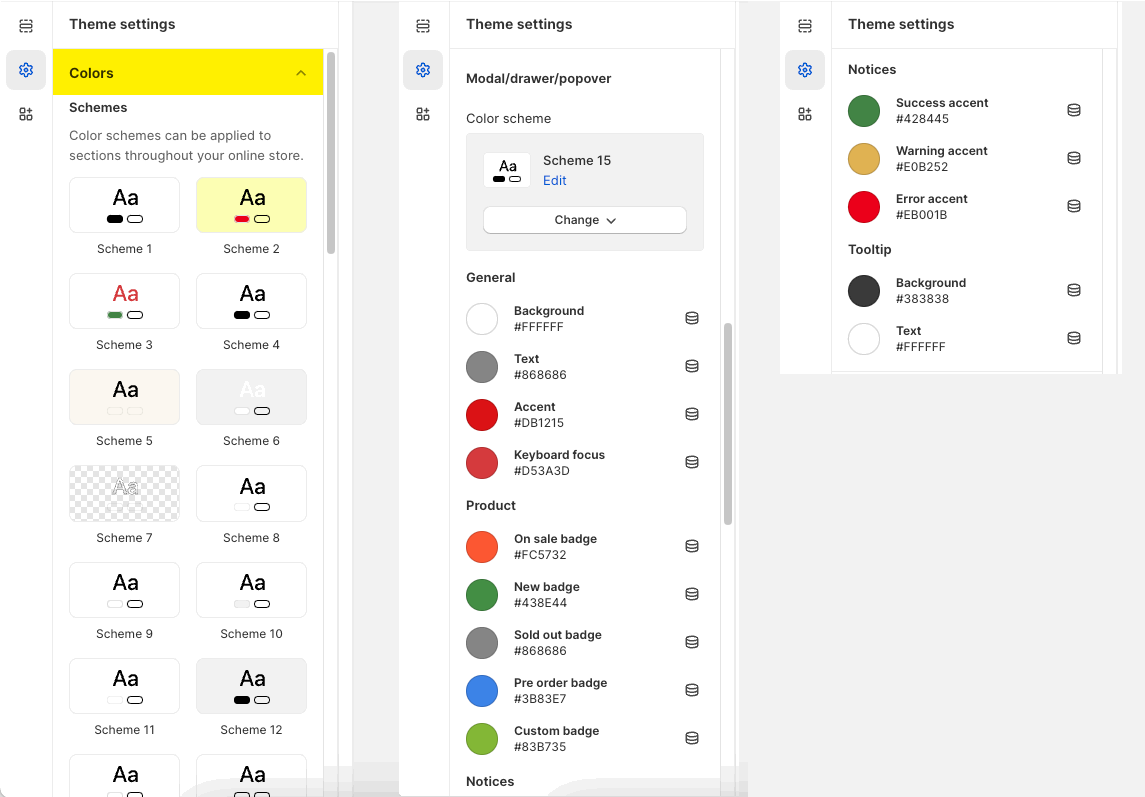
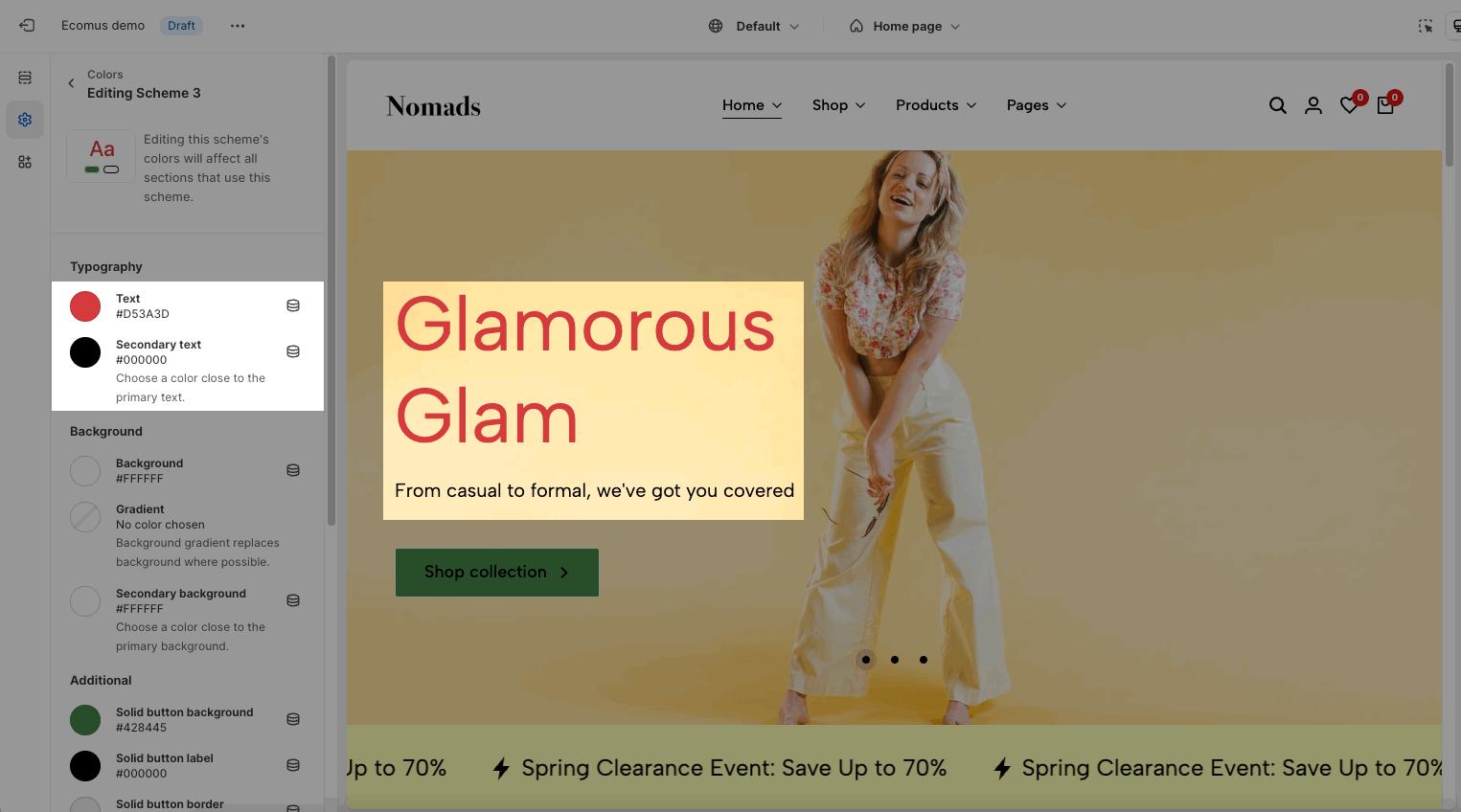
By default, there are 15 color schemes in the theme. You can click on each color scheme to edit your own colors.
1.1. Typography
Text: the heading text of section
Secondary text: the subheading text of section
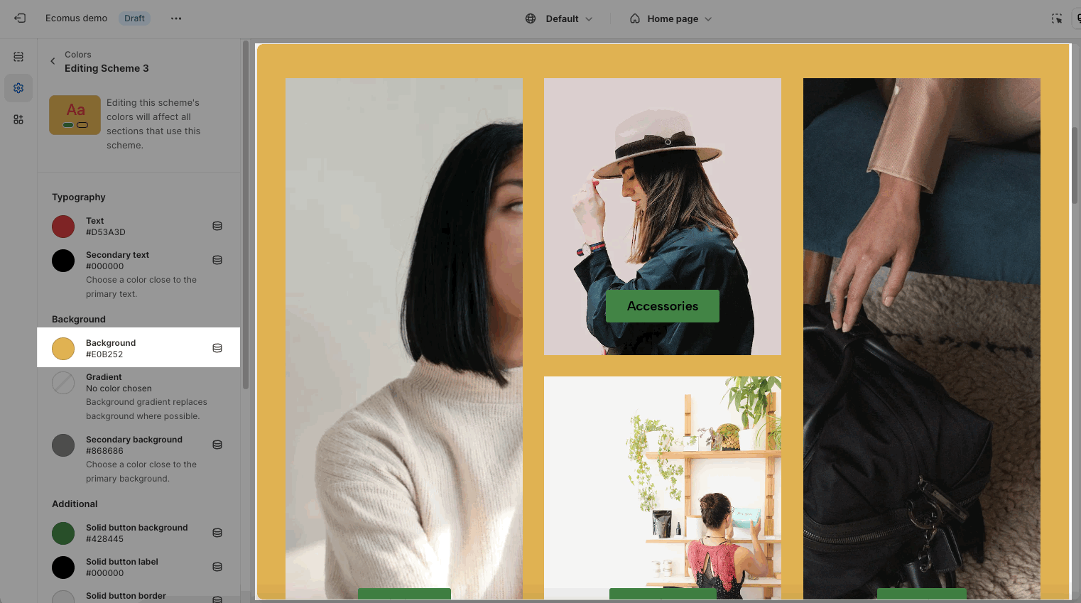
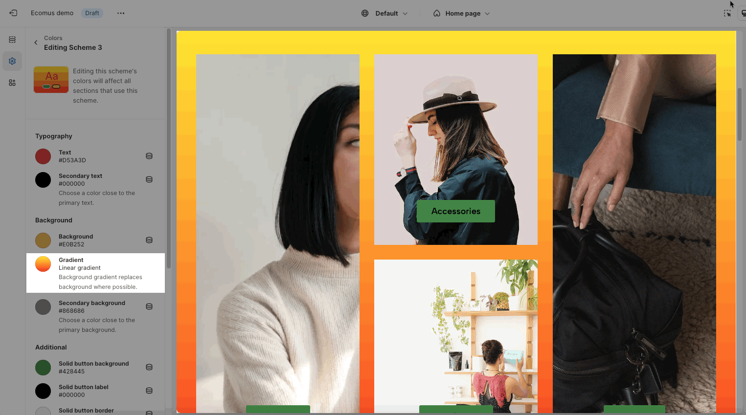
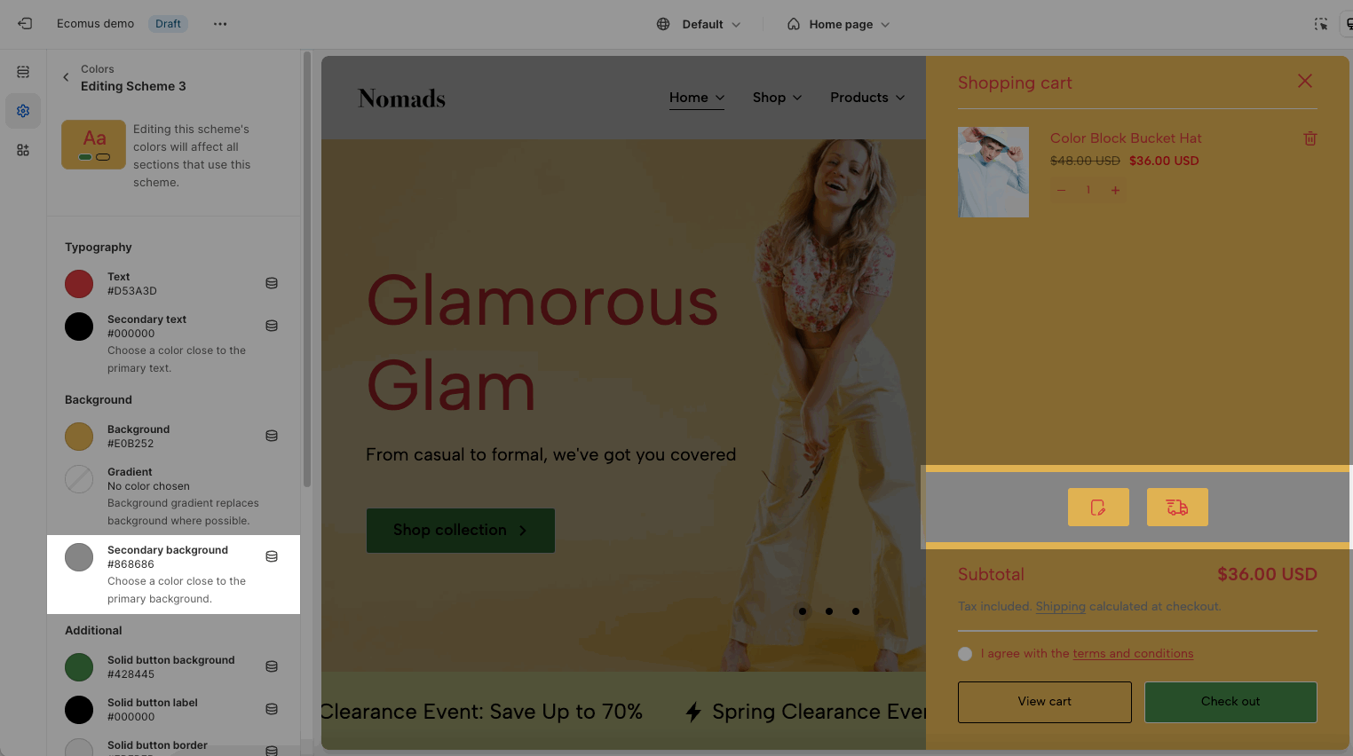
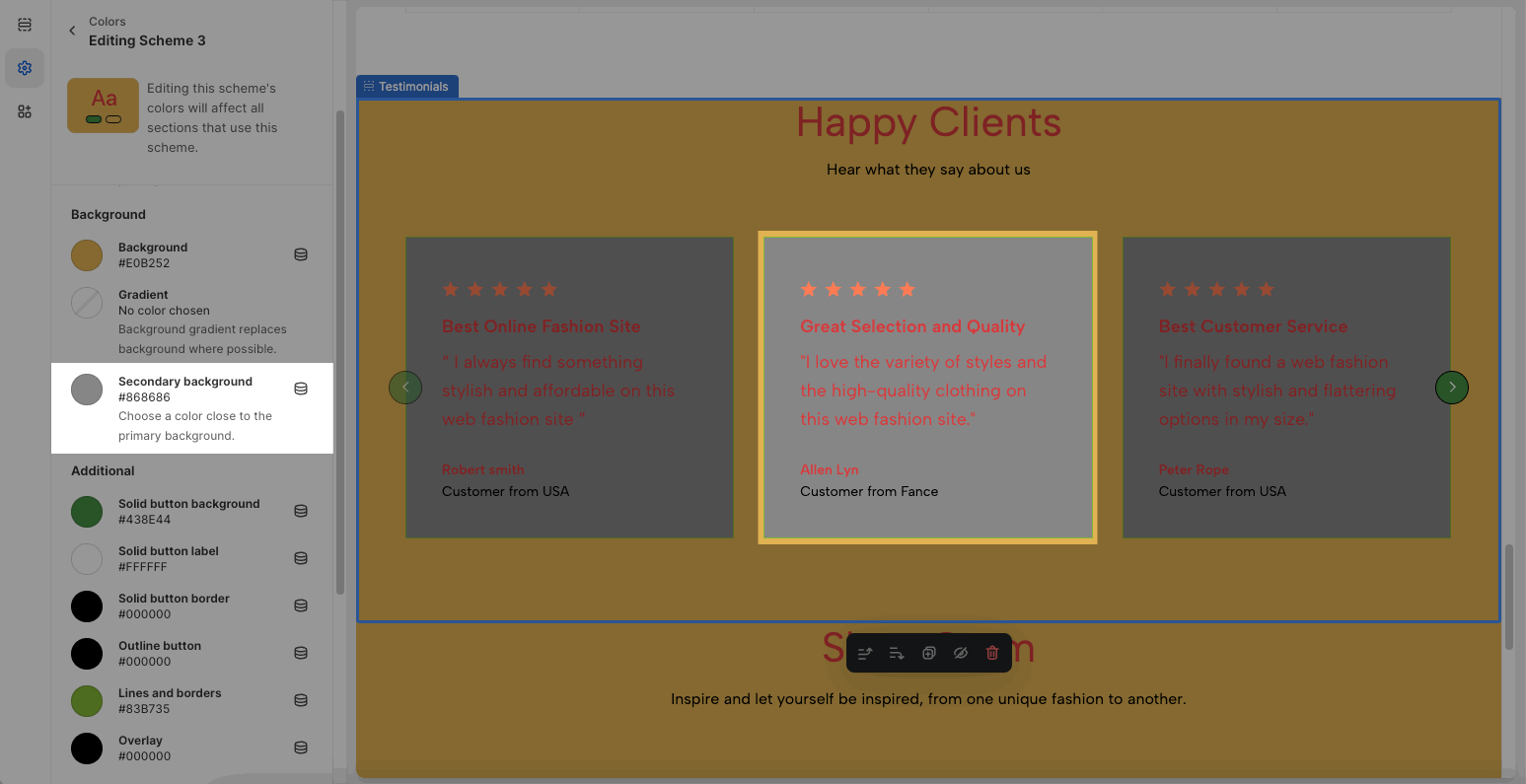
1.2. Background
Use for sections that have a background. Not for sections with background images: slideshow, video, etc...
Background and gradients: the main background of section.
Secondary background: some sections have a second background for the child element. Example: Order note, Shipping blocks in Cart Drawer, Testimonials
1.3. Additional
Button, button border: all buttons over the theme, in sections, in product grid. Button colors depend on the design of button. Please check this video to know more:
Example of butons in section will be affected by that option:
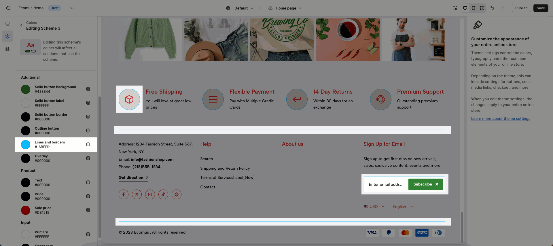
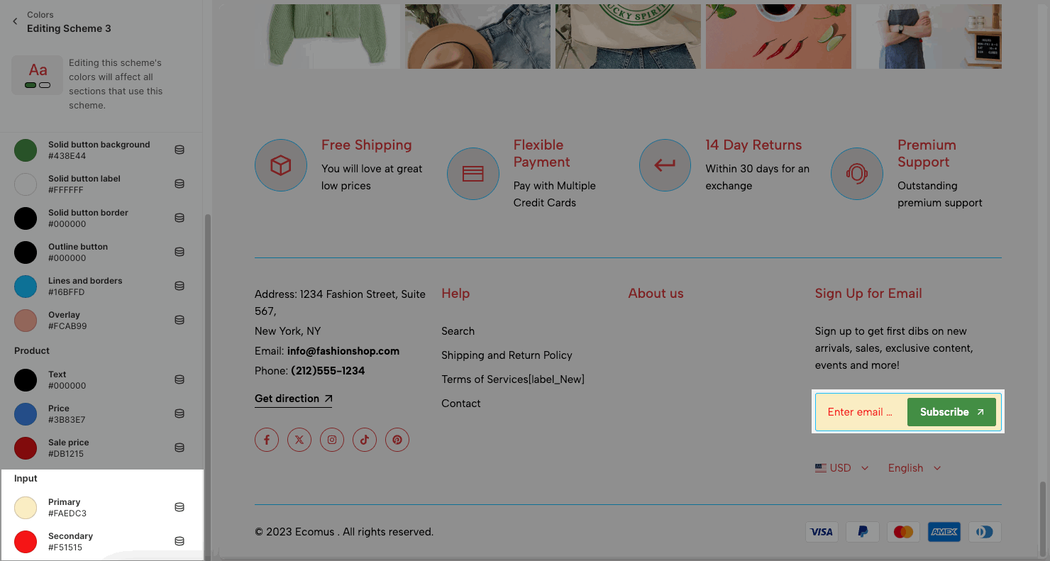
Lines and borders: applied on some sections which have lines and borders. Example:
Overlay: works when you open a drawer, pop up, mobile menu
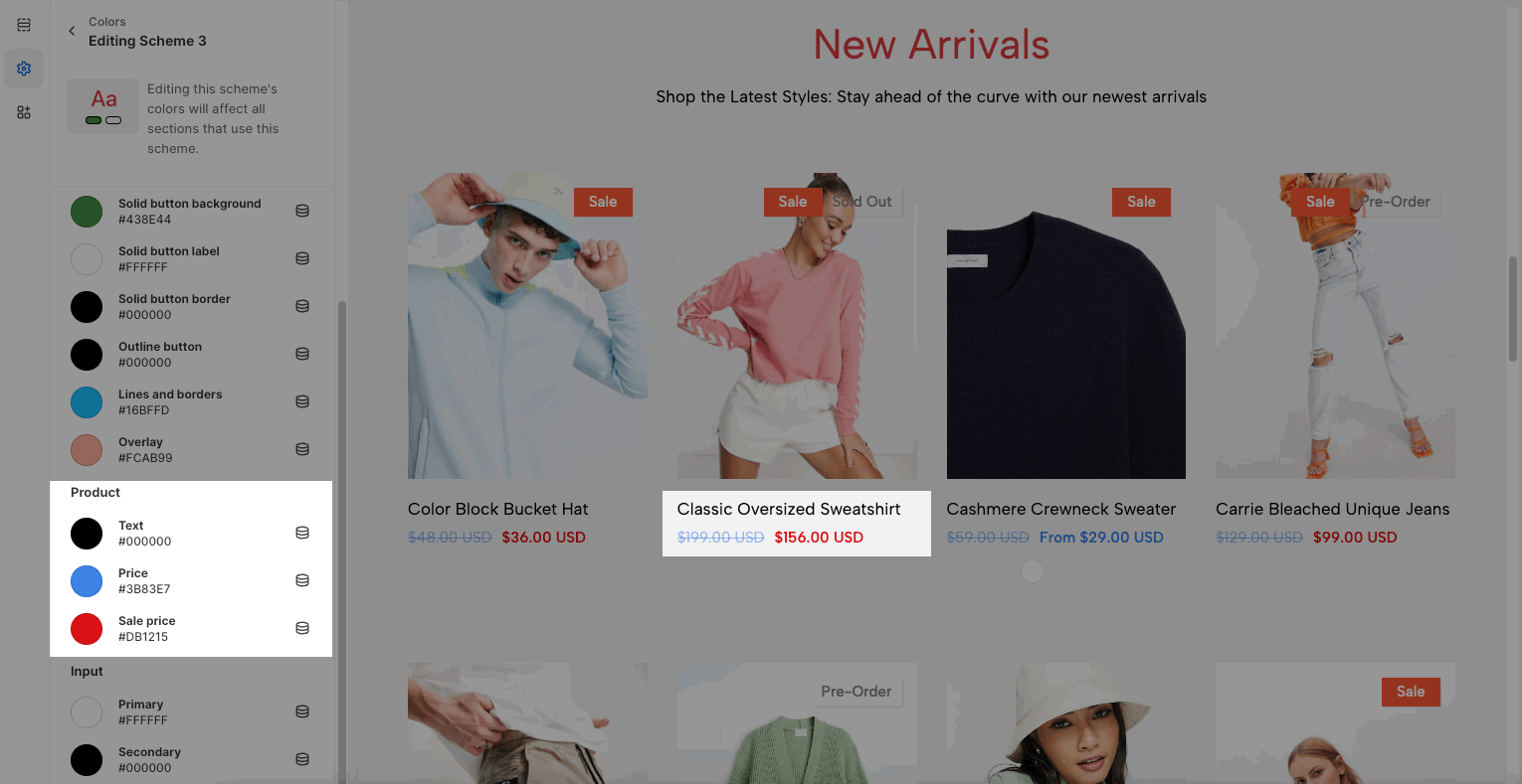
1.4. Product
Text, Price, Sale price are used in Product Grid layout
1.5. Input
Primary: background input color
Secondary: text input color
2. Other color options
2.1. Modal/drawer/popover
Choose a color scheme for modal/drawer such as: Search drawer, Login pop-up.
Not for sections that have the own option: Cart Drawer, Mobile menu
2.2. General
Background: Main cart background, placeholder background when you scroll sections. Please see the video below to know more about it
Text: use for some text content in the theme. For example some sections below:
Accent: text hover color, button hover color for header buttons, product title, cart buttons, dynamic checkout button, etc...
Keyboard focus: please check the video for this feature.
2.3. Product
You set up the background for product badges.
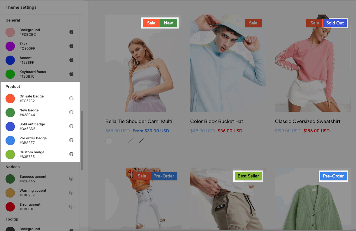
To configure the custom badge such as 'Best Seller', please follow this guide.
2.4. Notices
Config colors for success, warning, and error messages in the theme.
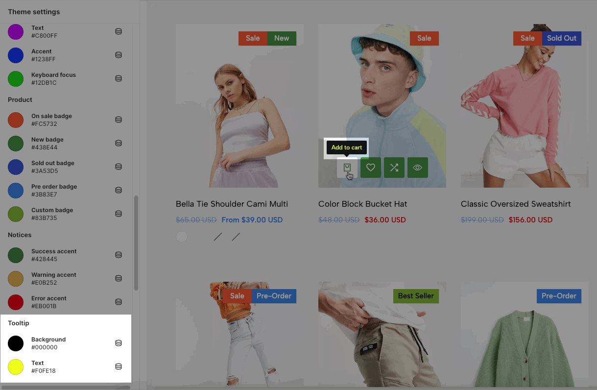
2.5. Tooltip
The tooltip shows when you hover the mouse over some buttons.