


There are 4 Collection List sections: Collection List, Collection List Tab, Collection List Manual, and Collection List Simple.
These sections allow you to create the collection list with feature images.
You can look over this video about 4 sections:
Steps: In the Theme editor (Customize) > Add section > Collection List > Save.
1. Collection List
1.1. Collection list item
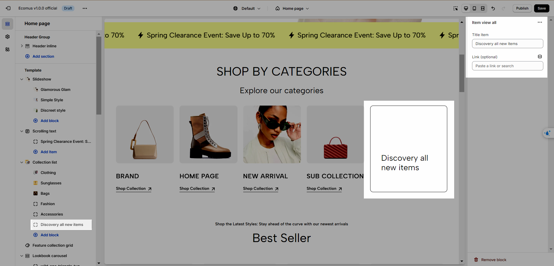
To add a collection list item, click Add Block > "Collection item"
You have some options to configure the item:
Collection: Choose your desired collection.
Collection Image, Collection Title, Collection Link: Replace the collection default data.
The other block is Items View All, which allows you to create a button leading to a collection list of products.
1.2. Collection List options
- Heading options
There are numerous options to adjust the heading and subheading. See the video below to have better insights.
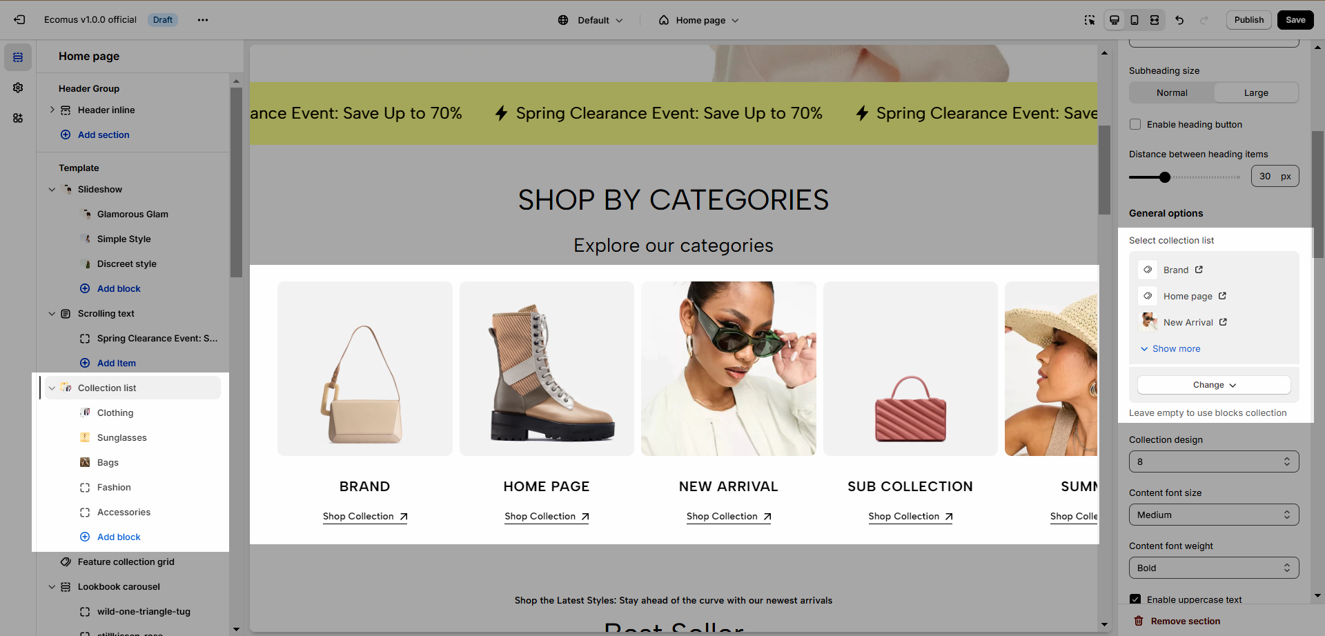
- General options
Select collection list: If you use this option, the blocks will be replaced.
Content position: Content position will depend on the selected design, it could be on the image or outside the image.
Content padding on image: Only applied for the design that has content on the image.
Enable half item: Add a collection at the end of the screen and divide it in half.
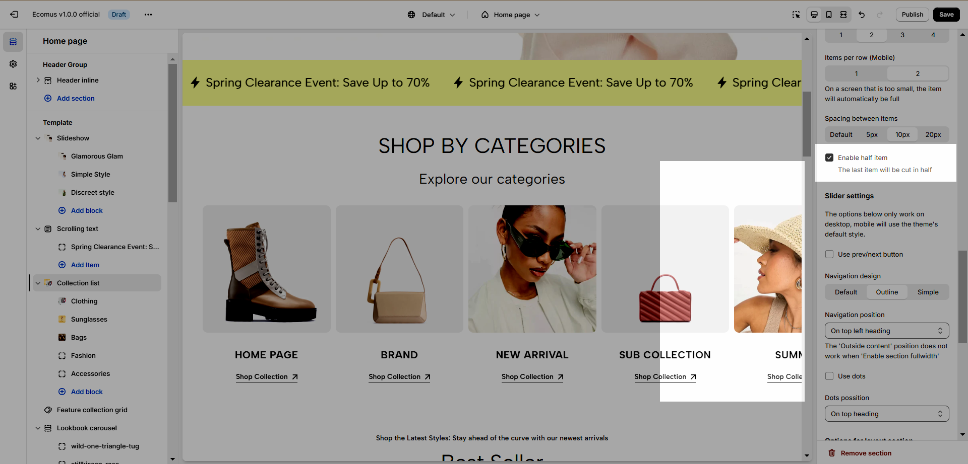
- Slider settings
You have several options: Use prev/next button, Use dots, Navigation design, Navigation position, or Dots position. See the video below for better insight.
- Options for layout section and section padding
Enable Full-Width Section: Expand the collection to cover the entire screen width.
Boxed Full Width: Create a contained box for the collection.
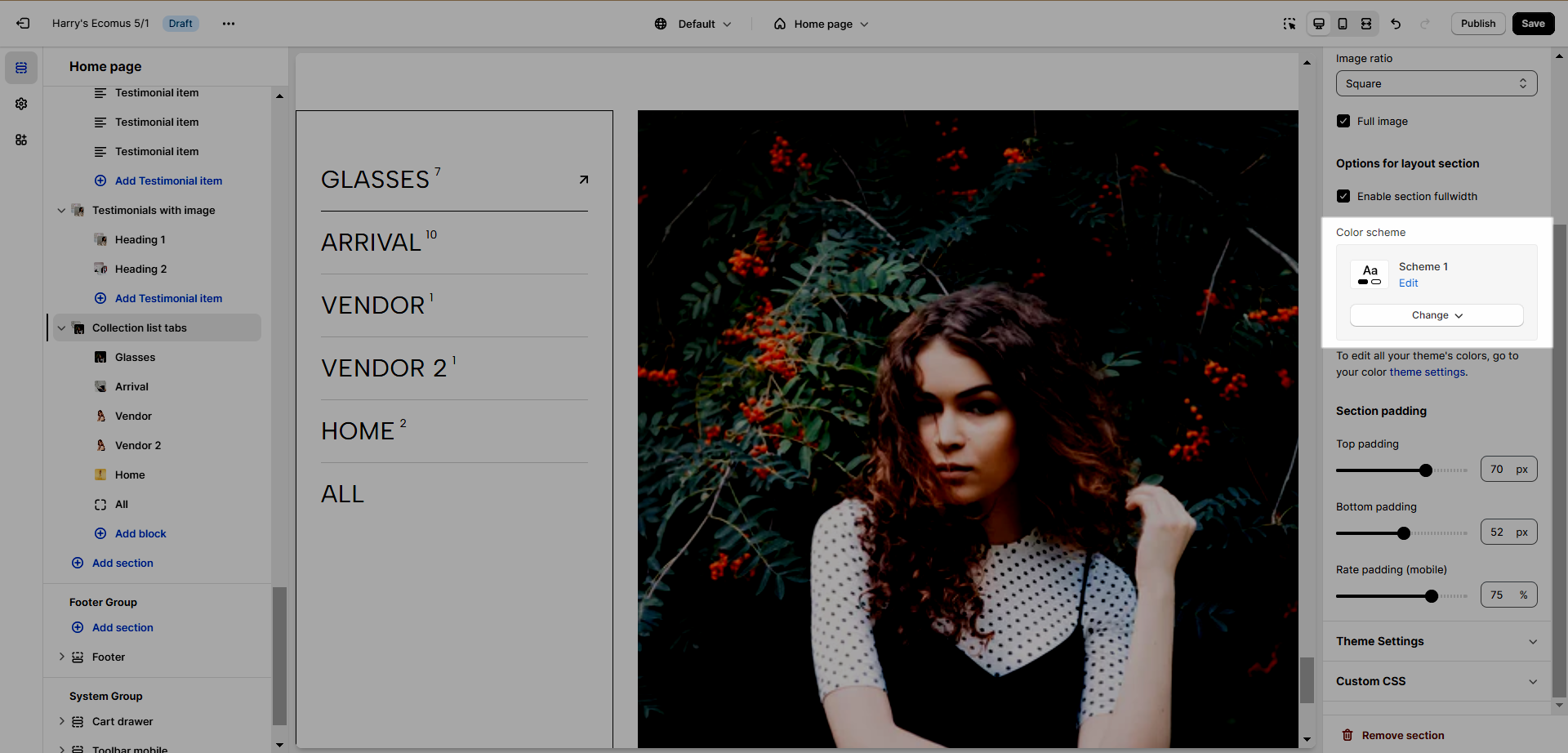
Color Scheme: Select your preferred color as previously prepared. For detailed customization instructions, consult this document.
Rate padding (mobile): The mobile padding will be calculated based on the top-padding and bottom-padding.
2. Collection List Manual
2.1. Collection Items
Collection: Select the collection you want to display.
Collection Image, Collection Title, Collection Link: Replace the collection default data.
Column width: This dictates the horizontal space each item occupies, with configurations tailored for three devices: Desktop, Tablet, and Mobile. Refer to the image below for visual guidance.

The item "New Arrival" item takes up 33% space horizontally
Row Count: In contrast to column width choices, this feature controls the vertical space occupied by items. If an item has a designated height, this option dynamically adjusts the item's height accordingly. This also has responsive options.
2.2. Collection List Manual options
To utilize the collection list manual, select "Add section," locate "Collection List Manual," and proceed to configure it by clicking on the respective option.

- Heading options
There are numerous options to adjust, you can read below:
Heading align: Choose between Default (Left) or Center alignment.
Heading: Input your desired header text.
Heading Tag: Select the heading tag from h2 to h6.
Heading font size: Pick from three font size options.
Section subheading: Enter your subheading using basic text editing tools.
Subheading size: Choose between Normal and Large.
Distance between heading items: Adjust the space between the heading and collection items.
- Options for collection items
To add a collection item, click on "Add Collection item". See image below.

Explore various features within the collection item to enhance the appearance of your site. Refer to the options below for more details.
Collection design: Choose from 2 available designs.
Content font-size: Apply Base, Normal, Medium, or Large to your content.
Content font-weight: Opt for Normal, Medium, Semibold, or Bold.
Enable uppercase text: Activate uppercase formatting for your content.
Content position: Experiment with 4 positions, including Center, Center Bottom (Or Center), Left Bottom (Or Left), and Right Bottom (Or Right). Note that the appropriate location depends on the design.
Content padding on image: Adjust image padding, effective when the Content Position is not centered.
- Collection Layout
Row Height: Customize the height of items for Desktop, Tablet, and Mobile.
Item Spacing: Set the distance between items on Desktop, Tablet, and Mobile.
- Options for layout section
Enable Full-Width Section: Expand the collection to cover the entire screen width.
Boxed Full Width: Create a contained box for the collection.
Color Scheme: Select your preferred color as previously prepared. For detailed customization instructions, consult this document.
- Section Padding
You can adjust padding-top and padding-bottom in this config on the desktop and mobile screen.
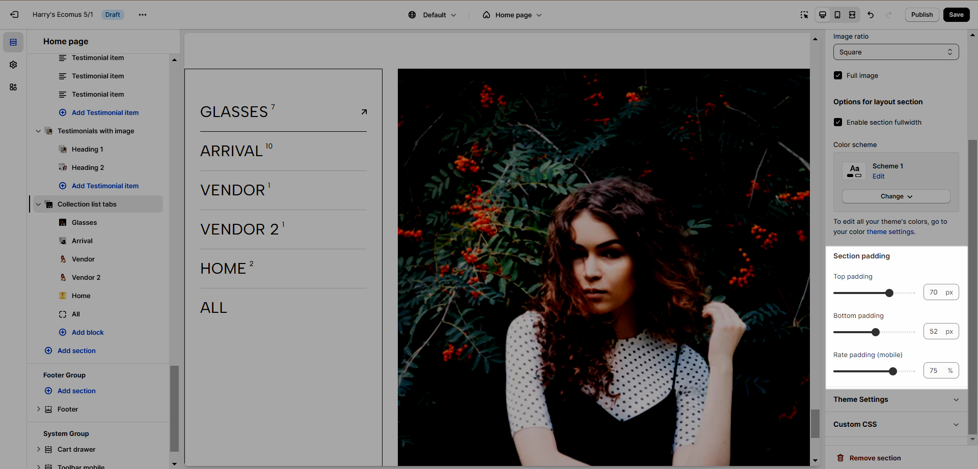
3. Collection List Tab
See the video below to learn how to configure this section.
Color Scheme: To learn more about this, please refer to this document.
Section Padding: Adjust the top and bottom padding of the section both on desktop and mobile.
4. Collection List Simple
See the video below to learn how it's done
In the video, the color scheme had been skipped, to learn more about this, refer to this document.


