


There are 2 sections: Featured Collection Grid and Featured Collection Carousel
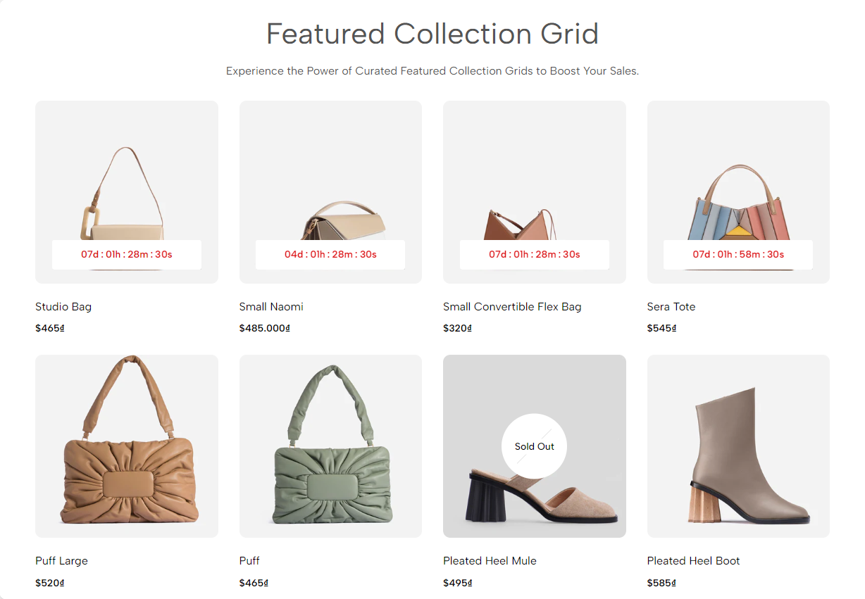
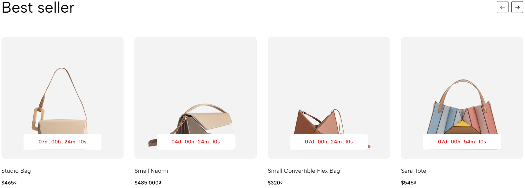
Featured Collection allows you to show the collection of products. Allows customers to have a glance at products and quickly decide which product is best fit for them.
1. Featured Collection Grid
1.1. Heading options
You have some options for heading in this feature: Heading align, Heading, Heading tag, Heading font size, Subheading, Distance between heading items.
Heading reverse: Change the position between Heading and Subheading.
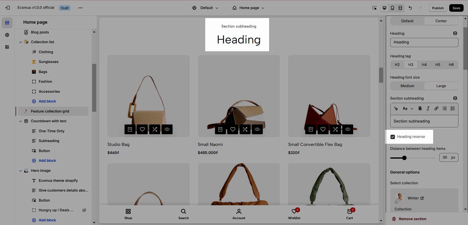
1.2. General options
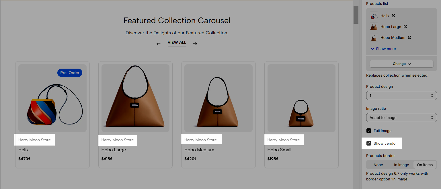
Select Collection: Choose the collection to show
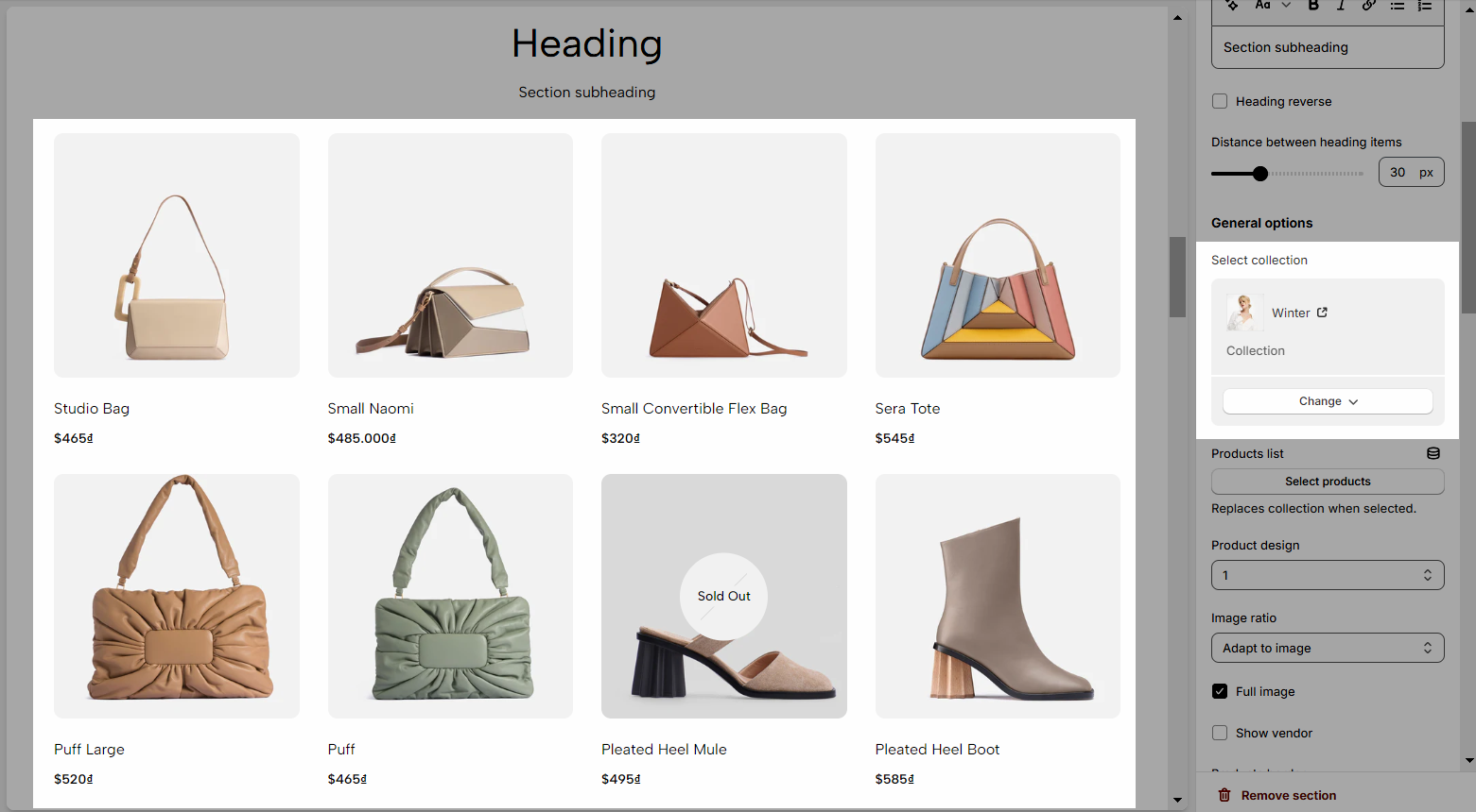
Product list: If this option is selected, the Select Collection will be replaced.
Product design: There are 10 designs to choose from, making different looks for products.
Full image: This option will be only applied for products that have an image smaller than their container
Show vendor: Show product vendor
Products border: Apply border for products on image, items, or grid.
1.3. Product layout
Maximum items to show
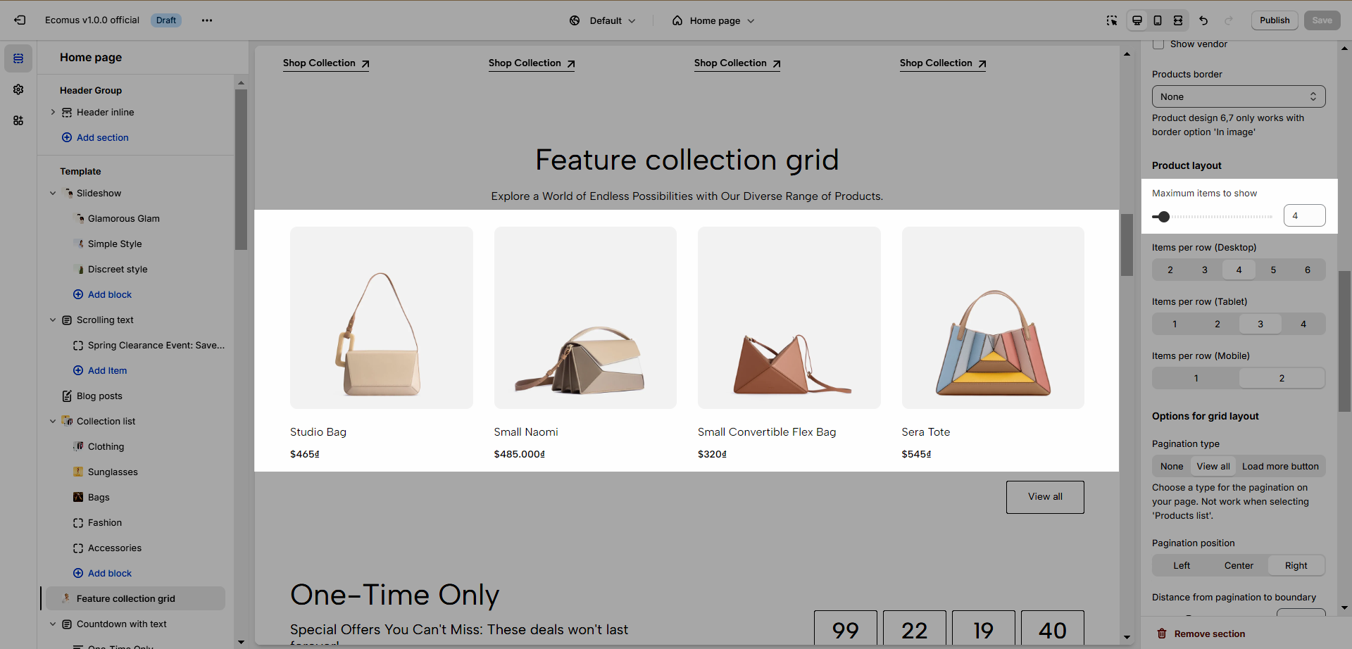
Items per row (Desktop)
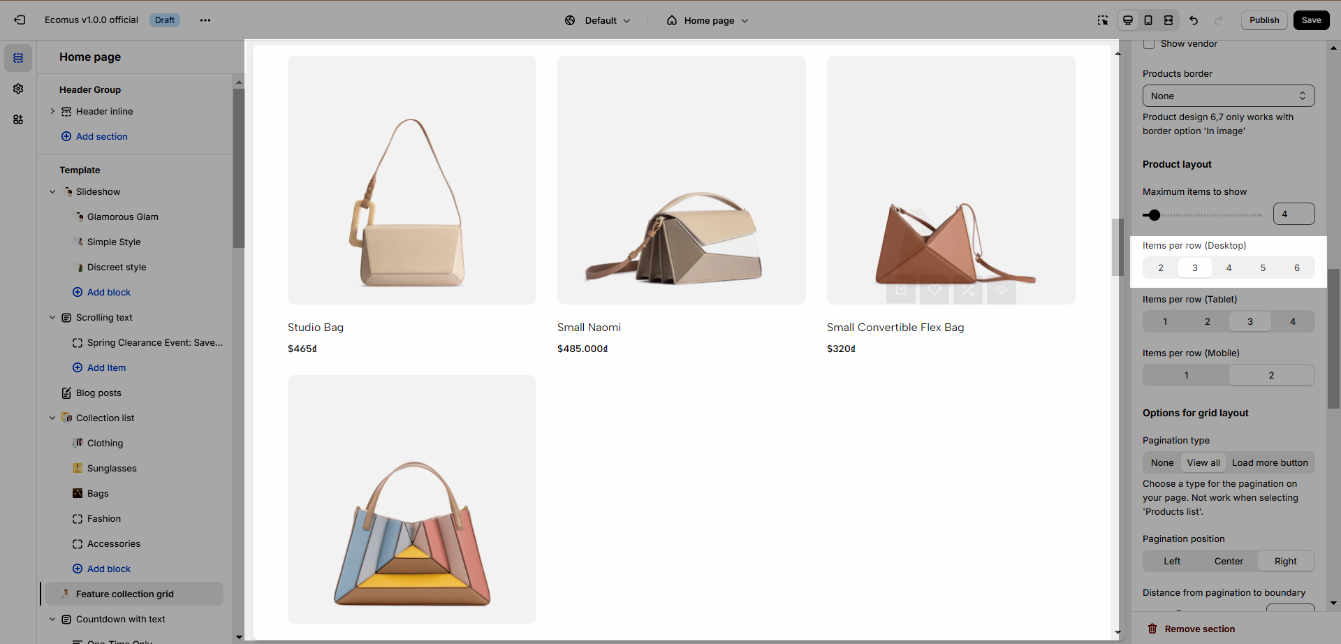
1.4. Options for grid layout
Pagination type: You can choose between View all or Load more.
Pagination position: Left, center, and right.
Distance from pagination to boundary: The space between the button and the items.
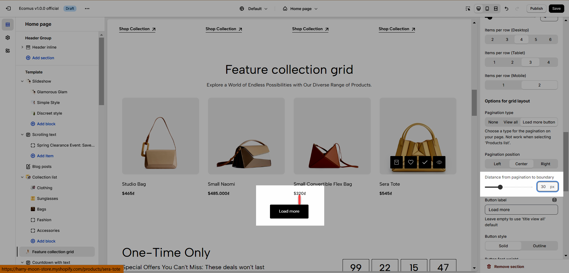
Button label: Change the title of the button.
Button style: You can use Solid or Ouline.
Button font-weight: Change the text font-weight of the button.
1.5. Options for layout section
Enable section full-width: The section will have 100% screen width.
Boxed full width: Only works when enabling full width.
Color scheme: Change the colors of the section by the configured scheme color, learn more here.
Section padding: Determine the top and bottom padding on both desktop and mobile.
2. Feature Collection Carousel
2.1. Heading options
You can adjust Heading align, Heading, Heading tag, Heading font size, Section subheading, Enable heading button, Navigation heading design, and Distance between heading items. See the video below to have a better insight.
2.2. General options
Select Collection: Choose the collection of products to show.
Products list: Choose products to show, if this option is used, the Select Collection will be replaced.
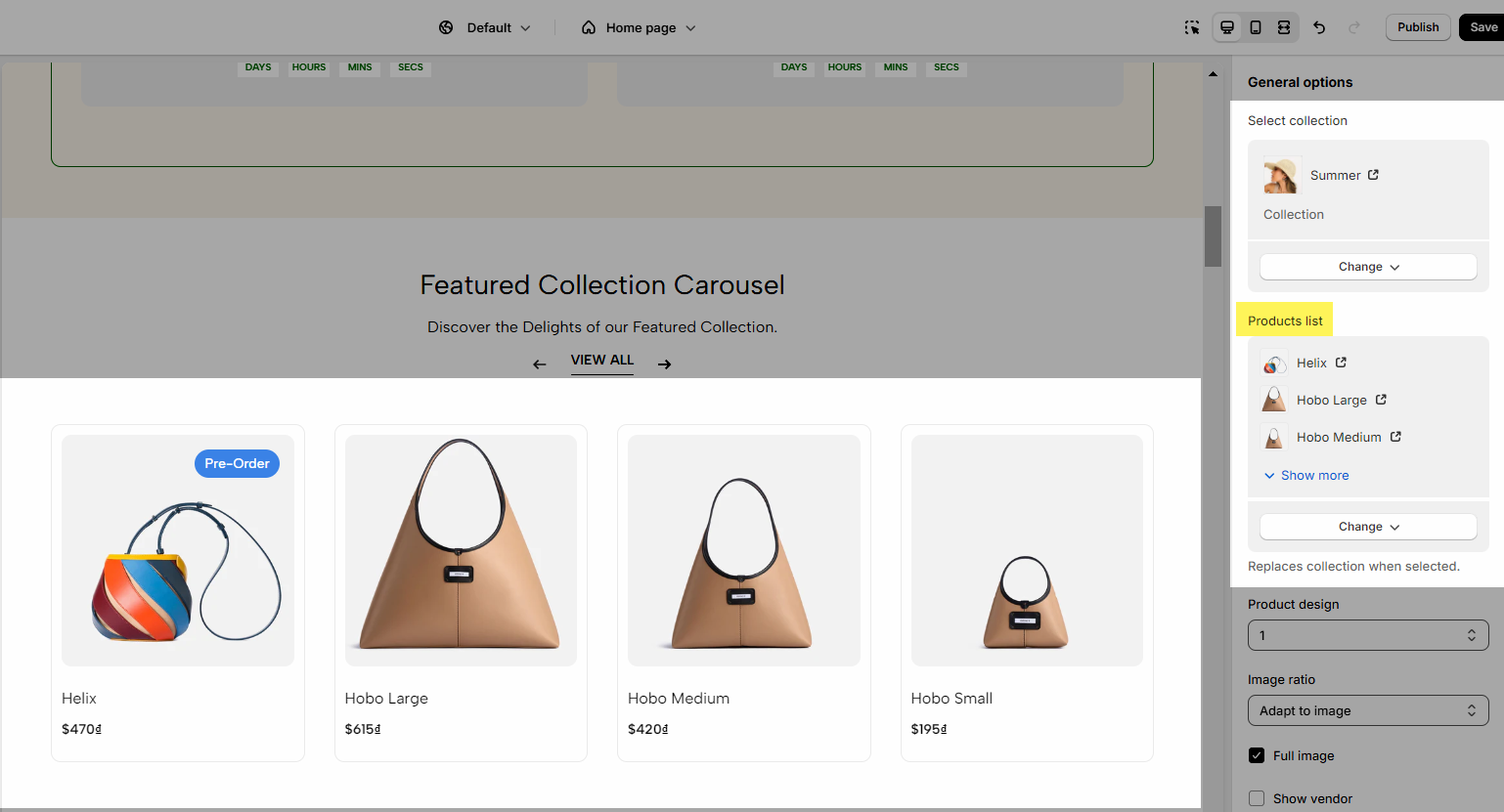
Product design: Choose the design to change the product's look.
Full image: This option is only applied for image smaller than its container.
Show vendor
Products border: Show border covers the image or the product.
2.3. Product Layout
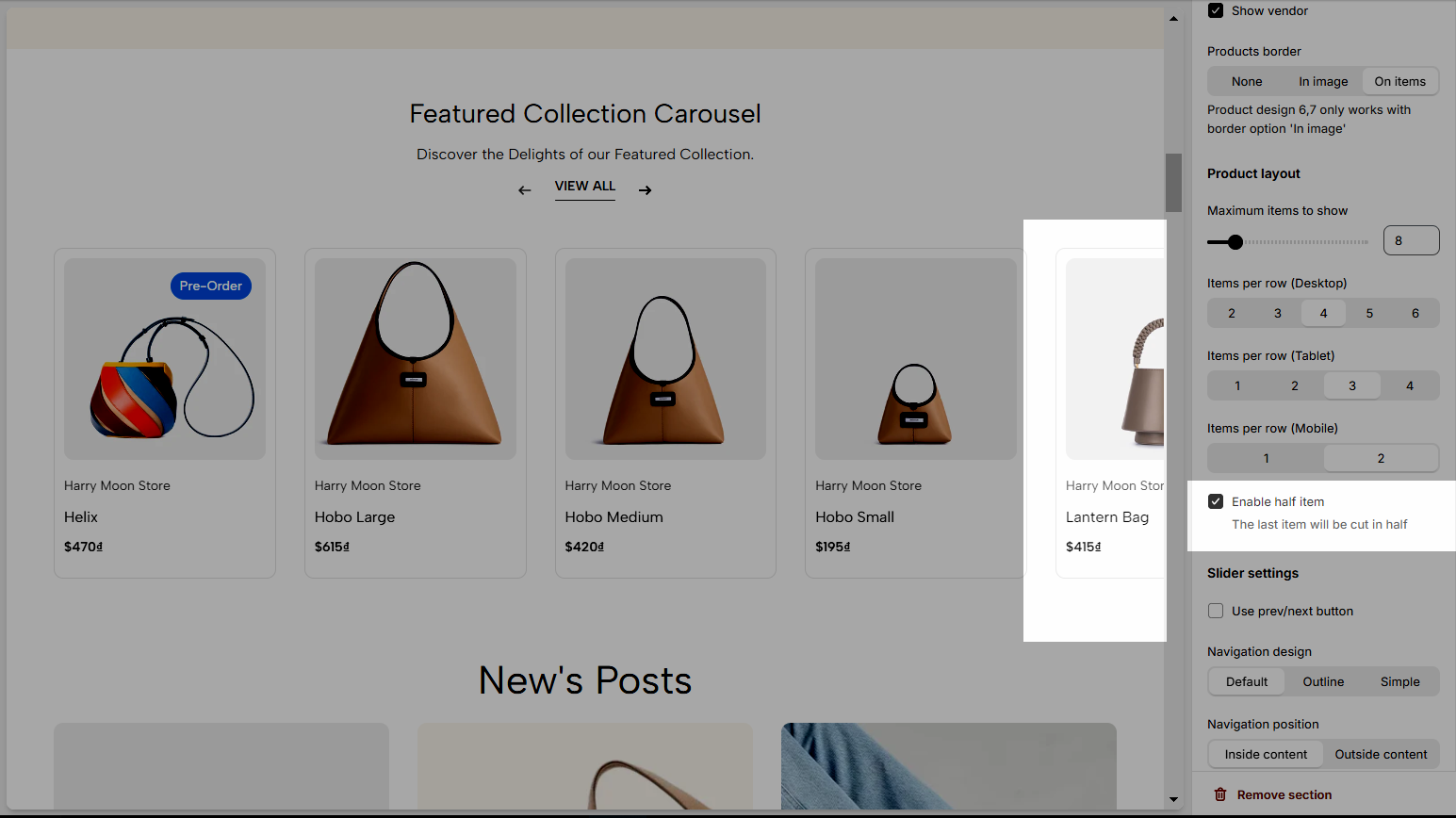
Maximum items to show: Limit the showing products.
Items per row: Determine the amount of product in a row.
Enable half item
2.4. Slider settings
Use the prev/next button and dots.
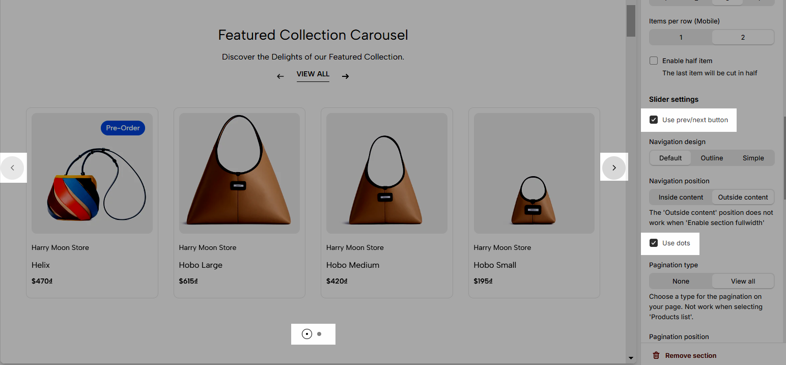
Navigation design: Change the prev/next button design, you can choose 1 of 3 options Default, Outline, or Simple.
Navigation position: Determine the pre/next button inside or outside content.
Pagination Type: Choose a type for the pagination on your page. Not work when selecting 'Products list'.
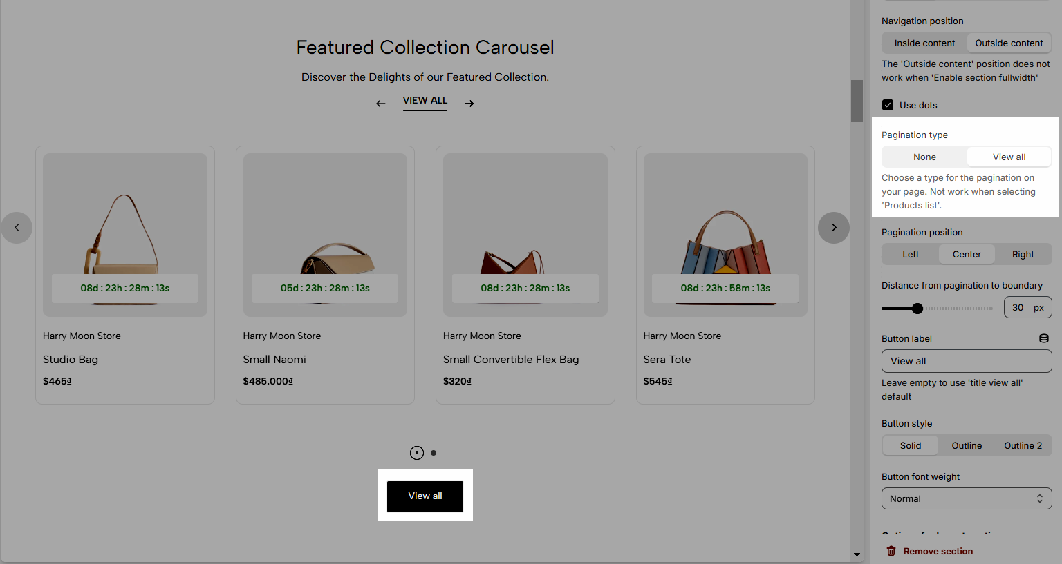
For the Pagination, you have some options to adjust: Pagination position, Distance from pagination to boundary, Button label, Button style, Button font weight.
2.5. Options for layout section
Enable section full-width: Make the section 100% width of the screen.
Color scheme: Change the color of the section, take a look at this document to learn more.
2.6. Section padding
This option allows you to adjust the top and bottom padding of the section on both Desktop and Mobile devices.


