


A well-designed banner carousel can capture visitors' attention and provide them with quick access to your most important content. In this article, we will explore the steps involved in configuring the Banner Carousel.
1. Configuration section
1.1. Banner carousel
You can choose to make this section full-width and Boxed full-width only works when enabling full-width
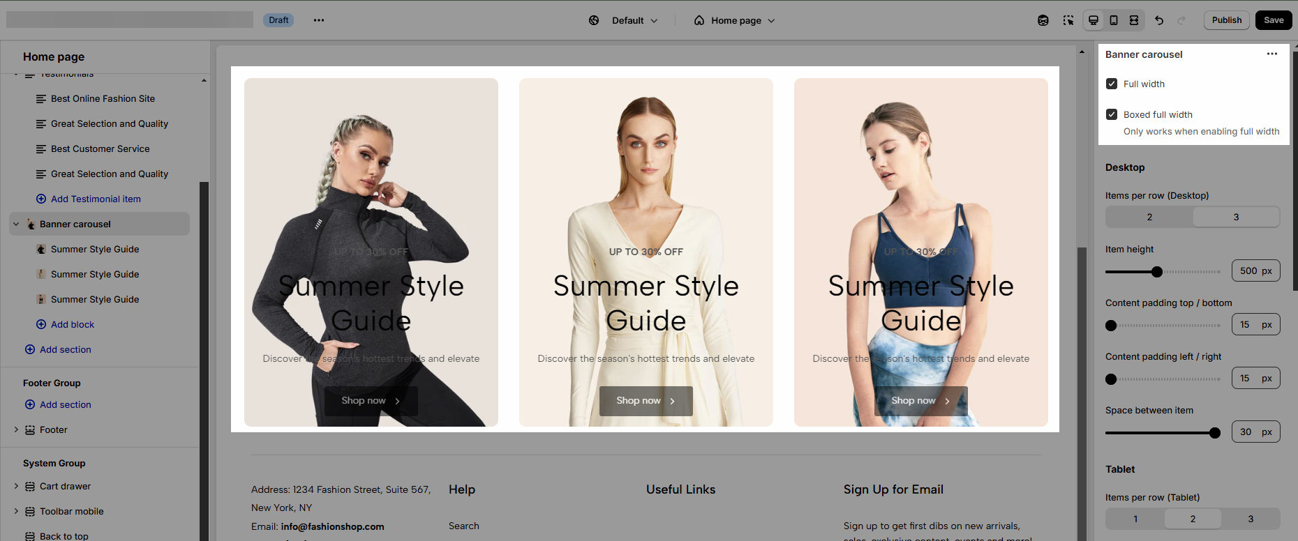
1.2. Settings for Desktop/Tablet/Mobile view.
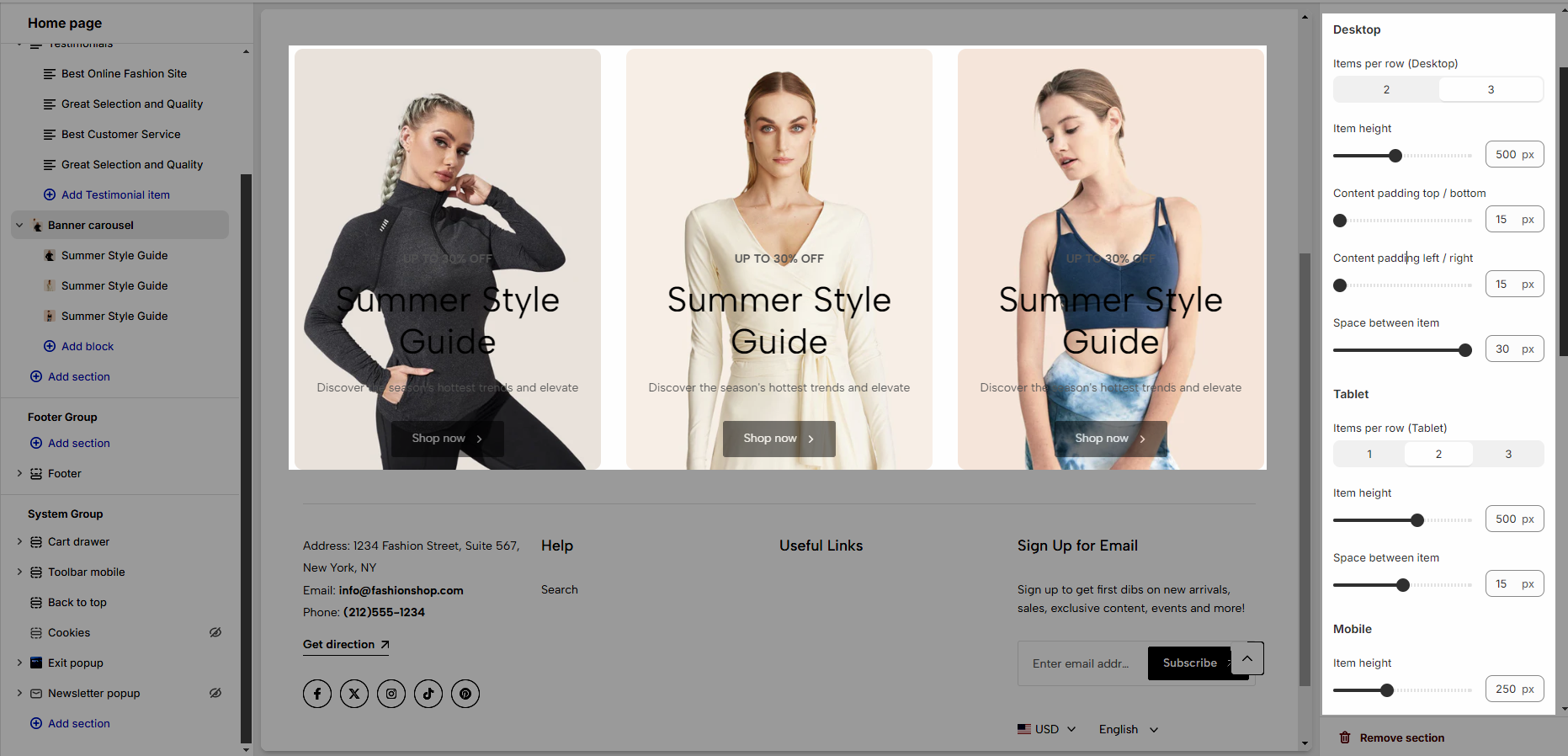
Items per row: Number of items displayed per row on a desktop screen.
Item height: The height of each item.
Content padding top/bottom: Padding is applied to the top and bottom of the content.
Content padding left/right: Padding applied to the left and right of the content.
Space between items: The distance or space between each item in the row.
1.3. Slider Settings
You can use the slider options as explained below:
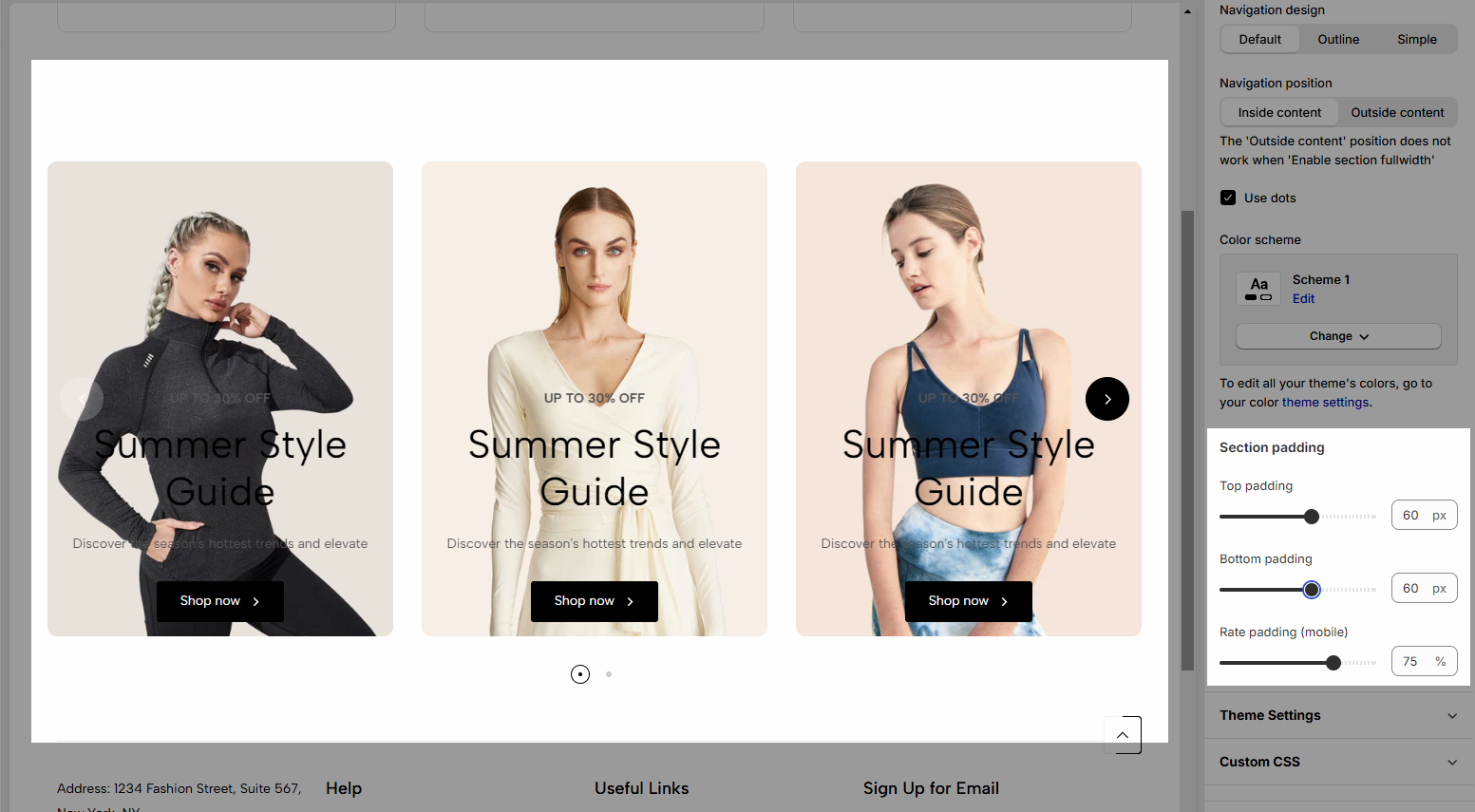
Use the prev/next button: You can choose a design (default, outline, or simple) and position (Inside content, or outside content).
Navigation: This allows you to adjust the position (left, center, or right), the space between products, and the style of buttons, you can also change the text and text style of the button.
Use dots: Show dots.
Color Scheme: The set of colors used throughout the design or section, determining the overall look and feel
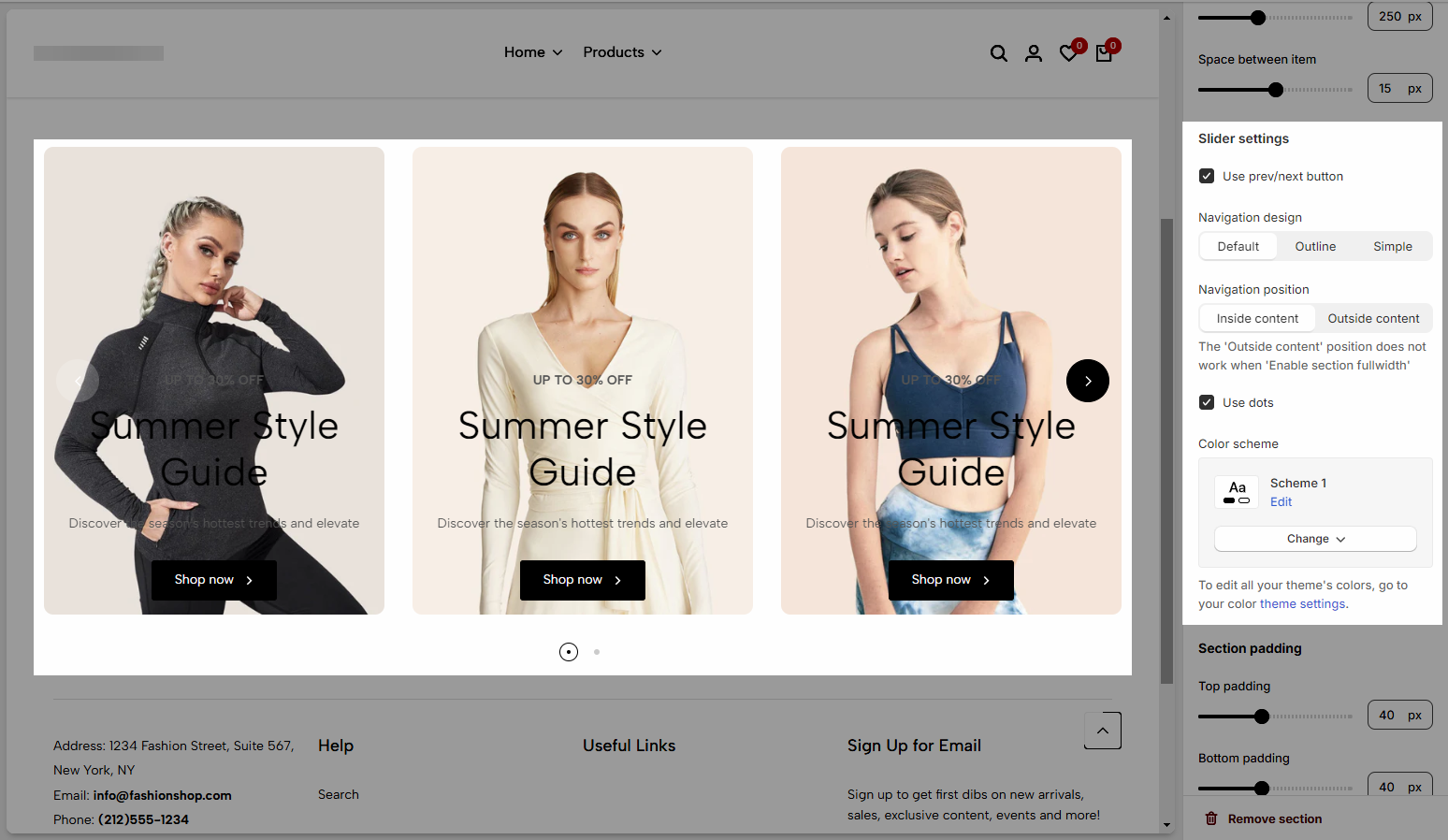
1.4. Section padding
Section padding: This option is in all testimonials sections, allowing you to adjust top and bottom padding on desktop and mobile.
2. Configuration item
There are 4 types of blocks you can choose from.
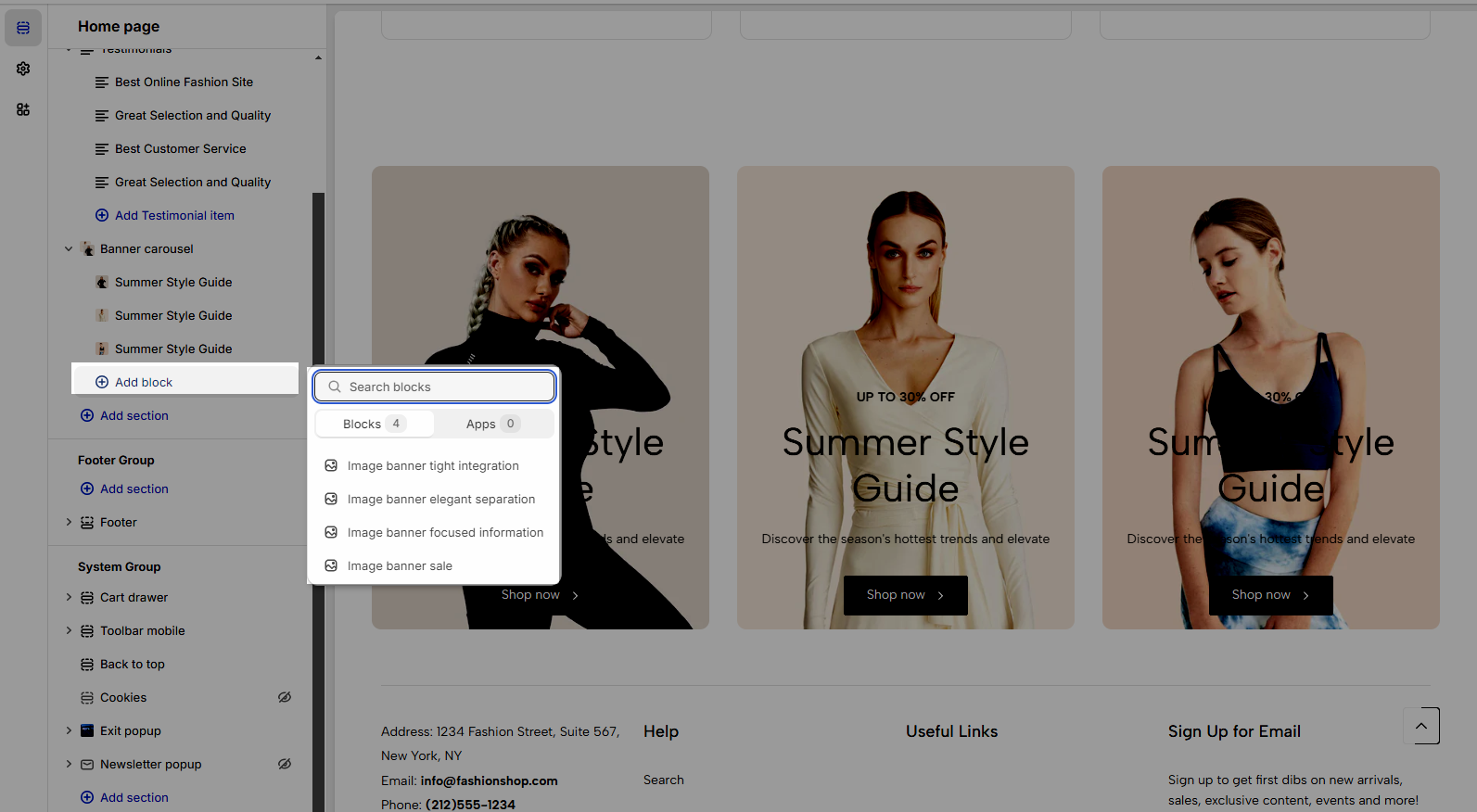
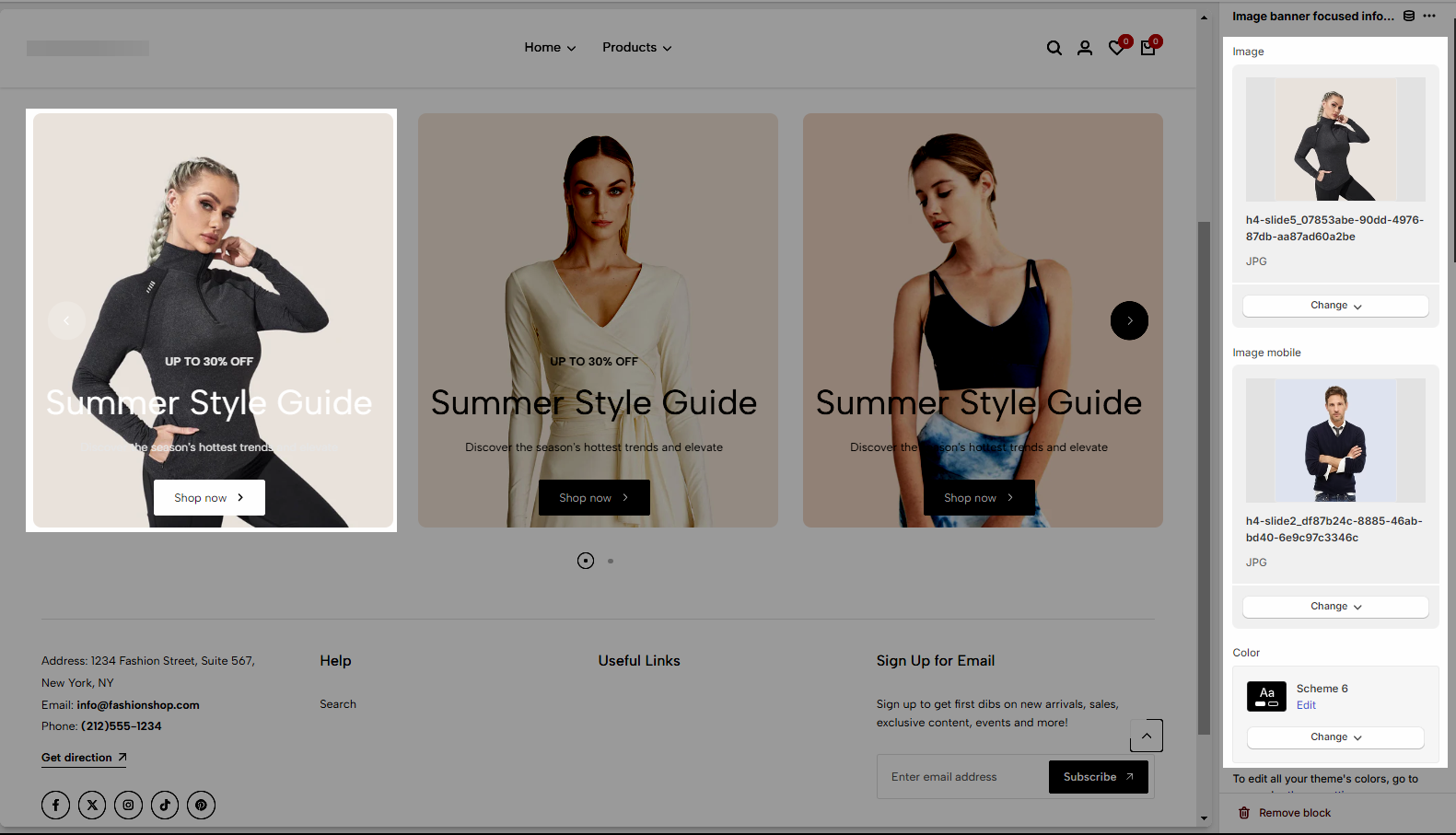
Image: Upload or select an image to be used in the section for Desktop/Mobile
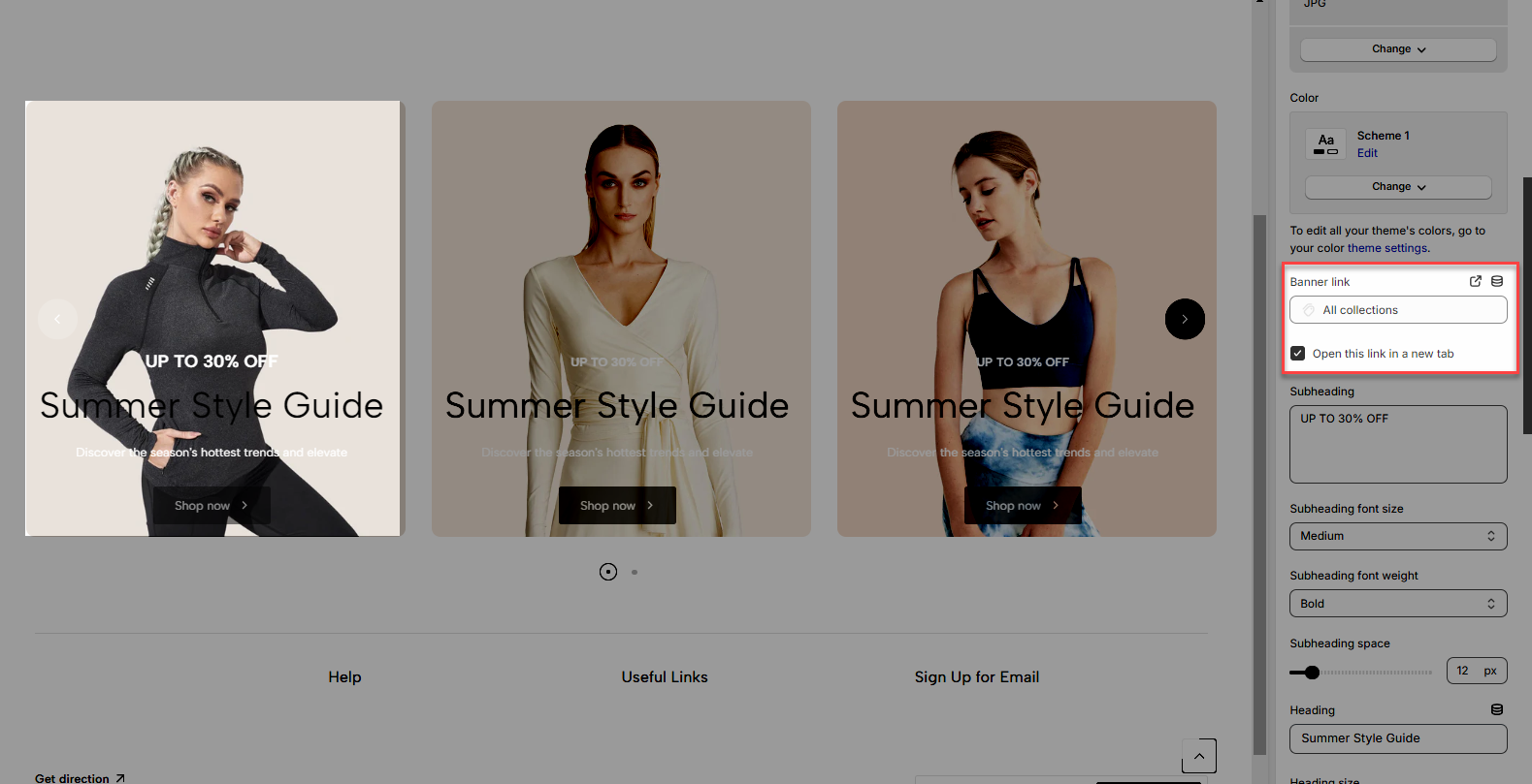
Color Scheme: The set of colors used throughout the item
Banner Link: The URL to which the banner will redirect when clicked.
Open this link in a new tab: Option to open the banner link in a new browser tab.
Subheading: The text that appears below the main heading, providing additional context.
Subheading Font Size: The size of the font for the subheading.
Subheading Font Weight: The thickness or boldness of the subheading text.
Subheading Space: The amount of space around the subheading, typically between the heading and the subheading.
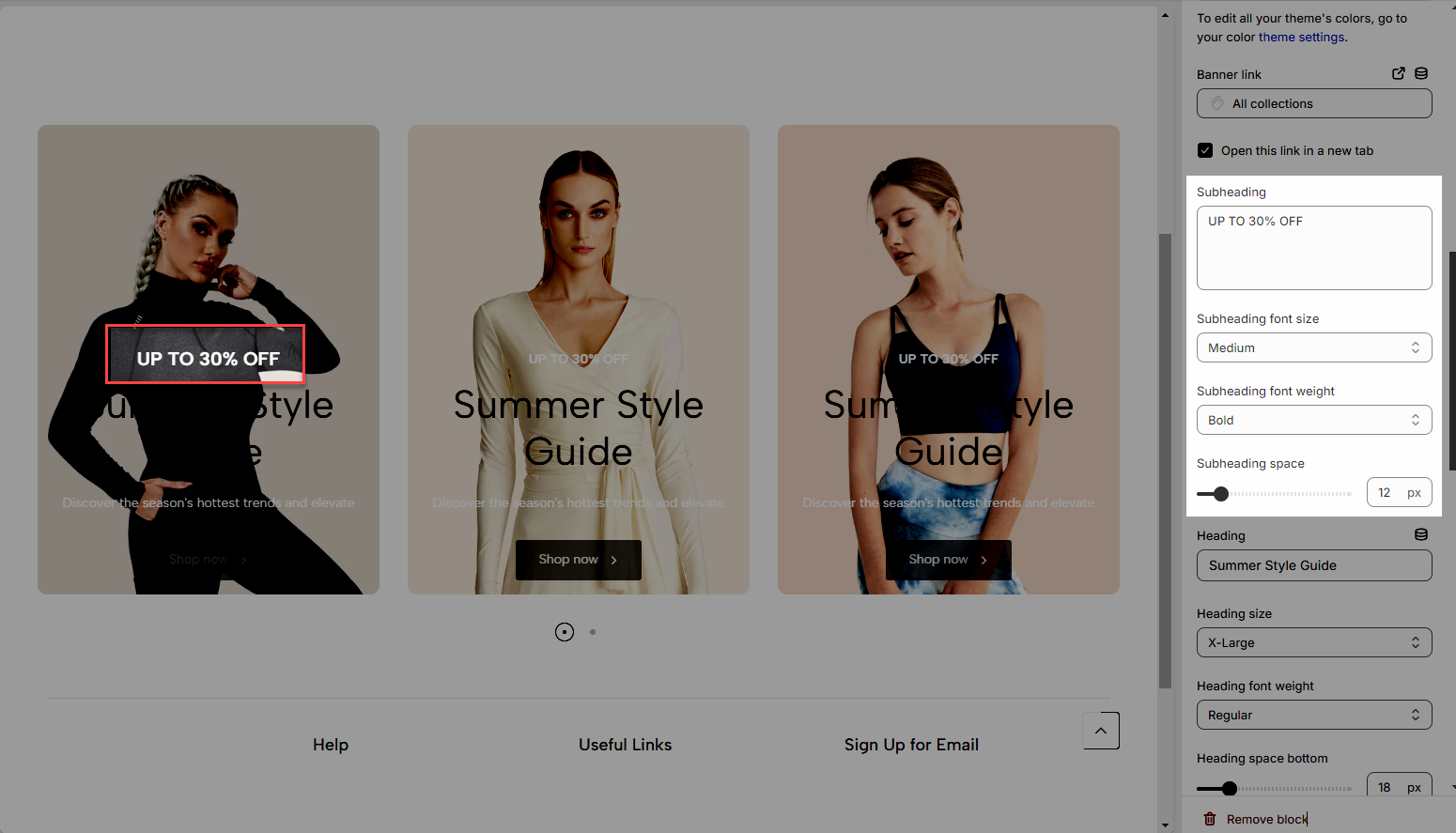
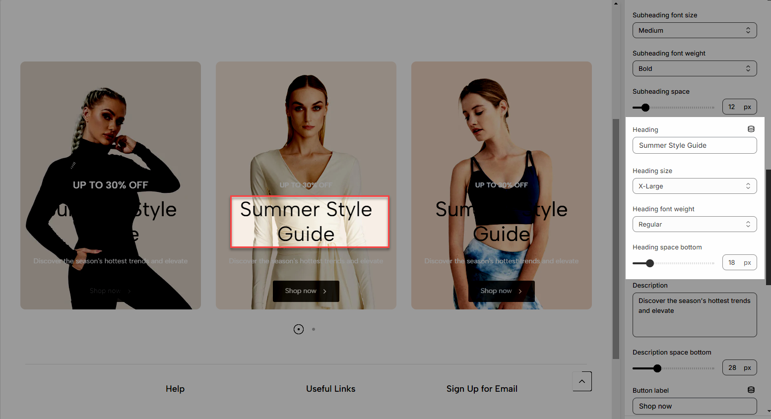
Heading: The main title or heading of the section.
Heading Size: The size of the font for the heading.
Heading Font Weight: The thickness or boldness of the heading text.
Heading Space Bottom: The amount of space below the heading.
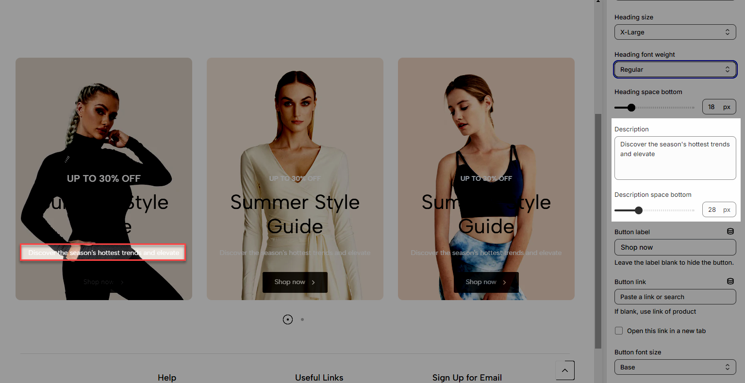
Description: Additional text or content that provides more details.
Description Space Bottom: The amount of space below the description text.
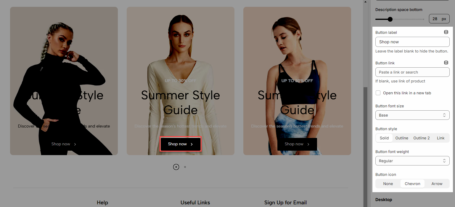
Button Label: The text that appears on the button.
Button Link: The URL to which the button will redirect when clicked.
Open this link in a new tab: Option to open the button link in a new browser tab.
Button Font Size: The size of the font for the button label.
Button Style: The design or appearance of the button (Solid, Outline, Link).
Button Font Weight: The thickness or boldness of the button text.
Button Icon: An icon that can be displayed on the button.
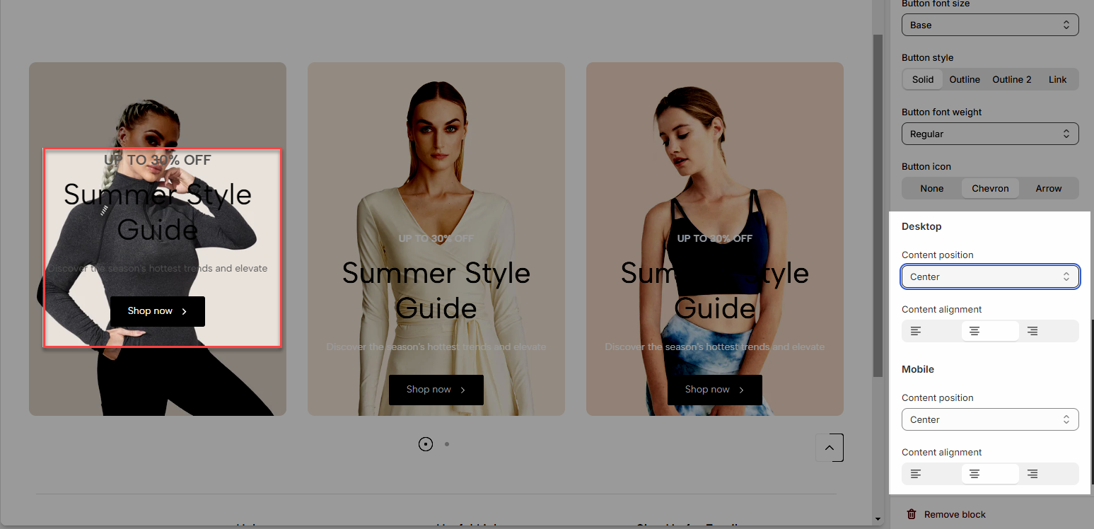
Content Position (Desktop/Mobile): The position of the content within the section
Content Alignment (Desktop/Mobile): The horizontal alignment of the content (left, center, right).
With other block types also configured similarly


